|
| Group |
Round |
C/R |
Comment |
Date |
Image |
| 3 |
Sep 20 |
Comment |
This is a nice travel shot that captures the mood of Paris. Do you by any chance have a shot of this that includes the water--for comparison. |
Sep 18th |
| 3 |
Sep 20 |
Comment |
I also like the touches of rust on the chain. Good eye.
Here is a question. You clearly chose to shoot at right angles to the plane of the alternate links, so you saw some full on and some edge on. I think this is the best idea, but I am curious as to how this would look at a 45-degree angle? I am guessing I would prefer this view, however. |
Sep 18th |
2 comments - 0 replies for Group 3
|
| 5 |
Sep 20 |
Reply |
Hi Pete, great shot, I prefer the full black background--a personal preference I have for almost all such shots. To me, it lends an air of formality to the portrait. |
Sep 30th |
| 5 |
Sep 20 |
Comment |
Great creation. Did I understand you to be shooting at an aperture of f1000? That must be in order to get a depth of field from here to their home planet. |
Sep 6th |
1 comment - 1 reply for Group 5
|
| 7 |
Sep 20 |
Comment |
Rich, excellent shot. The Moiré pattern comes out very well. Great that you spotted it. |
Sep 6th |
1 comment - 0 replies for Group 7
|
| 11 |
Sep 20 |
Comment |
You have done an interesting thing with this portrait. I think it is a combination of your choice of model, shooting at the right moment, your own ability to interact with the child, and a coincidence of her age and features. Your final image catches a child's portrait that reveals the woman to be hinting at emergence. The face is timeless, and a brilliant capture. If this shot does not win prizes in portrait competitions, then I don't understand anything about photo criticism. |
Sep 18th |
1 comment - 0 replies for Group 11
|
| 23 |
Sep 20 |
Reply |
Very good. You improved this a great deal. It really benefited from the straightening and cropping. |
Sep 30th |
| 23 |
Sep 20 |
Comment |
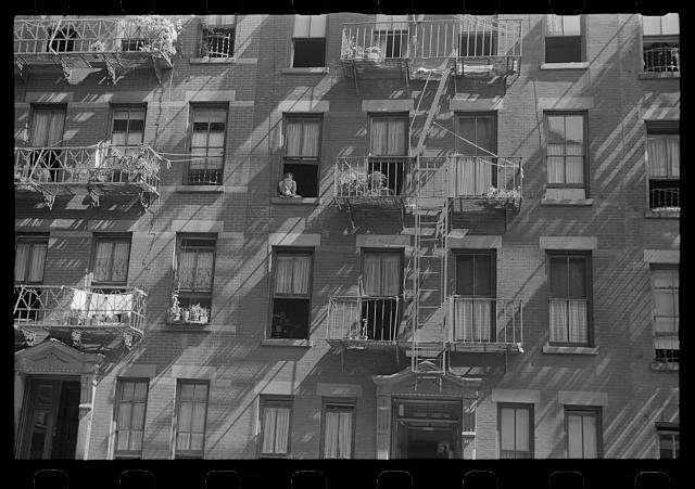
The front of an old building with interesting stuff happening is always a good shot. I guess you can't go back and try again, but I recommend shooting something like this at a time of day when there is slanting light falling on the facade, so there is a geometric contrast between the rectilinear facade and diagonal shadows. Here is a Walker Evans example. There is a bit of laundry in this shot--it is from the 1920s. |
Sep 16th |
 |
1 comment - 1 reply for Group 23
|
| 24 |
Sep 20 |
Comment |
I like this very much, especially the minimalist approach.
My only suggestions are about the composition--I would have half torn open the lone garlic, so the individual cloves were fully visible. Also, if you have a damaged bulb, then include it, to show that all living things also decay and die. |
Sep 6th |
1 comment - 0 replies for Group 24
|
| 26 |
Sep 20 |
Comment |
Merhaba, Fatih, it is exciting to see you now in Group 26. I used to see your images in Group 3, and they were wonderful, especially the woman with the pomegranates.
This is a fine shot, especially the contrast between age/youth, isolation/social. Although a poor section of the city, the colors perhaps suggest a cheerful care for the appearances of the little houses?
If you don't mind, what is the title in Turkish (my wife is Turkish, and we have a summer home in AlaçatÄ�). |
Sep 6th |
1 comment - 0 replies for Group 26
|
| 27 |
Sep 20 |
Comment |
This is a gorgeous shot. Because you have such good light on it, it would also look great in monochrome (my Group 32 is a monochrome group). Just mentioning--I prefer the color for this shot. |
Sep 16th |
 |
1 comment - 0 replies for Group 27
|
| 29 |
Sep 20 |
Comment |
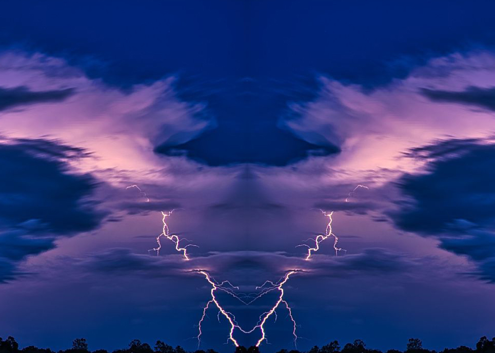
I like to play around with mirrored and combined images. How is this? |
Sep 6th |
 |
1 comment - 0 replies for Group 29
|
| 32 |
Sep 20 |
Reply |
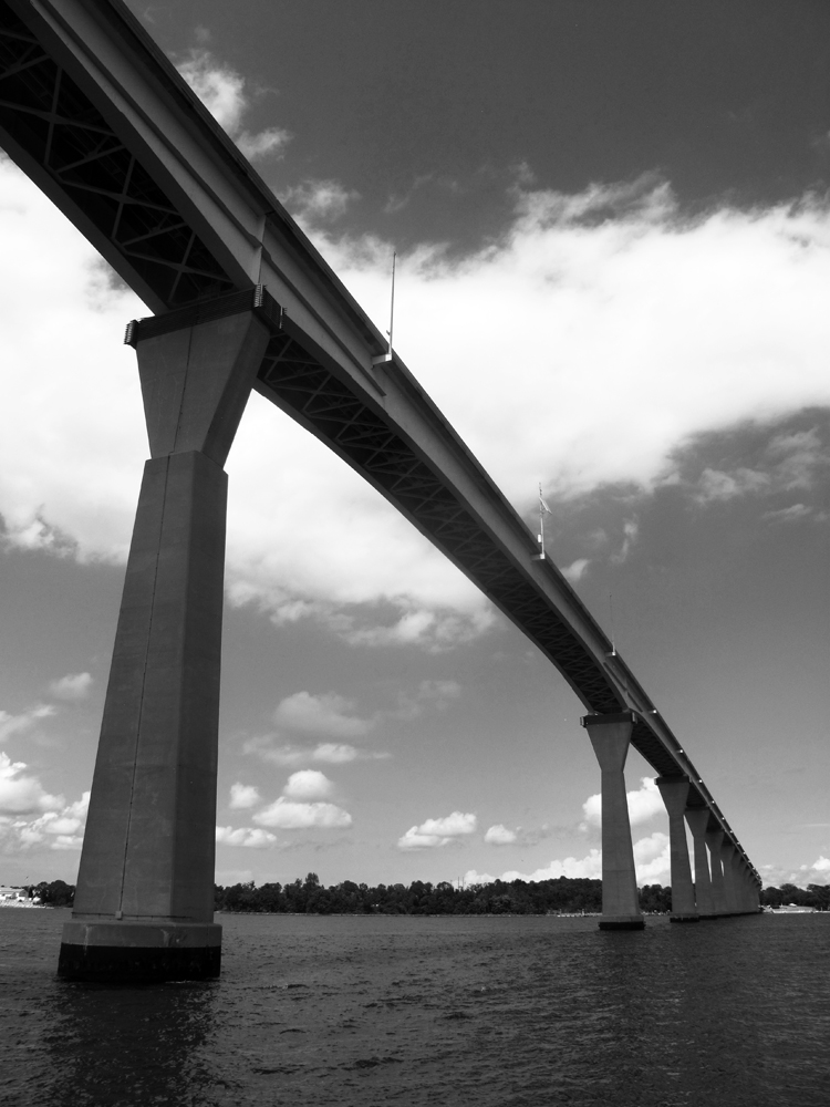
Diana encourage me to brighten the bridge and increase the contrast of the rest. See my dialogue with her at the end of the discussion page. You had the same suggestion. Thanks. |
Sep 29th |
| 32 |
Sep 20 |
Reply |
It was worth the work, and the learning process. Thanks. |
Sep 28th |
| 32 |
Sep 20 |
Reply |
Here is one more go-around. I selected the bridge, worked on it, then inverted the selection and worked on the rest. Not sure if this is pleasing, but I got a lot of practice with my controls. |
Sep 27th |
 |
| 32 |
Sep 20 |
Reply |
Everyone, I went back to my original and went to work with your suggestions using all the curves controls I have in PS Elements--four sliders for highlights, shadows, and mid-tone brightness and contrast. I applied all to the overall image--no selection work. How does this look? |
Sep 26th |
 |
| 32 |
Sep 20 |
Comment |
I think you are right about that sky overpowering the picture.
But also, sorry to say, I find the foreground burnt area does not connect to me. This might have been better shot closer to or amongst the burnt trees? |
Sep 10th |
| 32 |
Sep 20 |
Reply |
Quite right, Tom, in doing the rotation, however little, a bit of the picture gets lost. So it's best to make sure the camera capture has a bit of extra subject. |
Sep 10th |
| 32 |
Sep 20 |
Reply |
Thanks, Tom. Good idea about taking out the light poles--it emphasizes even more the slender causeway atop the bridge. |
Sep 10th |
| 32 |
Sep 20 |
Comment |
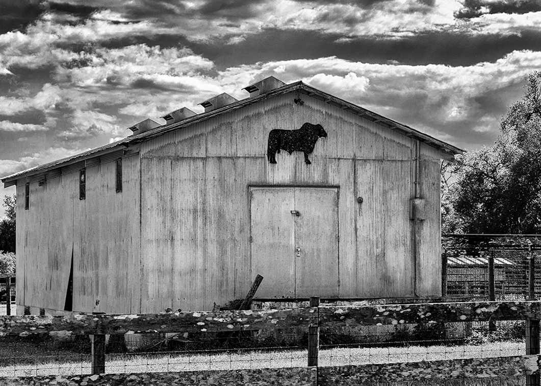
Everything looks good about this, except the leveling you noted, which is defined by the horizontal lines of the door and upper barn wall. I rotated the whole image half a degree to the right, just a bit, but I think you can see a difference. |
Sep 7th |
 |
| 32 |
Sep 20 |
Reply |
How is this? This is an overall change. Should I select different sections to work on? |
Sep 7th |
 |
| 32 |
Sep 20 |
Reply |
Oh my, not for me. The last time I met another car on a one-lane road, I graciously backed up--and did such a bad job, I went off the road. But at least it was on the surface, not a bridge. I was backing downhill and lost my view of where the road was, so went into the ditch. I had to call for a tow. I should have asked the other driver to back up, as he would have had a clear view of the road behind him. |
Sep 6th |
| 32 |
Sep 20 |
Comment |
Ha! How do you like that? No one will believe me now that Russ has said it first. That was my only suggestion, too. How will I ever convince any of you that I really thought so?
I like very much the how the mountain fills up the frame. |
Sep 5th |
| 32 |
Sep 20 |
Reply |
So PS Curves should take care of this, to map the dark grays to solid black. I have a similar function on PS Elements, and it has pre-selects, as well as sliders, so I used "Increase Contrast." How does this look. |
Sep 4th |
 |
| 32 |
Sep 20 |
Comment |
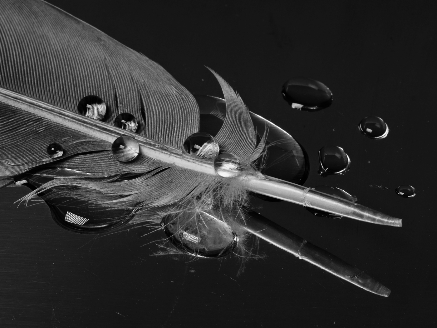
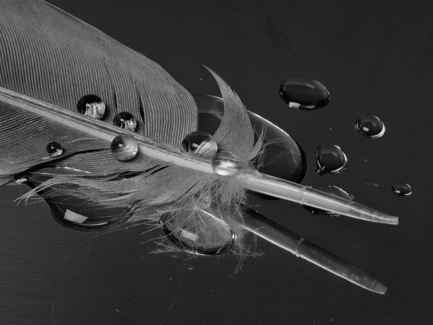
Applause for experimenting with new things, and for working so hard at it. I think you have some pretty good success with this. I really like the unique idea of combining a feather with water droplets--most people would have combined leaves or grass with water droplets.
I don't mind the reflections in the droplets, and I did not notice the dust bits.
The only suggestion I have is about your strong preference for contrast. I think in this case, there is a delicacy in the veins of the feather in the original that does not come through in the finished image. Also I think your finished image has the feather shaft a bit blown out. I started with your original and here is how I would have done it. Of course this is my preference, and does not have to be yours. |
Sep 4th |
 |
| 32 |
Sep 20 |
Comment |
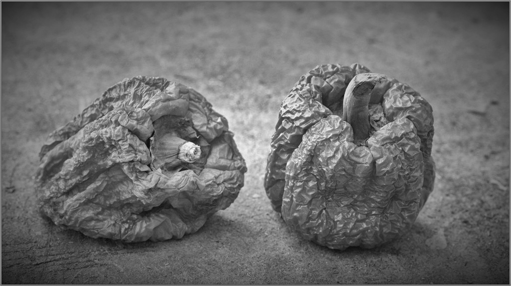
Hello Russ, welcome to our group.
You have a good eye for subject matter. This is indeed a good choice. I like the simplicity of just setting two peppers alone on a plain surface to discuss together how time has treated them. Perhaps the right one should be turned to face the left one?
I think it's a bit too bright in the center between the peppers, and could use a bit more contrast. So here is my suggestion. In PS, I did "Darken Highlights" overall, and then a tiny bit of "Increase Mid-tone Contrast." That all. What do you think? |
Sep 3rd |
 |
| 32 |
Sep 20 |
Comment |
Tom, this is instructive. I see you left lots of space to the left to show the drama of the cannon smoke. And making the cannon and reenactors 25% of the frame works just fine. The tint works great of course.
I am not sure, but perhaps the smoke could be a bit whiter. What do you think?
About the scene, although it would be an anachronism, I think those guys should be wearing modern noise-suppressing ear gear, not just sticking their fingers in their ears. |
Sep 1st |
| 32 |
Sep 20 |
Reply |
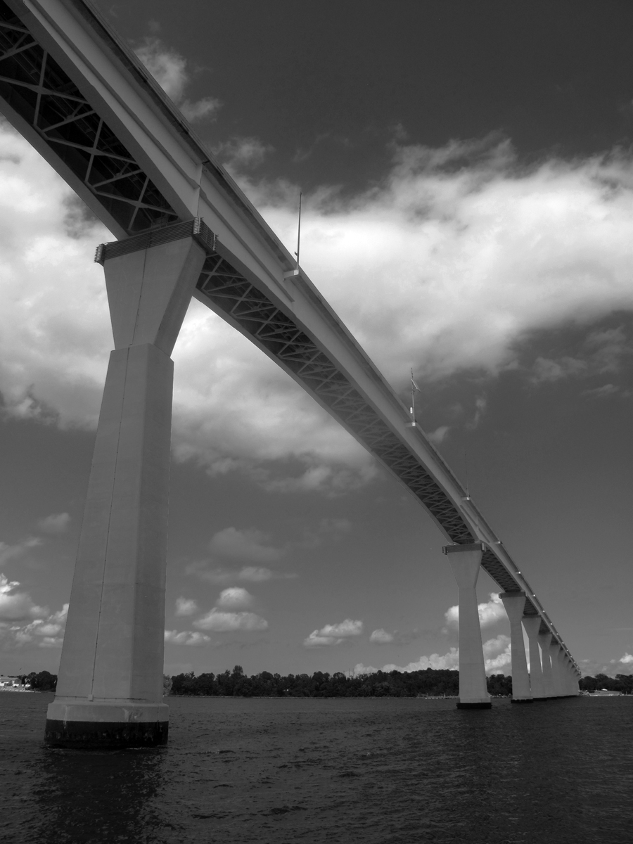
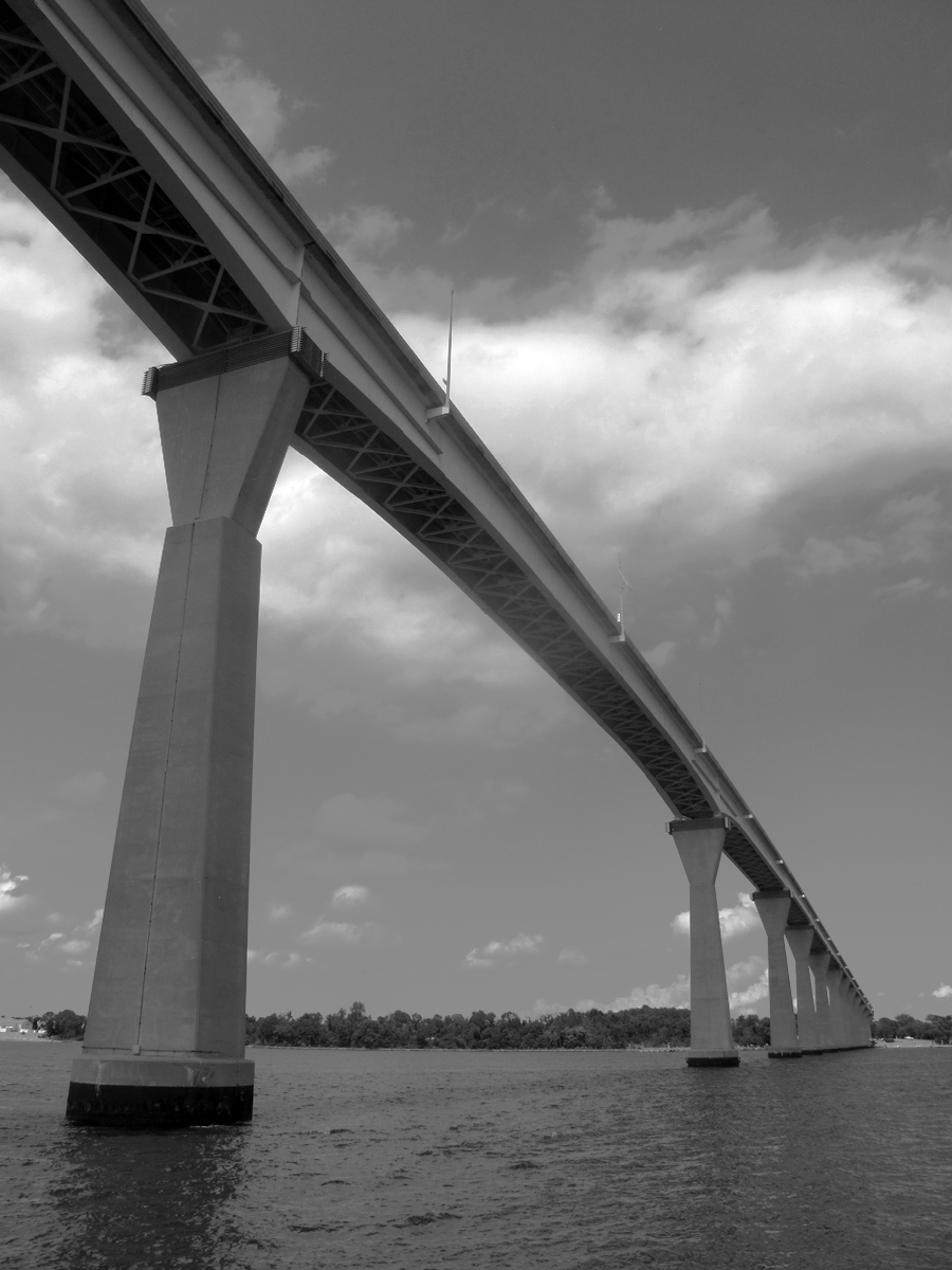
Merhaba, Ata, good to hear from you at the first of every month. Our family vacation was very good. I expect that September in Turkey will be a pleasant month for you--how my wife and I wish we were there this year. Now that we are retired, it is possible to go in September, and--bang--now we can't. How ironic.
The bridge is 140 ft. high, actually not nearly as big as many others, but proportionally, with just two lanes and the low barriers, it feels like one is climbing to the sky.
I will try increasing the contrast. Thanks. |
Sep 1st |
6 comments - 10 replies for Group 32
|
| 35 |
Sep 20 |
Comment |
Just visiting from Monochrome Group 32. I love the angle you chose on this. And I so much like that you managed to shoot it empty of cars and people, so that it is a study of just the bridge. Thanks also for the historical information. |
Sep 30th |
1 comment - 0 replies for Group 35
|
| 36 |
Sep 20 |
Comment |
The orchard owners did not realize what beauty lurked in their rows of naked trees. You did a great job with seeing the opportunity and capturing it.
My only thought is to have looked at more of an angle down the row of trees, standing a bit closer to the first tree. Just my personal preference in this type of situation. |
Sep 5th |
1 comment - 0 replies for Group 36
|
| 37 |
Sep 20 |
Comment |
Thank you for taking us to this ceremony. One of the purposes of our Digital Dialogues, for me, is to meet people and see places and things, as well as to discuss making photographs.
I see from your bio you live in Chandigarh. When I was a boy in the 1950s, my mother completed her B.A. One of her elective courses was Architecture History. I was fascinated by the book she brought home to study on the work of the architect Le Corbusier in Chandigarh. I thought they were the most stunning buildings I had ever seen, and also thought, "I will never go there." Yet in 1988-89, I worked in Taipei, and on the return to the U.S., I took my family on a tour of India. We saw the Chandigarh civic buildings, and ALSO the Rock Garden of Mr. Nek Chand, meeting Mr. Chand in person in his studio. |
Sep 15th |
1 comment - 0 replies for Group 37
|
| 39 |
Sep 20 |
Comment |
Oh boy, you are taking on a lot. And this shot is doing very well. But there are so many challenges. You identified the lack of level in the legs. But there is more. The scant draping of the woman's left leg shows great athletic muscular strength, but the other leg is discreetly covered, expressing a mood of graceful modesty--quite different. Both are legitimate, but I think this image is better with the modest draping, however strong and beautiful that left leg is. Then you can think about arranging their hair, and the man's eyes and fingers. It never ends.
Have a look at the dance photographs of Barbara Morgan for some history. |
Sep 2nd |
1 comment - 0 replies for Group 39
|
| 45 |
Sep 20 |
Comment |
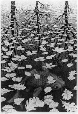
This is a fine shot, with sky, water surface, and sky reflection. Am I seeing a bit into the depths of the water, for another layer? Is this like Escher's "Three Worlds"? Can you shoot this again showing yet more into the depths of the water? You would then have four worlds: sky, surface, under-surface, and sky reflection. Oh, and if you inject your shadow onto the surface of the water with the sun behind you (like Vivian Maier often did), they you would have five worlds. |
Sep 5th |
 |
1 comment - 0 replies for Group 45
|
| 48 |
Sep 20 |
Comment |
Hi Bev,
Old memories are the best. Nice copy shot of a good original.
Jones Beach has a memory of a childhood visit for me (Jones Beach, LI). |
Sep 2nd |
1 comment - 0 replies for Group 48
|
| 49 |
Sep 20 |
Comment |
This is a charming golden hour shot of Taipei.
I lived there with my wife and three children in 1988-89, long before the Taipei 101 tower was built.
Can you recall from what compass direction you shot this?
Here are some facts from the internet about the tower:
Taipei 101 comprises 101 floors above ground, as well as 5 basement levels. It was not only the first building in the world to break the half-kilometer mark in height, but also the world's tallest building from 31 March 2004 to 10 March 2010. |
Sep 15th |
1 comment - 0 replies for Group 49
|
| 51 |
Sep 20 |
Comment |
I like very much that the alley is empty of people.
See Leah Konicki in Group 62, who also shot an empty alley this month. |
Sep 10th |
1 comment - 0 replies for Group 51
|
| 54 |
Sep 20 |
Comment |
Nice composition. I must admit to being most enchanted with the well-known literary references. I remember, by the pricking of my thumbs, how spine-chilling the Bradbury book was, even though I read it half a century ago. |
Sep 2nd |
1 comment - 0 replies for Group 54
|
| 55 |
Sep 20 |
Comment |
I like the capture of this sculpture on a reflecting surface.
Comment: Should there be something in this shot to show the giant scale of this sculpture? Or not?
Observation: There seem to be many constructions of this piece by artists Claes Oldenburg and Coosje van Bruggen. We have one here in Washington, DC at the National Gallery Sculpture Garden. |
Sep 15th |
1 comment - 0 replies for Group 55
|
| 58 |
Sep 20 |
Comment |
Randy's suggestion for another shot of your butcher holding one of his tools would both show the artifacts of his trade in use, but also show his hands--both good ideas for shooting trade-people. For example, see Group 53 this month, Dan Devries's image of a chef. |
Sep 30th |
1 comment - 0 replies for Group 58
|
| 59 |
Sep 20 |
Comment |
You caught quite a peak moment in this shot.
I am not conversant in sports photography, so this is a question, not a suggestion. I really like the "air" that the players get in the original shot. Why or why not will this narrow crop work? |
Sep 14th |
 |
1 comment - 0 replies for Group 59
|
| 62 |
Sep 20 |
Comment |
See Bob Barley in Group 51 this month, who also shot an empty alley. |
Sep 10th |
| 62 |
Sep 20 |
Reply |
Hi Pete, you certainly have captured a portrait that shows the record of a hard life, and no doubt very current problems. In a time now of national unrest about structural inequalities, this is a very forceful portrait. I agree you should show as much context as possible. |
Sep 5th |
| 62 |
Sep 20 |
Reply |
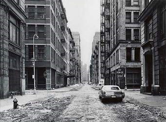
Hi Leah,
Here are some reference to Struth (and a low-quality copy of one of his empty city street photos); note especially the New Yorker article. This is from an article I wrote for my local club newsletter:
Here is the Wikipedia article on Struth:
https://en.wikipedia.org/wiki/Thomas_Struth
And here is a short quote from that article:
By including in his photographs people who are looking at art, "Struth makes viewers ... aware of their own active participation in the completion of the work's meaning, not as passive consumers but as re-interpreters of the past." [Quoted from the Museum of Modern Art (MOMA) catalog of his show there in 2003.]
Here is Struth's website, where you can browse through his projects on cityscapes, viewing art, family portraits, and some of his other major projects:
http://thomasstruth32.com/ipad/index.html
I became interested in Struth when The New Yorker published a major article on his work. Please have a look at it. It goes far deeper into Struth's work than I can do here.
https://www.newyorker.com/magazine/2011/09/26/depth-of-field
|
Sep 4th |
 |
| 62 |
Sep 20 |
Comment |
Bravo for you to seek out a shot with "emptiness." I so much prefer architectural shots like that. I think it also expresses calm, tranquility, or sadness, depending on nuances of the shot. I am reminded of the work of Thomas Struth.
I like the monochrome--there is no special color subject matter in the original. |
Sep 2nd |
2 comments - 2 replies for Group 62
|
| 69 |
Sep 20 |
Reply |
Huh, I did not see it until it was pointed out, but now it's obvious. "Rock-Face" is a fine title. Or a little more to my taste, "Stone-Face" or "Old Stone-Face," because this latter expression is already used in English to describe someone of severe aspect.
About titles, I feel very strongly that they are important to the work. If you call it "Rock-Face," no one will miss the profile, but if you call it something else, half the folks will miss it. So the title is essential in this case, although not so compellingly in other cases.
An editorial comment, I prefer it without a hyphen, which tends towards the formation of a new adjective, "Rock-Faced." But don't take my editorial comment too seriously. Language is flexible and up to you. |
Sep 25th |
| 69 |
Sep 20 |
Comment |
Nice shot. I am keen on titles. How about "Nature's Drapery"? |
Sep 2nd |
1 comment - 1 reply for Group 69
|
| 70 |
Sep 20 |
Reply |
Approve and applaud!
How great that you got the view through the window, and knew what title to use (You do know it's a book and film title?). |
Sep 14th |
| 70 |
Sep 20 |
Comment |
I think this is a stunning shot, especially in monochrome.
One suggestion, although it may not have been possible, would be to have removed the wire rope, either in place or in post-processing. |
Sep 14th |
| 70 |
Sep 20 |
Reply |
Thank you, Frans, it was just a lucky hit that I had used this technique and could pass it on. Glad it works for you. |
Sep 3rd |
| 70 |
Sep 20 |
Reply |
Hello Frans,
I am happy that you like the suggestion. It works very well for your situation. One caution, the image you flip must be perfectly rectilinear so that the mirror image looks OK. For my sample of your image, I used PS to "skew" the image very slightly to get it ready for mirroring. Entire process just took a few minutes. |
Sep 3rd |
| 70 |
Sep 20 |
Comment |
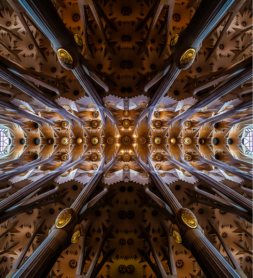
I am very excited to see this fine shot of the interior of the Sagrada Familia, as all the shots I have seen of it are from the outside. I hope to go there someday.
Here is a thought. It looks like you could not take in all of the ceiling in your image. So I suggest making a larger finished image by adding a mirrored copy of your image to the original. Here is a sample of one way to do that. One might want to be careful to be true to the original scene, but that is not required if you choose to be creative. What do you think? |
Sep 2nd |
 |
2 comments - 3 replies for Group 70
|
| 74 |
Sep 20 |
Comment |
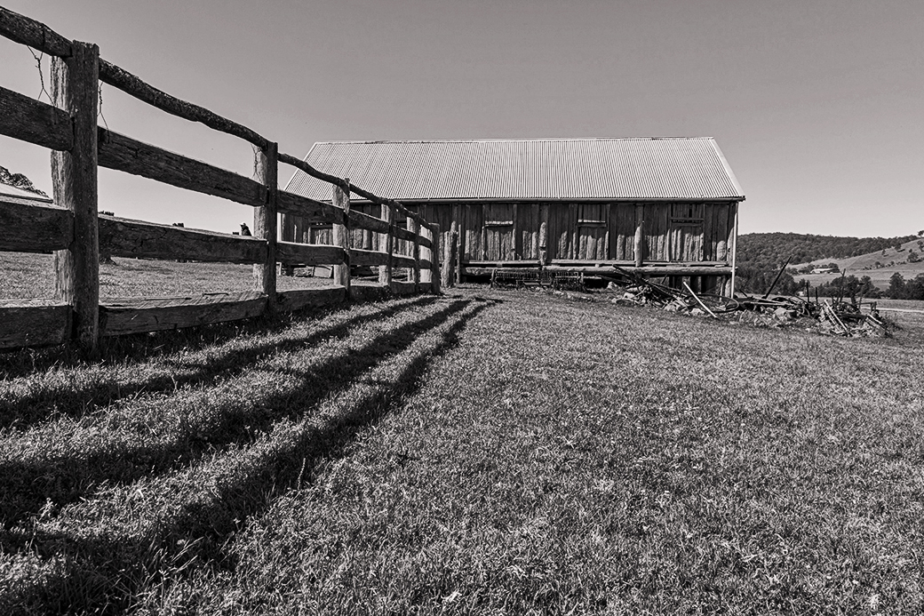
The fence line and barn are a very strong composition.
I am not very good at color adjustments into monochrome, but I thought the sky needed to be darkened a bit, so I tried to apply a red filter in post-processing. Then I brightened the image overall, lightened the shadows a bit, darkened the highlights a bit. Maybe I overdid these last two steps. How does this look? |
Sep 14th |
 |
| 74 |
Sep 20 |
Reply |
Lovely shot, and an interesting discussion about being a human tripod. I shoot entirely hand-held and started paying attention to it long ago when I met another photographer in an art museum shooting at 1/8, and he said he could get the shots. In my reading on the subject, one writer claimed that during that "hold your breath" moment, you can feel the right moment to shoot, and can do it between heartbeats. I am not sure about that, but I pretend to myself that I do that sometimes. |
Sep 14th |
| 74 |
Sep 20 |
Comment |
I like both your images, but prefer the monochrome because it has light/dark contrasts, whereas the color shot is almost a monochrome in green without showing much variation in brightness.
Thanks for taking us to this place, and telling the story of the arboretum, as opposed to a garden. Here in Washington, DC, we have the National Arboretum, and all such places are great treasures. |
Sep 14th |
| 74 |
Sep 20 |
Comment |
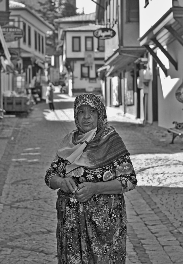
Hello Ata, how great to visit one of the old, protected towns with the Ottoman houses. You always find the people. Next year, we hope we can make such a side trip ourselves in the vicinity of Izmir.
I used PS Elements very basic controls on the overall image: "Darken Highlights" and "Lighten Shadows." How does this look to you? |
Sep 1st |
 |
3 comments - 1 reply for Group 74
|
| 77 |
Sep 20 |
Comment |
Hi Connie,
I really like a lot about this image. The finished image is very pleasing and successful. I think you got what you were after. I like the arrangement of shapes and textures very much.
My only suggestion is to consider that the objects do not relate to each other or tell a story together--consider arranging the ewer with a batch of freshly cut flowers lying on the drape and a pair of scissors. Just an alternative for another composition. |
Sep 2nd |
| 77 |
Sep 20 |
Comment |
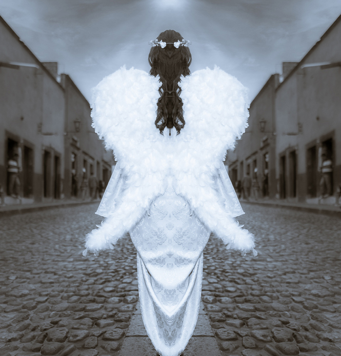
Hello Cecilia,
This is a fascinating concept. You have done a great job with your model. It is very daring, and successful in this case, to shoot a model from behind. The sky looks great.
I have comments:
1. The feet. It makes sense that an angel has no feet, so the normal rule to show feet and hands is not needed here, but could have been considered as an alternative.
2. No one around the angel seems to notice her. I suggest either replacing or removing all the people.
3. At least remove the car symbol sign and maybe the awning on the left.
4. I tried one method to address my suggestions, by cropping and mirroring half the image. See the attached, for discussion only.
What do you think? |
Sep 2nd |
 |
2 comments - 0 replies for Group 77
|
| 78 |
Sep 20 |
Reply |
This B/W version is SO MUCH more interesting than the color version (if you don't mind me saying), as the original does not have much color interest. (My Group 32 is a B/W group.) Brenda's comment about the leading line is spot on. Great shot. This is an interesting study in the choice between color and B/W. |
Sep 13th |
| 78 |
Sep 20 |
Comment |
This is a charming shot. I see you cropped off the bottom a bit and removed the large object from the left side.
The "autumn" color effect is very pleasant, but to my taste may be near to over-processing. I would have gone about 90% of what you did. But your group colleagues have not reacted to this, so my comment is only for consideration. |
Sep 13th |
1 comment - 1 reply for Group 78
|
| 79 |
Sep 20 |
Reply |
Glad it suits you. I did nothing more than what I said: increased the brightness slider a little, and also the contrast slider. Then a very small increase in the sharpen slider. I think it's important to make only slight changes sometimes, especially in this case I only moved the sharpness slider a tiny bit, until I could detect a slight change--oversharpening is obvious and terrible to look at. |
Sep 14th |
| 79 |
Sep 20 |
Comment |
Compositionally, I like the crop you chose, as it narrows the subject down to one coherent area.
But it's a very small area of the original, and I think it lacks sharpness, and could benefit from an increase in brightness and contrast. I tried working on these in PS. What do you think? |
Sep 13th |
 |
1 comment - 1 reply for Group 79
|
| 82 |
Sep 20 |
Comment |
This place has an aura that comes across in your image.
How about using a soft fill flash for the interior, say a ceiling bounce flash, and include some posed or candid people dining or conversing at the window (is there a COVID limitation now for entering?)? I don't have an HDR camera, but folks seem to get great shots with it. Good luck. |
Sep 13th |
1 comment - 0 replies for Group 82
|
| 83 |
Sep 20 |
Comment |
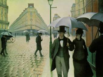
This is a stunning shot of a divided-yet-not-divided composition.
It reminds me of this painting by Gustave Caillebotte. |
Sep 13th |
 |
| 83 |
Sep 20 |
Reply |
Judith,
Thanks so much for the detailed explanations of how you did this. I feel like I have had an entire course on the subject.
About the third object, I recall you are a sailor. Could it be a small boat anchor? So I Googled "small boat anchor" and here is a link to an anchor call a "plow anchor." So maybe the object is either agricultural OR nautical.
https://www.amazon.com/Yak-Gear-Bruce-Anchor-2-2-Pound/dp/B004CG7HHM/ref=asc_df_B004CG7HHM/?tag=hyprod-20&linkCode=df0&hvadid=241931344467&hvpos=&hvnetw=g&hvrand=8218462360705087326&hvpone=&hvptwo=&hvqmt=&hvdev=c&hvdvcmdl=&hvlocint=&hvlocphy=9007770&hvtargid=pla-456284762323&psc=1 |
Sep 13th |
| 83 |
Sep 20 |
Reply |
Thank you, Judith, this is a very thorough answer. Yes, please show the example you offered. This is most interesting. |
Sep 2nd |
| 83 |
Sep 20 |
Comment |
Your finished images are very attractive, both compositionally and in terms of lighting.
I don't know anything about light painting except that it is often used to paint bright lines in the air, or light up outdoor subjects at night. But your work here is completely different. Can you explain what the goal of this kind of light painting is vs. using conventional fixed lighting? How are these results different from, say, using a ceiling bounce flash? |
Sep 1st |
2 comments - 2 replies for Group 83
|
| 88 |
Sep 20 |
Reply |
Hi Trey,
I am glad to make an exchange on our images this month. I like very much to cross groups and note similarities each month. This is the first time it involved one of my own shots. |
Sep 18th |
| 88 |
Sep 20 |
Comment |
Great shot and interesting discussion in your group about variations.
See my bridge shot this month in Group 32. I concentrated entirely on the soaring nature of a much smaller bridge. |
Sep 13th |
1 comment - 1 reply for Group 88
|
| 94 |
Sep 20 |
Reply |
I did not see the Japanese brush art in this image, but I can now that you mention it. I think that is a wonderful connection to try for. Perhaps it is most evident in the reflections, which might mimic the "dry brush" technique. Do I have this right? |
Sep 30th |
| 94 |
Sep 20 |
Reply |
Hi Jeffrey,
My father was a physicist, and did some work in early semiconductors, when the devices were still visible to the naked eye. He settled into teaching at Albany State University in New York. I studied math. It's fun to go at a question like this. |
Sep 13th |
| 94 |
Sep 20 |
Comment |
I think the question of symmetry is analyzed as follows:
1. The light path from the birds in the air to the camera--let us call that the "front" view.
2. The light path from the birds to the water surface to the camera--let us call that the "reflected" view--is a peek at the underside of the birds, because the water surface is below the birds.
3. You can see, counting from the left, that birds 3,4, and 5 are almost overlapping in the "front" view, but separated in the "reflected" view.
4. It is the different optical paths that create different views of the birds.
5. You can see this by looking in a mirror and holding up you hand--an extreme case--where you see different sides of you hand in the "front" and "reflected" views.
6. Hence, there is no symmetry in this kind of shot.
7. A landscape across a lake, for another example, with autumn trees reflected in the lake, is fairly symmetric because the two light paths are not very different.
8. This is how I see the matter. Does it make sense? |
Sep 13th |
1 comment - 2 replies for Group 94
|
45 comments - 26 replies Total
|


