|
| Group |
Round |
C/R |
Comment |
Date |
Image |
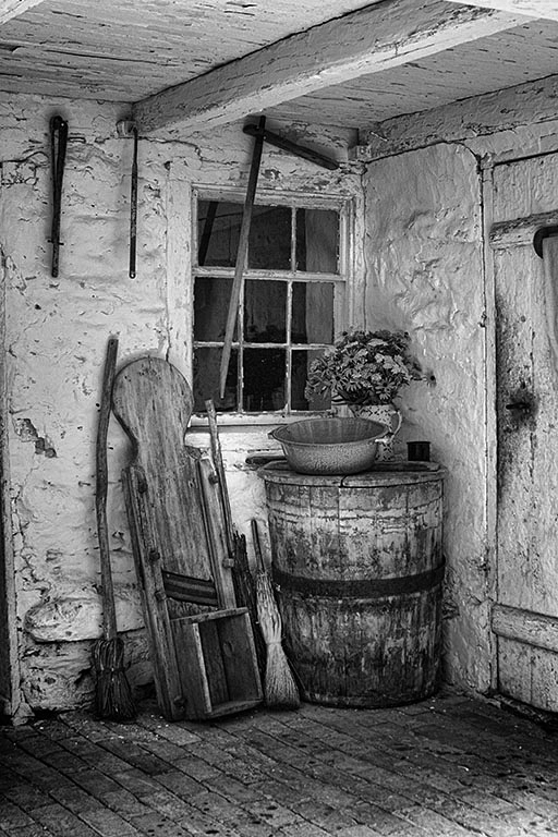
| 11 |
Jul 20 |
Comment |
This is a fine image.
I visit all the groups each month, and I like to note similar themes when I see them. This month, six folks have focused on hardware in some form:
Henry Heerschap in Group 11.
Darin Hlavinka in Group 25.
Gloria Fine in Group 32.
Steve Knight in Group 39.
Paul Moertl in Group 50.
Sunil Mehta in Group 78.
|
Jul 15th |
1 comment - 0 replies for Group 11
|
| 14 |
Jul 20 |
Comment |
What a fabulous picture! You did a great job with the angle from which you shot--what leading line could be better than a railroad train stretching into the distance?
I am very excited to travel the world with folks in these Digital Dialogs, and this trip you have taken us on is one of the highlights. Great shot, and thanks.
Your cropping is good; you bring the viewer as close as possible by cropping in tightly on the train--perhaps take a bit off the left so that the signal is at the extreme left of the frame, but I am not sure of that. Similarly you could remove the wires in the sky on the right, darken the white garment of the child on the left, or remove the radio tower on the left--but these are all small points. |
Jul 11th |
1 comment - 0 replies for Group 14
|
| 22 |
Jul 20 |
Comment |
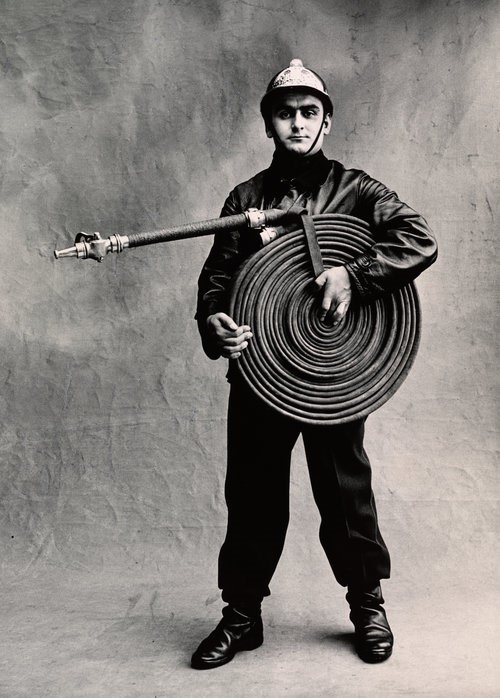
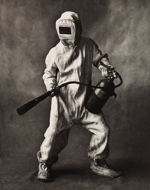
Here is the second Irving Penn image. |
Jul 11th |
 |
| 22 |
Jul 20 |
Comment |
I absolutely adore this image and this type of image. I shoot them all the time, any chance I get. I have the same reasons as you for enjoying them, plus they give me a sense of tranquility to look at them.
This particular image reminds somewhat of the work of Irving Penn, in his "Small Trades" collection. It's not really the same subject, but here they are for fun. |
Jul 11th |
 |
2 comments - 0 replies for Group 22
|
| 23 |
Jul 20 |
Reply |
Giuseppe,
I use PhotoShop Elements, and I suppose full PS has much the same, as probably do other PP packages.
In PS Elements, select "Filter," then "Blur." Within that, there are about half a dozen choices; among them are "Motion Blur" and "Radial Blur," this last perhaps akin to what you did with your lens manipulation. These come with parameters to control the magnitude and character of the blur. Of course you can get more control by choosing a selection and only blurring the selection--like blurring only a racecar, or inverting the selection and blurring the background. |
Jul 20th |
| 23 |
Jul 20 |
Comment |
Hello Giuseppe,
I like your camera movement blur very much. I have a local club colleague who is an expert at it, and he has show it in our local club.
So here in the Digital Dialogues this month, Michael Weatherford in Group 67 has a nice sunset image in which the colors in the sky, sea, and beach are the subjects, and details are not important. In the Group 67 comments, I suggested and showed a motion blur in post-processing. Please look at that if you care to see another approach to blur. |
Jul 11th |
1 comment - 1 reply for Group 23
|
| 25 |
Jul 20 |
Reply |
Hi Bill,
I am a bit divergent from the usual "improvement" comments. I like to note, as here, when people treat of the same subjects, and suggest they look at each other's work. I also often refer to paintings that might compositionally relate to the photographs. |
Jul 19th |
| 25 |
Jul 20 |
Comment |
This is a fine image.
I visit all the groups each month, and I like to note similar themes when I see them. This month, six folks have focused on hardware in some form:
Henry Heerschap in Group 11.
Darin Hlavinka in Group 25.
Gloria Fine in Group 32.
Steve Knight in Group 39.
Paul Moertl in Group 50.
Sunil Mehta in Group 78. |
Jul 15th |
1 comment - 1 reply for Group 25
|
| 32 |
Jul 20 |
Reply |
You mean make the ceiling an entirely blank surface? Very interesting idea. Thanks for the suggestion. |
Jul 28th |
| 32 |
Jul 20 |
Reply |
As I look more and more at these two approaches, I think I see that my shot is a personal memory (with a contrast between inside and outside), but your approach makes it all about the contrast, and energizes the dialogue between the two spaces. Yes, this is a very interesting discussion. Yes, I like my version for the memory book, but if I did competitions, I would take your approach now that I have seen it. |
Jul 19th |
| 32 |
Jul 20 |
Reply |
Diana,
I too thought I had a wishy-washy image and was not sure of anything about it, so asked a question about improving. I am very glad to see your alternative discussion, and I like your suggestions, and the reasons for them, especially about relating the interior to the exterior. |
Jul 18th |
| 32 |
Jul 20 |
Reply |
Thanks, Tom. I am a great advocate of good titles, and it's nice to hear your comment about the title. |
Jul 17th |
| 32 |
Jul 20 |
Comment |
This is a fine image.
I visit all the groups each month, and I like to note similar themes when I see them. This month, six folks have focused on hardware in some form:
Henry Heerschap in Group 11.
Darin Hlavinka in Group 25.
Gloria Fine in Group 32.
Steve Knight in Group 39.
Paul Moertl in Group 50.
Sunil Mehta in Group 78. |
Jul 15th |
| 32 |
Jul 20 |
Comment |
How about geometric arrangements of dried rose petals, that have been dried flat? |
Jul 7th |
| 32 |
Jul 20 |
Comment |
You found a great opportunity with this shot. It is very nicely done. The pattern of the boys with their hoops attractively brackets the girl with her kite.
A minor suggestion, because of our presentation in this website against a black background--you might use a thin white stroke around the frame to define it, especially to define the bottom.
More substantially, I think we could go on for a long time about how close in to crop on the children, and get a lot of different opinions, and in fact create quite different finished products. I like what you have here because I like a lot of space around human subjects in nature, but I could also see this expressed as a close crop. |
Jul 6th |
| 32 |
Jul 20 |
Comment |
What a great experiment. I have long heard about this, but never tried it. I think this was pretty successful. I much prefer the color version, but I can't give a reason. I do see that where there is even the slightest depth to the subject matter, there is blur, so I think this would look better if you used only the longer grasses, which evidently lie flatter in the copying plane of the scanner.
The scanner would have a zero depth of field, since it does not have a conventional lens, and its whole purpose is to copy what lies in direct contact with the glass. See also photograms, or Man Ray's Rayographs, for making images that eliminate the scanner as well by placing objects directly on old type photo paper. |
Jul 5th |
| 32 |
Jul 20 |
Reply |
Prasad, thanks for visiting.
You are so right about my lens, and I had not even noticed. I corrected the problems in Photoshop with "skew" and "lens distortion" adjustments. |
Jul 5th |
 |
| 32 |
Jul 20 |
Comment |
...and that fantastic old pump, such as I have never seen in the eastern USA. Wow! |
Jul 3rd |
| 32 |
Jul 20 |
Comment |
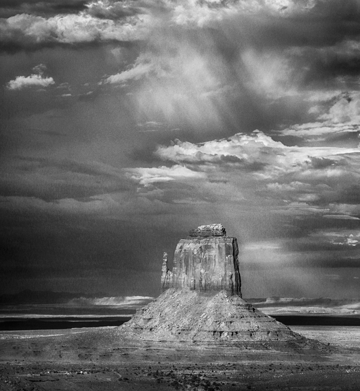
The separation of mountain and sky is great in the color version, but the clouds look better in the monochrome.
I notice that your monochrome version has more height to it than the color--too much I think. How would it be if both cropped off just barely above the rain downpour, like this? |
Jul 3rd |
 |
| 32 |
Jul 20 |
Comment |
I saw the spider web right away and thought it was a great plus.
I like the closeup of the metal parts and their texture, but I feel a little uncomfortable being so close in to a part of a larger whole. I think I would have pulled back some and made the cable run a long diagonal from the upper left corner to the anchor point occupying about 20% of the frame. Of course I was not there and don't know what the full situation looked like. |
Jul 3rd |
| 32 |
Jul 20 |
Reply |
Good to hear from you, Ata. Thanks for your comments. |
Jul 1st |
7 comments - 6 replies for Group 32
|
| 36 |
Jul 20 |
Reply |
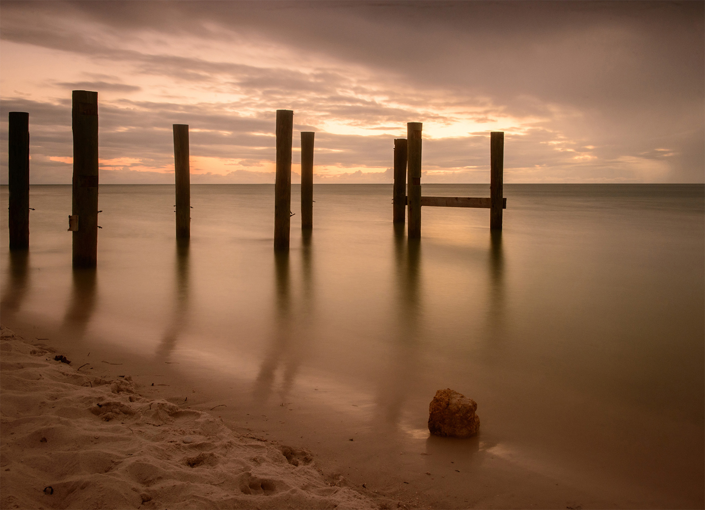
I tried "skew," which allows one to alter the perspective on each side individually, whereas "perspective" works on both side identically. Is this a bit better? |
Jul 11th |
 |
| 36 |
Jul 20 |
Comment |
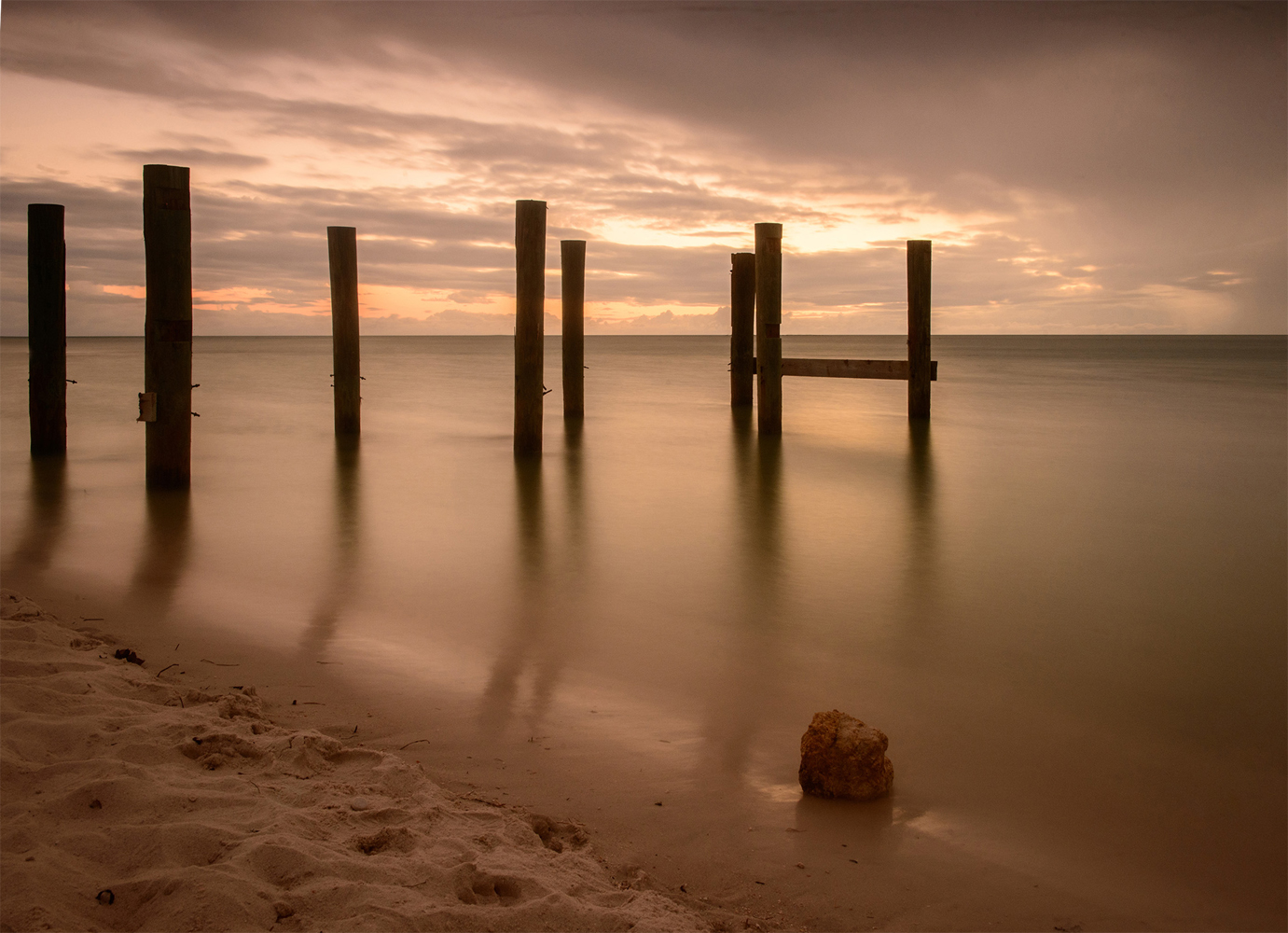
Hi Larry,
As usual, you tell the best stories, complete with how you found the scene, how it made you feel, and how you conceived of and captured the image. I have never tried controlling exposure like this, but I will always remember your lessons for the time I might do that.
The mixture of the recent past with a brightening present is very clear in this shot.
You mentioned that the posts lean in all directions, but in this shot the ones on the left lean left, and the ones on the right lean right. So this is a happy chance opportunity to do a bit of "perspective" change--not that it is necessary at all, but here it is. I had to cut off too much from the left, so this is just a discussion about perspective alteration. |
Jul 10th |
 |
| 36 |
Jul 20 |
Comment |
This takes me back to 1988, when my wife and children and I visited Thailand. Thanks for showing this. Is it the Grand Palace complex in Bangkok? |
Jul 2nd |
2 comments - 1 reply for Group 36
|
| 39 |
Jul 20 |
Comment |
This is a fine image.
I visit all the groups each month, and I like to note similar themes when I see them. This month, six folks have focused on hardware in some form:
Henry Heerschap in Group 11.
Darin Hlavinka in Group 25.
Gloria Fine in Group 32.
Steve Knight in Group 39.
Paul Moertl in Group 50.
Sunil Mehta in Group 78. |
Jul 15th |
1 comment - 0 replies for Group 39
|
| 42 |
Jul 20 |
Comment |
I really like your backlit concept. It is so intense, and that makes it unique.
Your group colleagues are mentioning a lack of sharpness--is that due to the 8 second exposure or a depth of field limitation on the macro shot? |
Jul 10th |
1 comment - 0 replies for Group 42
|
| 50 |
Jul 20 |
Comment |
This is a fine image.
I visit all the groups each month, and I like to note similar themes when I see them. This month, six folks have focused on hardware in some form:
Henry Heerschap in Group 11.
Darin Hlavinka in Group 25.
Gloria Fine in Group 32.
Steve Knight in Group 39.
Paul Moertl in Group 50.
Sunil Mehta in Group 78. |
Jul 15th |
1 comment - 0 replies for Group 50
|
| 58 |
Jul 20 |
Comment |
Your title is as interesting as the image. These Buddhist monks seek joy through their practice. I am presently reading "The Book of Joy," documenting a recent one-week meeting between the Dalai Lama and Bishop Desmond Tutu. What a nice surprise to see your image! |
Jul 5th |
1 comment - 0 replies for Group 58
|
| 59 |
Jul 20 |
Reply |
Yes, I see what your goal is, so in that case, you are quite right to want everything in sharp focus. |
Jul 5th |
| 59 |
Jul 20 |
Comment |
Here is the other example. |
Jul 2nd |
 |
| 59 |
Jul 20 |
Comment |
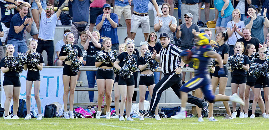
You have a good action shot here, and Gerald has a good idea about closing in on the core subject matter.
I think you are facing the problem of separating the action from the background. If you could have shot at a slower shutter speed and panned with the runner's motion, then you would have blurred the spectators, thereby separating them.
Lacking that, you can do blurring in Photoshop in post-processing if you choose. Here are two very rough examples of blurring the runner, or blurring the spectators. |
Jul 2nd |
 |
2 comments - 1 reply for Group 59
|
| 64 |
Jul 20 |
Comment |
This is a fine image. I love the whipping.
I visit all the groups each month, and I like to note similar themes when I see them. This month, six other folks have focused on hardware in some form:
Henry Heerschap in Group 11.
Darin Hlavinka in Group 25.
Gloria Fine in Group 32.
Steve Knight in Group 39.
Paul Moertl in Group 50.
Sunil Mehta in Group 78. |
Jul 26th |
| 64 |
Jul 20 |
Reply |
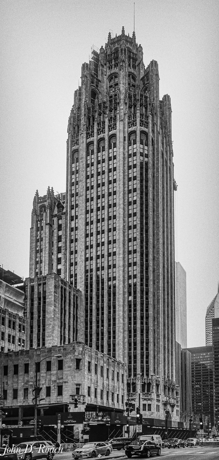
You are in the best of company with this fine shot. All professional architectural photographers prefer your perspective. |
Jul 10th |
| 64 |
Jul 20 |
Reply |
Now that Stuart in your group has replied, I will just add a slightly more exaggerated version of what I did before. The idea is to give a little touch of "soaring" to the building, because that is how you actually see it in real life. |
Jul 10th |
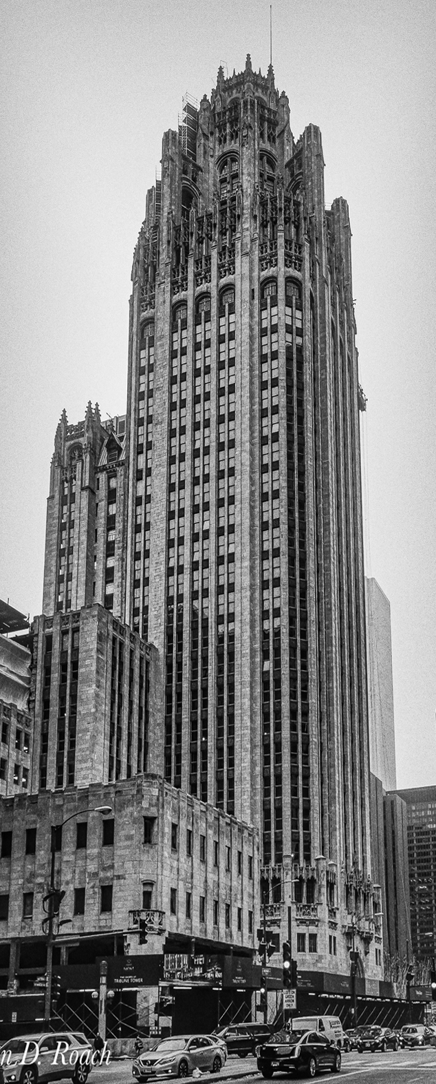 |
| 64 |
Jul 20 |
Comment |
Stuart raises a very interesting point. I am guessing that this image was perspective altered to make the verticals parallel. This is very popular amongst professional architectural photographers, but I don't care for it because it removes the sense of soaring that both your eye and camera normally see.
To Stuart's exact point, I recommend that a shot like this have just a hint of convergence kept in to satisfy the brain's expectation of parallel line convergence. Here is a try at that. |
Jul 10th |
 |
2 comments - 2 replies for Group 64
|
| 67 |
Jul 20 |
Comment |
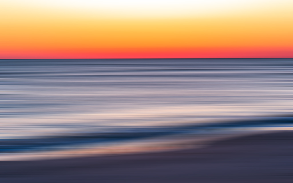
The colors here are lovely. Your shot reminded me of something that one of my local club colleagues is an expert at--moving the camera as he shoots. I applied a strong "motion blur" filter to your image. Just to discuss. What do you think? |
Jul 5th |
 |
1 comment - 0 replies for Group 67
|
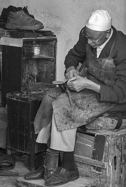
| 74 |
Jul 20 |
Comment |
Hello Ata,
You are documenting the life of the workers in Istanbul very well. This shot adds to the project. How worn out this man looks.
Tomorrow would have been our departure date to go to Turkey for the summer, but we are hoping that next year will work out. Perhaps we will stay a good long time next year, since we have both retired this year.
You shoot a lot in the heart of Istanbul--what neighborhood do you live in?
|
Jul 10th |
1 comment - 0 replies for Group 74
|
| 76 |
Jul 20 |
Comment |
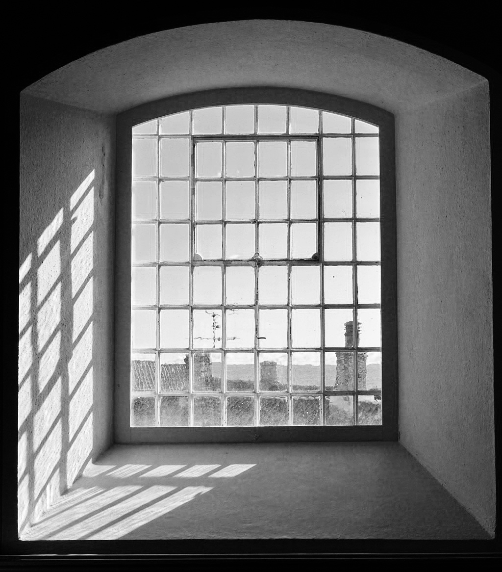
This is a wonderful brief story of your life, revisiting the church where you were christened. The view out the window, with its shadows and bars is a fine geometric study of shapes and light and dark.
This also looks good in monochrome--I adjusted brightness, contrast, and sharpness. |
Jul 9th |
 |
1 comment - 0 replies for Group 76
|
| 77 |
Jul 20 |
Comment |
You have a great eye for a fine composition.
Being in monochrome group 32, I am always looking out for monochrome candidates, so here is your shot in monochrome, for discussion only. Of course it lacks the colors of the flowers. |
Jul 4th |
 |
1 comment - 0 replies for Group 77
|
| 78 |
Jul 20 |
Comment |
This is a fine image.
I visit all the groups each month, and I like to note similar themes when I see them. This month, six folks have focused on hardware in some form:
Henry Heerschap in Group 11.
Darin Hlavinka in Group 25.
Gloria Fine in Group 32.
Steve Knight in Group 39.
Paul Moertl in Group 50.
Sunil Mehta in Group 78. |
Jul 15th |
1 comment - 0 replies for Group 78
|
| 80 |
Jul 20 |
Comment |
Well done finished image, with good lighting.
That line might be the extra length of his thinnest guitar string. Good to get it out no matter what it is. |
Jul 4th |
| 80 |
Jul 20 |
Comment |
Nice shot, and I agree with Carol about the option to crop out the partial boat on the right. But I would sooner suggest that the tourist in the foreground do not add to the story, especially since there are tourists on the bridge. |
Jul 4th |
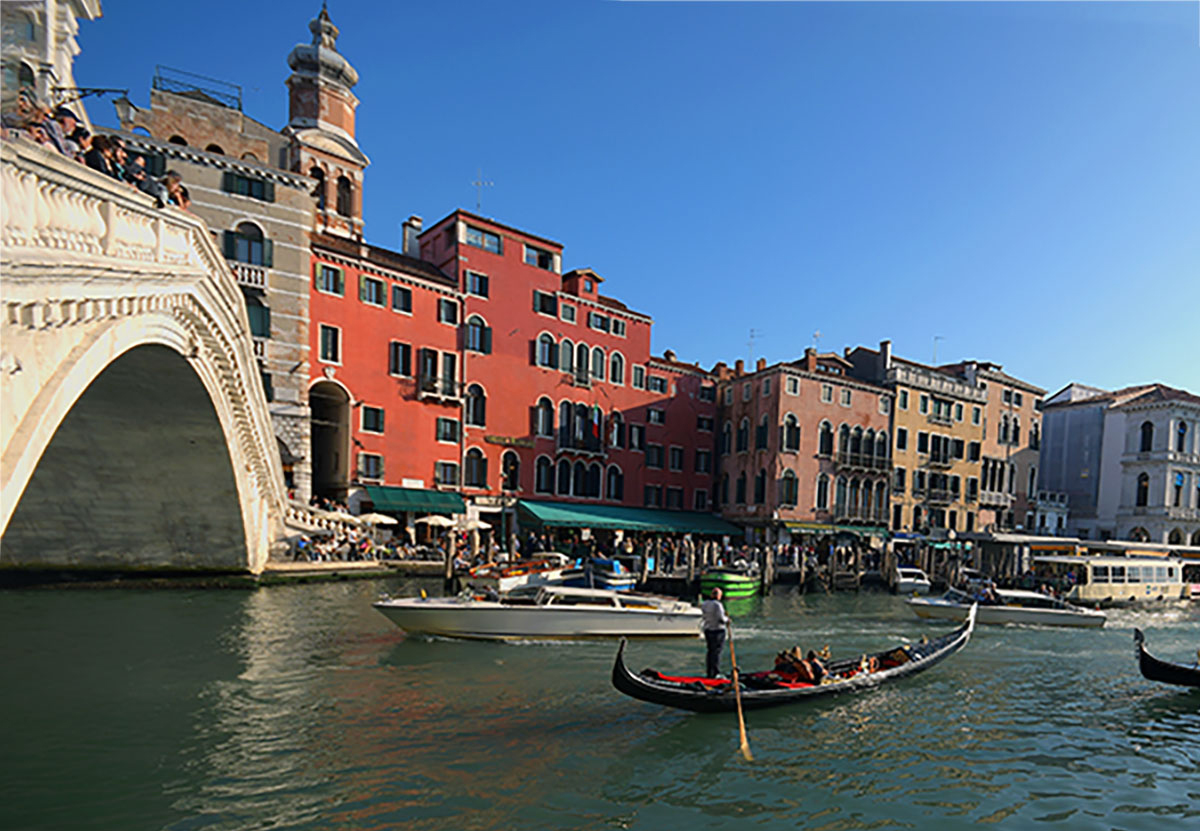 |
2 comments - 0 replies for Group 80
|
| 82 |
Jul 20 |
Comment |
I love it when people in these Digital Dialogues take us all over the world. Fine shot.
Please tell us the meaning of the hand positions and the tokens. Thank you. |
Jul 4th |
1 comment - 0 replies for Group 82
|
| 83 |
Jul 20 |
Comment |
I like the idea of the asymmetry in the lighted/not lighted windows.
If you leave this as is, you have a correct perspective of looking upwards. Although I do not prefer to alter that, many people do, so here is a rough version of an altered perspective view--some image is lost in the process. |
Jul 4th |
 |
1 comment - 0 replies for Group 83
|
| 87 |
Jul 20 |
Comment |
Everyone is talking about your great lighting. How exactly was this lit? Was it the diffuse light of an open window?
There is something about monochrome for portraiture that makes an ordinary shot into a classic. Nice going. |
Jul 3rd |
1 comment - 0 replies for Group 87
|
| 89 |
Jul 20 |
Comment |
Dhananjay opens an interesting discussion. As I understand it, it is about where the tourist should be and whether they are "in" the landscape, or somewhat "outside" the landscape, observing it.
Of course they are "in" the photograph. But I think in this case, the tourist is just at the edge of being an observer of the landscape (not quit "in" it) and being part of the landscape ("in" it). This is an interesting tension--I think it draws the viewer to identify with the tourist and feel that the viewer is actually the tourist, thus drawing the viewer half into the photograph to participate with the tourist to observe the landscape--this is a bit deeper that the viewer observing the photograph.
In short, I think you placed the tourist perfectly! |
Jul 25th |
1 comment - 0 replies for Group 89
|
| 92 |
Jul 20 |
Comment |
This is a good shot, showing the man's face and hands.
I don't think the white wall is useful, nor is color a special subject in this portrait shot. How do you like this in B/W--also cropped to keep proportions, and adjusted brightness, contrast, and sharpening to taste. |
Jul 25th |
 |
1 comment - 0 replies for Group 92
|
| 93 |
Jul 20 |
Reply |
It could be the other side, or nearby. Amazing that people could build their homes and farm storage into the hillsides with just a large hammer and chisel. How lucky you were to see that wonderful location. |
Jul 3rd |
| 93 |
Jul 20 |
Reply |
Here is a very old slide I shot back in 1994 from there. |
Jul 3rd |
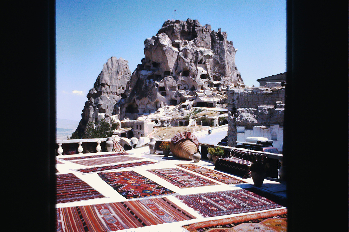 |
| 93 |
Jul 20 |
Comment |
Great shot. You got everything in this shot, especially the "fairy chimney" landscape below and a couple of balloons against the sky.
I have been there several times with my (Turkish) wife. Is that possibly the town of Uç Hisar in middle distance on the right? |
Jul 2nd |
1 comment - 2 replies for Group 93
|
36 comments - 14 replies Total
|


