|
| Group |
Round |
C/R |
Comment |
Date |
Image |
| 1 |
Jun 20 |
Comment |
You certainly traveled very far for this shot. Were you a tourist or there for business, diplomacy, or humanitarian work? Your story would be most interesting if you wouldn't mind sharing it. |
Jun 6th |
1 comment - 0 replies for Group 1
|
| 2 |
Jun 20 |
Comment |
This is a great subject, especially the retained advertising on the end facade. I have lots of questions and suggestions.
Did you alter the vertical perspective or was this "as taken"?
I think the lamppost, although charming, is a bit lost in the picture. Could you have moved to the left and had the lamppost off to the right as a boundary of the frame?
Although authentic, the smokestack rises out of the building. I would consider removing it. |
Jun 6th |
1 comment - 0 replies for Group 2
|
| 3 |
Jun 20 |
Reply |
I find deep symbolism in Fatih's images. Remember his image last month of the young woman in a red dress holding six red pomegranates, with her hands dripping with red pomegranate juice. She resembled the ancient statues of the fertility goddess Artemis from Fatih's part of the world. Randolph had pointed out that pomegranates were fertility symbols in some cultures. |
Jun 24th |
| 3 |
Jun 20 |
Reply |
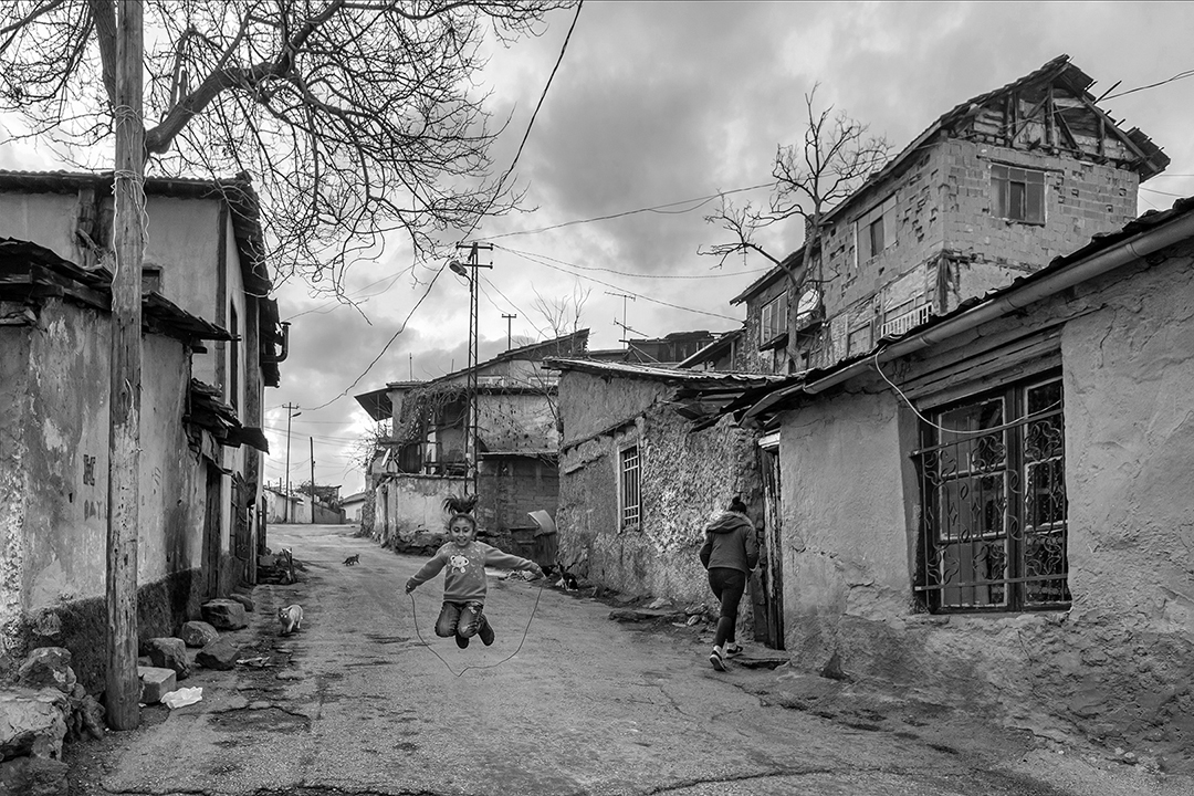
You raise interesting compositional questions, LuAnn. Based on Fatih's work in past months, I think his compositions are very carefully constructed. I take his choice of minor prominence of the playing child in a dismal street with undecorated falling-down houses to indicate a small spark of hope amidst dominating poverty--it is not just about a happy child jumping rope. The woman turning away into a mysterious doorway is a symbol of despair--it could be a doorway to hell. One day, the happy little girl will be that same woman turning into a doorway. I tried the b/w conversion in recognition of the despair, but I don't think it works as well as the color version. |
Jun 24th |
| 3 |
Jun 20 |
Reply |
Oh, I agree, Beverly, I just tried the monochrome for discussion. On the whole, I prefer the color. |
Jun 13th |
| 3 |
Jun 20 |
Comment |
My (Turkish) wife says it should be "The Soul of the Street" and that "Street Life" is not a correct translation. |
Jun 5th |
| 3 |
Jun 20 |
Comment |
The Turkish title means literally, "The Spirit of the Street," but I suspect Fatih might intend, "Street Life." Perhaps he, or Ata Sahin from Group 74, can help us.
This is a fine shot with subtle and conflicting elements. The happy child vs. the girl/woman turning away in perhaps a negative posture. The street is poor, has two cats scavenging for food, and the sky is dismal in winter.
I tried converting this to monochrome. It has a different feel. |
Jun 4th |
 |
2 comments - 3 replies for Group 3
|
| 5 |
Jun 20 |
Comment |
This makes everyone hungry for the peaches--so successful.
Speaking of the border (per Nick), how did you do the border? It looks on my monitor like it is hand drawn in the frame, and drawn double in the vicinity of the fork. |
Jun 13th |
1 comment - 0 replies for Group 5
|
| 11 |
Jun 20 |
Comment |
Since I visit all the DD groups each month, I sometimes like to point out subject matter coincidences to everyone. This month, four people have dealt with deeply cast shadows:
Group 11, Henry Heerschap.
Group 32, Jennifer Doerrie.
Group 51, Bob Barley.
Group 78, Jason Kravitz. |
Jun 19th |
1 comment - 0 replies for Group 11
|
| 15 |
Jun 20 |
Comment |
This is a nice choice and transformation to a finished product.
I am very interested to know the focal length of the lens and your shooting distance, as this greatly affects the view and proportions of the bottles. |
Jun 9th |
1 comment - 0 replies for Group 15
|
| 21 |
Jun 20 |
Reply |
I liked these piano images because I am from Monochrome Group 32, and there we key on black and white. |
Jun 23rd |
| 21 |
Jun 20 |
Comment |
Since I visit all the DD groups each month, I sometimes like to point out subject matter coincidences to everyone. This month, three people have presented piano keyboards:
Group 21, Barrie Bieler.
Group 62, Leah Konicki.
Group 77, Bunny Laden. |
Jun 19th |
| 21 |
Jun 20 |
Comment |
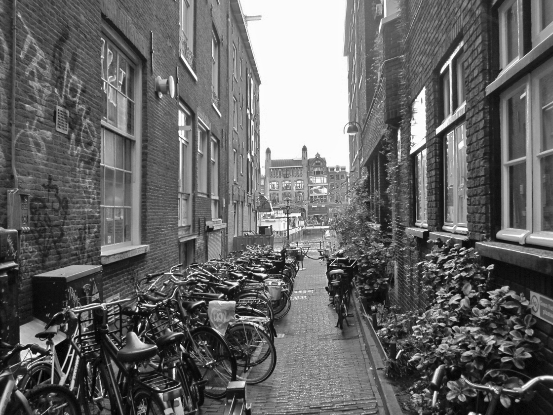
Your eye for subject matter is excellent, to spot this tranquil alley. I like the row of repeated bicycles very much.
However, I prefer your original shot, and I treated it as a monochrome (I am from monochrome group 32), and here it is for discussion.
I do not have experience substituting skies, but this could use a different, more dramatic sky. |
Jun 18th |
 |
2 comments - 1 reply for Group 21
|
| 26 |
Jun 20 |
Comment |
Good shot, and so poignant. I particularly notice that the "garden" edging consists of empty bottles. |
Jun 6th |
1 comment - 0 replies for Group 26
|
| 28 |
Jun 20 |
Comment |
Your farmer looks great, especially his shirt, and his fabulous vegetables. When shooting workers, crafters, artists, it's nice to include artifacts of their work and place them in action with them. You might shoot this gentleman as he is bagging the first item, so the rest are still in view on the scale, and his eyes are directed to his active hands. Consider pulling back a bit and including his (probable) collection of piles of fresh produce for sale--the colors are great. |
Jun 6th |
1 comment - 0 replies for Group 28
|
| 29 |
Jun 20 |
Comment |
This is really lovely. It makes me think of Monet's flower garden paintings. |
Jun 6th |
1 comment - 0 replies for Group 29
|
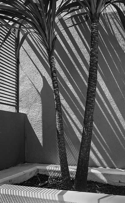
| 32 |
Jun 20 |
Comment |
The more I look at this, the more I like Diana's suggested version.
This might be obvious to everyone, but I note that the building itself is entirely rectilinear, but the photograph is of entirely diagonal lines, including and especially the shadows. |
Jun 21st |
| 32 |
Jun 20 |
Comment |
Since I visit all the DD groups each month, I sometimes like to point out subject matter coincidences to everyone. This month, four people have dealt with deeply cast shadows:
Group 11, Henry Heerschap.
Group 32, Jennifer Doerrie.
Group 51, Bob Barley.
Group 78, Jason Kravitz. |
Jun 19th |
| 32 |
Jun 20 |
Reply |
That is so well said, Tom. |
Jun 13th |
| 32 |
Jun 20 |
Reply |
Wait, there is an entire school of thought about shooting flowers that says you SHOULD choose flowers with blemishes, because you are suggesting the story of birth/life/death with that blemish. Edward Weston's famous green pepper has a damaged spot that was on the verge of rotting. I have a close friend here who always shoots flowers with death showing on them. |
Jun 13th |
| 32 |
Jun 20 |
Comment |
This architectural study looks great, and the verticals are good.
The door is in the shade, so it does not dominate. But better is the way its left frame aligns perfectly with the corner vertical of the balcony, making a continuous line, and diminishing the prominence of the door.
I don't do competitions, so I am not sure how this would do, but I suspect it is not quite dramatic enough. Perhaps stronger light and shade elements might do better. How about shooting something like this with diagonal shadows, like the shadows you have in the top half of this shot? A lot of the famous 20th century photographers who shot building facades made use of slanting sunlight, so there was a contrast between the rectilinear components of the building and the diagonal shadows. |
Jun 8th |
| 32 |
Jun 20 |
Comment |
Have a look at the flower photo by Debasish Raha in Group 83 this month, if you care to, and then let's discuss more where stems should enter a frame.
While you are in Group 83, also have a look at the photo by Judith Ponti-Sgargi; she has done some highly creative work with "Jump" photographs, in the style of Philippe Halsman (she was not familiar with Halsman), and it is worth looking at. |
Jun 7th |
| 32 |
Jun 20 |
Reply |
Well done. Thank you. I am going to go back to my original image and fix it up according to your edits. |
Jun 7th |
| 32 |
Jun 20 |
Reply |
Diana, you raise an interesting point. Such images are not usually "wall-hangers," but are part of discussions about proportion (since and probably before the building of the Parthenon), and therefore, I think, tranquility. |
Jun 7th |
| 32 |
Jun 20 |
Reply |
Note that any point on the diagonal delimits rectangles of the same proportion as the main rectangle (back to 10th grade geometry).
But this is just my academic and abstract idea. Do you think it works as a guide for your composition? |
Jun 6th |
| 32 |
Jun 20 |
Comment |
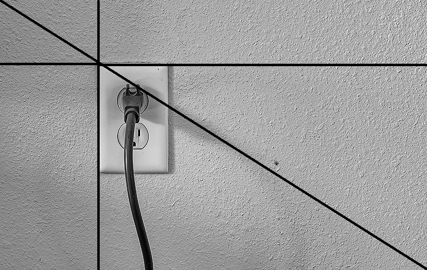
Here are the golden mean rectangles, marked off. The socket plate and the whole frame are also golden mean rectangles. |
Jun 6th |
 |
| 32 |
Jun 20 |
Reply |
I think in your new image the upper-right corner of the socket plate is on the diagonal. I was suggesting the upper-left corner to be on the diagonal. Here is a crop that would do it. |
Jun 6th |
 |
| 32 |
Jun 20 |
Reply |
Ah, so I don't know the flowers very well, and all I reacted to was the size of the stem and blossom on the image--some five inches across on my screen. Hence my reaction to it as a large and heavy blossom. But in a sense it is the finished image that one reacts to--evidently that was me.
This brings up a tangential issue--monumentality. Can a small object, either in physical encounter or in an image, be monumental? My study of art history answers this with "of course; monumentality is a matter of presentation, not scale."
So where am I with all of this? I prefer either my crop or Lynne's. Interesting that we are talking about millimenters! |
Jun 6th |
| 32 |
Jun 20 |
Comment |
The more I look at this (and I keep looking at it again and again [that means it's a good image]), I am beginning to sort out my thoughts on the entry of the stem.
I think if it were a thread-thin stem, entry from the exact corner would be OK. But this is a big blossom and a thick stem. I think my sense of gravity requires my eye to see it enter the frame from the bottom, implying that the stem and blossom are supported from below against gravity.
?
|
Jun 6th |
| 32 |
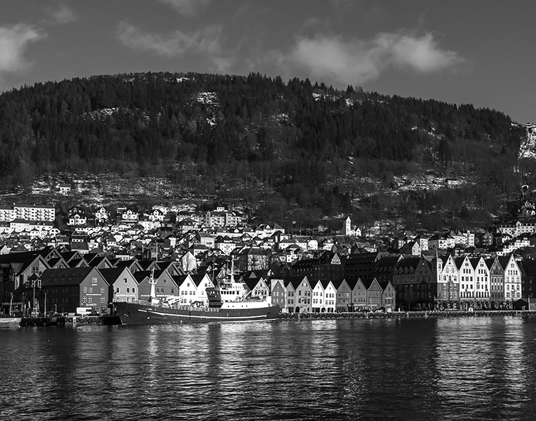
Jun 20 |
Comment |
Welcome Asbj�rn,
The old port is charming. You have a fine range of tones, and I like the emphasis you were able to give to the snow.
On the right, there are no bright-colored buildings on the waterfront, so that side of the town view fades out a bit. I can't say it would be an improvement to crop that out, just an alternative. What do you this of this? A bit too squarish? |
Jun 6th |
 |
| 32 |
Jun 20 |
Comment |
Yes, absolutely perfect with the sepia toning, making it a period shot. I love the young fellows' straw hats and smiles.
Also, good idea to leave a lot of space in front of the horse--I see you shot it that way. |
Jun 6th |
| 32 |
Jun 20 |
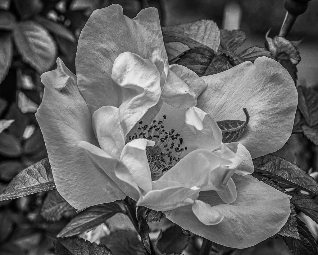
Comment |
You have very good depth of field with your macro lens at f 7.1. The result is very good looking. I also like the leaf you left in place.
Minor suggestions: maybe a bit lighter in the dark areas and a bit darker in the light areas. I used Photoshop Elements to do an overall "lighten shadows" and "darken highlights," but I introduced a halo around the edges of some leaves--I don't know what to do about that.
Another thought, maybe remove the stem in the upper right and a blurred light background object. |
Jun 6th |
 |
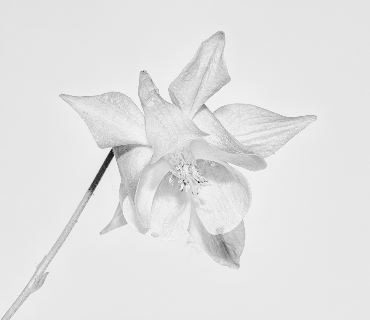
| 32 |
Jun 20 |
Comment |
This looks very fine to me, especially your decision to slightly overexpose. I will remember that.
From time to time, I have mentioned Robert Mapplethorpe's studio floral photographs--his extreme care with where the stem enters the frame, often from the exact lower corner, as you have done.
So I am tossing all that out. I am uneasy with the stem entering the frame precisely from the corner. I contradict myself and abandon my sources. For some reason, I prefer the attached. Please all comment and discuss with me what might be going on in my mind's eye. Thanks. |
Jun 5th |
 |
| 32 |
Jun 20 |
Comment |
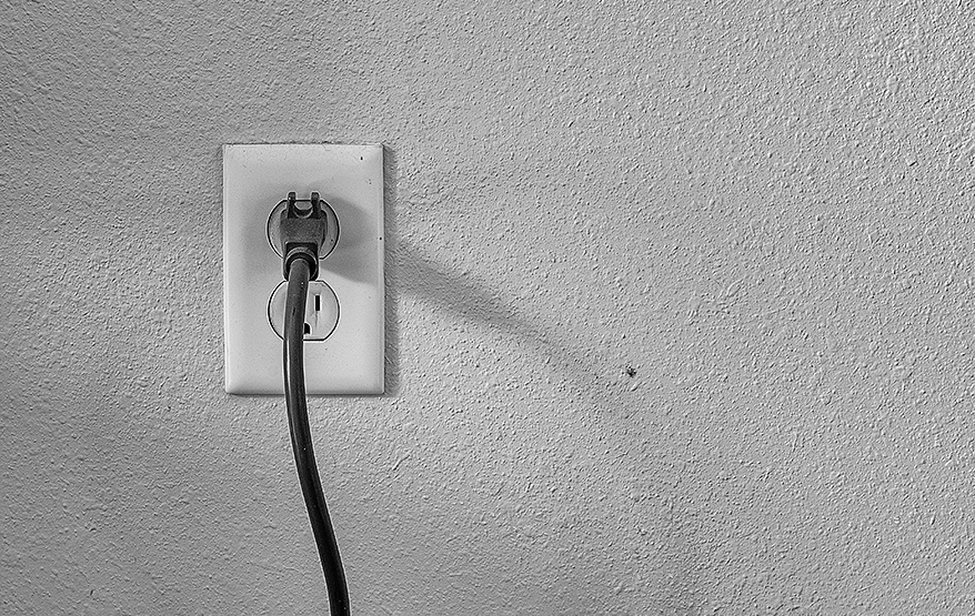
This is an absolutely fascinating shot.
The utter tranquil simplicity is arresting. I wonder if it would also work with nothing plugged in at all.
The socket plate observes golden mean proportions vertically, as does the entire frame horizontally.
I think the upper left corner of the plate should be placed on the diagonal of the frame. Then it would mark off smaller golden mean rectangular subsections of the frame above-left and below-right. |
Jun 5th |
| 32 |
Jun 20 |
Reply |
Thank you, Ata. This was taken on the terrace of our Alaçata, Turkey home, and I am sure you are right about the dress of the bride's friend. I don't have a good shot of the womens' hair salon that had just finished, but it was fascinating to see the entire staff of a hair salon come to our home to do the wedding party hair. |
Jun 1st |
11 comments - 8 replies for Group 32
|
| 36 |
Jun 20 |
Comment |
Michael is right. This is "barrel distortion." Its opposite is "pincushion distortion." It shows up near the edges of an image where there are parallel lines. Otherwise, you usually don't notice it. You can test your lens for it by shooting a sheet of graph paper. It is a lens attribute, not a perspective problem. Even my little old PS Elements has a filter for it. I used a +2 barrel correction. Took only a few seconds. |
Jun 17th |
 |
| 36 |
Jun 20 |
Reply |
Yes and no about the bird on a branch. In that case, you don't want to see the background clearly to separate from the bird. But you and Arne are working with full landscapes, so applying that concept in that situation is innovative to me, and a teaching moment I received from you two. |
Jun 17th |
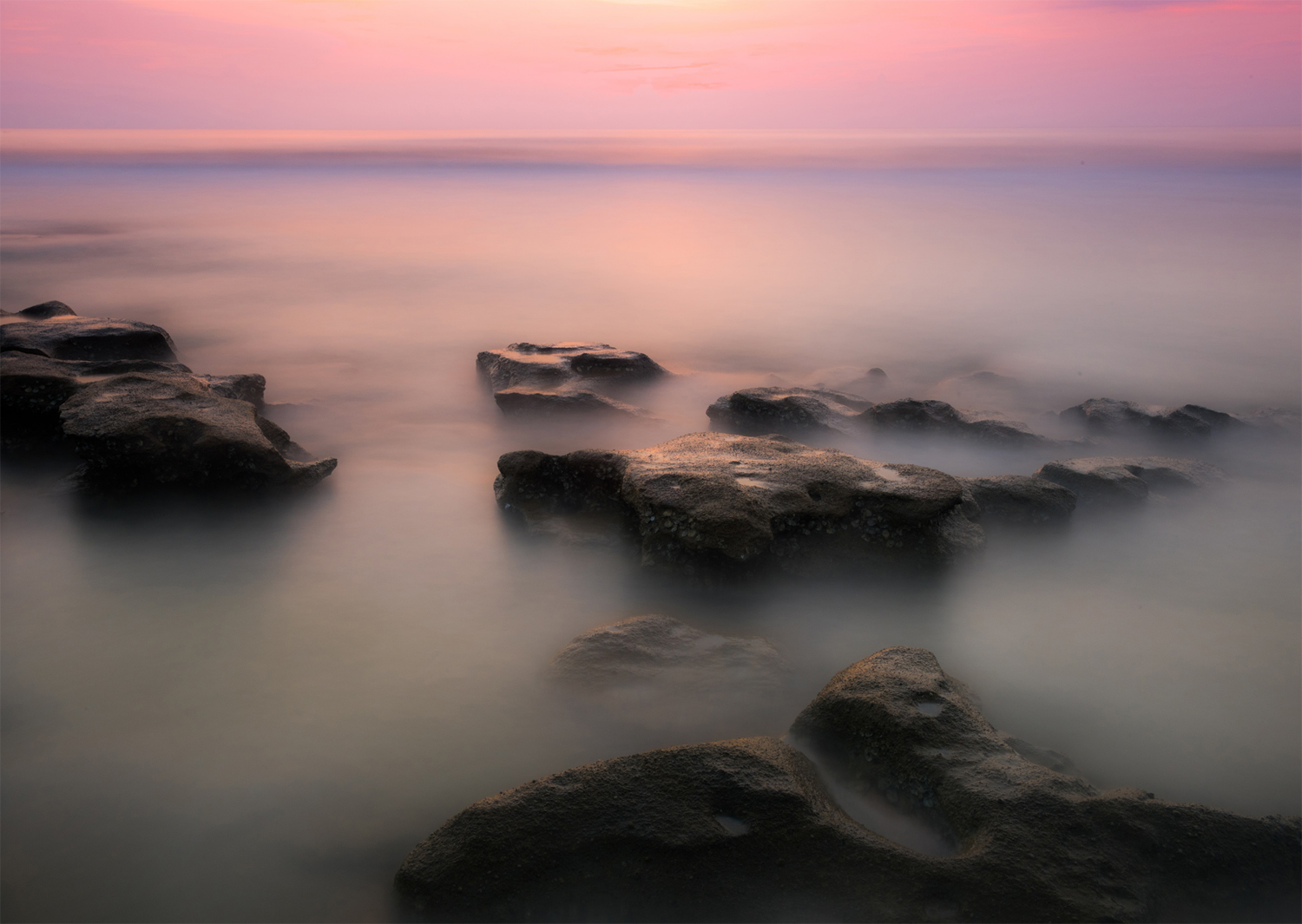
| 36 |
Jun 20 |
Comment |
Lovely result.
What is really interesting to me--to learn from this example--is that you have CHOSEN to have a considerable portion of the view out of focus ("By selecting an aperture of f11 and focusing on the closest rocks to the camera my DOF would be only a few feet. Therefore, the further the rocks were from the camera the softer (more out of focus) they would appear. It also meant the distant sea would only be a colored blur.")
Ths is really something to understand and remember. Thanks. |
Jun 5th |
2 comments - 1 reply for Group 36
|
| 37 |
Jun 20 |
Comment |
You have a great shot all about light and shadow. Being in Monochrome Group 32, I always look for monochrome candidates. Here is your shot in monochrome. |
Jun 5th |
 |
1 comment - 0 replies for Group 37
|
| 44 |
Jun 20 |
Comment |
I like this, and such diagonal interiors. Here is something that can always be done with them for fun. |
Jun 9th |
 |
1 comment - 0 replies for Group 44
|
| 45 |
Jun 20 |
Reply |
Is that mountain location the same as Yangmingshan, or is Yangmingshan further away? We used to live a kilometer past the National Palace Museum, and pass through the tunnel to downtown. |
Jun 17th |
| 45 |
Jun 20 |
Comment |
I agree with Ray that the foliage on the sides does not contribute well at night (but it might in daytime). But the shot is fine and dramatic in all other respects.
As I have mentioned before, I have a strong interest in Taiwan and Taipei, as we lived there in 1988-89, before the 101 Tower of course. Please tell me from which direction or location you shot this. Thanks. |
Jun 17th |
1 comment - 1 reply for Group 45
|
| 48 |
Jun 20 |
Comment |
Wow, Beverly, that certainly changes it from an ordinary to a special shot. Congrats. |
Jun 17th |
1 comment - 0 replies for Group 48
|
| 51 |
Jun 20 |
Reply |
Remember the new "Current Images" button at the top of the page, which shows all groups' all images in a summary format, for a quick view. |
Jun 19th |
| 51 |
Jun 20 |
Comment |
Since I visit all the DD groups each month, I sometimes like to point out subject matter coincidences to everyone. This month, four people have dealt with deeply cast shadows:
Group 11, Henry Heerschap.
Group 32, Jennifer Doerrie.
Group 51, Bob Barley.
Group 78, Jason Kravitz. |
Jun 19th |
| 51 |
Jun 20 |
Comment |
I really like your study of light and shadow. I don't think it's possible in this image to show only the shadows, but I find that the most interesting part of the study. If you shoot something like this again, you might consider shooting only the shadows. |
Jun 17th |
2 comments - 1 reply for Group 51
|
| 55 |
Jun 20 |
Comment |
Your composition of objects is just lovely and balanced, as your group colleagues have already mentioned. The export ware lamp is very beautiful, and the illumination from within is a great touch.
Samuel hinted that such an image can tell a story of the person not seen, which I call a "portrait of a person without the person." You can consider adding, in similar compositions, information about the unseen person, like a partly written (and legible) letter, and a pair of reading glasses. Perhaps the letter writer and their kin are half-way round the world from each other, one in China and one in the Eastern USA? |
Jun 17th |
1 comment - 0 replies for Group 55
|
| 62 |
Jun 20 |
Comment |
Since I visit all the DD groups each month, I sometimes like to point out subject matter coincidences to everyone. This month, three people have presented piano keyboards:
Group 21, Barrie Bieler.
Group 62, Leah Konicki.
Group 77, Bunny Laden. |
Jun 19th |
1 comment - 0 replies for Group 62
|
| 71 |
Jun 20 |
Comment |
This is quite a striking shot. Aside from the formal composition, I think it comments on the painful relationship between natural creatures and the works of humans. |
Jun 5th |
1 comment - 0 replies for Group 71
|
| 74 |
Jun 20 |
Comment |
What a fantastic shot. Not a bit of obscuring spray between you and your subject. |
Jun 17th |
| 74 |
Jun 20 |
Comment |
Merhaba Ata,
I think you did a good job capturing this contrast. I see the man on the left with his customary cap, jacket, and pants, and holding his prayer beads behind his back. The man on the right has recently purchased fashionable clothing and carries a "man bag."
The close crop focuses very well on these two.
(I wonder how they each vote. They might represent "tradition" and "business" and both vote the same.) |
Jun 5th |
2 comments - 0 replies for Group 74
|
| 76 |
Jun 20 |
Comment |
Hi Jay, my group 32 is a monochrome group, so I am always looking out for color images that convert well to monochrome. How does this look to you? |
Jun 17th |
 |
1 comment - 0 replies for Group 76
|
| 77 |
Jun 20 |
Comment |
Since I visit all the DD groups each month, I sometimes like to point out subject matter coincidences to everyone. This month, three people have presented piano keyboards:
Group 21, Barrie Bieler.
Group 62, Leah Konicki.
Group 77, Bunny Laden. |
Jun 19th |
| 77 |
Jun 20 |
Reply |
Another thought. Your image is in the genre of what I call "portrait of the person without the person," which is a personal portrait of someone showing only their artifacts, but not themselves. Do you compose by writing by hand--if so, you could put your handwritten sheet music in this image, perhaps along with a pen/pencil and reading glasses? |
Jun 5th |
| 77 |
Jun 20 |
Comment |
Congratulations on a fine shot. I am very happy that you shot this empty of people, as I very much like architectural shots with no one in them. |
Jun 4th |
| 77 |
Jun 20 |
Comment |
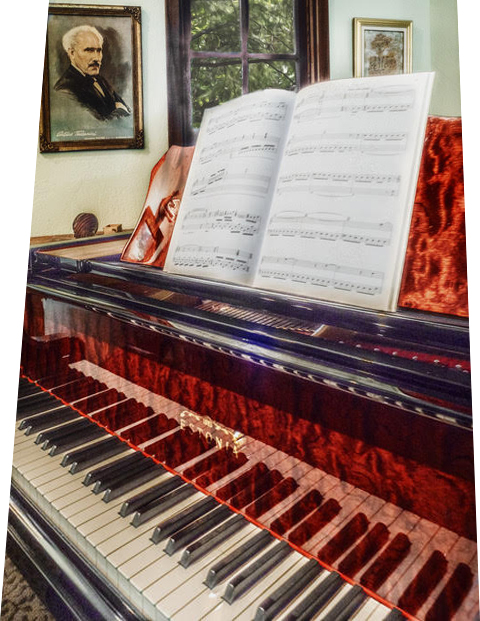
A personal view of your home--lovely, and so meaningful to you.
Toscanini is immediately recognizable, and you have a beautiful piano. How about shooting this with the title page of the sheet music piece visible?
I think the diagonal view of the keyboard is very suitable. The perspective discussion about the back wall items is interesting, but I think can be solved for everyone. Step back a little to include a little more in the image, and then in post-processing use "skew" to make the vertical lines parallel (skewing inwards loses image, so you need to start with a larger image). This would not significantly affect the keyboard view. Here it is, with lost image--so you need to start with a larger image. |
Jun 4th |
 |
3 comments - 1 reply for Group 77
|
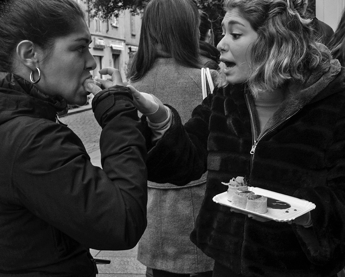
| 78 |
Jun 20 |
Reply |
Jason, I have bookmarked your Aminus3 site and started to look through it. So very interesting. Thank you. |
Jun 19th |
| 78 |
Jun 20 |
Comment |
Since I visit all the DD groups each month, I sometimes like to point out subject matter coincidences to everyone. This month, four people have dealt with deeply cast shadows:
Group 11, Henry Heerschap.
Group 32, Jennifer Doerrie.
Group 51, Bob Barley.
Group 78, Jason Kravitz. |
Jun 19th |
1 comment - 1 reply for Group 78
|
| 80 |
Jun 20 |
Comment |
I agree with everyone, and here it is in monochrome, with a slight overall "lighten shadows," which takes care of the woman on the left, but still shows she has a darker complexion than her companion. |
Jun 4th |
 |
1 comment - 0 replies for Group 80
|
| 82 |
Jun 20 |
Comment |
I like the sky on this as a backdrop for viewing the soaring columns. In cases like this where you want a sense of upward soaring, I think it is best to leave the perspective as you have it here. The convergence of parallel lines is what your eye sees as well, whether it it vertical like this, or horizontal looking down a long street. |
Jun 7th |
1 comment - 0 replies for Group 82
|
| 83 |
Jun 20 |
Reply |
Judith,
If you decide to make this a project, and it would be a great project, you would be collecting a wonderful body of work. I think your setting is perfect.
You would be in good company, as Halsman's project/book is quite famous, and he originated the idea. If you Google "Philippe Halsman" and click on "images," you can see many of his jump images. His idea was that people cannot maintain a facade while leaping in the air, so their real personalities come through. |
Jun 4th |
| 83 |
Jun 20 |
Comment |
This is a very successful pose. Congratulations.
I like your original full-frame shot best, fully showing the ground, so I understand how very high he is jumping, and explaining what that background thing is (some sort of closed window).
Have you ever seen photographer Philippe Halsman's Jump Book? |
Jun 4th |
1 comment - 1 reply for Group 83
|
| 87 |
Jun 20 |
Reply |
Tea is best drunk from a glass cup, so that is perfect.
But I like the tea bag and spoon in the cup--it signals immediacy. So you can put a little glass saucer next to the cup showing that you are about to dip in the spoon and take out the tea bag. |
Jun 16th |
| 87 |
Jun 20 |
Comment |
This is a charming composition, and your group colleagues have already discussed lighting.
I have two compositional suggestions to tell more of a story. 1) Include a saucer to receive the spoon and tea bag. 2) This one is just me, being far out: work half the crossword puzzle and get your shot sufficiently in focus to show the puzzle and all the hints. Be sure to cross out the hints for the solved words. Use a ball-point pen, not a pencil, because that announces that the unseen person is a bold puzzle-worker. Consider including a pair of reading glasses. |
Jun 4th |
1 comment - 1 reply for Group 87
|
| 89 |
Jun 20 |
Comment |
Hi Larry,
As usual, your explanation of your "taking" process is detailed and full of good information, especially about using a cloudy day for an outdoor shot. Thanks.
I love this tranquil scene, and like the foreground/background composition. I agree with your self-suggestion to crop a bit from the left and go to a square format. See my attached suggestion. Also, I tried doing an overall "darken highlights" and then selected the foreground flowers only, and did an additional "darken highlights" on them. What do you think? |
Jun 4th |
 |
1 comment - 0 replies for Group 89
|
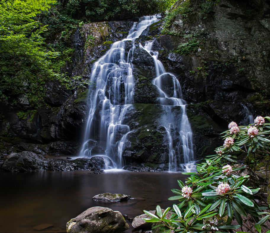
| 96 |
Jun 20 |
Comment |
I really like the work you have done on this image, especially that you have exercised restraint and not over-processed the colors, so the finished images looks totally realistic and totally beautiful.
On the question of the cropping, I would love to see your attempt at including the rocks in the foreground. I think the idea of three layers is great: above water/ water surface/ below water. I especially like the lone leaf floating on the water, defining the surface. Yes, that would change the composition, and that might not work. You could also try a portrait crop from the top of the mountain to rocky foreground (but I admit I like your chosen crop very much). |
Jun 3rd |
1 comment - 0 replies for Group 96
|
47 comments - 19 replies Total
|


