|
| Group |
Round |
C/R |
Comment |
Date |
Image |
| 1 |
Jan 20 |
Comment |
Hello Sol, I love these kinds of shots. I call them "Jumbles," and have been shooting them for 20 years. See my image this month in Group 32, where I posted my very first Jumble.
I think you have just the right size and number of peppers. You also have a variety of colors, shapes, and ripeness/flaws to show natural processes.
I also love the reference to the famous pepper shot by Edward Weston. |
Jan 6th |
1 comment - 0 replies for Group 1
|
| 2 |
Jan 20 |
Comment |
I agree with your and your colleagues' comments. The sky is great and your angle of view makes the shot interesting.
I suggest a tiny bit of perspective alteration, as attached. |
Jan 12th |
 |
1 comment - 0 replies for Group 2
|
| 4 |
Jan 20 |
Comment |
For the purpose of your official photographer role, this is a fine record shot, showing the processing and its context in the community. Compositionally, I think a closer crop would also be nice to get in closer to the marchers, like this: |
Jan 3rd |
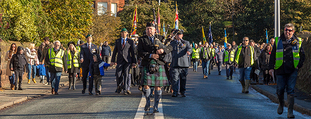 |
1 comment - 0 replies for Group 4
|
| 5 |
Jan 20 |
Comment |
Great shot resulting from a great effort. Good practice for shooting grandchildren. |
Jan 23rd |
| 5 |
Jan 20 |
Comment |
I love shots of rope, twine, or any woven strands, as I am a knot hobbyist.
Yes, I think your original framing, showing more, especially a fuller view of both knitting needles, is better.
Yes, the frayed end is a great detail feature, and so is the texture of the woven strands.
How about converting this to monochrome and showing it to us--I tried, but my program failed because it "encountered an unknown JPEG marker." Sorry, I would have tried it. |
Jan 4th |
2 comments - 0 replies for Group 5
|
| 7 |
Jan 20 |
Comment |
Great shot, as everyone has said. I like the original framing because I like a lot of natural space around the human element in nature--just a personal preference. |
Jan 23rd |
1 comment - 0 replies for Group 7
|
| 8 |
Jan 20 |
Comment |
I have a lot of good reactions to this shot. I like the angle best of all--it could not be better with all the right angles viewed from a diagonal point of view. It makes me think of the angles on Frank Lloyd Wright's "Falling Water" house in Pennsylvania.
I find the modern rain spouts interesting to see in an adobe building, as well as hints of finished windows and a balcony.
But I don't think the cat is needed. |
Jan 7th |
1 comment - 0 replies for Group 8
|
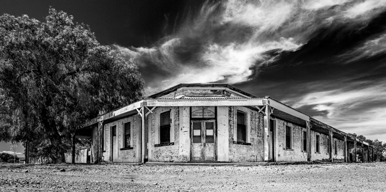
| 11 |
Jan 20 |
Comment |
Also, consider a flip. |
Jan 2nd |
 |
| 11 |
Jan 20 |
Comment |
Yes, I think there is a great shot here. Here is my suggested crop. How about swapping out the sky using one of the post-processing tools that does that well? |
Jan 2nd |
 |
2 comments - 0 replies for Group 11
|
| 16 |
Jan 20 |
Comment |
Looks great to me. I shoot with a G10--wonderful compact and very capable camera. Complete controls if you want them, but still fits in a pocket. |
Jan 22nd |
1 comment - 0 replies for Group 16
|
| 17 |
Jan 20 |
Comment |
I love shots with lots of black, and this is a dramatic one. I did not see this location when I visited there, so thanks for the shot.
A few months ago, one of our colleagues talked about reflecting and doubling an architectural shot when a good view could only be obtained on one side. So here is something I decided to play with, attached. |
Jan 15th |
 |
1 comment - 0 replies for Group 17
|
| 23 |
Jan 20 |
Comment |
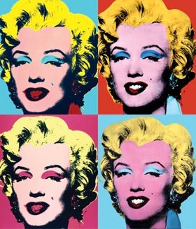
Adelet really nailed the artistic origins of this style--Andy Warhol. See the attached sample of the MM images she refers to. Your technique is very compelling. I really like the way the four images came out. |
Jan 22nd |
 |
1 comment - 0 replies for Group 23
|
| 26 |
Jan 20 |
Comment |
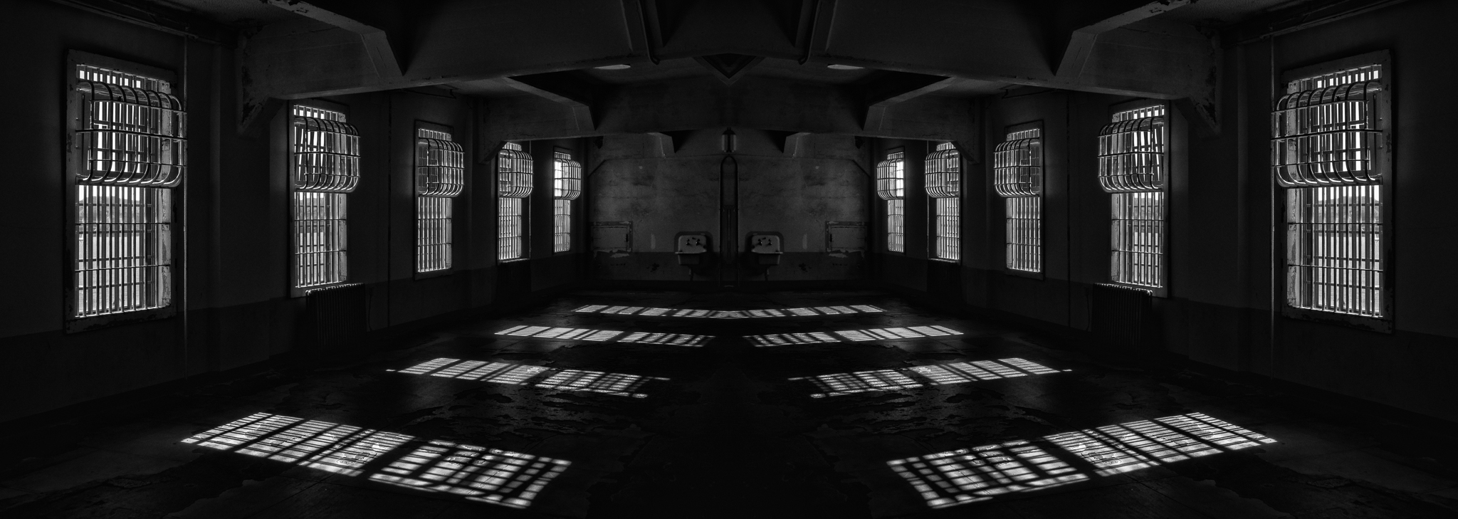
Worth mentioning here is a technique shown once by one of our colleagues in another group: when shooting an architecturally symmetric scene, and one half is imperfect (crowds, lighting, obstructed view, construction, etc.), take the good half, copy and flip it and attach the flipped copy to the original good half. Presto, a good shot. You can also do this with a half-shot to make it look like a whole shot. I showed this technique this month in Group 17 on Sheldon Wecker's interior shot. |
Jan 22nd |
| 26 |
Jan 20 |
Comment |
Are the images reversed? The "original" looks like the finished images.
That's my downtown! I live a couple of blocks outside downtown Bethesda. I could walk to this spot in 20 minutes or drive there in 5. Le Pain Quotidien restaurant is excellent. |
Jan 3rd |
| 26 |
Jan 20 |
Comment |
Nice shot. I love architectural shots empty of people. I rotated it right .95 degrees. |
Jan 2nd |
 |
3 comments - 0 replies for Group 26
|
| 27 |
Jan 20 |
Comment |
Congratulations on your excellent control of the saturation. Your image looks natural and lovely. Way too many shots of fall colors and sunsets are overdone in post-processing. |
Jan 15th |
1 comment - 0 replies for Group 27
|
| 28 |
Jan 20 |
Comment |
Both images are very beautiful. It would be interesting to see the images as taken, to understand how much you post-processed them. Can you show them?
But I do suggest a bit less post-processing, because both image announce "I am post-processed," and I think it would be better if the viewer does not see that in an image. Pardon me if I am mistaken about that--it is how it looks to me on my monitor. |
Jan 15th |
1 comment - 0 replies for Group 28
|
| 29 |
Jan 20 |
Comment |
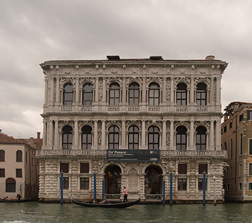
Hi Bill, I tried to do perspective adjustment in PS Elements using "perspective" and also rotated the image left 1.5 degrees to level it. See the attached. I did not work on other aspects. But I want to point out that the radical alteration of proportions in your image shows up in the unnaturally thin gondolier in front of the building. Best to remove the man and boat if you choose to keep the altered proportions. The proportions you rendered are not bad looking, but not true to the original architecture. |
Jan 15th |
 |
1 comment - 0 replies for Group 29
|
| 30 |
Jan 20 |
Comment |
You folks are having a great and instructive discussion about this image. It's rare that the photographer can go right back and try again. I'm in Monochrome Group 32, so this is a very interesting shot for me.
You might consider that the top half of your original is a separate composition, like this: |
Jan 12th |
 |
1 comment - 0 replies for Group 30
|
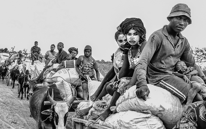
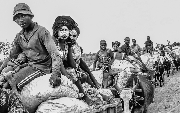
| 31 |
Jan 20 |
Comment |
Too many roadside character shots simply show "interesting" faces. I think you have avoided that, to show something of this woman's hard life--essential in my view when shooting in another land.
She might be blind in the other eye, and her twisted mouth may suggest she is a stroke survivor. Her head-covering is of plain cotton. |
Jan 22nd |
1 comment - 0 replies for Group 31
|
| 32 |
Jan 20 |
Reply |
Great idea! |
Jan 27th |
| 32 |
Jan 20 |
Comment |
Thanks to everyone for their comments. I just love the "Woo Hoo" name suggestion from Larry, and Tom's coloring suggestion. Thanks also to Bob for the contrast work. And to Diana for reminding me that I can manipulate a scene before I shoot it. |
Jan 27th |
| 32 |
Jan 20 |
Reply |
Thanks for visiting, Ata. I shot this in Çe�…Ÿme, Turkey town center in a market basket outside a souvenir shop. |
Jan 25th |
| 32 |
Jan 20 |
Comment |
Everyone is spot on with their comments above. I agree 100%. Very pleasing shot, particularly the necks. And the original cropping is just right. |
Jan 22nd |
| 32 |
Jan 20 |
Reply |
Thanks for visiting, Bob. I had tried it myself and got this. I like the increased contrast. |
Jan 15th |
 |
| 32 |
Jan 20 |
Comment |
Everything is sharp, and the framing is fine, but I don't get anything from the subject matter (I don't care for glamour shots), nor any real personality from the model. The pose is fine, and the curves under the paper an interesting concept. |
Jan 6th |
| 32 |
Jan 20 |
Comment |
Looks great to me, and a good story about the subject. I am sure someone can help you with getting rid of the extra car's fender--I hear about "content-aware" modification all the time, although I don't use it.
How about the tech data? I always want to know the lens focal length and the distance you stood from the subject. Thanks. |
Jan 6th |
| 32 |
Jan 20 |
Comment |
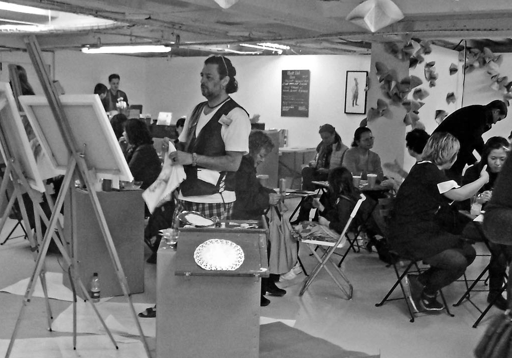
Michael, I just can't get a good sense of organization and central subject on this one. It must have been an interesting visit for you, but I probably would have shot over the shoulder of the artist to include his painting. For me the best I can figure is to contrast the artist intent on his painting against the cafe people totally oblivious to him. Like this: |
Jan 5th |
 |
| 32 |
Jan 20 |
Reply |
You nailed it, Larry. That's so much fun. Thanks. |
Jan 3rd |
| 32 |
Jan 20 |
Comment |
I like the conversion to monochrome, getting rid of the distracting and unimportant (to me) dark green of the leaves. (Interesting that Tom has just done that in his image this month, getting rid of bright red objects.)
But I don't care for the second out-of-focus partial blossom--is that what I see? |
Jan 2nd |
| 32 |
Jan 20 |
Comment |
Good idea to get rid of distracting bright colors by switching to monochrome. I will save up the lesson. This is so helpful. |
Jan 2nd |
7 comments - 4 replies for Group 32
|
| 34 |
Jan 20 |
Comment |
Fun shot. See also folk dancers this month by Hema Narayanan in Group 81. |
Jan 18th |
| 34 |
Jan 20 |
Comment |
Good job getting rid of the junk on the water's surface, but I liked the trash in the bottom of the boat, the number on the side, and the context among the other activity at the marina.
The dock is hard to understand, because it now looks vertical--I prefer its original perspective.
The color work is great--you could present this to the owner with a proposal to sand and paint their boat to this level of beauty--but it might be just a bit too bright. |
Jan 12th |
2 comments - 0 replies for Group 34
|
| 35 |
Jan 20 |
Comment |
This is a captivating composition that makes me want to keep looking at it.
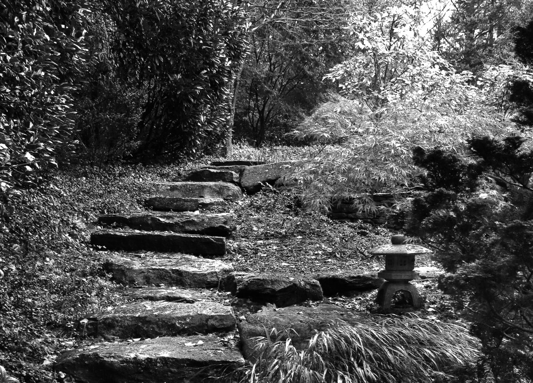
It is full of symbolism: the tree is new life springing from a difficult rocky spot. Since this building may be (once) a church, and new life is often discussed in church (both physical and spiritual), a tree of new life doubly resonates here. The stone steps lead up to a mysterious and difficult door--to what--to new life, eternal redemption, an ordinary mass or meeting? The stone steps are an improvise stairway, instead of a normal wood stair--must we build our own stairway to heaven out of stones we carry with difficulty, and climb with effort? On and on. Great composition. |
Jan 22nd |
1 comment - 0 replies for Group 35
|
| 39 |
Jan 20 |
Comment |
Thank you for the useful instruction about lighting. Very useful. I like your colleagues' comments about blurring the skin a bit.
I am uncomfortable with the slightly parted lips, as (to me) they add an emotional note not consistent with the rest of the face. |
Jan 2nd |
1 comment - 0 replies for Group 39
|
| 42 |
Jan 20 |
Comment |
In spite of your several colleagues suggesting some cropping, I will give a reason to consider keeping the current view. The relationship between nature and humans (especially in Asian art) is often portrayed as the human element occupying a very small place in the grandness of nature. I think your image expresses that very well--the grandeur of the lake has expanded in flood to overwhelm the human objects. Perhaps it is gentle, and will subside, and the human element will be permitted to re-assume its presence beside the lake. |
Jan 21st |
1 comment - 0 replies for Group 42
|
| 43 |
Jan 20 |
Comment |
Hello Harley, I am visiting from Monochrome Group 32, so your monochrome shot interested me. I quite like the composition of objects, and combination of chicken eggs with and without shells.
Overall, I find it a bit too light, whereas your color original had (to me) deeper and better shadows.
I am not concerned about possible phallic symbolism--it may even be artistically appropriate when shooting eggs.
The large Emu egg, however, appears to me to be ever so slightly tilted to the right--what do you think? |
Jan 15th |
1 comment - 0 replies for Group 43
|
| 44 |
Jan 20 |
Comment |
Good job on handling the light, both inside and outside.
I adjusted the perspective using PS Elements "Skew," just making one motion to pull the left bottom corner further to the left. |
Jan 20th |
 |
1 comment - 0 replies for Group 44
|
| 45 |
Jan 20 |
Comment |
Per Phyllis's comment, placing the pieces is an opportunity. Say, in a logically impossible or improbable position--to see if anyone notices. |
Jan 14th |
| 45 |
Jan 20 |
Comment |
Thank you for showing me the Taipei I do not know (since I was there in 1988-89). This is a wonderful shot. |
Jan 14th |
2 comments - 0 replies for Group 45
|
| 46 |
Jan 20 |
Comment |
Nice shot. Please tell us your camera settings and post-processing, if any--and the story of getting the shot. |
Jan 14th |
1 comment - 0 replies for Group 46
|
| 50 |
Jan 20 |
Comment |
Nice action shot. See also another rugby shot this month by Miriam Power in Group 53. |
Jan 18th |
1 comment - 0 replies for Group 50
|
| 53 |
Jan 20 |
Comment |
Good action shot and a good discussion. See also Karl Hokanson's two rugby shots this month in Groups 50 and 59. |
Jan 18th |
1 comment - 0 replies for Group 53
|
| 58 |
Jan 20 |
Reply |
Right you are, Issac, of course. The rotation was completely new to me--such a good idea! |
Jan 23rd |
| 58 |
Jan 20 |
Reply |
Thanks for showing us this variation of an excellent composition, making a very interesting alternative. I always thought only of cropping, and only rotated to straighten horizon lines--but the idea of rotating to introduce diagonal lines is new to me. Thanks for the instruction. |
Jan 18th |
0 comments - 2 replies for Group 58
|
| 59 |
Jan 20 |
Comment |
Nice shot of an unconfusing action moment. I prefer this crop of five facing one, emphasizing the title, "Oh Oh".
See also another rugby shot this month by Miriam Power in Group 53. |
Jan 18th |
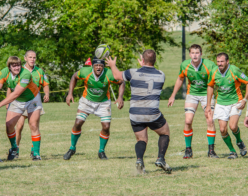 |
1 comment - 0 replies for Group 59
|
| 60 |
Jan 20 |
Comment |
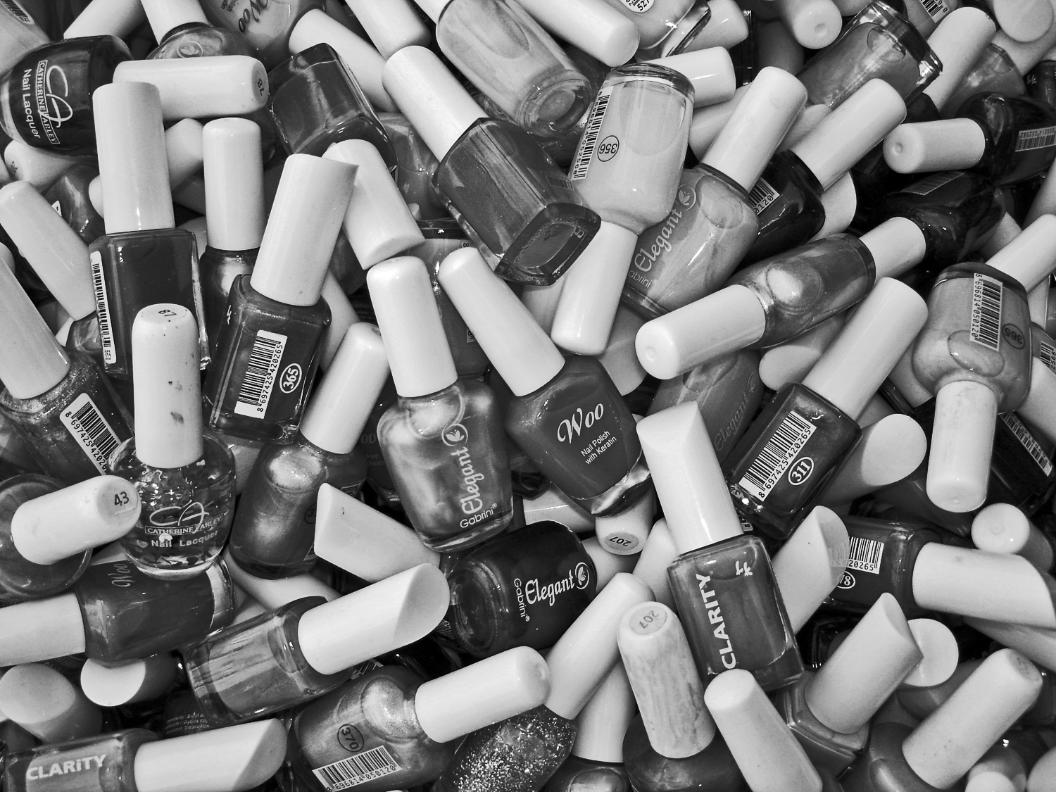
I love shots like this--piles of small objects. This one is great, as folks have observed, especially showing the letters and numbers. I have been shooting such "Jumbles," as I call them, for over 20 years. Please come visit my Jumble this month in Group 32. |
Jan 13th |
1 comment - 0 replies for Group 60
|
| 64 |
Jan 20 |
Comment |
Looks like a Frank Gehry building? |
Jan 7th |
1 comment - 0 replies for Group 64
|
| 67 |
Jan 20 |
Comment |
I have lots of comments on this one, Larry.
First of all, thanks for the lesson on spot metering. Very clear.
Second, how does "finger roll" work exactly? When I want to be careful about vibration, I press down on the shutter release with my forefinger, and simultaneously up with my thumb from below.
All your other choices look great, and a great story of course.
But most important of all--how did you persuade the bird to stand still through all of your activity, especially wading into its watery domain? |
Jan 2nd |
1 comment - 0 replies for Group 67
|
| 73 |
Jan 20 |
Comment |
Very will done. In the cinematic world, this is sometimes called "Day for Night." Reference the 1973 François Truffaut French film released in the USA under that name. |
Jan 13th |
1 comment - 0 replies for Group 73
|
| 74 |
Jan 20 |
Comment |
Merhaba Ata,
Your colleague has given you a good comment for this interesting shot. On my part, I would like to hear the story of how you took it. In particular, I would also like to know if the potters make all those identical pots free-hand or if the have a template or shaping tool to get them all the same size and shape. Thanks. |
Jan 20th |
1 comment - 0 replies for Group 74
|
| 78 |
Jan 20 |
Comment |
Yes, you gave good a good reason for the angle, and it was an informative explanation. I agree with Terry's comments about the overall composition. |
Jan 6th |
| 78 |
Jan 20 |
Comment |
Very nice backlight.
I rotated it 4 degrees to the right. |
Jan 3rd |
 |
2 comments - 0 replies for Group 78
|
| 81 |
Jan 20 |
Comment |
Nice shot. See also folk dancers this month is Group 34 by Steve Estill. |
Jan 18th |
1 comment - 0 replies for Group 81
|
| 87 |
Jan 20 |
Comment |
Very nice shot, and very good idea to express the Yin/Yang. In the Yin/Yang symbols there is an opposite color dot in the center of each element, suggesting that each concept contains within it a seed of the opposite. In your image, on the bright left side, there is a single dark pine, and on the darker right side there is a white tree trunk in the very center. So you have expressed Yin/Yang very deeply. |
Jan 13th |
| 87 |
Jan 20 |
Comment |
Congratulations on this very delicate shot. It is especially nice to see that the sunrise color is not overdone in post-processing! |
Jan 13th |
2 comments - 0 replies for Group 87
|
| 90 |
Jan 20 |
Comment |
This is a great composition. What was the lens focal length and how far were you standing from the bow?
I am in Monochrome Group 32, so always on the lookout for good monochrome compositions. Here is you shot with a bit of adjustments to taste for brightness and contrast, and a touch of sharpening. |
Jan 13th |
 |
1 comment - 0 replies for Group 90
|
| 92 |
Jan 20 |
Comment |
Is it a rainy day? Is that their problem? |
Jan 7th |
1 comment - 0 replies for Group 92
|
52 comments - 6 replies Total
|


