|
| Group |
Round |
C/R |
Comment |
Date |
Image |
| 6 |
Dec 19 |
Comment |
Yes, the little stem does all the things you are hoping for. I can't imagine this image without it.
Compositionally, how did you decide on where the main stem entered the image? (I might have had it enter exactly at the bottom left corner.) |
Dec 18th |
| 6 |
Dec 19 |
Comment |
Tom, I like your conscious choice to keep this fairly dark. It gives drama to the center, especially since the center is compact. This would also look good in B/W. |
Dec 18th |
2 comments - 0 replies for Group 6
|
| 7 |
Dec 19 |
Comment |
Hi, I am visiting from Monochrome Group 32, and am always on the lookout for candidates for monochrome. This is great subject matter. Here it is in monochrome. |
Dec 17th |
 |
| 7 |
Dec 19 |
Comment |
You had a good eye to spot your subject with such great light. You could vary this with a close-in portrait. But I prefer this image to include the feet of the stool. It is to me a matter of gravity, no pun intended, I mean the force of gravity that holds all things down on the earth--I like to see the meeting point of things and the earth. |
Dec 17th |
2 comments - 0 replies for Group 7
|
| 8 |
Dec 19 |
Comment |
Hi, I am visiting from Monochrome Group 32. This is very fine. I think the space on the top is useful--to let the central subject "breathe," if you accept my metaphor. |
Dec 17th |
1 comment - 0 replies for Group 8
|
| 10 |
Dec 19 |
Comment |
Hi, I am visiting from Monochrome Group 32. The colors on this are a fantastic subject. I just want to add that this image also works very well in monochrome. |
Dec 17th |
 |
1 comment - 0 replies for Group 10
|
| 11 |
Dec 19 |
Comment |
Hi Tom, this is a truly unique idea--to do this type of filtering in B/W! I like your image, and I like the way your colleague, Henry, added to the idea. |
Dec 17th |
1 comment - 0 replies for Group 11
|
| 12 |
Dec 19 |
Comment |
I think Photoshop "skew" would work to straighten out the lines. See my attempt. But also suggest to show the group of ladies to get a personality shot of them smiling around their completed puzzle, sharing the activity and friendship. |
Dec 1st |
 |
1 comment - 0 replies for Group 12
|
| 13 |
Dec 19 |
Comment |
Yes, agree, very good use of the lens. Please tell us the name and location of the temple or monument. How about the story of you taking the picture? |
Dec 17th |
1 comment - 0 replies for Group 13
|
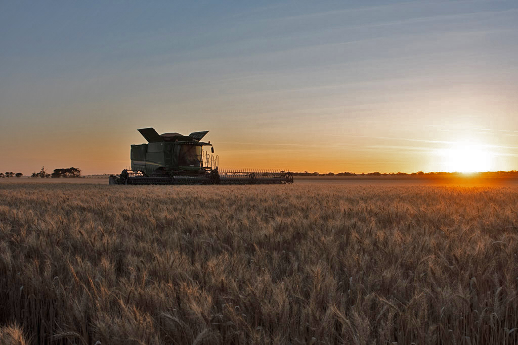
| 16 |
Dec 19 |
Comment |
Very good action shot with both wrestlers' faces in full view--hard to get. You were a little disadvantaged with the lighting, having to shoot action at only 1/160, and I think the result is a bit of blur, but not too bad in the overall composition.
One alternative (strictly an option) would be to include the referee in the finished shot, as he is closely watching for a pin, and seeing him anticipate that would add drama. |
Dec 5th |
| 16 |
Dec 19 |
Comment |
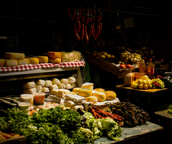
I like everything you have done with this, starting with your original. You have made it into a beautiful still life. The lighting is great, so is the vignette and border. The found arrangement of still life foods is very tranquil. Good idea about moving the sausages. Good eye and good job.
My only suggestion is to get rid of the plastic crate holding up the table, and maybe the half-melon, like this. |
Dec 5th |
 |
2 comments - 0 replies for Group 16
|
| 19 |
Dec 19 |
Comment |
I totally agree with your view on this image and in general. |
Dec 26th |
| 19 |
Dec 19 |
Comment |
This is a great shot as it is, and I do not suggest any changes, but want to discuss a possible change that I do not recommend! See the attached version with the vertical lines brought parallel using PS "skew". Some people, like architectural photographers, prefer this, especially for shorter buildings. But it is not the true perspective that both your eye and camera see. Furthermore, for taller buildings, like this one, there is a very pleasant "soaring" feeling to the vertical converging lines that is lost if you "skew" the perspective. |
Dec 16th |
 |
| 19 |
Dec 19 |
Comment |
I like the subject and concept of this. I think the gradient filter is a great success.
I prefer your original framing, showing the sky and mountain--entirely a personal preference.
I suggest that the color and brightness post-processing are a bit too much, because your finished image sort of announces, "I am post-processed." |
Dec 4th |
3 comments - 0 replies for Group 19
|
| 24 |
Dec 19 |
Comment |
Nice shot with good colors, and thank you for telling the story--we all like to know about the world from our digital dialogue colleagues.
With buildings not too tall, as this one, a little perspective alteration might work--I used "skew" in PhotoShop, which tends to preserve heights, whereas "perspective" tends to fatten buildings.
However, in all cases such changes are untrue to what both you and the camera actually saw--the converging vertical lines are correct perspective, just as converging horizontal lines of a street are correct perspective. So use judgement when you consider to alter perspective. |
Dec 15th |
 |
1 comment - 0 replies for Group 24
|
| 32 |
Dec 19 |
Reply |
Yes! I definitely mean for the upward look on the view to still be partially there, as I think it is essential to the subject matter and composition, but a bit less that the original capture. I am usually against complete straightening, as I feel it is lying about perspective, and of course often makes an image squat. |
Dec 10th |
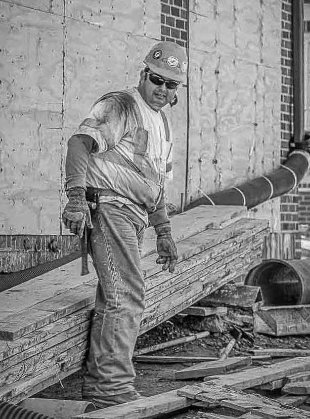
| 32 |
Dec 19 |
Comment |
You had good light on the worker, and especially on his face.
I had a couple of ideas on this, so I played around with it.
1. I rotated left four degrees.
2. I roughly selected the worker, inverted the selection, and very slightly darkened the background to make the worker separate from the background.
Anyone else? |
Dec 10th |
 |
| 32 |
Dec 19 |
Comment |
It is interesting that the bright green of the original does not contribute to the color version. It seems that color can be bright, but still not be an attraction. Your finished image looks good to me. I particularly like the white puff--the whistle? |
Dec 10th |
| 32 |
Dec 19 |
Comment |
looks fine to me, and I don't have a cropping suggestion--I think you got the framing just right. I feel like I am right in the lane. |
Dec 10th |
| 32 |
Dec 19 |
Comment |
I like the light spots, one on each item, echoing each other.
As to composition, this is a matter of taste--I would have shown the entire knife, but I understand this view has the focus on the U.S.M.C. etching.
Good touch that the slice shows below the entry point of the knife--it suggests slicing action. |
Dec 10th |
| 32 |
Dec 19 |
Comment |
I think you are absolutely right to crop the left side--no problem with a square format if that is the subject matter--in fact, I think it makes the shot intimate. Good idea. The snow tones look fine on my monitor. Fine overall shot. |
Dec 10th |
| 32 |
Dec 19 |
Comment |
Nice shot, especially with your usual excellent darkening of the sky in b/w. The composition is good from this point of view of the building.
My usual discussion of perspective. As taken, the camera sees what your eye saw, so the tilt is the actual perspective. Architectural photographers like to alter it to make the vertical lines parallel, but I don't like that, as it removes the soaring look of the buildings. In this case, I suggest a partial alteration, keeping some "soaring," using PS "skew." |
Dec 9th |
 |
6 comments - 1 reply for Group 32
|
| 36 |
Dec 19 |
Comment |
I particularly like that you have placed the horizon line just barely in the frame. I also like the aerial perspective and would not dehaze to remove it--it is after all what you really saw. All your colleagues' cropping suggestions are great alternative views of this scene. |
Dec 15th |
1 comment - 0 replies for Group 36
|
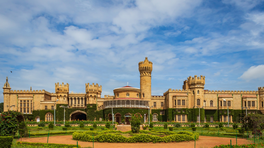
| 44 |
Dec 19 |
Comment |
After seeing dozens of shots of this famous site in these digital dialogues, I am at last seeing the overall look of the place. Thank you! That is not to denigrate those other shots, most of which were of details and special views, but it's fnally good to see what the whole place looks like. |
Dec 13th |
1 comment - 0 replies for Group 44
|
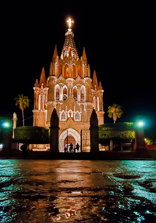
| 50 |
Dec 19 |
Comment |
Great shot, very sharp, and perfectly straightened parallel lines. You can consider leaving a verrrry tiny bit of tilt in the columns to just suggest their soaring nature, but perhaps this shot is best like this.
Lorna's comment about symmetrical capture reminds me that several of our digital dialogue colleagues in past months have pointed out that if you can't position yourself for a symmetric capture, then just take half the image, flip it and join it to the original--hey presto, a symmetric image. |
Dec 13th |
1 comment - 0 replies for Group 50
|
| 53 |
Dec 19 |
Comment |
Hi Dan, the fish market is a great place to shoot, and this is such a fun image. I personally like all the signs not blurred.
When in Seattle, I shop at Mutual Fish Co., 2335 Rainier Ave S., just below Beacon Hill. There is a great fresh-air produce market a couple of blocks away. |
Dec 13th |
1 comment - 0 replies for Group 53
|
| 54 |
Dec 19 |
Comment |
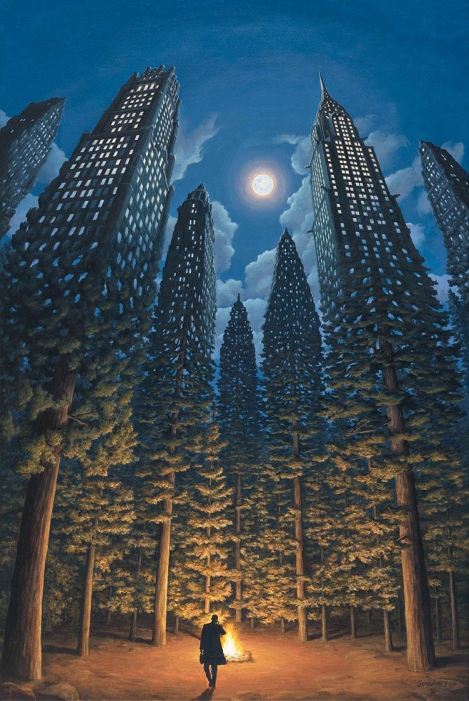
Here is a sample of Rob Gonsalves' surrealism. I don't think he is as important an artist as Magritte, but he sure produces a lot and is "popular." I selected this sample because it has a slight similarity to you image--the merging of nature and city. |
Dec 14th |
 |
| 54 |
Dec 19 |
Reply |
Right you are! How is this? I did a little PS "Distort" adjusting. |
Dec 13th |
 |
| 54 |
Dec 19 |
Comment |
The concept here is really clever. I like the blend of trees and houses, especially the lit street lamps that you added.
I am not so sure about the bird and flame, nor the "star-track." Would you consider just the star-track arching across the top? |
Dec 13th |
| 54 |
Dec 19 |
Comment |
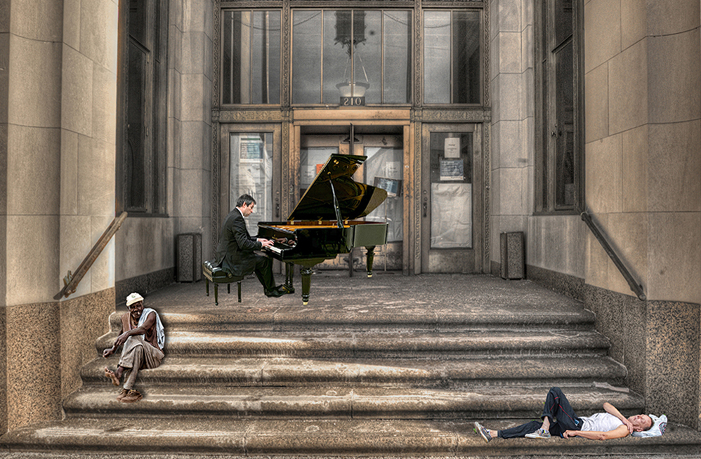
I really like the story and the finished image, giving a social justice message. There is not enough of social messaging in our digital dialogues, so this story and image are refreshing to see.
I rotated it right 1.1 degrees to level it. |
Dec 13th |
 |
3 comments - 1 reply for Group 54
|
| 58 |
Dec 19 |
Comment |
This is a very well done portrait. I also know the very spot. You are fortunate to have been able to visit Istanbul. Did you take the city (non-touristic) ferry up and down the Bosphorus?
As an alternative approach to this image, since the Istanbul skyline is so famous for its mosques, the Galata Tower, the Egyptian Market building, you might consider getting the background in sharp focus. |
Dec 13th |
1 comment - 0 replies for Group 58
|
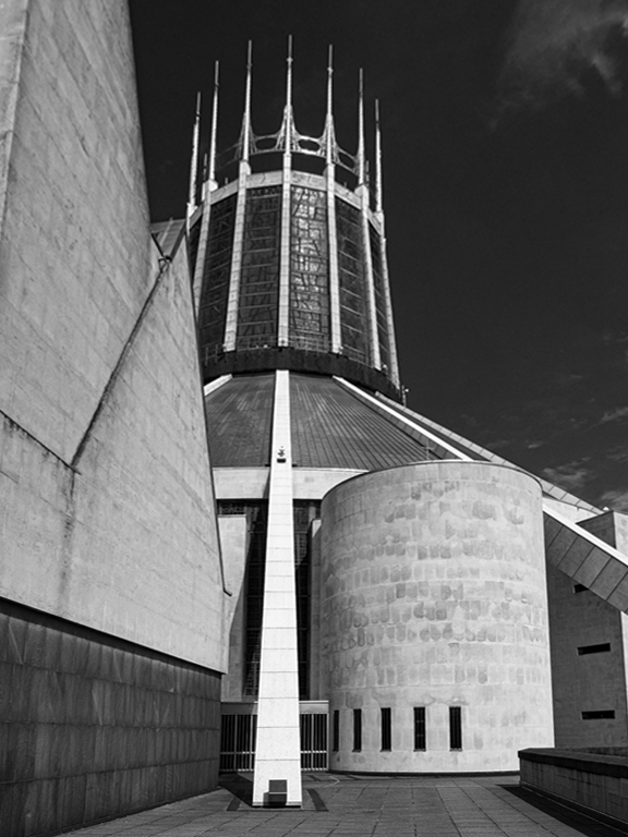
| 67 |
Dec 19 |
Comment |
I adore images with a great deal of black, 50% or more, and shoot a lot of them myself. This is just perfect. Keep on shooting like this. |
Dec 11th |
1 comment - 0 replies for Group 67
|
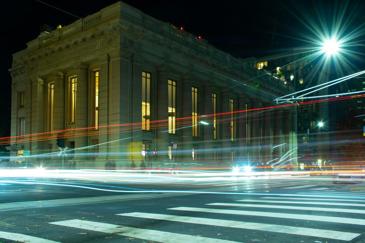
| 73 |
Dec 19 |
Comment |
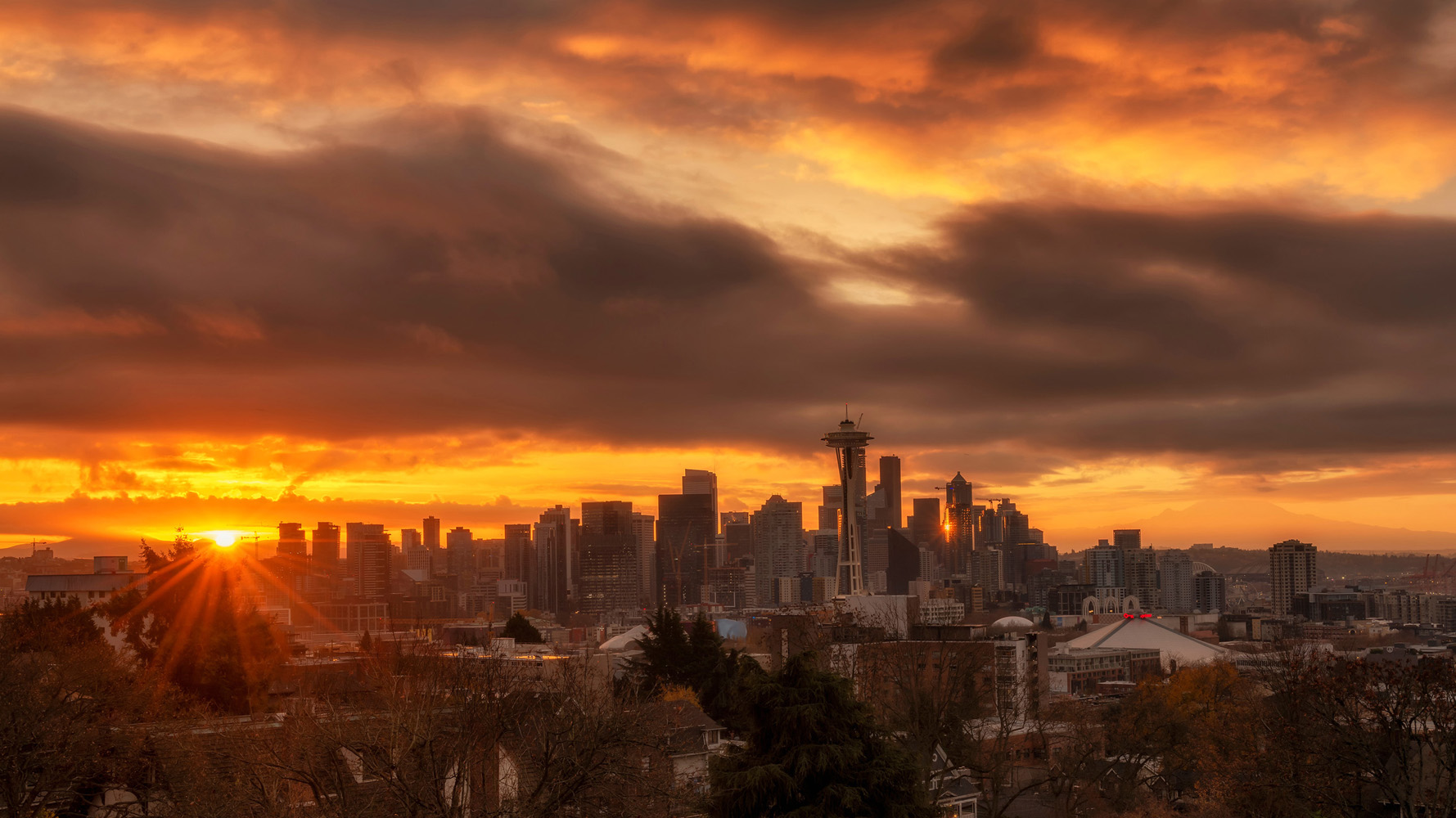
Great shot and great colors. Good idea about using f/20--I will remember that. Also nice that you got a reflection of sunlight off one of the towers.
Is that Mt. Rainier on the right? Is this shot from Kerry Park or another location?
I think the horizon is not level. I rotated it left 1.4 degrees. How is this? |
Dec 12th |
 |
1 comment - 0 replies for Group 73
|
| 74 |
Dec 19 |
Comment |
Hi David,
How about telling us the story of this event? And how you came to be there? It's nice to hear about your experiences. |
Dec 11th |
| 74 |
Dec 19 |
Comment |
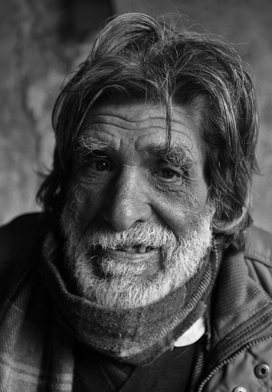
Merhaba, Ata, nasÄ�lsÄ�nÄ�z? E�…Ÿim Türk, ama Türkçe konu�…ŸmÄ�yorum.
I am visiting from Monochrome Group 32. Welcome to Digital Dialogues.
This looks better in monochrome than color. You sure got a great model. Nice that you got a catch-light in the dark side eye.
I see that the original is a bit darker on the dark side than the monochrome. I suggest making the monochrome also very dark on the dark side, taking advantage of the excellent side-lighting. Also, the bright area of the beard might be a bit too light. These are just my personal preferences. How does this look to you? |
Dec 2nd |
 |
2 comments - 0 replies for Group 74
|
| 75 |
Dec 19 |
Comment |
This is a great scene, but it looks a bit over-processed. How about this for the concept, only in my limited PS Elements. |
Dec 11th |
 |
1 comment - 0 replies for Group 75
|
| 81 |
Dec 19 |
Reply |
Ha! How the technology has enabled everyone to do that with ease. It was not known at the time I read that article. |
Dec 12th |
| 81 |
Dec 19 |
Comment |
Great shot.
I have never done this, but I read up once on the problem of suspending objects like this. The article said to use thin skewers piercing the fruits from the back, and extending back through holes in the backdrop to fixtures supporting them. You must position things so that the view of the skewers and holes in the backdrop is entirely blocked by the fruit. |
Dec 11th |
| 81 |
Dec 19 |
Comment |
A perfect scene.
You could consider cropping out the ploughed snow in the foreground, so one only sees the untouched snow. That might be too much off the bottom, but it's a thought. |
Dec 11th |
2 comments - 1 reply for Group 81
|
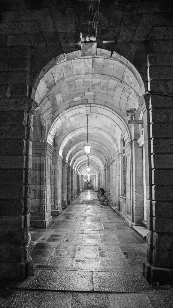
| 82 |
Dec 19 |
Comment |
I love shots of empty corridors, and take a lot of them myself. Good job that you resisted inserting a person at the end of the corridor as a "point of focus," which a lot of folks recommend--I don't like that at all. I prefer what you have--a study in architecture and perhaps a tone of calm.
I think this also works well in monochrome. |
Dec 11th |
 |
1 comment - 0 replies for Group 82
|
| 83 |
Dec 19 |
Comment |
Yes, like Lance said, please tell us about how you shot this, and why the stars are blurred (they are lovely like this--just asking about technical details). What was the shutter speed, aperture, lens focal length, and distance from the lighthouse? |
Dec 11th |
1 comment - 0 replies for Group 83
|
| 86 |
Dec 19 |
Comment |
Lovely shot. I am praising your restraint in not over-post-processing the colors. This looks great. |
Dec 11th |
1 comment - 0 replies for Group 86
|
| 88 |
Dec 19 |
Reply |
This is a wonderful result that you have come up with, in your discussion with Gary! |
Dec 11th |
| 88 |
Dec 19 |
Comment |
What a lovely shot. I visit children and grandchildren in Seattle a lot, and it's Mt. Rainier in those images, with I think Mt. Hood in the far distance.
I agree with Gary's suggestion to back off the saturation a tiny bit, so the image does not announce, "I am post-processed."
One question to your entire group, about the DOF comments. Everything in the image is at least 100 feet off, so the f/22 focus is at infinity with everything in sharp focus as a result, and there is no actual DOF problem. Am I not understanding something about DOF? |
Dec 11th |
1 comment - 1 reply for Group 88
|
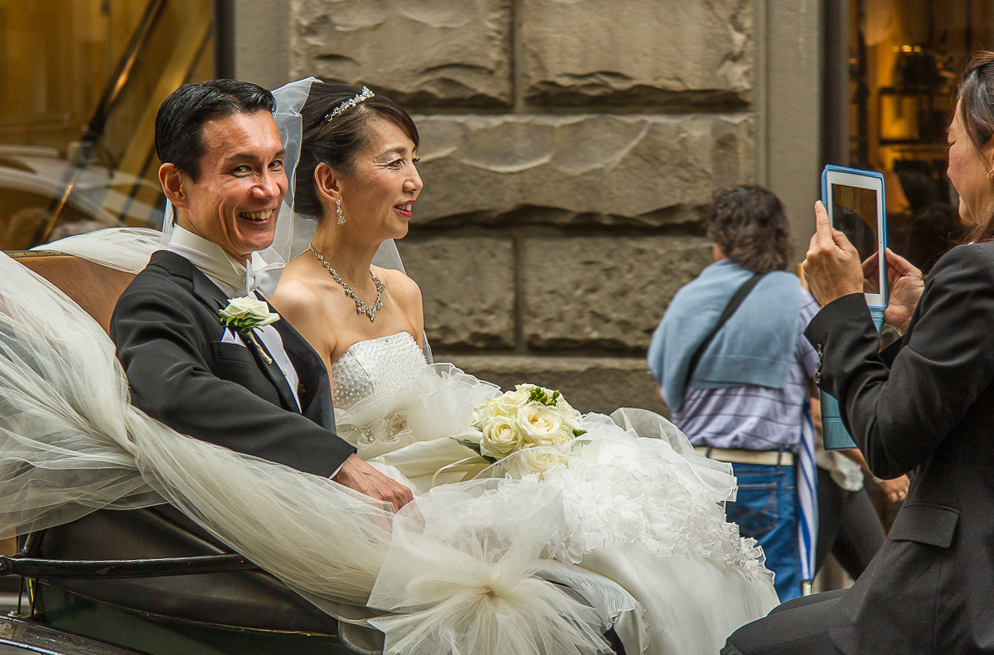
| 92 |
Dec 19 |
Reply |
In some situations, I think titles are really important, and combine with the images to tell a story. I don't think that all images should stand on their own without titles. |
Dec 11th |
| 92 |
Dec 19 |
Comment |
This is a great street catch.
I rotated it 2 degrees right to straighten the lines of the stone building behind.
Now let me imagine what I cannot possibly know, but it is fun for me to launch my brain into that mode when I see an image with "possibilities." The woman is significantly older than the man, probably. He is very handsome and has a winning smile. I imagine he is smiling like that because he is a fortune-hunter and is marrying a rich woman. Entirely imaginary--but perhaps a little possible. Not to be sexist, perhaps she is smiling because she has bought herself a good-looker. Orrrr, they are just a happy couple.
P.S. Suppose you had titled this, "A Good Catch." That would then suggest my imaginary story, perhaps? |
Dec 11th |
 |
| 92 |
Dec 19 |
Comment |
I like all the lights, and that is a beautiful old building.
The slight convergence of the vertical lines is actually the perspective we see with our eyes (although our brains tend to remove it), and the camera captures it accurately. Nevertheless, for shorter buildings like this, some folks (like professional architectural photographers) like to alter the vertical perspective. See if you prefer this as captured or as altered.
For very tall buildings, I would definitely suggest keeping the converging vertical lines, as they give a soaring effect. |
Dec 5th |
 |
2 comments - 1 reply for Group 92
|
42 comments - 5 replies Total
|


