|
| Group |
Round |
C/R |
Comment |
Date |
Image |
| 1 |
Oct 19 |
Comment |
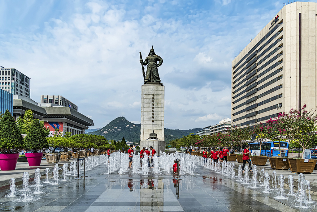
This is a very attractive travel shot.
I distorted the perspective to straighten the buildings, not required, but an option. I used Photoshop Elements "skew". How do you like it? |
Oct 8th |
 |
1 comment - 0 replies for Group 1
|
| 3 |
Oct 19 |
Comment |
Marion, this is such a colorful and charming shot. Well done.
Your colleague's suggestion to correct "perspective distortion" can work, as shown below. I used PS Elements, "skew" control, not quite equal on each side. A little bit of content is lost, so shoot wide in the future if you anticipate perspective changes.
A word about "perspective correction." The apparent lean of buildings as you shoot upwards is not actually "distortion." It is exactly what your eye sees, and the camera is true to the eye. Just as perspective converges parallel lines on buildings or streets (as in this image--we are used to this), so it does on vertical parallel lines. This works well to emphasize the soaring aspect of very tall buildings. For less tall building, you have the option to "alter" the perspective to suggest a level view, but that is the actual distortion. Of course, commercial architectural photographers do it all the time. Use it if you prefer in a case like this, but remember you are altering the perspective, not correcting distortion. |
Oct 8th |
 |
1 comment - 0 replies for Group 3
|
| 5 |
Oct 19 |
Comment |
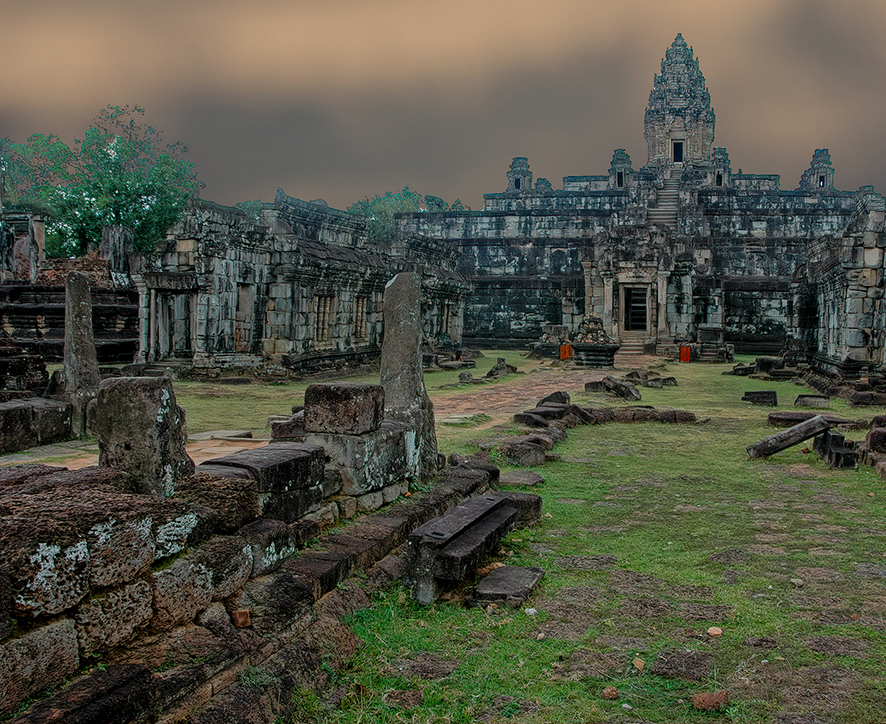
Hi Richard, this is a fine dramatic shot of an Ankor temple. I like very much the diagonal line on the left, leading to the main door of the temple. To strengthen that, I suggest the attached crop. |
Oct 8th |
 |
1 comment - 0 replies for Group 5
|
| 8 |
Oct 19 |
Comment |
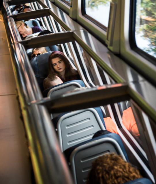
This is an interesting technique. Suggest rotating 180 degrees, as below.
Also, see my shot this month in Group 32. I shot into a mirror on an airport shuttle, then flipped left for right so my camera name would be readable. |
Oct 8th |
 |
1 comment - 0 replies for Group 8
|
| 9 |
Oct 19 |
Comment |
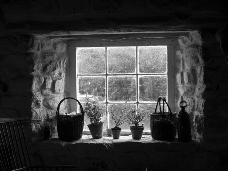
Very successful. I can't decide about the empty chair, if I want to see all of it or not. I understand about the stove being included--good reason--maybe include a tad more it it? |
Oct 30th |
1 comment - 0 replies for Group 9
|
| 10 |
Oct 19 |
Comment |
Hi Herb, this is an interesting composition. Please tell us the story of how you discovered and shot it, plus your post processing, as I think I see some painting effect applied? Also, the depth of field is pretty good, so it would be interested to know the ISO, f-stop, and shutter speed. Thanks. |
Oct 9th |
1 comment - 0 replies for Group 10
|
| 13 |
Oct 19 |
Comment |
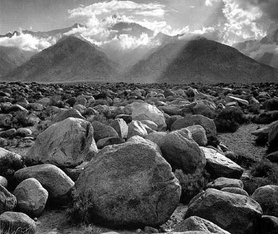
Wendy, this is a charming overlook, especially at the close of day.
The big rock seems too dominant to me, especially since it crosses the horizon line. Can you shoot from a little to the right?
This reminds me of Ansel Adams' famous shot, attached. |
Oct 8th |
 |
1 comment - 0 replies for Group 13
|
| 14 |
Oct 19 |
Comment |
Thanks for the shot of the Chora Church. Good image with the woman reading, and nice improvement after Bill's advice.
I have been there several times, and it is a visit in Istanbul not to be missed. |
Oct 9th |
1 comment - 0 replies for Group 14
|
| 15 |
Oct 19 |
Comment |
I am visiting from another group. I like the intense colors and the composition. Also, your story is essential to know what is going on--thanks. Did you do perspective alteration--the lines are nicely parallel. |
Oct 30th |
1 comment - 0 replies for Group 15
|
| 18 |
Oct 19 |
Reply |
Yes, of course you did a creative turn with it. It looks great both ways! |
Oct 30th |
| 18 |
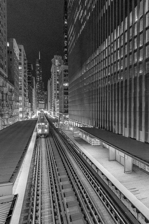
Oct 19 |
Comment |
Hi. I am visiting from monochrome group 32. I know yours is a creative group, but I just want to mention that your original is also a fine candidate for rendering in monochrome. |
Oct 15th |
 |
| 18 |
Oct 19 |
Comment |
Striking image. See a similar effort this month by David Bornmann in Group 90. |
Oct 8th |
2 comments - 1 reply for Group 18
|
| 22 |
Oct 19 |
Comment |
Al, thanks for the fine story of getting the picture. It's great to hear how folks follow their passions and interests.
The shot is very interesting, contrasting the two aircraft.
One question. If you shot at a slightly slower shutter speed, could you get some blur in the P-38's propellers but still stop the motion of both aircraft? |
Oct 9th |
| 22 |
Oct 19 |
Reply |
Keep at it! Some situations require hundreds of shots to get a single good one, now possible with our digital cameras. Our digital dialog friends who shoot polo matches often shoot 300 or more and don't get a single good one. |
Oct 9th |
| 22 |
Oct 19 |
Comment |
Really good use of a diagonal line in the foreground and getting close to the foreground content. |
Oct 7th |
| 22 |
Oct 19 |
Comment |
Excellent job panning to get the shot. Yes, you can try 1/60 and see if you can pan to capture the cyclist and increase the background blur.
Note that in this image, the cyclist is not quite at the point of maximum speed relative to you--she is still approaching that point, so it is easier to get a shot of her still. You could even try 1/30 from this angle.
Do let us all know how that works out.
Also, see Group 78, Richard Huang, this month, who is working on panning horseback riding, and note that he allowed some blur of the horse and rider, a more complicated situation, since there are multiple motions in equitation. |
Oct 7th |
3 comments - 1 reply for Group 22
|
| 32 |
Oct 19 |
Comment |
This is also a non-photography note. Shooting old buildings is dangerous if you go inside, because an abandoned building can collapse on you. Be careful about taking interior shots. |
Oct 14th |
| 32 |
Oct 19 |
Comment |
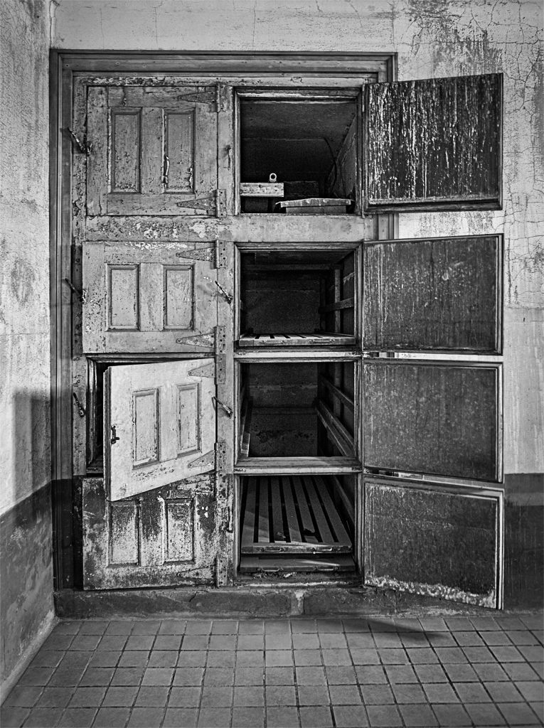
The water droplets are perfect, as is the whole flower. This is a pleasing shot.
I like very much what you and Tom are doing to solve the stamen/petal separation problem.
I think the background leaves are fine as they are, or might be just a bit brighter, as they presently say to me--hey, I have been darkened. |
Oct 14th |
| 32 |
Oct 19 |
Comment |
I am afraid I don't have a very strong instinctive response the the left/right thing (maybe because I am left-handed). I guess it looks better flipped, but maybe my eye has just been trained by everyone's practice. |
Oct 12th |
| 32 |
Oct 19 |
Reply |
Yes, I agree with that. When shooting, I was very happy with the spacing of the trees. |
Oct 10th |
| 32 |
Oct 19 |
Reply |
Lance, thanks so much for your discussion. I am very excited to have visitors across the DD Groups. I drift into your groups whenever something catches my eye.
I tend to agree with your comment of keeping the larger "space". After all, that was the shot I took in the camera. But the "croppers" have good ideas also, with different compositional goals, and that shows how an image can go in many directions, even this simple scene. |
Oct 9th |
| 32 |
Oct 19 |
Comment |
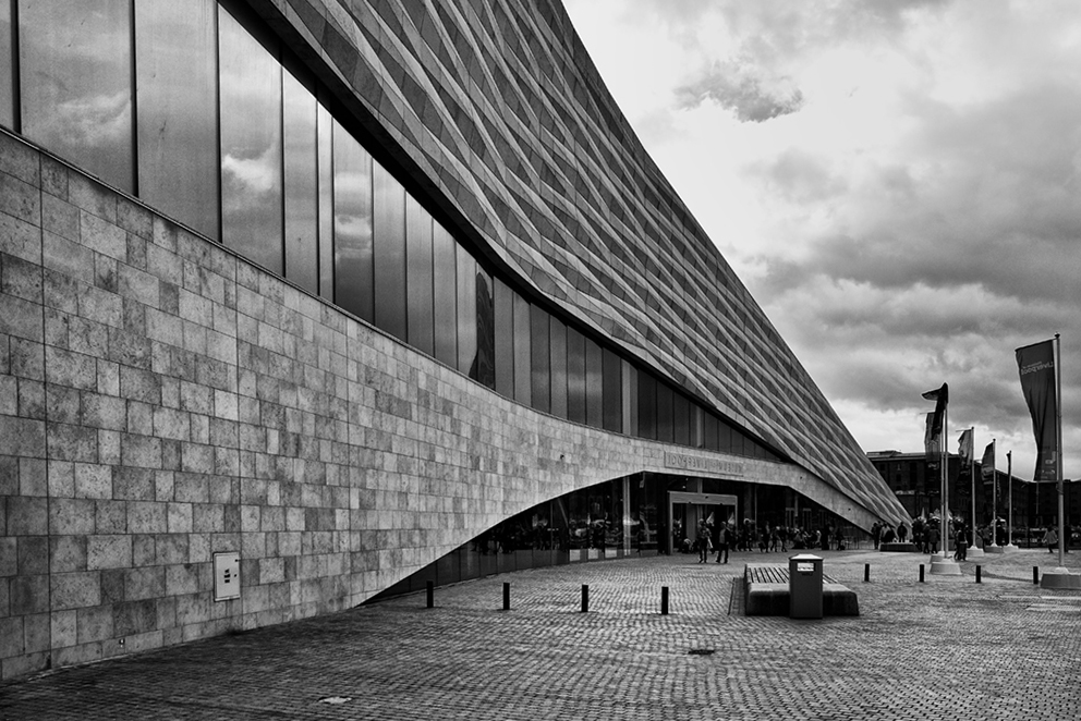
This is a very handsome architectural shot. Filling up the frame on one side with the building and then it diminishing to a point is just great.
I rotated it left two degrees to level it. There was a small loss of content around the edges. |
Oct 9th |
 |
| 32 |
Oct 19 |
Reply |
Thank you, Diana, this looks like a well-composed crop. I agree with the flipping left/right, but I can't explain why. Setting my family members off-center also seems to work well. |
Oct 9th |
| 32 |
Oct 19 |
Reply |
Hi Stuart, thanks for the comment. This looks quite good. |
Oct 9th |
| 32 |
Oct 19 |
Comment |
Yes, the sky looks great.
As to your question, I think the concept of an old and lonely prairie house needs simplicity, and the trees in front of the collapsing barn sort of clutter up the shot. I would be OK with the two small trees to the right. Therefore, I can't suggest anything except another visit to the place, and shoot from the other side of the barn. |
Oct 7th |
| 32 |
Oct 19 |
Reply |
Hello Lance,
Thanks so much for visiting and for the detailed comments and suggestions. |
Oct 5th |
| 32 |
Oct 19 |
Comment |
Nice shot, especially that you got one leg fully extended. Your frame is a little tight on the top, so I would suggest cropping a bit off the bottom, say to remove that bit of white line or curb. Maybe also brighten his face a bit, as it appears brighter in the original, and I think that works well. |
Oct 1st |
6 comments - 5 replies for Group 32
|
| 33 |
Oct 19 |
Comment |
Ken, see group 67 this month, where Larry Treadwell is working on a similar problem. |
Oct 8th |
| 33 |
Oct 19 |
Comment |
Hi Ken, I am in monochrome group 32, and always looking out for candidates for monochrome. I agree with Bob about this being a good monochrome shot. Here it my try, with a touch of sharpening as well. |
Oct 7th |
 |
2 comments - 0 replies for Group 33
|
| 37 |
Oct 19 |
Comment |
Did you see the ballooning image in Group 38 this month? |
Oct 25th |
1 comment - 0 replies for Group 37
|
| 38 |
Oct 19 |
Comment |
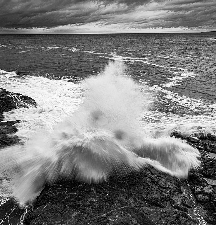
Very nice strong wave image.
See this month other groups where our colleagues worked with powerful waves:
Ken Carlson in Group 33.
Larry Treadwell in Group 67.
Angela Bonner in Group 81. |
Oct 25th |
| 38 |
Oct 19 |
Reply |
Yes, of course, I understand the restriction. Our Group 32 is not so restricted. We would readily change backgrounds, but not for competition in restricted categories like yours, or photojournalism. |
Oct 14th |
| 38 |
Oct 19 |
Reply |
Oh, thanks for showing that. It's wonderful. |
Oct 9th |
| 38 |
Oct 19 |
Comment |
Wonderful shot and framing, and a dramatic angle of the wings.
I find the background distracting, even though it is blurred, especially the color change from earth tones to sky tones. Would you consider changing the background? |
Oct 7th |
| 38 |
Oct 19 |
Comment |
The morning light is wonderful. I particularly like the highest balloon on the right, whose stripes seems to be a continuation of the stripes in the clouds.
One suggestion, if in Cappadocia, it would be even better to have included more of the geology that the balloon riders are going to see. |
Oct 7th |
3 comments - 2 replies for Group 38
|
| 39 |
Oct 19 |
Comment |
PS Elements is very inexpensive, and sufficient for starting out (I will never exhaust it because I make light use of PS). Just learn a few basics and get in the habit of using them all the time, then add skills as you need or want them. There are free instructions online, commercial courses, and lots of help right here from our Digital Dialogue friends. |
Oct 25th |
| 39 |
Oct 19 |
Comment |
Vincent, you caught the dancers in a perfect pose. It is not easy to get everything right, and you did a very good job. Specifically, their symmetry is perfect: both feet, both knees (same amount of bend), identical arms, down to the hands (drat--just one thumb missing :) ). If you take up PS, you can copy a thumb onto the hand missing it. |
Oct 6th |
2 comments - 0 replies for Group 39
|
| 40 |
Oct 19 |
Comment |
I like everything about the story of this urban take-off. I would suggest maybe one more f-stop closed, and then correspondingly slow the shutter speed to get a bit more rotor blur, as the top rotor does not have much blur. Just my taste. |
Oct 25th |
| 40 |
Oct 19 |
Comment |
After reading all the comments, I would like to add that the lack of separation of the dress from the background can be viewed positively, in that it looks like the woman is emerging out of the background, almost as if by magic. Sculptors, Michelangelo among them, have created statues of subject emerging from the stone. In this image, you could even experiment with strengthening that effect. |
Oct 25th |
| 40 |
Oct 19 |
Comment |
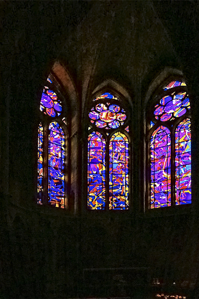
Thanks for showing this. I had no idea that Reims (or any of the old French cathedrals) had relatively modern windows. It is a beautiful image.
Since you left a lot of space in the frame, there was room for me to try adjusting the perspective. I used "skew" in PS Elements, a little unequally on each side. |
Oct 6th |
 |
| 40 |
Oct 19 |
Comment |
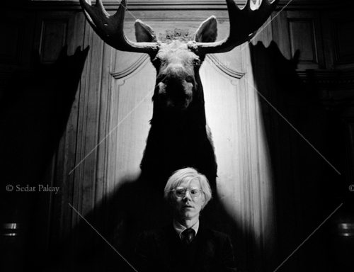
What a dramatic shot you have here. Very striking.
Your colleague, Manfred, has given you some very wise comments, I think. I learned from them. As to his number 3, I think the model's hands work pretty well in this shot, although I can see that Manfred is warning that you are close to the danger zone.
This reminds me of photographer Sedat Pakay's image of Andy Warhol, shown here just for interest. |
Oct 6th |
 |
4 comments - 0 replies for Group 40
|
| 42 |
Oct 19 |
Comment |
This is a total character portrait, complete with the Alpine hat. Nicely done.
Suggestions: it looks to me like the sharpening shows and is a bit over-done. Also, if you can include the hands of a musician, I think that would work better. |
Oct 4th |
| 42 |
Oct 19 |
Comment |
Kodachrome 64. Wow. It was worth it to scan the slide. This is a great, personally historic image.
Minor suggestions. The commercial sign in the center is annoying to the composition, and the PS processing seems a bit too bright and color-enhanced--at least to me. |
Oct 3rd |
2 comments - 0 replies for Group 42
|
| 44 |
Oct 19 |
Comment |
Beautiful shot, and good job with straightening the lines.
A warning to everyone: be cautious to enter a dilapidated building. There may be danger of the building collapsing on you. |
Oct 12th |
| 44 |
Oct 19 |
Comment |
A story that tells itself. Well done. The title is absolutely essential, a good example of an argument I have with some folks that a good title is a great asset.
Here it is in monochrome, for discussion. |
Oct 3rd |
 |
2 comments - 0 replies for Group 44
|
| 45 |
Oct 19 |
Comment |
This is just like paintings of such scenes by old masters--proving that their scenes were not imaginary. Beautiful. I like the aerial perspective of the mountains in the distance. |
Oct 24th |
| 45 |
Oct 19 |
Comment |
I love seeing your images of Taiwan. This one is spectacular. Thanks for the detailed story. I lived in Taipei in 1988-9, so I have an enduring interest in your home. |
Oct 8th |
| 45 |
Oct 19 |
Comment |
You have really fabulous clouds and a great cityscape here, but it looks a bit over processed. My suggestion is to dial it back a bit, so the viewer cannot discern that you have done any post processing. |
Oct 3rd |
3 comments - 0 replies for Group 45
|
| 47 |
Oct 19 |
Comment |
Hi, I am visiting from Monochrome Group 32. This is a total success, especially your first chosen crop. I don't care for the other views because I think elephant rear or side views are not as exciting as the straight on dramatic view you chose. |
Oct 24th |
1 comment - 0 replies for Group 47
|
| 48 |
Oct 19 |
Comment |
Oh no! We all think it is VERY meaningful to discuss--we just wanted to know more.
You were very fortunate to shoot a mundane moment and to accidentally create such an interesting image. We all wish we were so lucky (as Margaret said). |
Oct 24th |
| 48 |
Oct 19 |
Comment |
This is a good shot, typifying the Italian countryside, and a good discussion about improving it. I have a question and a comment.
Was this a grave marker? Or what? Could you tell?
I find the right side of the cloud "V" distracting, since it is a non-natural jet plane vapor trail. (I would never have noticed this myself if I were taking the shot.) |
Oct 12th |
| 48 |
Oct 19 |
Comment |
I really like your "dark series" image, both as an example of a body of work, and this specific one. Suggest you do a show.
Also, I think your signature detracts from this sort of image. |
Oct 8th |
| 48 |
Oct 19 |
Comment |
Hello Yun, this is a very interesting shot, and must surely have a story behind it. Please tell us about how you came to take this shot, and what you intended it to represent or arouse in viewing. Perhaps a title would give us a hint.
Many of us will no doubt want to know the shooting data and post processing details--do you recall this information to share with us? |
Oct 3rd |
4 comments - 0 replies for Group 48
|
| 49 |
Oct 19 |
Comment |
Yes, it is hard to shoot in available light while dancers are in motion. Keep trying. Sometimes you will get a great shot.
Perhaps you would be so kind as to tell us in what country or place this was shot? What religion? What course of study? |
Oct 8th |
1 comment - 0 replies for Group 49
|
| 52 |
Oct 19 |
Comment |
Yes, monochrome would be great, but I suggest a pure silhouette. |
Oct 3rd |
1 comment - 0 replies for Group 52
|
| 53 |
Oct 19 |
Comment |
This is the best display I have ever seen in these PSA groups of such impressive circles of rope. I can almost feel that hard lay in my hand (I am a knot hobbyist), plus you show the roper's face. Everything else is secondary. Would be nice to darken the white hat behind, even if the guy stays. |
Oct 3rd |
1 comment - 0 replies for Group 53
|
| 57 |
Oct 19 |
Comment |
I adore shots of "jumbles". I shoot them all the time. This is a great idea to add a special button. Congrats on the idea. |
Oct 3rd |
1 comment - 0 replies for Group 57
|
| 62 |
Oct 19 |
Comment |
How fortunate you were to be in this place as that storm approached, but skilled to take advantage of it. This is one of the best ominous storm cloud shots I have even seen.
Also, I love the "long empty road" theme, and you did a great job of it, angling off center, with both ends of the road at the frame corners. Well done. |
Oct 12th |
1 comment - 0 replies for Group 62
|
| 64 |
Oct 19 |
Comment |
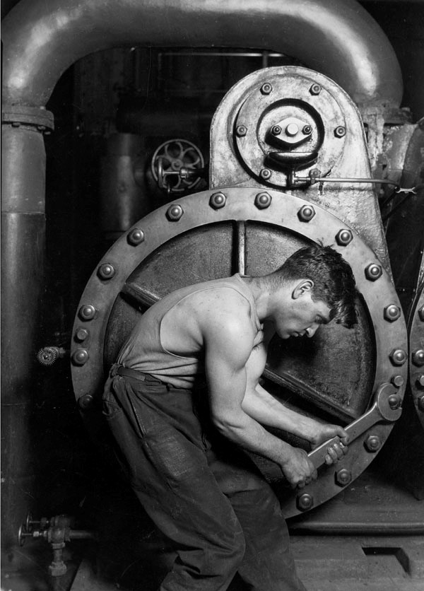
This is a great shot of an interesting subject. Everything is perfectly illuminated. It reminds me of this famous shot by Lewis Hine. |
Oct 3rd |
 |
1 comment - 0 replies for Group 64
|
| 67 |
Oct 19 |
Comment |
Larry, as usual, great shot and great story.
see group 33 this month, where Ken Carlson is working on a similar shot. |
Oct 8th |
1 comment - 0 replies for Group 67
|
| 73 |
Oct 19 |
Comment |
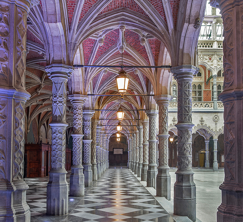
Hello Tim, I am visiting from Group 32. This is a stunning composition, and it's wonderful to visit far away places in these dialogue groups. I love empty corridor shots, and I think this one is straight down the center--would you comment on when you prefer to shoot down the center and when you like to be off to one side a bit? Thanks.
Minor comments from an amateur (me) to a professional (you): I thought it was a bit too light, so below is a version with the highlights darkened a tiny bit. How do you view this choice?
Also, I can't get away from a "feeling" that the arches are flaring outwards, even though they are perfectly straight--I assume you adjusted the perspective. I am wondering if my reaction is my brain expecting a vertical convergence of lines; and when not finding it makes a mental interpretation of the outward flare--is this crazy to think? Therefore, I tried a tiny bit of inward skew below, to settle my brain.
I would really like to know your thoughts on this. Thanks so much. |
Oct 23rd |
 |
1 comment - 0 replies for Group 73
|
| 77 |
Oct 19 |
Comment |
I agree with what your colleagues have said about your finished image. It's very successful.
But I want to suggest that if you have a chance to work with these two again, or another two, that you explore the original image's basic pose. I think arms akimbo is a dramatic and interesting pose. You might consider dressing both models in black tights and showing all four elbows. The nearly infinite complexity of that pose is fascinating.
Also consider finishing it in b/w. |
Oct 11th |
1 comment - 0 replies for Group 77
|
| 78 |
Oct 19 |
Comment |
Richard, please see Peggy Reedar's work in Group 22 this month. You are both working on panning, although with slightly different subjects. |
Oct 9th |
| 78 |
Oct 19 |
Comment |
My daughter is an equestrienne and all of Brenda's comments resonate with me. Yes, flying hair (unsafe), good leg, exciting position--all make a great shot. I agree with Brenda, let's see more of these. |
Oct 6th |
| 78 |
Oct 19 |
Reply |
I understand now, Brenda, the ND filter was for getting a longer exposure to smooth the water. Lesson for me! Graduated filters are often used when the sky is brighter and the landscape below is darker.
Interesting to me that I was evidently wrong about the color of morning and evening light.
About your reply to Richard, each filter cuts out a certain percentage of light. After the light passes the first filter (reduced), the remaining light is subject anew to light reduction by the second filter. Hence multiplication. The same concept applies to stacking lens extenders--a 2X stacked with a 3X give a net effect of 6X. |
Oct 6th |
| 78 |
Oct 19 |
Comment |
I think this is a highly successful shot, resulting in an impressionistic image of the horse and rider. The synchronicity of flying mane, flying hair, and flying tail is just great.
Only one suggestion. You shot at 1/60. How about 1/100 to freeze the rider a bit more, but still show motion in some parts of the horse's legs. |
Oct 2nd |
| 78 |
Oct 19 |
Comment |
Wonderful shot, Brenda.
Can you explain a little more? Why a ND filter? Was it graduated so you could get the sky and buildings in one exposure? Also, did you do any perspective adjustment in post-processing?
Finally, Richard assumes you shot in the morning, and I think so too, believing that morning light is yellow and sunset light red, but please tell us when you shot.
Thanks. |
Oct 2nd |
4 comments - 1 reply for Group 78
|
| 81 |
Oct 19 |
Comment |
Hello Angela,
I am visiting from Monochrome Group 32. This is very impressive, filling up the whole frame with the spray.
I am referring you to two other ocean spray images in the groups this month, for your interest:
Larry Treadwell in Group 67, and Ken Carlson in Group 33. |
Oct 22nd |
| 81 |
Oct 19 |
Comment |
Subtle and profound. You find the large in the small. Well done. Great title also--I advocate for good titles--look how the title explains the relationship between the large and the small. |
Oct 8th |
2 comments - 0 replies for Group 81
|
| 87 |
Oct 19 |
Comment |
I adore shots like this. I shoot "jumbles" a lot myself. Your b/w choice makes this very effective. |
Oct 1st |
1 comment - 0 replies for Group 87
|
| 88 |
Oct 19 |
Comment |
Wow! 1/6 second. Were you able to brace the camera against something stable? This is a very effective composition with all its receding lines.
You said "basic" adjustments? No perspective adjustment?
This also looks like a good b/w shot. |
Oct 1st |
 |
1 comment - 0 replies for Group 88
|
| 90 |
Oct 19 |
Comment |
Also, see a similar effort this month by Mike Cowdrey in Group 18. |
Oct 8th |
| 90 |
Oct 19 |
Comment |
Great as is. But if you want more, how about flipping it left for right, and then combining the two images with the tree trunks touching near the top? |
Oct 1st |
2 comments - 0 replies for Group 90
|
| 92 |
Oct 19 |
Comment |
Your perspective shot angle is very good. But why f/3.5 and 1/1000? Why not f/16 and 1/50 to increase depth of field? If you shot at f/16, you could focus at 25 feet and get everything sharp from near to far. If you used a tripod (or set the camera down) and had f/22, you could do even better with depth of field. |
Oct 1st |
1 comment - 0 replies for Group 92
|
64 comments - 10 replies Total
|


