|
| Group |
Round |
C/R |
Comment |
Date |
Image |
| 1 |
Sep 19 |
Comment |
This is a fine story-portrait. I think your man is working on one of the big office manual machines I learned to type on in the late 1950s.
Since color is not really the main subject matter, I tried switching to b/w. What do you think? |
Sep 1st |
 |
1 comment - 0 replies for Group 1
|
| 14 |
Sep 19 |
Comment |
I don't mind the divided composition--it is rarely done, but can be very effective. However, I think the horizontal line would look better if it were perfectly level.
I particularly like the diagonal stair in the top half, so you have rectangles, a half circle, and a diagonal--all very interesting. I also like the two light sources.
Nice going with that compact and excellent Canon G--my shooting choice as well.
Did you get to see the Chora Church? |
Sep 12th |
1 comment - 0 replies for Group 14
|
| 24 |
Sep 19 |
Reply |
Well, perhaps as I said, this is too much a personal view of mine, or the way my eye works. |
Sep 13th |
| 24 |
Sep 19 |
Reply |
Perhaps my opinion is too personal. But see Scott Messer's image this month in Group 88 as an example of the distinction I am suggesting. Do let me and us know what you conclude if you discover any interesting information.
I did do a bit of reading on the subject, and while there is no difference between dawn and dusk for the effect of sunlight slanting through the atmosphere, there may be slight differences due to calm morning air vs. the evening air after a day of winds raising dust into the air. |
Sep 13th |
| 24 |
Sep 19 |
Comment |
What a beautiful and rugged terrain you have captured. You did well with the location you were in, and cropping out the section of discolored pavement was wise.
My only thought is about the colors of sunrise and sunset. I think sunrise is usually tinted yellow, and sunset red. So I think you have made your sunrise shot into a sunset shot. That's OK, of course, but if you want to express sunrise, I suggest adjusting color a bit less. |
Sep 12th |
1 comment - 2 replies for Group 24
|
| 25 |
Sep 19 |
Comment |
The main thing here is that you have a great pose and good lighting. Nice job.
I am in Monochrome Group 32, and always looking out for suitable monochrome subjects. Portraits are good candidates. How do you like this in monochrome? |
Sep 12th |
 |
1 comment - 0 replies for Group 25
|
| 30 |
Sep 19 |
Comment |
Very good pose and expression, but shooting against a bright sky washes out the tones somewhat. I think flash fill would have worked here, or else spot meter on his face. |
Sep 11th |
1 comment - 0 replies for Group 30
|
| 31 |
Sep 19 |
Comment |
I like this as captured because the bonfire itself seems to have a human form. A bit too bad the person in front of it is looking at their phone. |
Sep 11th |
1 comment - 0 replies for Group 31
|
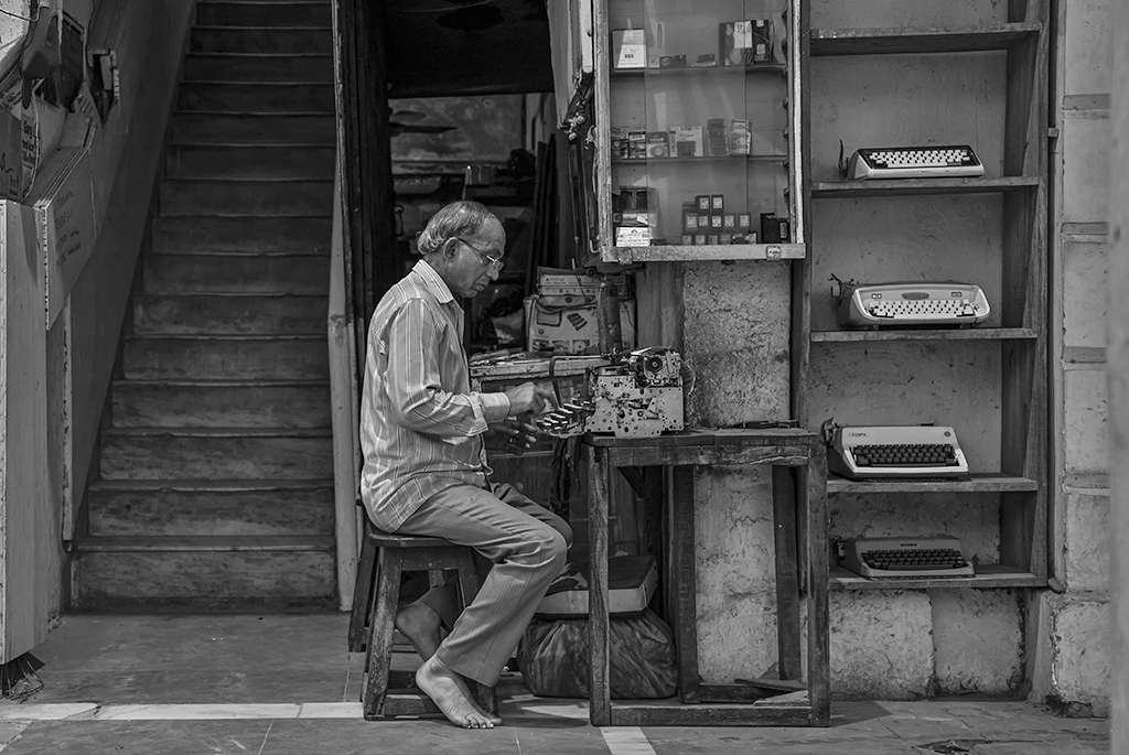
| 32 |
Sep 19 |
Comment |
Good setting to show the man and his work. Can you go back and try again with better light? Perhaps you could have used flash fill.
In this shot, the reflections on his glasses obscure his eyes somewhat, and I can't make them out. |
Sep 11th |
| 32 |
Sep 19 |
Comment |
I think this is a pleasant enough shot, given you could not arrange the bottles. You might have gotten a little elevated to look a bit more down on the open tops, and set the lens to a wider angle to get some variation in the shapes of the open tops. I am basing this on a classic shot I have seen in a museum photo exhibit. Of course if you can get your own bottles and arrange them as well... |
Sep 11th |
| 32 |
Sep 19 |
Comment |
OK, I will take a crack at this. It's the eyes. I don't get an understanding of what their eyes are doing, expressing, or looking at.
1. With those faces and stares, either one of them alone, looking straight into the camera, would make a great shot.
2. In this shot, they do not quite seem to be looking at the same thing, and if they were, I would like to see it in the shot. The younger woman is not quite glaring at the older women enough to support the title.
3. Maybe they could be glaring hard straight at each other.
Processing is excellent, as usual! |
Sep 11th |
| 32 |
Sep 19 |
Reply |
Ha Ha. Same with me this month. I never noticed I did not quite have the entire circular mirror in the frame--it would have been so easy to just look and see what I was getting. Also with that bulkhead--I could have easily moved three inches to eliminate it.
BUT, I did learn from the past, and I flipped the image left-for-right so my camera name would be readable. |
Sep 5th |
| 32 |
Sep 19 |
Comment |
Jennifer's suggested changes make a dramatic difference. It enhances the "personality" of the gazebo. |
Sep 5th |
| 32 |
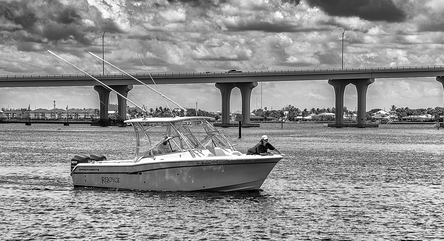
Sep 19 |
Comment |
Having your subject in an odd position on the boat makes the picture unique. And the clouds are great in the b/w version.
I rotated it 1.5 degrees to the right to level the horizon. I used PS Elements and displayed a grid to make it easy to see the level point. |
Sep 5th |
 |
| 32 |
Sep 19 |
Reply |
Hi Larry, thanks for coming by. Those are good suggestions for next time. Everyone says that street photography is hard, and I am fast learning that is the case. |
Sep 3rd |
| 32 |
Sep 19 |
Comment |
Thanks for taking us on a visit to this attractive and interesting place. The diagonal roof line makes for a captivating composition. |
Sep 1st |
| 32 |
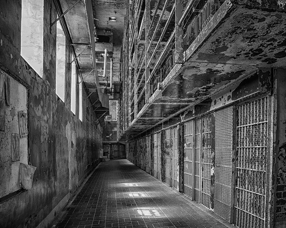
Sep 19 |
Comment |
This is a nice serene shot, and I think your post-processing did a nice job of reducing the excessive contrast between the mostly shady scene and the splotches of sunlight.
I like empty architectural shots, so the lack of humans in this shot is, to me, a good choice. |
Sep 1st |
7 comments - 2 replies for Group 32
|
| 45 |
Sep 19 |
Comment |
I love architectural shots of empty places, expressing tranquility, or in this case perhaps a loneliness of history.
I'm in monochrome group 32, so I tried changing this to monochrome. That great red is gone, of course, but I think monochrome tells a slightly different story--for your consideration. I also applied a tiny bit more skew. |
Sep 10th |
 |
1 comment - 0 replies for Group 45
|
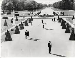
| 58 |
Sep 19 |
Comment |
Having also shot people and their shadows in the bright summer sun in Istanbul, this image resonates with me a lot. I like the strong contrast, although it might be a bit too much. It reminds me of the famous shadow/shadowless still for the 1961 film, Last Year at Marienbad, dir. by Alain Resnais, in which the people cast sharp shadows, but the bushes and statues do not. Perhaps that is a bit of a reach, but I immediately thought of that film. |
Sep 9th |
 |
1 comment - 0 replies for Group 58
|
| 59 |
Sep 19 |
Comment |
Nice action shots. If you don't care about photo-journalism requirements to not alter images, I suggest you merge the two images. |
Sep 9th |
1 comment - 0 replies for Group 59
|
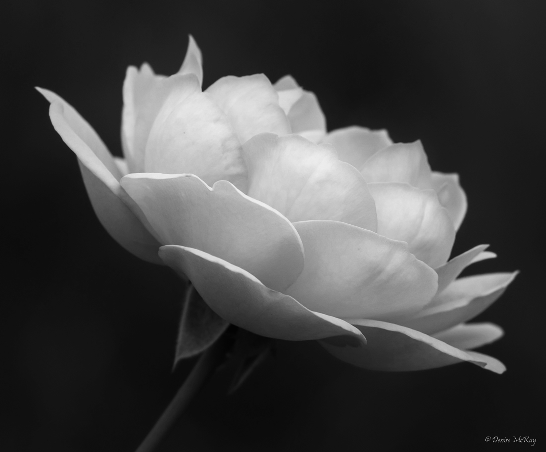
| 60 |
Sep 19 |
Comment |
Nice shot, and truly unique to focus on the outer rim of the petals--I think you made that work very well.
I'm in Monochrome Group 32, and I am always on the lookout for color shots that also work well in monochrome. Here is you shot in monochrome, more contrast, and a touch of sharpening. |
Sep 9th |
 |
1 comment - 0 replies for Group 60
|
| 67 |
Sep 19 |
Comment |
Hello Larry, again you have given us a wonderful narrative of your personal experience and the techniques you used. I am very fond of phenomena, so this is a real treat.
Here are a couple of questions:
1. I *think* I can see a secondary bow in this image. Or am I staring at my screen too much?
2. You mentioned "focused on infinity." My lenses from 50 years ago used to be marked with depth of field indicators, so one could focus at 30ft at f11, and get everything in focus from 15ft-infinity--an approximation from memory. Has something changed to make my old method not preferred? |
Sep 4th |
1 comment - 0 replies for Group 67
|
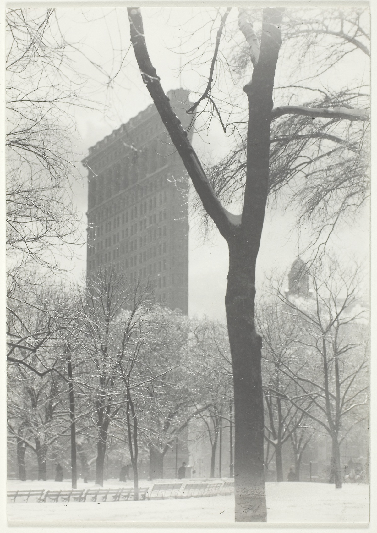
| 74 |
Sep 19 |
Comment |
This is a great shot of this famous building. I really like that you left in the clock in the foreground to anchor the building in its local setting, and maybe to suggest that it has been there a long time (since 1902). For historical reference, here is Alfred Stieglitz's 1903 shot. |
Sep 7th |
 |
1 comment - 0 replies for Group 74
|
| 75 |
Sep 19 |
Comment |
Nicely done. A very fine personal memory. |
Sep 7th |
1 comment - 0 replies for Group 75
|
| 77 |
Sep 19 |
Comment |
I really like the curved line of boats--it is a unique way of demonstrating the sort of line usually found in shots of country road curves.
I don't mind the anchors, but agree that the partial bird should be removed.
Also, I suggest not quite so much vibrance and saturation--they hit me in the eye a bit too much. |
Sep 7th |
1 comment - 0 replies for Group 77
|
| 80 |
Sep 19 |
Comment |
I have been trying street photography the last two months, and I am finding it very hard to get a good shot. Most of mine have flaws, even if I ask people to pause and pose.
This shot is good with the man sitting in an alcove, and rapt in his phone, especially since he is old, and that is usually the behavior of younger people. The cropping is perfect.
On the other hand, a more frontal shot might have been better, with a fuller view of his face. Also, a nice contrast might have been if he were surrounded by activity that he was not noticing by looking at his phone. Just ideas.
(I am still envious of all your travels, especially Cuba.) |
Sep 6th |
1 comment - 0 replies for Group 80
|
| 88 |
Sep 19 |
Comment |
I like the softer look of the distant hill as is, as it shows the aerial perspective of distance, which is actually there. But if one of you would like to show a sample of more dynamic contrast, I would like to see the effect.
On the other hand, it would be nice if the clouds could pop more. Am I asking too much? |
Sep 5th |
1 comment - 0 replies for Group 88
|
23 comments - 4 replies Total
|


