|
| Group |
Round |
C/R |
Comment |
Date |
Image |
| 1 |
Jun 19 |
Comment |
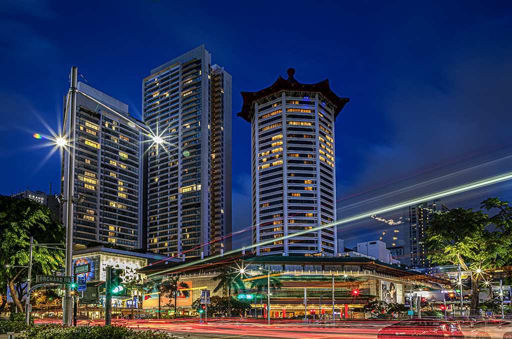
Here is the perspective-adjusted version. Anyone can take their pick of how they like the two versions. I prefer the soaring effect of the original, but many folks will prefer the adjusted version.
I just want to point out that parallel lines receding from the camera (or you eye) will always appear to converge. We are used to that for horizontal parallel lines (receding streets or buildings to the left or right), but are sometimes uncomfortable with the same for vertical parallel lines, but all such perspectives are correct and are what both we and the camera actually see. |
Jun 21st |
 |
| 1 |
Jun 19 |
Comment |
I like very much that you left unchanged the vertical perspective, to give the tall buildings a feeling of soaring upwards. I don't like perspective alteration of tall buildings, except for commercial real estate photographs--where it seems to be mandatory. |
Jun 7th |
2 comments - 0 replies for Group 1
|
| 5 |
Jun 19 |
Comment |
Very nice juxtaposition, in all the ways already mentioned. I like, or don't have any concerns about, the out of focus human in back. In a way, that adds another layer of juxtaposition. Here they all are: metal vs. flesh, near vs. far, large vs. small, facing left vs. right, below the wall vs. above the wall, AND in-focus vs. blurred.
Also, you nailed the perfect angle to keep the statue below the top edge of the wall. Nicely done. Sharp eye! |
Jun 20th |
1 comment - 0 replies for Group 5
|
| 18 |
Jun 19 |
Comment |
This has a lot of impact.
There are a lot of rain and falling water images throughout the Digital Dialogs this month. What was your shutter speed? |
Jun 16th |
| 18 |
Jun 19 |
Comment |
Ian has made a full disclosure of the source of his image he has posted in our Digital Dialogs. Whether his adjustments are successful or interesting is a matter for his group colleagues to comment on. I have just re-read the "Guidelines" (see the button at the top of this page). There is nothing to suggest we can't shoot other art, and then discuss with each other how well we have done that. I shoot statues all the time and ask my group colleagues to comment, because point of view, and lighting management are things to work on. Lots of our members shoot wall art and graffiti when they travel. I think shooting other people's art is fair game and fair for discussion, as long as you tell the story of what it is, what you are trying to do with it, and what advice you are seeking. |
Jun 16th |
2 comments - 0 replies for Group 18
|
| 22 |
Jun 19 |
Comment |
This is a great idea and so much fun. How about putting in one small sign that is a joke, that will bring people up short if they actually read it. Like, moving the decimal point on one of the gas pumps over one place to make the price 10 times higher, or "Road Work 2000 miles." |
Jun 16th |
1 comment - 0 replies for Group 22
|
| 29 |
Jun 19 |
Comment |
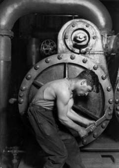
This is a great shot.
Here is a classic by Lewis Hine called "Power House Mechanic." From the early 20th century. |
Jun 16th |
 |
1 comment - 0 replies for Group 29
|
| 30 |
Jun 19 |
Comment |
Great idea for this shot. I suppose I could look up terminal velocity of falling raindrops and calculate the exposure time, but I would rather just ask you the shutter speed--I am guessing 1/15 from what other DD photographers have done? |
Jun 15th |
| 30 |
Jun 19 |
Comment |
This was a great idea to shoot. Look at how much discussion and variety of ideas you and your group are coming up with. Good job looking around and SEEING. |
Jun 15th |
2 comments - 0 replies for Group 30
|
| 32 |
Jun 19 |
Comment |
Hello Gloria, welcome to the group. I am originally from upstate: Albany, Syracuse, and Binghamton University (1967, when it was originally Harpur College).
This is a pleasing shot of a sculpture. I very much like to shoot sculptures as well, finding the lighting and point of view interesting problems to solve.
Would you like to show us another version of your shot, according to your discussion with Tom? |
Jun 18th |
| 32 |
Jun 19 |
Comment |
I like what Diana has done to lighten up the building. Her suggestion to shot it again in HDR sounds good, or maybe on a different day with better clouds and shoot with a filter to enhance the excitement of the sky. Before HDR, people shot with graduated neutral density filters. |
Jun 10th |
| 32 |
Jun 19 |
Comment |
Yes, good choice of light on the boy's face. An entirely pleasing shot. |
Jun 10th |
| 32 |
Jun 19 |
Comment |
I agree with all of Diana's comments. Attractive shot. |
Jun 10th |
| 32 |
Jun 19 |
Comment |
I see the tail feather problem, but I think it tunes out mentally when on looks directly at the Egret's eye. I am particularly impressed also with the perfect position in the frame left to right, and top to bottom--there is just enough space all around for the image to breathe. |
Jun 10th |
| 32 |
Jun 19 |
Comment |
Your framing and cropping are always right on. You asked about the versions. The sepia and old-style photograph edge work well together. I think the staight b/w is good also, but should only have a simpler stroke around it. I note that you made sure to get a full view of your model's eyes through her specs--well done. If the model was posing as a tradeswoman, than another shot of her with her trade tools might have been interesting--see Irving Penn's portrait series on "Small Trades." |
Jun 10th |
6 comments - 0 replies for Group 32
|
| 51 |
Jun 19 |
Comment |
This is a fine and interesting shot and concept. For a connection to another art form, read "Spoon River Anthology" by Edgar Lee Masters, a collection of poems inspired by the tombstones of the dead in a fictional small rural American town. It's hundredth anniversary of publication just passed. It is a masterpiece of poetry, and exposes the souls, sins, and foibles of its fictional subjects to memorable depth. |
Jun 13th |
1 comment - 0 replies for Group 51
|
| 53 |
Jun 19 |
Comment |
Yes, and yes.
First of all, you got a really fine shot and from your lighting explanation showed you managed that very well with a good result.
The light splashes on the back door tells the story of where this is taking place.
Showing more of the sheep tells the story of what is happening, and especially to whom.
I suggest taking only 5% off top and bottom of your original. |
Jun 13th |
1 comment - 0 replies for Group 53
|
| 64 |
Jun 19 |
Comment |
Very nice capture, and I like that the composition is a bit to one side.
Jerry's comment about eliminating the sign is worth considering, but then you would have to remove the two benches and the small sign in the distance. |
Jun 4th |
1 comment - 0 replies for Group 64
|
| 67 |
Jun 19 |
Comment |
Larry, I came to view this pretty late this month, but my first thought was, "Must be the Smoky Mountains." You captured their essence.
I really enjoyed your story-telling about shooting this. You always tell the whole story. Also, great discussion with your group colleagues.
I'm in monochrome group 32--I love your monochrome version--it expresses things differently, doesn't it? |
Jun 28th |
1 comment - 0 replies for Group 67
|
| 74 |
Jun 19 |
Comment |
You did very well posing your model. Both her feet have beautiful and graceful toe points. It is very easy to catch the wrong angle on this and make a ballerina's feet look like lumps. |
Jun 28th |
1 comment - 0 replies for Group 74
|
| 76 |
Jun 19 |
Comment |
Nice going, Tyler. You are being very ambitious in your composition. Your group colleagues have given you some great ideas and suggestions. One thing to consider is to include a very near foreground as a dramatic contrast with the distant sun. You can try flash fill for the foreground. |
Jun 28th |
| 76 |
Jun 19 |
Comment |
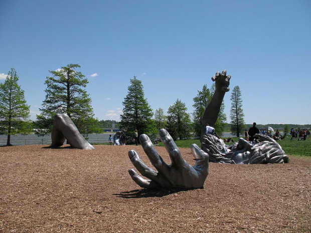
I think the finished crop is a bit too tight. I like that the original showed the extent of the art museum structure.
Compare this to our five-piece statue here in Washington, DC, "The Awakening." |
Jun 12th |
 |
| 76 |
Jun 19 |
Comment |
I love those long shadows. |
Jun 12th |
| 76 |
Jun 19 |
Reply |
Sorry to digress from the subject image, but I want to reply to Sanford's reference to Ara Gülar. My wife is Turkish and we summer vacation in Turkey every year. I also admire the work of Sedat Pakay, who passed away recently. He did a major series of images of James Baldwin in Istanbul. Do you know that work? |
Jun 10th |
3 comments - 1 reply for Group 76
|
| 78 |
Jun 19 |
Comment |
You folks have been having a great creative and collegial discussion about this shot. I love the last b/w! |
Jun 17th |
| 78 |
Jun 19 |
Comment |
You had choices with this fine portrait.
a. As is, a smiling gentleman with smooth skin.
b. B/W with roughened skin, as you did, suggesting a hard outdoor life, but still smiling. I don't find the skin overdone if that is your goal, but...
But, your model shot showed a man who clearly had a hard life experience. I don't think your smiling man quite fits with that concept, with his smile and happy eyes. So I find that a bit inconsistent with the idea of the rough skin. |
Jun 4th |
| 78 |
Jun 19 |
Comment |
This is a really interesting project--to do (or simulate) art restoration in PS. I like either your original restoration, or the one that Alan and Sunil are working on. I can see your original restoration 8'x12' decorating an entire mural wall of a room.
I suspect the black area represents an actual mountain skyline somewhere in NM. |
Jun 4th |
| 78 |
Jun 19 |
Comment |
I think Richard has the right idea to crop out the tree-tops. Otherwise, I like the colors more or less as taken--subdued--to match the subject matter and pose.
One small suggestion. Consider removing that navel bulge on your model. It is entirely natural in a modern portrait of pregnancy, but IMO not consistent with the picture story you are telling with that costume. Just my reaction. |
Jun 4th |
4 comments - 0 replies for Group 78
|
| 80 |
Jun 19 |
Comment |
How lucky you were to get to Cuba. My wife and I just had our trip there cancelled do to an incompetent travel agent, and now there are new restriction. Well, we hope to make it there sometime. So many of the Digital Dialog members have been showing great shots from their travels.
I think your concept on this was great: the corridor and arch, the lit courtyard, and the social scene within. This was a fine concept. Keep shooting like this. |
Jun 7th |
1 comment - 0 replies for Group 80
|
| 87 |
Jun 19 |
Comment |
Hi Lance. The Taos Pueblo is immediately recognizable in this image, evoking the history of photography. You certainly made a highly original shot with your point of view and use of the sun. |
Jun 7th |
1 comment - 0 replies for Group 87
|
| 88 |
Jun 19 |
Comment |
You used the wide-angle to get the architecture right into the foreground and contrast it against the distant view. Well done. |
Jun 7th |
1 comment - 0 replies for Group 88
|
30 comments - 1 reply Total
|


