|
| Group |
Round |
C/R |
Comment |
Date |
Image |
| 2 |
May 19 |
Comment |
You captured a great shot, with both horse and rider's face in clear view.
I suggest anyone interested in horse motion to go look at websites of the great early photographer, Eadweard Muybridge, who did the first photographic motion studies of animals and people. In your shot, the hind legs are coming down to get ready to push from the rear and the forelegs are coming up to get ready to reach forward. Although it is easy to see that a galloping horse has all four feet off the ground at the same time (as in your shot), that is also true of the canter and trot--but it took Muybridge's work to settle that question, especially for the trot. |
May 10th |
1 comment - 0 replies for Group 2
|
| 3 |
May 19 |
Comment |
I think your choice of 1/8 second to show motion is quite successful. I don't mind that there is no point of sharp focus. But if you want to work on the problem, as your group colleagues suggest, consider that motion is more blurred as it moves left/right, but not so much as it comes directly towards you. You could try the same shot from a head-on angle, and then the subjects would be less blurred--but of course you can't get this side-view of the action. You can also try shooting at a faster shutter speed and then using post-processing zoom to simulate some motion. |
May 10th |
| 3 |
May 19 |
Comment |
What a great shot this is, with this very useful technique. If you browse through the DD groups, you will see one or two shots using this technique every month. Some do it in the camera as you did, and some use post-processing. In the latter, you can choose the diameter of the region to zoom and the magnitude of the zoom. |
May 10th |
| 3 |
May 19 |
Comment |
Wonderful shot. This is one of my local airports, so I know it well. Sometimes my wife and I take the grandchildren here to see the planes landing and taking off.
I can't guarantee that the architects did this on purpose, but the series of connected domes forming a long hall is exactly the same architectural element as used in Ottoman buildings in my wife's country, Turkey.
You say in your bio, "J'utilise la photographie pour ... reduire le stress de mon style de vie tres occupee." Ca va? |
May 10th |
3 comments - 0 replies for Group 3
|
| 4 |
May 19 |
Comment |
How is it that the lightning bolts have much the same color as the interior lights of your hotel? Was this wonderful correspondence a natural accident or the result of your post-processing? In any case, it looks absolutely great. |
May 8th |
1 comment - 0 replies for Group 4
|
| 5 |
May 19 |
Comment |
I would like to add that this model looks vibrantly REAL in your shot. She seems very relaxed and direct with the photographers, and you caught that. Also, I would like to praise you for showing her with real skin with real pores. |
May 8th |
1 comment - 0 replies for Group 5
|
| 6 |
May 19 |
Comment |
I love pictures of knots made of ropes with great color and texture like this, being myself a rope and knot hobbyist. Suggest you try this some more and improve the depth of field, like Dick suggested. Also, the figure-of-eight knot, the central subject of the shot, is an incredibly beautiful knot--I suggest you isolate it more, especially to get rid of the extra piece of solid orange rope that confuses the pure view of the figure-of-eight knot. |
May 8th |
1 comment - 0 replies for Group 6
|
| 13 |
May 19 |
Comment |
Great shot, and very successful panning, in a way I have never seen before. I think I figured out the physics of this. You were panning right to left to exactly match the first rider. The second and third rides are further back in their turns, so still have a significant component of motion towards you--hence less motion right to left. So you over-panned for them. This is confirmed by the greater blur of the third rider, who is furthest back in the turn and has the least right to left motion. For anyone who took physics, this is vector analysis. Your end result is truly fascinating and a good hint for a special panning technique for all of us. |
May 16th |
1 comment - 0 replies for Group 13
|
| 14 |
May 19 |
Comment |
Hi Gregory, I am visiting from Monochrome Group 32. I am always interested in shots in which the photographer chooses monochrome. You have made this so much more dramatic than the original, doing what is sometimes called a "day for night" swap: this looks like a brightly moonlit scene. You also did well to crop down a bit. Great job all around. |
May 8th |
1 comment - 0 replies for Group 14
|
| 23 |
May 19 |
Comment |
|
May 16th |
 |
| 23 |
May 19 |
Comment |
This is a charming shot, and shows a problem with outdoor shooting that we all have. Some folks will use "flash fill" to solve the problem, or meter for the faces and let the background come out a little too bright.
Without selecting each face in PS, I used "lighten shadows" overall, and improved the faces a bit, I think. How does this look to you? |
May 16th |
| 23 |
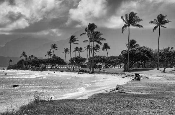
May 19 |
Comment |
I like everything about your submitted shot: lighting, silhouette, skirt, pose. Just one minor but very noticeable thing to try to improve next time. Look at your well-lit shot of the woman dancer alone, and note the curved profile of her back-extending foot. That beautiful dancerly foot posture is missing from the silhouetted couple image. In fact, her upraised foot looks rather lumpy, whereas it should be the crowning and graceful point of the image. If you try this again, consider directing the dancers to show a better angle. |
May 15th |
3 comments - 0 replies for Group 23
|
| 28 |
May 19 |
Comment |
Great shot. Since you model is in a cabin, the light source must be an open window or door. Yes? Is it direct sunlight or diffuse? |
May 22nd |
1 comment - 0 replies for Group 28
|
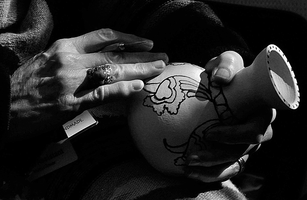
| 29 |
May 19 |
Comment |
Hi Bill, I am visiting from Monochrome Group 32. You have a fine composition and great lighting on this shot. I also like the idea of making a portrait of a person showing only their hands and their craft. Because the lighting is so great on this shot, I tried it in monochrome, adjusting overall brightness and contrast, and sharpened it a bit to bring out the texture in the artisan's hands and the pot surface. Here it is for discussion. |
May 7th |
 |
1 comment - 0 replies for Group 29
|
| 30 |
May 19 |
Comment |
A few other members of the various DD Groups have shot polo matches over the years, and it is really hard to catch a good moment. For all the minor problems you all have been discussing, you were incredibly fortunate to get a fairly good shot on your first time out. The last time I asked someone how many shots they took to get the one they showed, the answer was "300." |
May 7th |
1 comment - 0 replies for Group 30
|
| 32 |
May 19 |
Reply |
Hi Pete, nice to hear from you. Thanks for the hint and sample work. It looks much improved. I checked out how to do this; I had no idea that one could open an image file in this special mode. Thanks! |
May 22nd |
| 32 |
May 19 |
Comment |
So now I have the direct experience of why I should shoot in RAW. I shot this as a JPG, and I don't think there is enough there to work with, at least for my PS skills. I will take this under advisement for the future: shoot more in RAW, and watch out for sharp and deep shadows. |
May 21st |
| 32 |
May 19 |
Comment |
Thanks, everyone, for the analysis. While I don't do salons and therefore do not care about suitability for them, I am concerned to take a good museum shot as a record of my tourism. So your comments about the harsh lighting are very helpful. I think the human eye has more latitude than the camera, so it was not so obvious in person. If the museum permitted a bounce or fill flash perhaps that would help, or maybe another person could hold some sort of discreet light by hand. Other than that, does anyone have any thoughts as to how to improve this situation. Post-processing? But I don't see how that would unsharpen the shadow line, even if it lightened the area in shadow? |
May 20th |
| 32 |
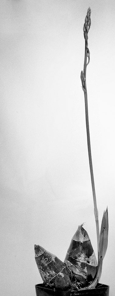
May 19 |
Comment |
I cropped according to my study of Robert Mapplethorpe's floral photographs. He was very aggressive with the way his flowers interacted with the boundaries of his frames. |
May 12th |
| 32 |
May 19 |
Comment |
Indeed you should push the envelop a bit, as we all should. I find this very interesting, but it makes me feel crowded in the frame. I think I would have shot it from further back, but then again, I don't know if my composition would have been interesting. Next thought, how about pushing further, like this? |
May 10th |
 |
| 32 |
May 19 |
Comment |
Good point about the landscape format. I agree your original format would be best (it is a very grand view), if there had been a suitable foreground for it. |
May 10th |
| 32 |
May 19 |
Comment |
Like I just mentioned to Diana, maybe some more attention to placing a flowering shrub in the foreground, but this is the shot you have now. I rotated left 1.25 degrees to straighten the tower, then applied PS controls overall to lighten darks, increase brightness, and sharpen a bit. What do you think? I have never replaced a sky, but what about working on the sky? Tom has done a lot with sky; maybe he can chime in here. |
May 10th |
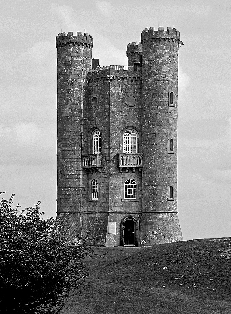 |
| 32 |
May 19 |
Comment |
Looks great, but here is my only thought. It lacks a foreground to make the viewer understand the great expanse of the middle and background. I cropped what you had, to place that tuft of grass in the foreground, but it would be better if were more substantial flowering bushes. Your thought on this composition, and this compositional problem in general? |
May 10th |
 |
| 32 |
May 19 |
Comment |
Hi Tom. This is a really interesting transformation. The color shot is an ordinary old building shot, but the change to b/w makes it entirely different. More contrast, more formal, and it seems sharper. |
May 2nd |
8 comments - 1 reply for Group 32
|
| 34 |
May 19 |
Comment |
Fascinating image. And interesting that you were inspired by a 1965 movie. This also reminds me of an old movie--2001: A Space Odyssey, made by Stanley Kubrick in 1968, with screenplay by Arthur C. Clarke. In the final scene, Keir Dullea, as a old man, is marooned in a space of magical reality in which moving from one room to another only brings him back to the same room he was already in. |
May 6th |
1 comment - 0 replies for Group 34
|
| 37 |
May 19 |
Comment |
Lovely image, and very attractive at night. Funny you should bemoan the lack of people milling about, as in most such images I have seen in our DD Groups, the photographers complain that it was hard to get a clear shot of the architecture because of the excessive number of people milling about. I like this just the way it is, with a touch of life seen through the windows of the patrons inside. I very much like the progressing from light to dark as the eye travels up the structure and eventually to the black sky. |
May 6th |
1 comment - 0 replies for Group 37
|
| 40 |
May 19 |
Comment |
I find three wonderful things happening in the DD groups, as we share our stories: 1) we discuss the images, 2) we tell the stories of the places, and 3) we share our feelings about having gone there and taken the pictures. Thank you so much for telling us the legend of this place. |
May 14th |
1 comment - 0 replies for Group 40
|
| 42 |
May 19 |
Comment |
Hi Lynne, I am visiting from Monochrome Group 32. How I wish I had made a trip to Cuba recently--so many of the DD members are showing great images from their travels there. This is a captivating image--especially the headless statue on the bannister--and almost monochrome, so I tried it all the way. I straightened the verticals a bit, adjusted overall brightness and contrast to taste, and added a tiny bit of sharpening. How do you like it in monochrome? |
May 14th |
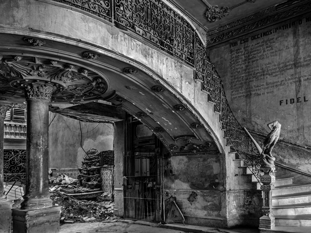 |
1 comment - 0 replies for Group 42
|
| 43 |
May 19 |
Comment |
Hi Mike, I am visiting from Monochrome Group 32. This is just a fantastic shot, all about the light, like Mark said. Your cropping was very careful and very effective. |
May 14th |
1 comment - 0 replies for Group 43
|
| 44 |
May 19 |
Comment |
I am not bothered at all by the slight downhill view--it looks perfectly natural to me.
I am so impressed with the colors--I was going to ask if you enhanced them in post-processing, but you anticipated and answered that question. I had no idea that this famous chapel produced such fantastic colors.
The mirror idea is really great, too. We have seen some excellent mirroring in past months in other DD groups. It's a great technique at the right time. |
May 6th |
1 comment - 0 replies for Group 44
|
| 45 |
May 19 |
Comment |
Hi Ray, I love how industry creates patterns, and you did very well to catch this.
In our local club, we have a catalog of hundreds of possible monthly photo topics. One of them is "Workroom Back Walls." If we were doing that topic, and if you had entered our competition, and if I were one of the judges, I would have voted you first. |
May 6th |
| 45 |
May 19 |
Comment |
I like the composition very much, both as an arrangement of shapes, and as a social exploration.
I think the brightening of the colors is a bit too much, and suggest maybe halfway between your original and your finished images. You could also consider monochrome--here is a sample. |
May 6th |
 |
2 comments - 0 replies for Group 45
|
| 49 |
May 19 |
Comment |
Hi Kata,
Great portrait. I think the drapery is done extremely well--it looks like the raw fabric for a man's distinguished suit. If that is the case, it adds an interesting nuance to a portrait of a beautiful women. If not, it still presents large attractive folds, reminiscent of drapery work in Renaissance painting, in a modern way. |
May 22nd |
1 comment - 0 replies for Group 49
|
| 51 |
May 19 |
Comment |
I love shots like this of children walking away from the camera. I think it a compositional technique far too little used. I also like both versions of your image. As Jerry says, it tells a story.
Here, for historical reference, is W. Eugene Smith's "The Walk to Paradise Garden," a shot of his kids. This image was on the back cover of the famous book version of "The Family of Man" exhibit. |
May 4th |
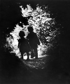 |
1 comment - 0 replies for Group 51
|
| 53 |
May 19 |
Comment |
Hi Tom. This is very successful. I particularly like the color effect you achieved. So many such shots are over-done with color intensity, and tend to lose their honesty. You have shown admirable and effective restraint to give this shot just the right amount of enhancement. |
May 4th |
1 comment - 0 replies for Group 53
|
| 59 |
May 19 |
Comment |
Just an opinion from an outsider cruising around the DD groups. I prefer the six-helmet shot because it is people that make the picture. I have seen a number of such shots, and while this one is exciting, I think you did not have the fortune to catch the best action. I think if everyone had been paddling in unison that would be a sure PJ competitor. |
May 4th |
1 comment - 0 replies for Group 59
|
| 62 |
May 19 |
Comment |
Hi Oliver,
I also often take shots of three-dimensional art, as records of my tourisms. I think it is legitimate to discuss such in these DD groups. I did that this month in Group 32, and boy, did I get a lot of comments about the problems I had with capturing a good image. Our colleagues can help us become better photographers for this purpose. Of course, as your Group colleagues have pointed out, you went quite a lot beyond a simple record shot like I did this month. Great job. |
May 22nd |
1 comment - 0 replies for Group 62
|
| 64 |
May 19 |
Comment |
I like the soaring effect of the perspective of the original image. It helps one to feel how tall those buildings are.
Additionally, that perspective (not distortion) is exactly what your eye sees, although your brain tends to remove it.
Vertical perspective works exactly the same as the two horizontal perspectives, which you are more accustomed to accepting.
Many building photographers like to alter the vertical perspective, but I don't think it can work for very tall buildings like this. |
May 13th |
1 comment - 0 replies for Group 64
|
| 76 |
May 19 |
Comment |
Just for discussion, I like to have a look at such nicely lit scenes in monochrome. |
May 13th |
 |
1 comment - 0 replies for Group 76
|
| 82 |
May 19 |
Comment |
I am not sure if you intend it, but since your title is "Beach Delivery," I wonder where the recipients of the delivery are, and if they are tourists at leisure. This implies a discussion of class--workers vs. entitled. If you intended that, it might be good to include the "others" in the image. |
May 18th |
1 comment - 0 replies for Group 82
|
| 83 |
May 19 |
Comment |
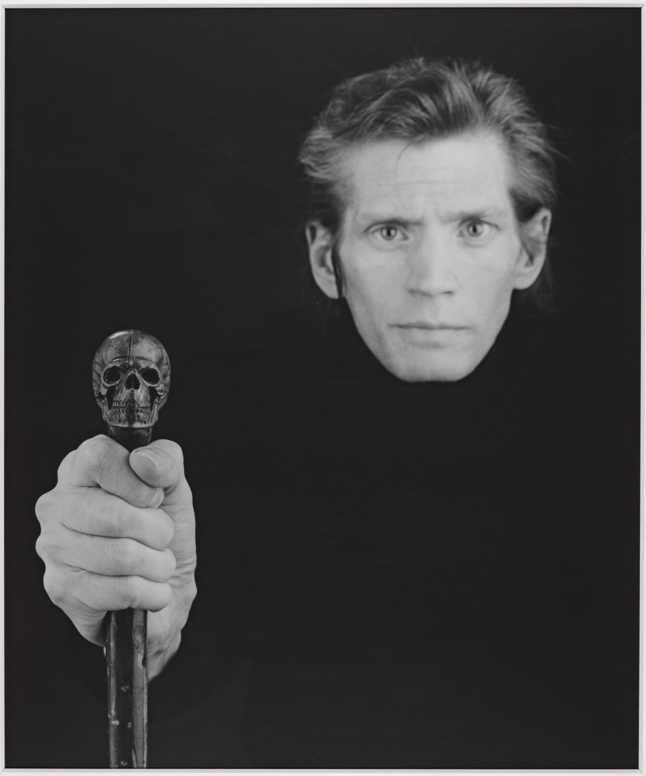
Hello Dirk, I like what you are trying to do here. Keep on with such ideas. Here, for history, is a famous self-portrait by Robert Mapplethorpe, a year before he died of AIDS. Note the death's head on his cane. |
May 18th |
 |
| 83 |
May 19 |
Comment |
Judith,
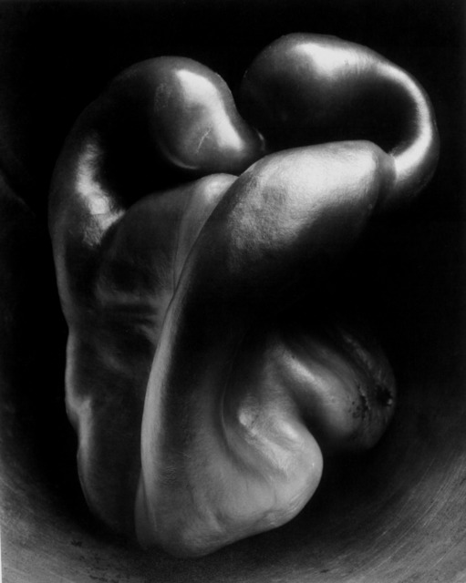
I might add that Weston's pepper has a blemish on it on the lower right side. Without a doubt this is a reminder that all living things eventually die and rot. Also, this image has had such impact that photographers have even made shots of nude people posing like the pepper--a very cute variation.
As to your other shot, I much prefer your first one.
|
May 18th |
| 83 |
May 19 |
Comment |
This is a fine sensitive portrait. You did a great job taking advantage of the open door indirect light--I love to use that also. |
May 11th |
| 83 |
May 19 |
Comment |
How about this? Not much different from Jose. But I opened up a little more empty space on the left, trying to imply an infinite open space in the mists. I centered that little tree on the top of the mountain. I am trying to imitate a lot of Chinese paintings I have seen. |
May 11th |
| 83 |
May 19 |
Comment |
Hello Judith, the conversion to monochrome utterly changes everything, from a pleasant and colorful vegetable image to an artistic discussion of equivalents and deep meaning, invoking the artists of the past that inspire us still (Alfred Stieglitz and Edward Weston). I like that you focused on the stems--very original!
For reference, Weston was one of the early 20th century photographers who sought great depth of field with small aperture. As I recall, his famous pepper shot had a seven-minute exposure. Here it is for the interest of anyone who has not seen it. I don't think I would be alone saying it is one of the ten most important photographs ever taken. |
May 11th |
 |
5 comments - 0 replies for Group 83
|
44 comments - 1 reply Total
|


