|
| Group |
Round |
C/R |
Comment |
Date |
Image |
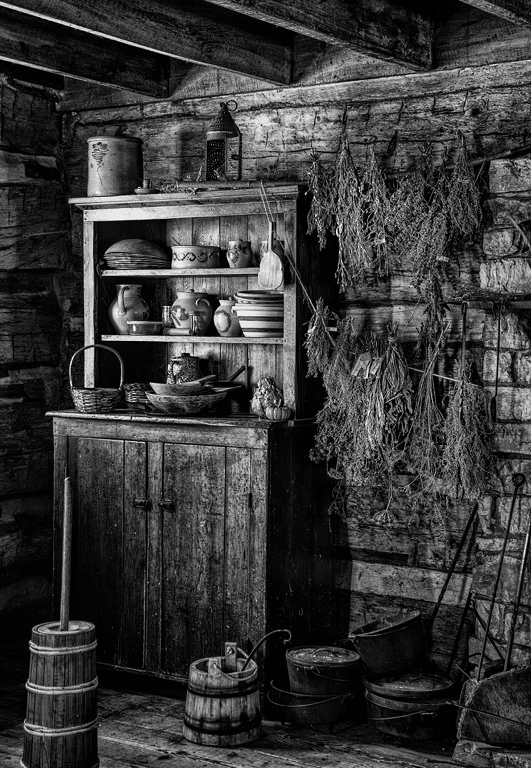
| 7 |
Apr 19 |
Comment |
Hi Tom, nice solid composition with classically good light falling on the table. Have you tried it in monochrome to see which you prefer?
--Steve |
Apr 9th |
1 comment - 0 replies for Group 7
|
| 11 |
Apr 19 |
Comment |
This is a wonderful story and a fantastic shot. Thanks for the great narrative--too many PSA members fail to tell their stories, which are so valuable. Well done. |
Apr 8th |
1 comment - 0 replies for Group 11
|
| 24 |
Apr 19 |
Comment |
I very much like this shot, especially the decision to use a black background--it give such formality to the shot. |
Apr 8th |
1 comment - 0 replies for Group 24
|
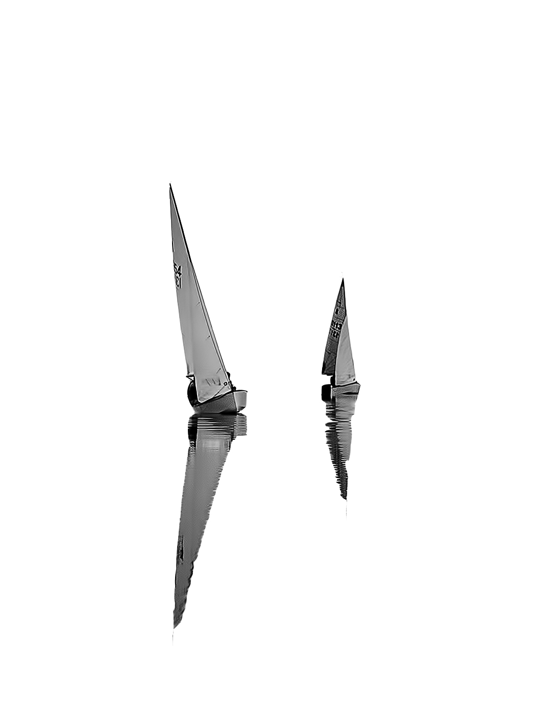
| 30 |
Apr 19 |
Comment |
The second rainbow is a real treat to see, and rare, so even if it's incomplete in this shot, it's great to have it in. |
Apr 8th |
1 comment - 0 replies for Group 30
|
| 31 |
Apr 19 |
Comment |
Beautiful composition. I suggest going further and removing absolutely everything. |
Apr 8th |
 |
| 31 |
Apr 19 |
Comment |
This is very interesting. The lighting is obviously controlled--please tell us about it. How many lights, how diffuse, how far from the model, and if more than one, their relative intensities. I am guessing one light, fairly close, but it is not a direct sharp flash. Another question, did you also shoot with the model turned more to get a Rembrandt triangle under her right eye, and if you did, can we see that also. Thanks. |
Apr 8th |
| 31 |
Apr 19 |
Comment |
Great shot. I am a rope and knot hobbyist, so I love to see the correct knot formed to secure the line.
I looked up bollard--that's a vertical post. A "T" shape like this is cleat. |
Apr 8th |
3 comments - 0 replies for Group 31
|
| 32 |
Apr 19 |
Reply |
Thanks for the verification. It's nice when all the advice agrees.
As to the motion blur thought. When I resumed serious photography, once our kids were grown, the digital age was upon us. I was tired of toting equipment, so I now shoot only with one fairly small camera, a Canon G10. It has all manual controls, but can fit in a spacious pocket. The compromise is only 4 f-stops, a fixed lens with 5X zoom, and a small battery with slower refresh time than a big camera. By extension, I never shoot with a tripod. One day, in a museum not permitting flash, I ran across another photographer shooting the paintings. I asked him what was his shutter speed. "1/8" he replied. "How can you do that," I asked. "A lot of practice, but it's possible," he answered. He was my inspiration. Ever since then, I have practiced shooting between breaths, waiting for the Zen moment of no movement, maybe even believing I am shooting between heartbeats (pure fantasy, maybe). So this was a long story to explain why I probably don't have any motion blur with the phone--I really really cultivate a steady stance when shooting. |
Apr 30th |
| 32 |
Apr 19 |
Comment |
Living in Maryland since 1968, I have never used snow tires or chains locally. But when I was a kid in Albany, NY, my father kept the snow tires on until the end of April. Just once, driving south from NY State around 1972, I hit a storm and pulled into a gas station on the NJ Turnpike and paid to have my chains put on--how great that was until I got further south and the storm changed to rain. Then the chains beat on wet pavement, wore out in an hour, and broke, wrapping around the axle. I managed to get them off and complete my trip.
About your lovely image. It is very beautiful. How great it is that you can visit Yosemite so often. I don't know much about competition standards, but yes it does have a lot in it. |
Apr 16th |
| 32 |
Apr 19 |
Comment |
In your original, your friend is standing straight up and the box appears to lean to the left. But in your finished b/w image they both lean slightly to the right. I sense a delicate humor here with both leaning in concert. This is a very pleasant shot. |
Apr 11th |
| 32 |
Apr 19 |
Comment |
I agree with Diana's comments, but maybe make the lightness halfway between your original and her suggestion.
I like the receding line of the windmills. You stood in just the right place, and your final crop nicely filled up the frame with the closest windmill. |
Apr 10th |
| 32 |
Apr 19 |
Reply |
This is extremely instructive, Diana, and I thank you for a tour de force of corrections and the time you took on it. I like almost all of them, especially leveling the horizon and darkening the sky at the corners. I also like removing the middle gent. I see that removing the shops is the right compositional reasoning here; I was remembering this shot as a travel record, and not thinking much about composition. Your final image really has great impact.
Some of us here speak a few words of UK English, so I understand letterbox; in fact our front door has such a slot. |
Apr 10th |
| 32 |
Apr 19 |
Reply |
OK, I see what you are going for. So here is a half-humorous, half-serious idea. How about making it DARKER, and adding in a moon? I am specifically thinking of the Truffaut film of 1973 called "Day for Night" (English title in the USA), where they shoot a scene in the day, but darken the exposure to resemble a night scene. |
Apr 9th |
| 32 |
Apr 19 |
Reply |
So this can be an interesting discussing about DARK. I like dark, even pure black sections of an image. What was your artistic aim in choosing dark, when there are little fluffy clouds in a clear sky? That's why I'm having confusion on this one. How can one resolve that? |
Apr 8th |
| 32 |
Apr 19 |
Comment |
I wonder that a judge could not see the difference between "not in focus" and the use of a soft focus lens that suffused the entire image. I think they must have had a preference for tack-sharp images that show every pore--which has a certain popular interest, but I understand that was not what you were trying for.
On the plus side, you have created good mood, got a good model, and had good lighting. On the negative side, you have lost the actual skin of the model, and that rather aristocratic nose is not separated from the cheek behind it. |
Apr 7th |
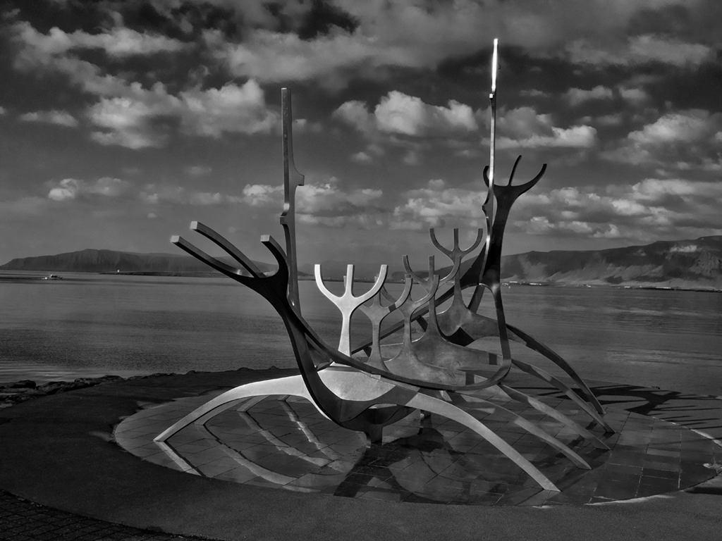
| 32 |
Apr 19 |
Comment |
Nice subject, good composition, and fine clouds. But it's a bit too dark overall for me. I also would like something in there to give me the scale of the statue--although I realize that is an artistic choice not always made. I tried in PS to lighten the darks and darken the highlights overall, but I think the entire sky region might take a bit more lightening. |
Apr 7th |
 |
5 comments - 4 replies for Group 32
|
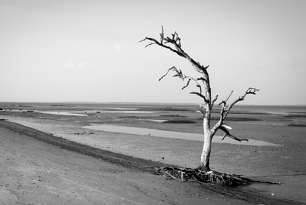
| 33 |
Apr 19 |
Comment |
Hi, I am visiting for Monochrome Group 32. This very simple scene looks great, and I tried it in monochrome, with a touch of sharpening, just for discussion. |
Apr 15th |
 |
1 comment - 0 replies for Group 33
|
| 36 |
Apr 19 |
Comment |
Great shot with fantastic lighting. Since I am in Monochrome Group 32, I like to try great shots like this in monochrome, just for discussion. |
Apr 15th |
 |
1 comment - 0 replies for Group 36
|
| 38 |
Apr 19 |
Comment |
This is a charming shot, giving the feeling of seeing the flower. I don't mind the blurry petals, but as Gerhard says, there are ways to increase the depth of field. How about shooting at 1/200 or so, and a a correspondingly smaller f-stop to get more depth of field. If there is no wind moving the petals, and a tripod is allowed, you might even shoot at 1/60. You can also approach such a shot with less depth, and therefore more in focus, by shooting straight down at the blossom, rather than from the side. |
Apr 14th |
1 comment - 0 replies for Group 38
|
| 45 |
Apr 19 |
Comment |
How I enjoy seeing your pictures of Taiwan each month. We also visited Taroko during our stay in 1988-89. I remember scenic views from the cross-island highway, going in and out of tunnels for many miles. This shot brings back memories. Thanks. |
Apr 13th |
1 comment - 0 replies for Group 45
|
| 49 |
Apr 19 |
Comment |
This is a wonderful picture story. I have never seen a mated couple like this before in the ten years I have been in the PSA Digital Dialogues (DD).
Aside from the compositions themselves, I love the subject matters of the photographs in the DDs because they educate us all about the world around us. I also like the story-telling by the photographers of their experiences.
Thank you for telling us your story so well--it is part of the great experience of belonging to the DDs. |
Apr 13th |
1 comment - 0 replies for Group 49
|
| 50 |
Apr 19 |
Comment |
I went to the website of this place, to learn about the architect: "Maurice Jennings, a prominent Arkansas draftsman from Fayetteville (AR), relied on his 25-years of experience working with nationally renowned design partner Fay Jones to create a truly awe-inspiring chapel." |
Apr 5th |
1 comment - 0 replies for Group 50
|
| 51 |
Apr 19 |
Comment |
Wonderful transformation.
My Bell Labs clients had the entire Holmdel complex as their offices when I worked for IBM in the 1970s. I visited this famous building many times back then. Great to see it again. In the lobby was a public demonstration kiosk of the telephone of the future, developed at Holmdel: a touchtone phone. |
Apr 5th |
1 comment - 0 replies for Group 51
|
| 54 |
Apr 19 |
Reply |
We went there on a tour some years ago. Nice to see a shot of it again. All my shots had flat dull skies also. Did you know it was featured in the French film, Indochine? Here is my best shot. |
Apr 6th |
 |
| 54 |
Apr 19 |
Comment |
Caloniceland?
Looks great and seamlessly put together.
How about a traditional Chinese dragon emerging from the distant rocky cove on the left? |
Apr 5th |
1 comment - 1 reply for Group 54
|
| 55 |
Apr 19 |
Comment |
The lighting on this is so great, I had to try B/W (my Group 32 is a monochrome group). I like your color original better, of course, but here is the B/W for discussion. |
Apr 5th |
 |
| 55 |
Apr 19 |
Comment |
What a poignant image, and compositionally stunning as well. However, I felt a little uncomfortable with the angles. How does this look, adjusted with "Skew" in PhotoShop? |
Apr 5th |
 |
2 comments - 0 replies for Group 55
|
| 59 |
Apr 19 |
Comment |
Yes, as Ed says, the dark image is extremely unique and effective. You also nailed one of the two most important points of tennis (or any hitting sport)--to keep your eye on the ball. The other is the weight shift to convey power in the stroke.
About the moment of the pose. You chose the moment of the ball toss, so the ball is still close to the player and you can get everything in the picture and get close to the player. But at this moment, the racket (to me) is not at its most exciting. I prefer when it is cocked back at an angle, but then the ball is very high and you could not get everything in and be so close. The next opportunity is when the racket is coming forward for the impact, but then you may have to deal with blur, which you may or may not prefer, depending on the effect you are going for. |
Apr 5th |
1 comment - 0 replies for Group 59
|
| 64 |
Apr 19 |
Comment |
Both images are well-done and interesting. Also, good job shooting through a glass case!
What museum were you at? I visited Corning, NY a very long time ago. |
Apr 5th |
1 comment - 0 replies for Group 64
|
| 73 |
Apr 19 |
Comment |
So often our members do not tell us the story of how they got their shot. Thanks for your narrative. It is so interesting to meet other people in these discussion groups and hear their stories.
Perspective correction was very easy, and I think it improves the shot. |
Apr 5th |
1 comment - 0 replies for Group 73
|
| 76 |
Apr 19 |
Reply |
These are beautiful subjects. My wife and I still remember a trip there 40 years ago. |
Apr 5th |
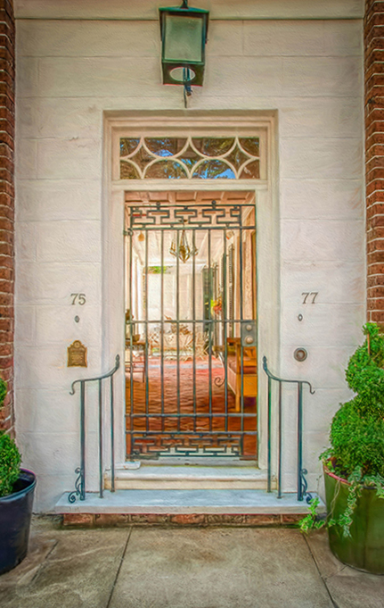
| 76 |
Apr 19 |
Comment |
This is a lovely door shot. Good job on bringing out the colors without looking over-processed.
About the alignment. If you had just tilted the camera up, then you would have seen a convergence of the verticals (assuming the brick walls are truly vertical, of course), a perspective problem. But you also have here an apparent curve in the vertical brick lines, which I believe might be lens distortion. All lenses have distortion, but it is often not noticed unless you are shooting parallel lines. In PhotoShop Elements, I corrected this using Filter/Correct Camera Distortion/Remove Distortion. Then I used a tiny bit of Image/Transform/Skew (only on the upper left corner). I had to crop a bit as part of the process. |
Apr 5th |
 |
1 comment - 1 reply for Group 76
|
| 81 |
Apr 19 |
Reply |
Come visit us in Group 32, as well as the other nine Monochrome groups. Further, many of the other groups not specifically monochrome will have some shots in monochrome. Getting around the groups is great fun. |
Apr 5th |
| 81 |
Apr 19 |
Comment |
Y'all push your points with great penetration in this discussion. |
Apr 5th |
| 81 |
Apr 19 |
Comment |
I also prefer your original shot, although if you wanted to brighten the colors just a bit, I think that post-processing touch would work well. |
Apr 5th |
| 81 |
Apr 19 |
Reply |
I mostly prefer B/W for such portraits, but in this case, I prefer your color shot because the colors are so great. |
Apr 5th |
| 81 |
Apr 19 |
Comment |
Yes, you have a great color shot. Here, for discussion only, is the B/W version. |
Apr 5th |
 |
3 comments - 2 replies for Group 81
|
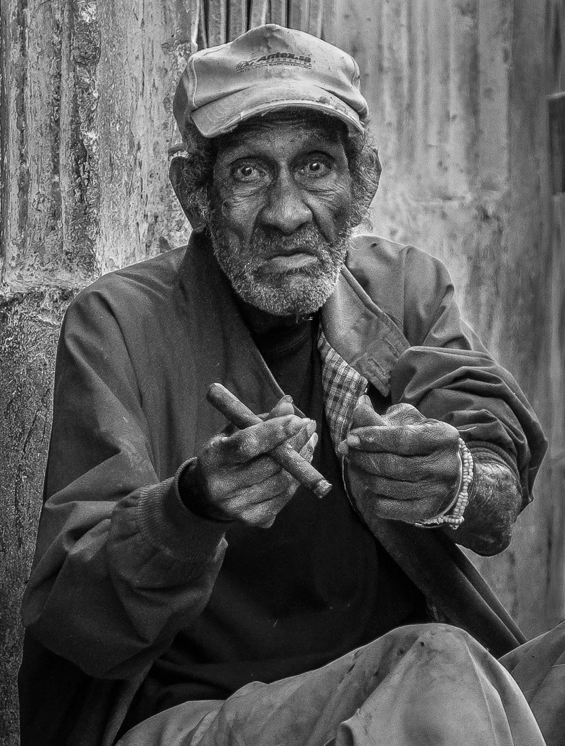
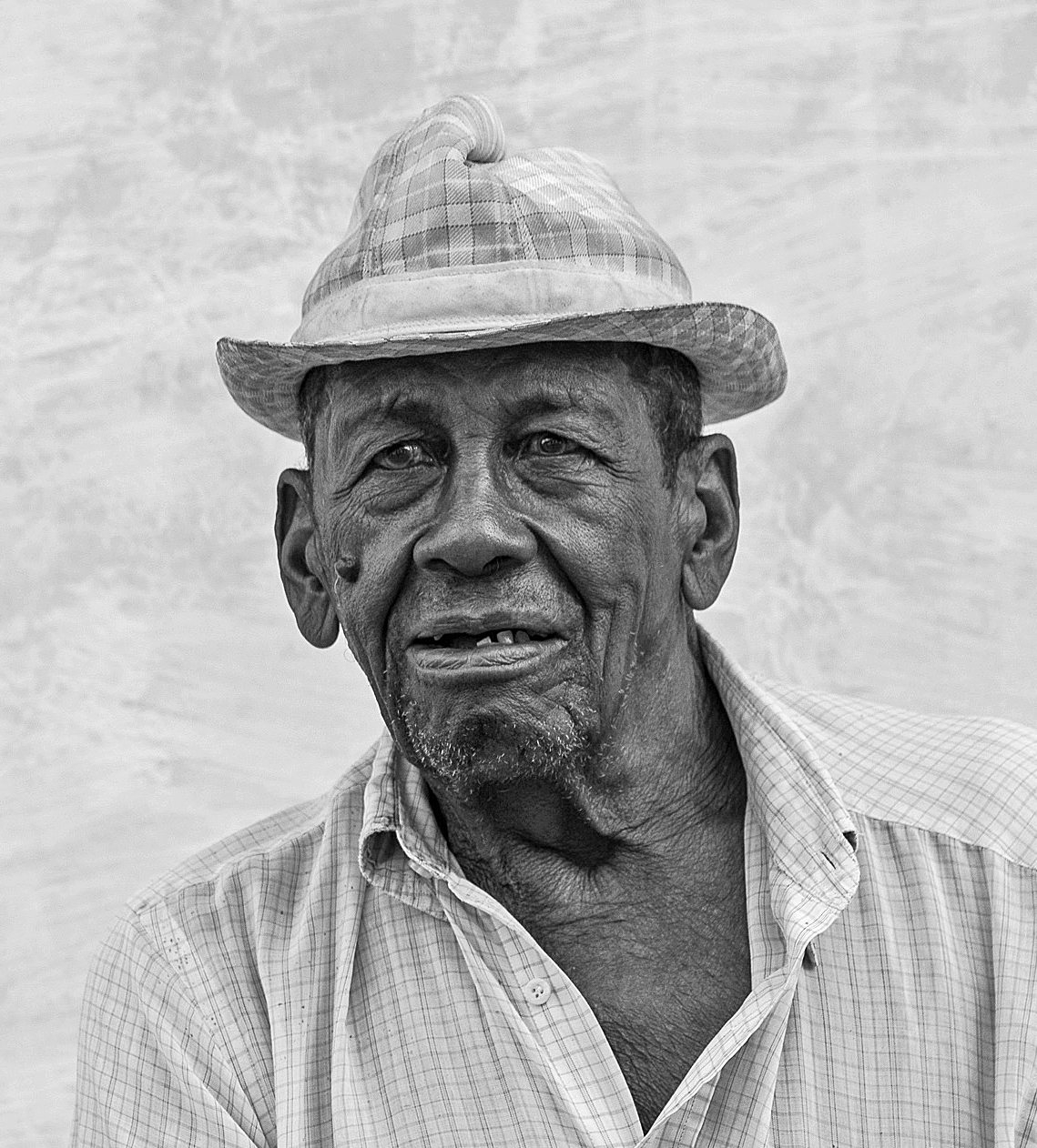
| 82 |
Apr 19 |
Reply |
Lots of portraits look very good in B/W. I did not work too hard on this. Adjusted overall brightness and contrast in PS Elements to taste, and added a little bit of sharpening, just a bit, avoiding oversharpening, to bring out his white chin hairs. I did not work on the hat, but it could stand to be darkened a bit, IMHO. Some folks might suggest a background swap, but I have no position on that. |
Apr 5th |
| 82 |
Apr 19 |
Comment |
I love this and other portrait shots from Cuba from the other groups. I tried it in B/W. |
Apr 4th |
 |
1 comment - 1 reply for Group 82
|
30 comments - 9 replies Total
|


