|
| Group |
Round |
C/R |
Comment |
Date |
Image |
| 1 |
Jan 19 |
Comment |
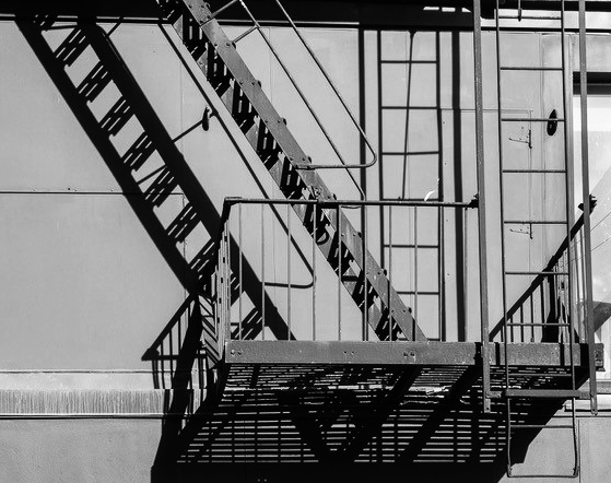
Hi Kathryn, I am visiting from Monochrome Group 32. This is a great building facade study, and almost a monochrome shot as it is. So here it is in pure monochrome, with a bit of increased brightness and contrast, and a tiny crop. What do you think? |
Jan 8th |
 |
1 comment - 0 replies for Group 1
|
| 8 |
Jan 19 |
Comment |
I agree with Gloria about that great shot working well as a b/w. How about converting your original to b/w and showing it to us in this discussion? |
Jan 17th |
1 comment - 0 replies for Group 8
|
| 27 |
Jan 19 |
Comment |
Just a comment about your intro, wanting to see a green flash.
Seeing a green flash is only possible at sunset, after you have been staring at the sun as it just disappears below the horizon. I saw one only once. After a few years of wondering, scientists figured out it was an effect in your eye--not an event in the sky--from staring continuously at one color, and then seeing its compliment when the sun is gone. |
Jan 16th |
1 comment - 0 replies for Group 27
|
| 28 |
Jan 19 |
Comment |
Hi, I am visiting from Monochrome Group 32. You made a great choice to change this to monochrome. Not only does it emphasize the contrast, as you said, but it makes the image more formal, in my view.
Your composition is strikingly original, and I think it breaks all sorts of rules or conventions, and results in a memorable image that I keep looking and looking at. I would have thought that the fence line on top of the horizon line would not work--but it does! I would have thought the wire and board fence on the right would have taken my eye out of the frame, but I am held in the frame by the old building in the opening in the fence. That piece of wood hanging in the wire, and the loop of wire are brilliant touches. Congratulations. |
Jan 8th |
1 comment - 0 replies for Group 28
|
| 29 |
Jan 19 |
Comment |
Does everyone know that Roebling designed the Brooklyn Bridge in New York City? |
Jan 21st |
1 comment - 0 replies for Group 29
|
| 30 |
Jan 19 |
Comment |
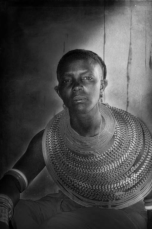
Hi, I am visiting from Monochrome Group 32. You have excellent diffuse side lighting on this portrait, giving great tones on the face. Your subject's expression is great, and so are the colors. Although you would lose those wonderful colors, this would also look good in monochrome. |
Jan 2nd |
 |
1 comment - 0 replies for Group 30
|
| 31 |
Jan 19 |
Reply |
Ah! Those peppers by Weston! Ah! Ah! |
Jan 10th |
| 31 |
Jan 19 |
Reply |
Yes, of course the flash power is important, but the diffuse edges of the shadow can only be created by the distance of the flash and the surface area of the flash source. Someone please correct me if I have that wrong. I very much like the diffuse shadow you got here, so that is why I asked--to learn how you accomplished this pleasing effect. |
Jan 7th |
| 31 |
Jan 19 |
Comment |
This is a wonderfully simple shot, and quite a contrast with your complex still life last month. Every edge of the fruit stands out from the background perfectly. I really like the deep shadow on the dark side. Please tell us how far away the flash was from the fruit--I am guessing not close, since the shadow on the tabletop is fairly diffuse? |
Jan 6th |
1 comment - 2 replies for Group 31
|
| 32 |
Jan 19 |
Comment |
This was a really interesting discussion. Thanks, everyone, for all the suggestions. |
Jan 28th |
| 32 |
Jan 19 |
Reply |
Thanks, Jennifer, that takes it in a great direction. |
Jan 23rd |
| 32 |
Jan 19 |
Comment |
Tom, that is such a good point. I had never thought of that explicitly, that color separation solves the problem of the tree growing out of the wagon. I will try to remember that. |
Jan 18th |
| 32 |
Jan 19 |
Reply |
All very good points, Diana. This is the right discussion to have. These are good hints to think about for the next opportunity! |
Jan 17th |
| 32 |
Jan 19 |
Comment |
I like this image a lot, but Tom raises a good point about explaining to the viewer what is going on. Perhaps this is where one of my discussions of titles comes in. I have always advocated for careful titles, whereas other argue that the image alone should suffice. Take your philosophical pick. How about "Out of the Cold Plunge Prison." Or just accept that the viewer is entitled to a paragraph of text, as you provided, to help the viewer understand the image. I am fine with all three levels: no title, careful title, additional text. |
Jan 14th |
| 32 |
Jan 19 |
Comment |
I can't say I see any difference between photographing this or a ballet. Of course, if there were a public notice that no photographs are permitted, in all cases we should respect that. Good idea to give credit. |
Jan 10th |
| 32 |
Jan 19 |
Comment |
Janice, this is really interesting. You are making a successful try at reaching deep into the psyches of your viewers. This image is full of fundamental symbols. Snow, a black human figure, a hole in the ground, a strange space with strange lights. I could go on about how these symbols are used in literature. Of course the hole is either sexual, generative, or demonic, depending on your source. Ice is in the deepest circle of Dante's Hell. The room resembles a number of literary distopian chambers of torture or confinement.
Compositionally, I would prefer not to see the traces of a costume on the figure, and just a pure silhouette. The pose is very good, with the right arm fully away from the body.
It would be interesting and maybe a challenge to add an overlay image of a dream event that relates to the phyche, but I have seen such work in museum photo displays.
You are on to some great material! |
Jan 8th |
| 32 |
Jan 19 |
Reply |
Yes, I think that helps, as the clouds are not the subject. Thanks. I rather like pure white or pure black backgrounds. |
Jan 7th |
| 32 |
Jan 19 |
Comment |
A lot here that you could not control, I bet. I think you chose a good pose, knowing your eye, but I would be interested in seeing here the other possible poses and us all discussing them. On this pose, I don't care for the sexy costume, and particularly not the way the waist-straps disappear into her flesh folds. I would prefer her in a wrestling or gymnastic leotard, in a purely athletic pose. Also, I am sure you did not choose the lighting, but it does not have the strong shadows I like in portrait and figure work. |
Jan 6th |
| 32 |
Jan 19 |
Comment |
So impressive! I can't add anything. I really like those two outliers. |
Jan 6th |
| 32 |
Jan 19 |
Comment |
Tom, I could use a little instruction about this lovely shot. I can see the excellent composition--the bisected tree on the right, and the wagon hitch going out of the frame exactly at the corner. But I don't know how one gets such a crisp range of lights to darks. Was this done in the original capture or in PS? |
Jan 6th |
| 32 |
Jan 19 |
Comment |
You got a great pose on this one.
I am fine with how you toned down the bird poop.
I think you are right about a bit too much sharpening, but I like the tail feathers like this, so attention is on the head and body. |
Jan 2nd |
9 comments - 3 replies for Group 32
|
| 33 |
Jan 19 |
Comment |
Bob and Elizabeth, this is a really interesting shot and a truly interesting story, and a great discussion with your group about it. I love to read such discussions in the DD groups; it adds so much richness to the sharing of the images. |
Jan 21st |
1 comment - 0 replies for Group 33
|
| 36 |
Jan 19 |
Comment |
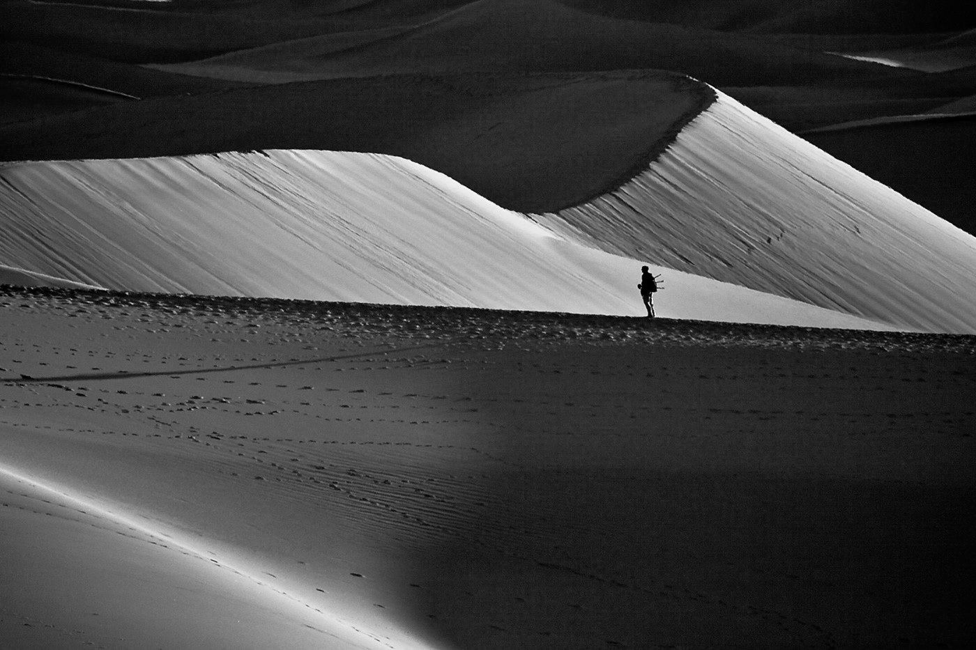
Hi Richard, I am visiting from Monochrome Group 32. This is a great shot, very dramatic, essentially already a monochrome image. Here, for discussion, it is in pure b/w. |
Jan 5th |
 |
1 comment - 0 replies for Group 36
|
| 38 |
Jan 19 |
Comment |
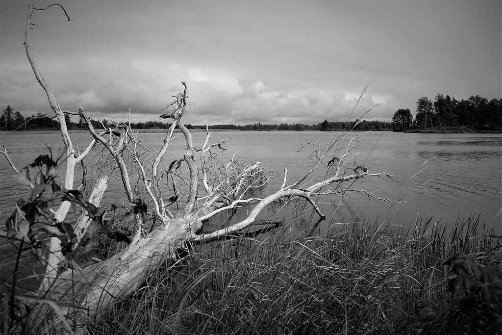
Hi, I am visiting from Monochrome Group 32. This is a very fine composition, with a great placement of the dead tree limbs bordering the frame, and a nice juxtaposition of near and far.
I want to comment on the "pop" concept. Art's sample surely pops, but I suggest something a bit milder, that does not reveal that it has been post-processed. How does this look? |
Jan 16th |
 |
1 comment - 0 replies for Group 38
|
| 39 |
Jan 19 |
Comment |
Nice subject matter, and pleasing choices about monochrome and tint. You caught the moment with the clouds for sure.
What was the focal length of the lens, and how far did you stand from the church, and did you angle your camera upwards to get the shot--this might bear on the perspective that David asked about. |
Jan 16th |
| 39 |
Jan 19 |
Comment |
Compositionally, I really like this. I love deserted street scenes, and I do not care for the argument that there should be a human figure at the end of the street as a point of focus. I think the entire idea of emptiness is ruined if you do that. I do note, however, that you have used the lone electric tower at the end of the street as a point of focus, thereby satisfying all parties, to have a point of focus, and still to keep the scene empty. Well done.
I don't do much post-processing, so I will just note that there is a fringe of white between the rooftops and the sky, but I don't know how to avoid that in post-processing. |
Jan 16th |
| 39 |
Jan 19 |
Comment |
David's comment about the visual feel of smooth and soft dune images highlights exactly what is unique about this shot--your dunes appear to have knife-edge sharpness--this is very well-done.
Obviously, you have nothing in this image to show us the scale of the dunes, but won't you tell us the scale? |
Jan 16th |
3 comments - 0 replies for Group 39
|
| 40 |
Jan 19 |
Comment |
Hello Prakhar, this is a perfect shot. I like that you left lots of space ahead of the man. You called this "Temple Walk," so I would like to think this is a monk, engaged in his walking meditation. Although walking briskly, he certainly looks concentrated and tranquil. |
Jan 16th |
| 40 |
Jan 19 |
Comment |
Hi Alison, good shot, taking in the contrasts between the old and new. I noted your comment about how most of your camera club friends used telephotos, and you brought a wide-angle out of "inexperience." You were SO RIGHT to bring the wide-angle. In my opinion, it is the workhorse of photography. If you look at professional work in magazines, I think you will see that much of it is shot with wide-angles. They enable you to get near and far subjects combined in a single shot, have great coverage, and have great depth of field.
I think this image works very well. Your colleagues' suggestions to get closer to the little house is a good idea, as it would make stronger use of just what the wide-angle is good at. |
Jan 16th |
2 comments - 0 replies for Group 40
|
| 42 |
Jan 19 |
Comment |
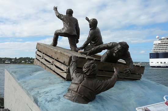
Very nice choice to show only part of the statue complex and place the two castaways waving to their rescuers against the clearing sky, symbolizing hope. For information, here is a tourist shot of the entire memorial, from the internet. |
Jan 21st |
 |
1 comment - 0 replies for Group 42
|
| 43 |
Jan 19 |
Comment |
What a nice panorama. There is another Cades cove shot this month by Walter Swett in Group 75. |
Jan 18th |
1 comment - 0 replies for Group 43
|
| 44 |
Jan 19 |
Comment |
Hi Bill, I am visiting from Monochrome Group 32.
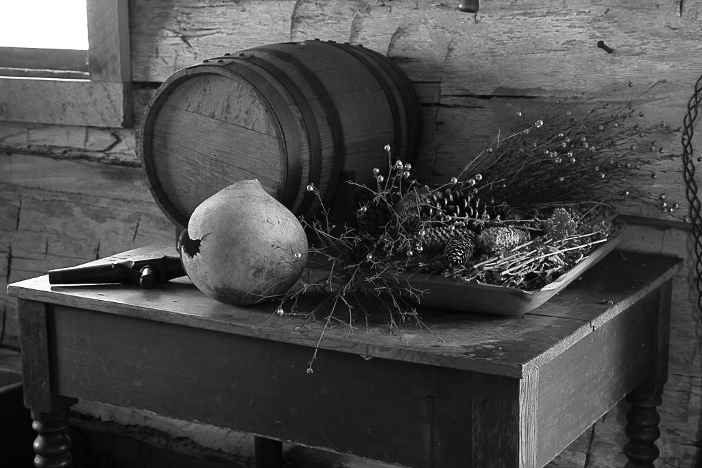
This is an impressive finished image, successful in your goal to create a "fire-lit" scene. I agree with Rick and Max's comments about the intensity of the reds, as the image tends a bit to announce itself as post-processed.
I liked the lighting in your original, and I think it is also a good source for a monochrome shot. |
Jan 21st |
 |
1 comment - 0 replies for Group 44
|
| 47 |
Jan 19 |
Comment |
Thanks for the great shot of this famous place. For half my life, I thought I would never visit it, but then circumstances changed and I went to that same spot with my wife and three young children in 1989. |
Jan 21st |
1 comment - 0 replies for Group 47
|
| 50 |
Jan 19 |
Comment |
I love it just as it is. Compositionally, it is just great. The eyeglasses are a great touch. To continue being picky, however, Jeffrey is right about being careful to assemble things that make sense together. The carpenter's pencil would be sharpened with a pen knife, as he said, and the compass lead with a fine sandpaper. Neither of these would be used for drawing floor plans or writing notes. The pencil sharpener would only be used for ordinary roundish lead pencils. |
Jan 19th |
1 comment - 0 replies for Group 50
|
| 56 |
Jan 19 |
Comment |
Well done. Your impressionist painting technique makes your model look like one of the impressionist masters. |
Jan 15th |
1 comment - 0 replies for Group 56
|
| 58 |
Jan 19 |
Comment |
For those of you interested in shooting people in museums looking at art, check out the work of the German photographer, Thomas Struth--museum photography is one of his life-long projects. A New Yorker magazine review of Struth's work commented that this is important work because it is the viewer of art who "completes the work" by seeing it.
See also this month another museum shot by Colin Price in group 80. |
Jan 21st |
1 comment - 0 replies for Group 58
|
| 61 |
Jan 19 |
Comment |
Continuing the lighting discussion by Manfred, perhaps if you have a chance to reshoot this, you might stand at the other end of the piano and take advantage of the light and dark tones produced by that great window light on the model's other side--at present, we see just a hint of that on her arms, legs, and breasts, but not at all on her face.
One other point, the model is touching the keys very lightly, and that's fine if it's your intent. You could also try having her noticeably depressing some keys, and keeping her thumbs up in playing position as well. |
Jan 9th |
| 61 |
Jan 19 |
Comment |
Thank you for the explanation of the lighting locations. I don't know much about figure lighting, so have a naive question. What does one do with those shadows on the floor? Are then normally left in, or removed? What is the aesthetic on this? |
Jan 6th |
2 comments - 0 replies for Group 61
|
| 62 |
Jan 19 |
Comment |
Oliver, this is a really interesting and highly original framing of a detailed section of a huge ship. I do like the minimalist approach of your original B/W, and I love the sunlit highlights on the rhythmically draped ropes. The immense size of the vessel is clearly conveyed. |
Jan 20th |
1 comment - 0 replies for Group 62
|
| 71 |
Jan 19 |
Comment |
I definitely like that you left some perspective in the third vanishing point (the vertical one), to give the feeling of the soaring buildings. Everyone that knows what a tilt-shift lens is must be envious of you. |
Jan 15th |
1 comment - 0 replies for Group 71
|
| 75 |
Jan 19 |
Comment |
Lovely shot. There is another Cades Cove shot this month by Lane Lewis in Group 43. |
Jan 18th |
1 comment - 0 replies for Group 75
|
| 76 |
Jan 19 |
Comment |
A lone lamppost like this always reminds me of the lamppost in Narnia in The Lion, The Witch, and the Wardrobe, by C.S. Lewis. It is a charmingly atmospheric (literally) shot. I like your original just as much as your post-processed image; maybe I think the post-processing is just a bit too much. |
Jan 6th |
1 comment - 0 replies for Group 76
|
| 79 |
Jan 19 |
Comment |
See also Group 55, May 2016, in which Wolfgang Lin had a novel technique for a slightly similar type of shot. |
Jan 26th |
| 79 |
Jan 19 |
Comment |
Mary, there is some new information. Dr. Nair has replied in your Group 79 and referred you to a sample he is posting of PhotoShop Radial Blur in his Group 16. |
Jan 26th |
| 79 |
Jan 19 |
Comment |
Hi Mary, I have seen this sort of effect produced in post-processing software. The user specifies the diameter of the center circle of sharp focus and the degree to which the rest should be "zoomed." One of our DD colleagues in another group had an image like that about a year ago, which came out very well. I will try to find out who, which month, and which group, so you can have a look. |
Jan 22nd |
3 comments - 0 replies for Group 79
|
| 80 |
Jan 19 |
Comment |
See also this month another museum shot by Daniel De Cort in Group 58. |
Jan 21st |
| 80 |
Jan 19 |
Comment |
For those of you interested in shooting people in museums looking at art, check out the work of the German photographer, Thomas Struth--museum photography is one of his life-long projects. A New Yorker magazine review of Struth's work commented that this is important work because it is the viewer of art who "completes the work" by seeing it. |
Jan 21st |
| 80 |
Jan 19 |
Comment |
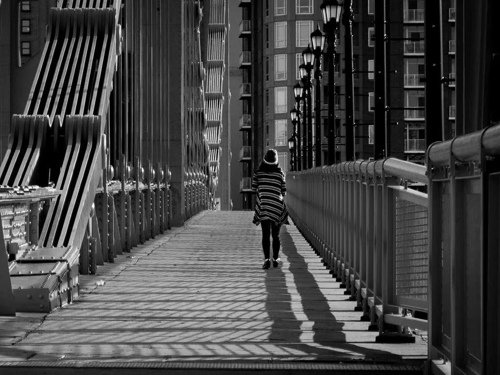
Hi Richard, I am visiting from Monochrome Group 32. This is a great image with a perfect title. You have captured strips and patterns everywhere--railing, shadows, bridge structure, lamp posts, and building facades.
Some of us debate about having a focal point in such architectural images. How would this image look without the woman in it?
Here it is in monochrome, emphasizing light and dark, but of course losing that great yellow?
Also, do tell us the story of how you saw and shot it, and technical data for those interested. |
Jan 1st |
 |
3 comments - 0 replies for Group 80
|
| 86 |
Jan 19 |
Comment |
Hi Carl, I am visiting from Monochrome Group 32. I love this sort of street scene, empty of people and cars. It is a portrait of a city. I think you did a great job with choosing monochrome and doing the post-processing.
I have two tiny suggestions. I think you went slightly too far on the vertical perspective correction, and can you find a way to illuminate the dark street lamp on the far right? |
Jan 18th |
1 comment - 0 replies for Group 86
|
44 comments - 5 replies Total
|