|
| Group |
Round |
C/R |
Comment |
Date |
Image |
| 4 |
Oct 18 |
Comment |
See Group 20, Nellie Bretherick's image his month for a similar effect, derived from a monochrome image. I think she mapped each tone into a different color. Is that what you did here? |
Oct 9th |
1 comment - 0 replies for Group 4
|
| 5 |
Oct 18 |
Comment |
Here is the exact same image in monochrome. |
Oct 1st |
 |
| 5 |
Oct 18 |
Comment |
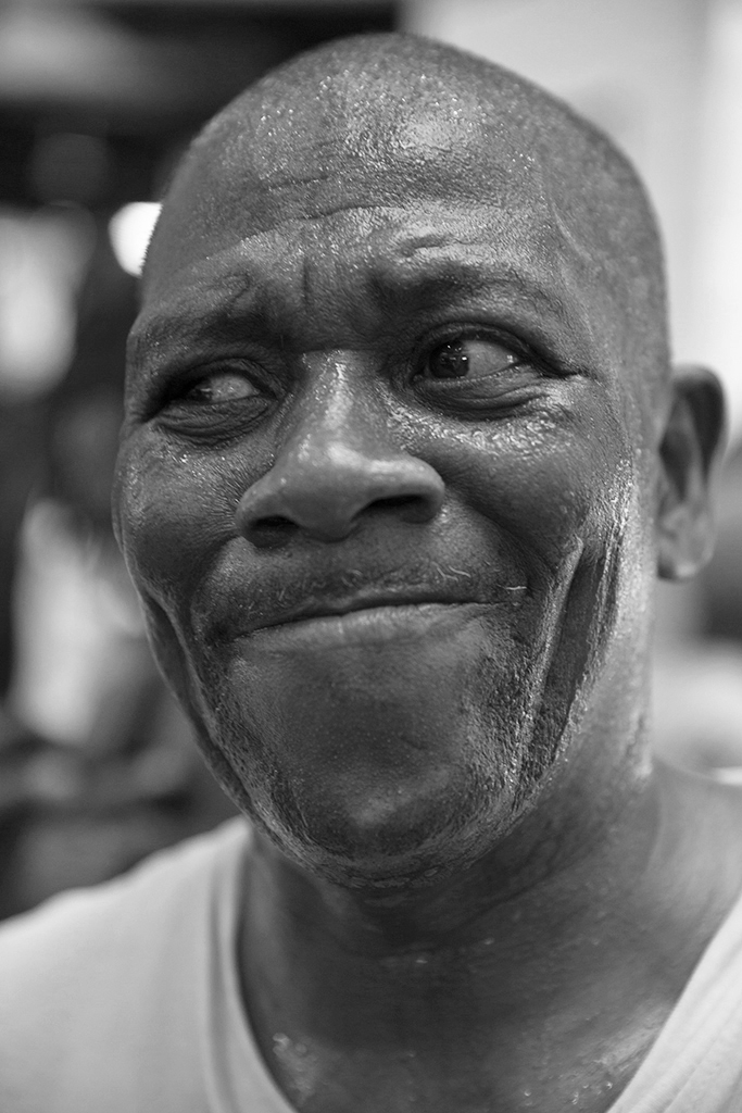
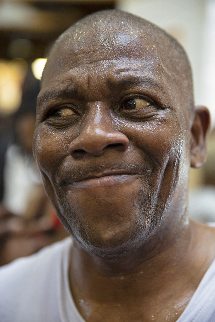
Great capture of an animated expression.
When I see a portrait like this, lit by window light, I like to keep more of the natural shadows. My suggestions, according to my own taste, are these, first in color, after in monochrome. |
Oct 1st |
 |
2 comments - 0 replies for Group 5
|
| 8 |
Oct 18 |
Reply |
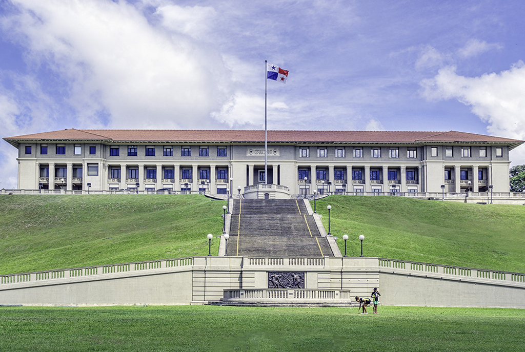
Yes, yes, you are exactly right about what the perspective alteration does to the finished image. It is definitely only an option to be used in situations where one wants to change the view of the building--many professional architectural photographers will do this. I do not actually care for it in personal shots because it is a distortion of the actual perspective one sees with one's eye. As you point out, the viewer's eye appears to be brought level to the base (or maybe the vertical center) of the building. But that cannot hide the other hints of the viewer's location down on the lower level of the grassy area, which is plainly the foreground at the viewer's feet. Also, the bottom of the stairs and the bottom of the building are slightly blocked by things in front of them--only possible from a low point of view. I will be discussing all of this in my article to explain the pros and cons of perspective alteration in post-processing. Your image is a perfect example. Thanks. |
Oct 24th |
| 8 |
Oct 18 |
Comment |
Nice architectural shot. It is optional to leave the slight lean-back effect of the perspective, or alter it to make the vertical lines parallel. Here is what it looks like if altered. I emphasize that this sort of alteration is an option, depending on what you want in the finished image.
I have a request. I am currently writing an article for my local club on perspective. May I reproduce this image as an example in the article of altering perspective? |
Oct 23rd |
 |
1 comment - 1 reply for Group 8
|
| 12 |
Oct 18 |
Comment |
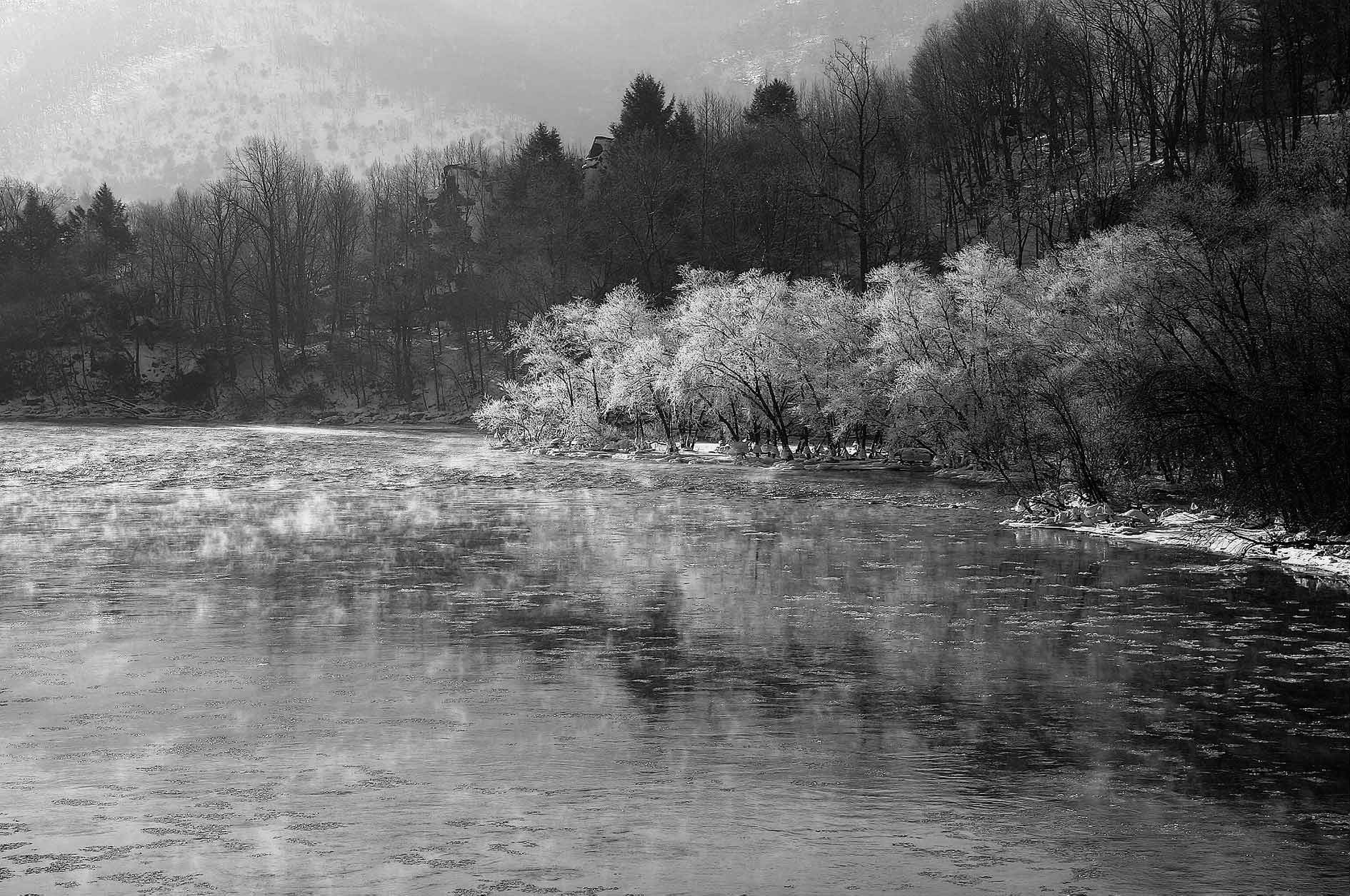
The richness of detail from the sharpening looks great in this shot. I tried changing it to monochrome as a test, but I prefer the delicate shades of color in your original. |
Oct 17th |
 |
1 comment - 0 replies for Group 12
|
| 13 |
Oct 18 |
Reply |
Wendy, I prefer your color version, too. I just thought I would show the monochrome for discussion. |
Oct 17th |
| 13 |
Oct 18 |
Comment |
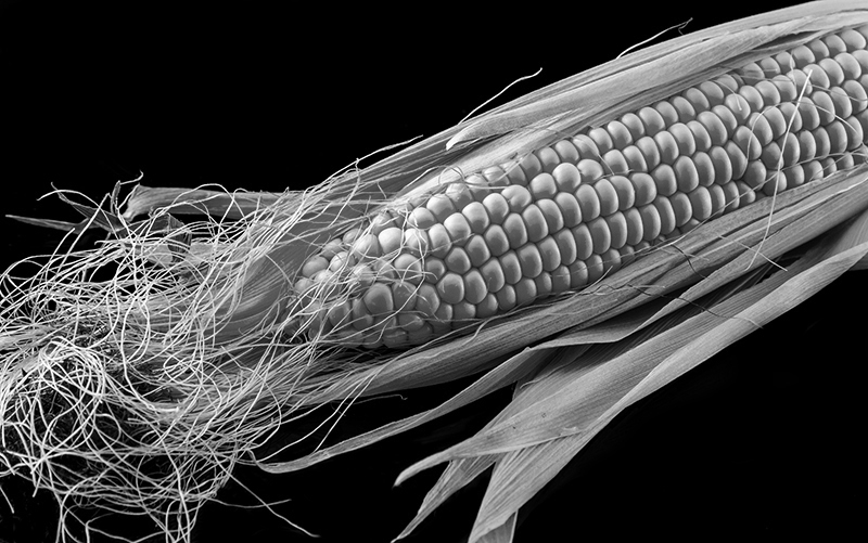
Hi, I am visiting from Monochrome Group 32. Your natural window light on this is just great, making this a stunning and very sharp image. Here it is in monochrome, just for discussion, if you please. Thank you. |
Oct 11th |
 |
1 comment - 1 reply for Group 13
|
| 16 |
Oct 18 |
Comment |
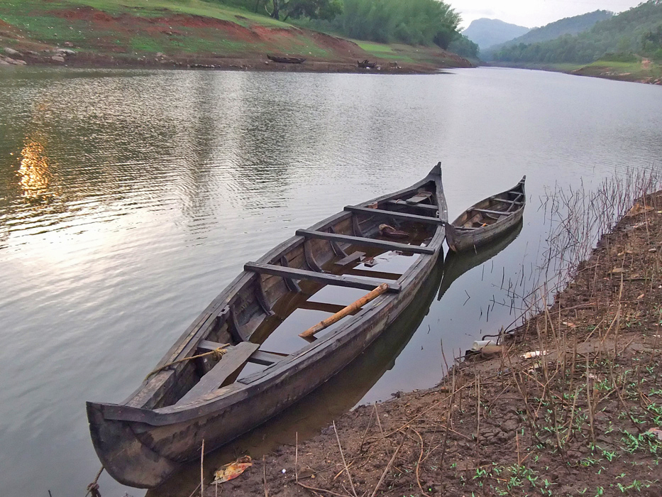
Dear Dr. Nair, I find your image very pleasing, with good composition, cropping, and selection of a natural and informative subject matter. I suggest your finished image is a bit too much color-and-brightness enhanced, and has lost the sunset quality. Perhaps half as much enhancement would preserve the mood of the original. Here is my rough suggestion. |
Oct 1st |
 |
1 comment - 0 replies for Group 16
|
| 17 |
Oct 18 |
Comment |
Hmmm, has anyone read The Turn of the Screw, or The Screwtape Letters? Remember also Lady Macbeth's advice (do I need to actually state it?).
Great image, by the way. Interesting that it does not render well in b/w. Good that you tried it. |
Oct 5th |
| 17 |
Oct 18 |
Comment |
Hello John, I am visiting from Group 32. Thanks for sharing your keen eye and enjoyment of surprising geometry with us. I really like this sort of photographer-observer action. |
Oct 2nd |
2 comments - 0 replies for Group 17
|
| 18 |
Oct 18 |
Comment |
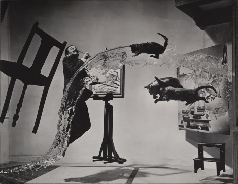
Here is the original of Salvador Dali, photograph by Phillipe Halsman, which I think you are referencing. Title: Dali Atomacus, 1948. |
Oct 7th |
 |
| 18 |
Oct 18 |
Comment |
This particular impressionist conversion is probably based on Renoir's "rainbow palette." |
Oct 7th |
2 comments - 0 replies for Group 18
|
| 19 |
Oct 18 |
Comment |
I love long hallways empty or nearly empty of people. What a great place to shoot. This would also look good in b/w, I think. |
Oct 17th |
| 19 |
Oct 18 |
Comment |
I adore "found art." It is so much fun that you saw and shot this. Thanks. |
Oct 1st |
2 comments - 0 replies for Group 19
|
| 20 |
Oct 18 |
Comment |
Nellie, see Group 4 this month, for what might be a similar treatment of an image by Erik Rosengren. |
Oct 9th |
| 20 |
Oct 18 |
Comment |
I don't do much post-processing in my photography, but I do know that a monochrome image can turn very interesting when yanked around. I like the result you got. It looks interesting. Evidently you mapped different levels of lightness and darkness into different colors. Nice. |
Oct 7th |
2 comments - 0 replies for Group 20
|
| 23 |
Oct 18 |
Reply |
Thank you, Shirley. My co-author and I will write the article sometime in the next few months. |
Oct 16th |
| 23 |
Oct 18 |
Comment |
Hi Shirley, I am visiting from Group 32. I very much like this stunning shot upwards. I note that this is a situation where perspective correction is neither needed nor appropriate, even though the towers appear to lean back and diminish--as they should, since they are diminishing in the vertical distance. So I want to ask your permission to use this image in an article I am writing on vertical perspective for my local club? |
Oct 15th |
1 comment - 1 reply for Group 23
|
| 27 |
Oct 18 |
Reply |
Danny, great to hear that you did well with "Corridor." I am looking forward to our DD group visits in coming months. |
Oct 12th |
| 27 |
Oct 18 |
Comment |
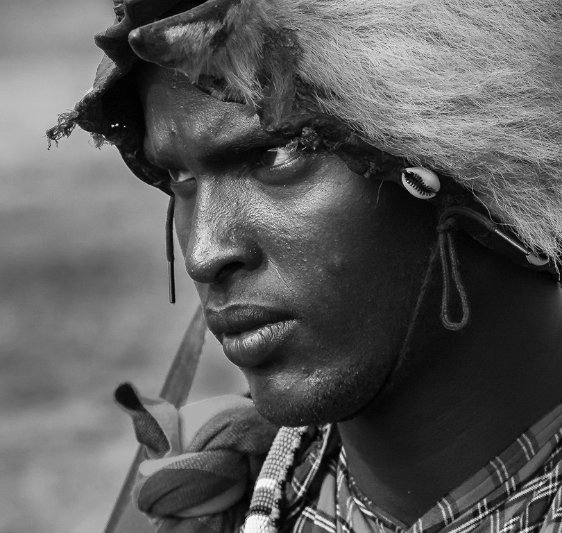
Hi, I am visiting from Monochrome Group 32. This intense portrait image will also work in monochrome because you have fantastically good lighting on your subject's face. Of course the colors are lost, but the monochrome portrait has an alternative way of telling the story of a face. I just put it her for discussion. Thank you. |
Oct 11th |
 |
| 27 |
Oct 18 |
Comment |
Very good original shot. You are to be congratulated on your restraint not to over-process the sunset beyond the point of realism. The finished image is most tasteful. |
Oct 11th |
2 comments - 1 reply for Group 27
|
| 29 |
Oct 18 |
Comment |
Hi, I am visiting from Monochrome Group 32, so naturally I was interested to see this striking image. Please tell us a little more about the circumstances--was it a performance, or a rehearsal, or posed shots? What venue and what company?
I know it's hard to catch dancers or actors in action just right, and you did very well on this. One point to try to improve next time--the woman's arm blocks the man's face. |
Oct 9th |
1 comment - 0 replies for Group 29
|
| 32 |
Oct 18 |
Reply |
Ha ha, how we have differences about this! I always prefer empty architectural compositions. Unless I am actually going for the people, I want them out of the scene. Of course in this case, it might have been interesting to take the shot with dozens of people at the evening rush crowding the escalators. But that would have been an entirely different shot. |
Oct 25th |
| 32 |
Oct 18 |
Reply |
Thank you, Lynne. It took me a long time and many reviews of this old shot to at last spot a picture within a picture. |
Oct 24th |
| 32 |
Oct 18 |
Reply |
Thanks, Diana, I like that slight vignette, and will remember the technique. |
Oct 20th |
| 32 |
Oct 18 |
Comment |
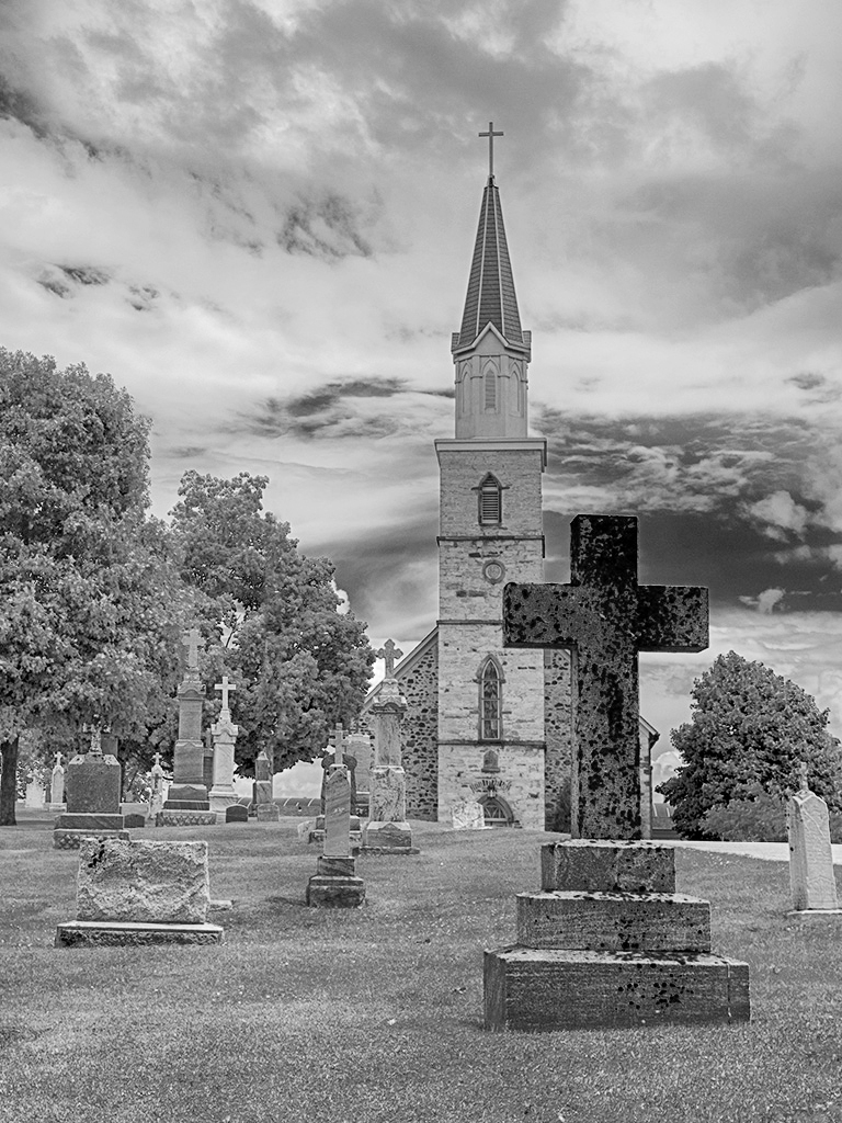
Hi Tom, nice picturesque shot through the old stone monuments. I would prefer it a little brighter, like this. Also, suggest that it be shot from a location a bit to the left so that the stone cross does not overlap the church tower--just my compositional preference--I guess that can be disagreed with. Good job removing the pole and improving the sky so well. |
Oct 12th |
 |
| 32 |
Oct 18 |
Reply |
Hi Larry, thanks for coming by. Wow, I would not credit myself with Grande Jatte; thanks for saying so.
Good idea to add a touch of contrast for the trees, maybe a bit of sharpening also.
Everyone agrees I should crop from the bottom a bit--nice to hear a consistent message. |
Oct 5th |
| 32 |
Oct 18 |
Reply |
Drat! I was going to ask in my initial comment if I should crop a bit more from the bottom--but I didn't say it, and now it's too late to claim I was thinking it (sigh). Thanks. That is a very good suggestion. |
Oct 3rd |
| 32 |
Oct 18 |
Comment |
How wise you were to reduce the glaring lights. This comes off very well, and still you have strong and attractive shadows on one side. Somehow, the model herself looks better and more professional in monochrome than in color. |
Oct 1st |
| 32 |
Oct 18 |
Comment |
Wow, nice shot. Yes, a thin white border would help.
Whenever I encounter someone showing something they have had all their lives, and talking about it so poignantly, I have the same reaction: do more! How about preparing an entire show of a dozen or so shots, all with this single milk bottle as the main subject. You could make the images VERY different from each other. See Hiroshige's 36 views of Mt. Fuji. |
Oct 1st |
| 32 |
Oct 18 |
Comment |
I don't have any concerns about clarity, but you might take out the two animals in the foreground. Yes, I think you are heading for a fine art image. I don't know much about that, but as I have browsed around the other groups, I have seen a number of people take scenes like this and soften the image with various post-processing techniques to give atmosphere and a sense of summer heat to the scene. Then the images get very fine artsy. |
Oct 1st |
| 32 |
Oct 18 |
Comment |
The point of view is very unique and interesting. It certainly works. And your cropping, as always, is just right. Not that I know competition, but I am guessing it's not a competition shot. How about that right side "up" escalator? How come it's well lit in the original, but so dark (not matching its mate on the far left) in the finished image? |
Oct 1st |
| 32 |
Oct 18 |
Comment |
It looks like I am following the rule of thirds here. Does it work? |
Oct 1st |
6 comments - 5 replies for Group 32
|
| 37 |
Oct 18 |
Comment |
Very attractive scene of nature and I think a spiritual feeling. I presume those are prayer flags on the left, and your image intends to show a person in a meditative state. In that case, I would remove their blue thermos (?) from the image. As to the cropping of the foreground, I personally prefer a lot of empty space around a human in a serene or contemplative pose, so I would recommend not cropping. This is consistent with the Eastern view that humans are small figures in the world of nature. |
Oct 9th |
1 comment - 0 replies for Group 37
|
| 39 |
Oct 18 |
Reply |
Vincent, I am writing an article on perspective for my local photography club monthly newsletter. This fence line image is a fine example of horizontal perspective. May I have your permission to use it in my article as an example of horizontal perspective? I am also going to discuss vertical perspective, and how to deal--or not to deal--with how a tall building looks when you point your camera up at it. |
Oct 22nd |
| 39 |
Oct 18 |
Comment |
Hi Folks, I am visiting from Monochrome Group 32. I certainly like this shot and the one you refer to from last month. Somehow, it seems to me they say so much more in monochrome. On this one, my only thought is to wonder how it would look if the camera were closer to the ground, which would put the entire length of the fence tops above the horizon line. I can't say that would work better, but I am just wondering. |
Oct 8th |
| 39 |
Oct 18 |
Comment |
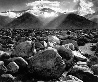
Very dramatic shot. I get the same feeling from your image that I get from this Ansel Adams image. |
Oct 2nd |
 |
2 comments - 1 reply for Group 39
|
| 42 |
Oct 18 |
Comment |
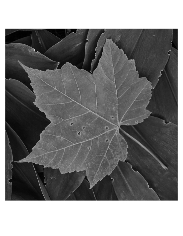
This is a very nicely observed composition. You have a good eye for spotting it. Here it is in monochrome, an entirely different way of seeing it, not better, just different.
I like that there are some deteriorating spots on the leaves--it shows that they are living things that start, thrive, and decay. |
Oct 25th |
 |
| 42 |
Oct 18 |
Comment |
Here is the cropped version. |
Oct 15th |
 |
| 42 |
Oct 18 |
Comment |
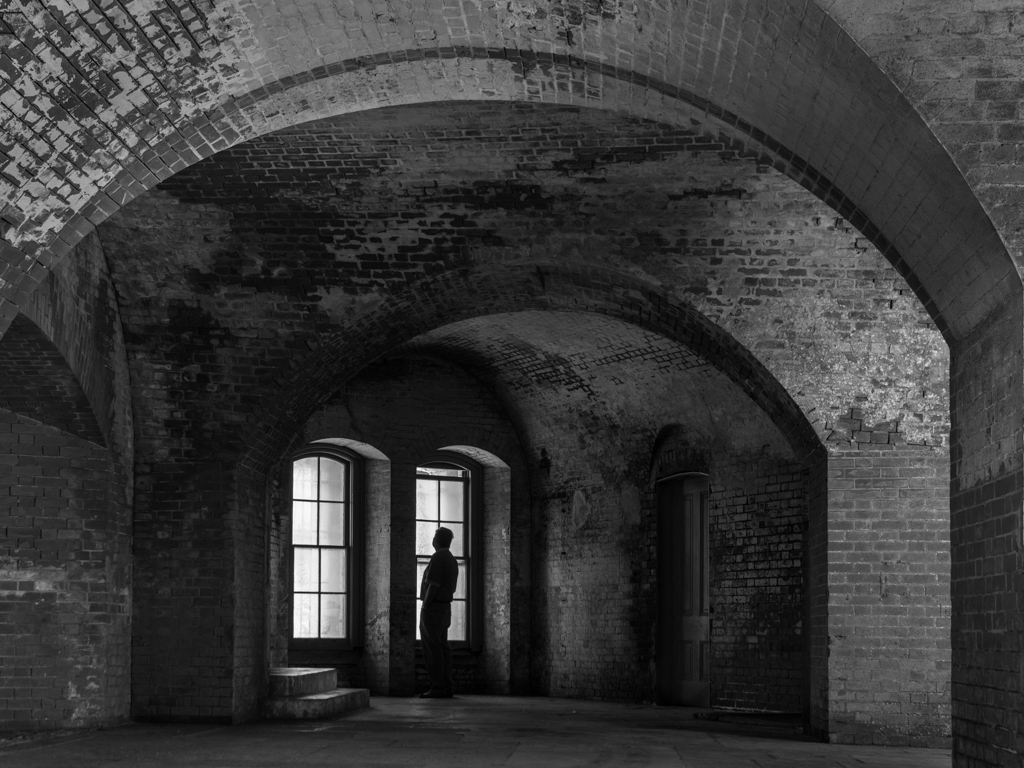
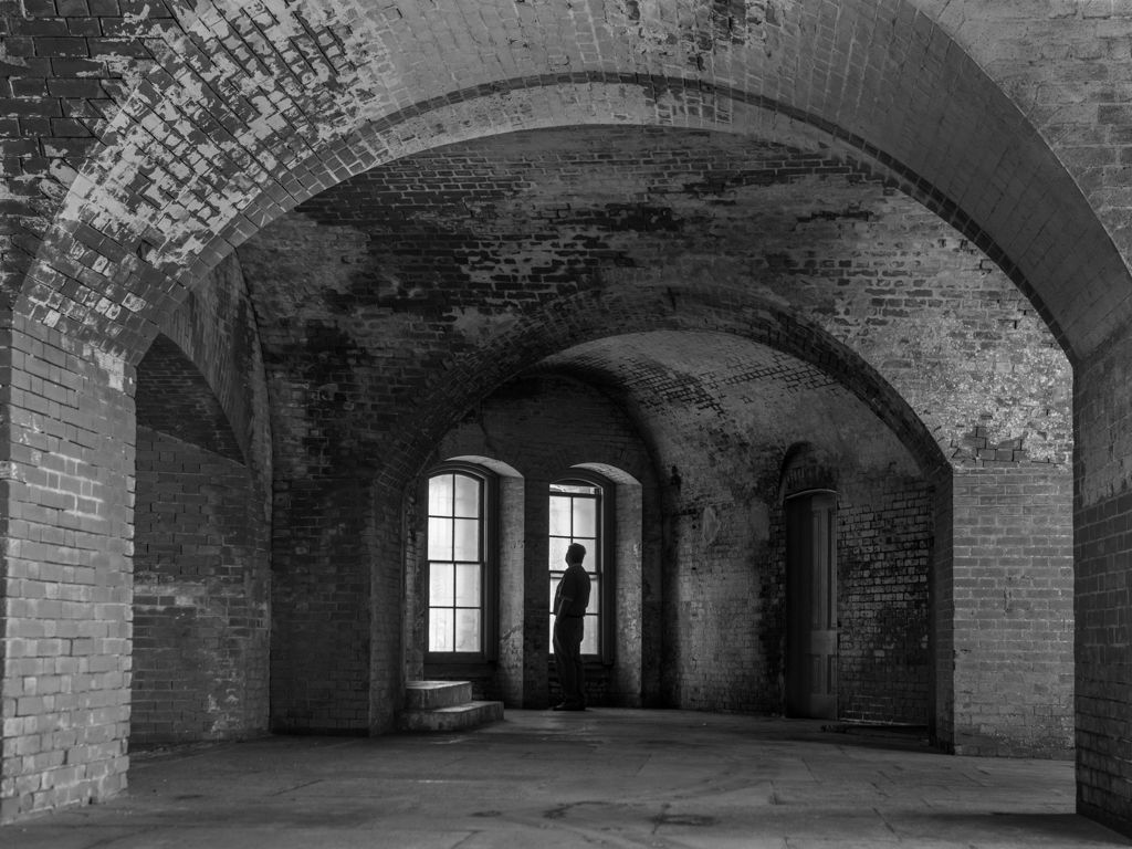
Hello Lynne, I am visiting from Monochrome Group 32. I very much like scenes that are lonely or tranquil. I think you did very well with the single person silhouette. I converted both versions to monochrome, for discussion. What do you and your group colleagues think? |
Oct 15th |
 |
3 comments - 0 replies for Group 42
|
| 43 |
Oct 18 |
Comment |
I think the hypnotic effect you experienced comes through nicely in your original image. Very well done to see the shot and get it.
I prefer your original image with lots of natural space all around the woman because when a human being is in nature, especially in an Asian art tradition, nature is a large and spacious place, and humans are very small by comparison. This is nicely expressed in your original image. |
Oct 24th |
| 43 |
Oct 18 |
Comment |
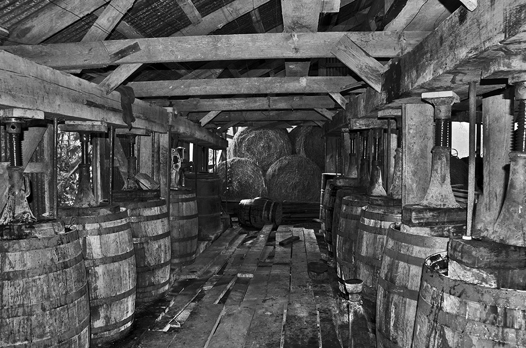
Hello Linda, I am visiting from Monochrome Group 32. I like you charming and interesting shot. I tried converting it to monochrome, and although I think it's OK in monochrome, I think the color tones in your original are preferable. I just include the monochrome here for the purposes of discussion, if anyone is interested. Thanks. |
Oct 5th |
 |
2 comments - 0 replies for Group 43
|
| 45 |
Oct 18 |
Reply |
Ray, I am doing an article on distortion and perspective for my local club's newsletter. May I use your before and after of this image as an example in my article? |
Oct 17th |
| 45 |
Oct 18 |
Reply |
Thank you, Ray. By the way, I am from Albany. I lived there as a boy in the 50s and 60s, long before any of this new construction. My Dad was in the Physics department at both the old and new campus of Albany State. Did you happen to know him? |
Oct 11th |
| 45 |
Oct 18 |
Comment |
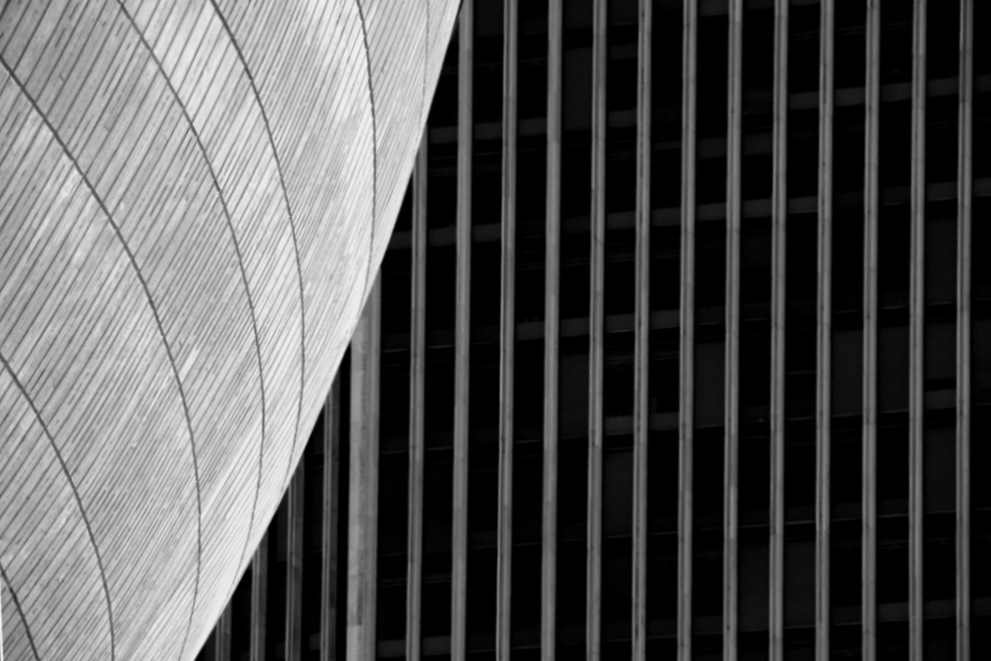
Wonderful composition. I love it. I think the distortion is a bit more complex than just applying a skew correction. It looks like a lens characteristic called pincushion distortion, which is not a perspective problem. I tried to correct it in PS Elements 6 using filter-correct camera distortion. Here is my rough attempt. See the Wikipedia article on Distortion (Optical).
|
Oct 8th |
 |
1 comment - 2 replies for Group 45
|
| 46 |
Oct 18 |
Comment |
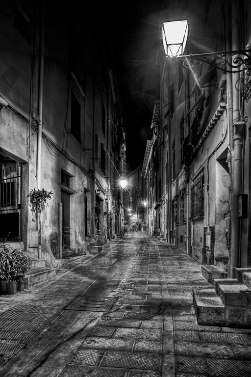
Hi Richard, I am visiting from Monochrome Group 32. I really like street scenes empty of people, so I very much like this. I think it also works very well in monochrome. What do you think? |
Oct 5th |
 |
1 comment - 0 replies for Group 46
|
| 47 |
Oct 18 |
Comment |
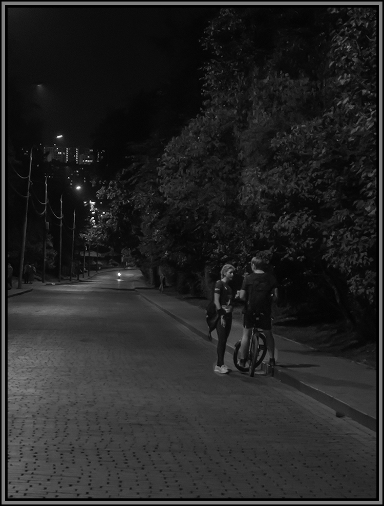
Hello Ed, I am visiting from another monochrome group, 32. I like your eye for this scene. I tried out lightening the couple, just a tiny bit, and did so only roughly, to see if that works. Perhaps it is like they were under a streetlamp. What do you think? |
Oct 8th |
 |
1 comment - 0 replies for Group 47
|
| 50 |
Oct 18 |
Comment |
Hi, I am visiting from Monochrome Group 32. This last comment from David sparked my imagination. I like his suggestion to use a dead rose, so I am adding a suggestion to include a page of stationery and a period pen, and a few words legible on the paper that tell of a sad situation, like "My dearest Mary, how I have disappointed you ...." Just imagining ... |
Oct 15th |
1 comment - 0 replies for Group 50
|
| 58 |
Oct 18 |
Reply |
Oh yes, I see, I went back to look at your last month, and now I understand the continuity. Kind of you to consider my formal portrait version, even though it does not fit this context. |
Oct 5th |
| 58 |
Oct 18 |
Comment |
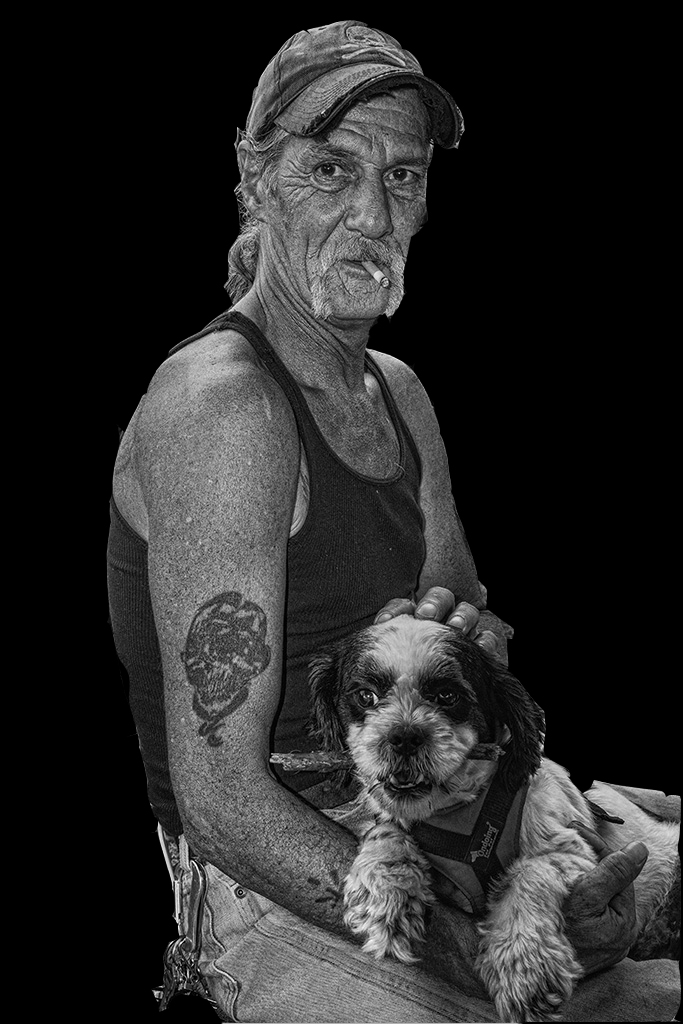
Your model is a very dramatic real-life individual, and you got a good shot of him. I find the background cluttered, especially the open car door. I like to formalize portraits of people and things against pure white or black backgrounds. I tried both here, but did not like the white. Here is the black, not very carefully done. What do you think? |
Oct 5th |
 |
1 comment - 1 reply for Group 58
|
| 63 |
Oct 18 |
Reply |
Glad to hear you are interested in doing that, Murphy. I am looking forward to seeing that. |
Oct 11th |
| 63 |
Oct 18 |
Comment |
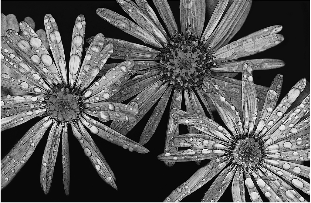
Hi, I am visiting from Monochrome Group 32. This is a lovely arrangement of the three blossoms. Being in a monochrome group, I always look for suitable shots to render in monochrome, and I think this would look fine, so I tried it. The dew drops came out fine, but not the yellow centers. I am not sure why--perhaps the conversion from your posted low-density image does not have enough pixels? Would you be interested in trying it on your full density original and discussing? |
Oct 8th |
 |
1 comment - 1 reply for Group 63
|
| 64 |
Oct 18 |
Comment |
Very attractive shot of the Golden Pavilion, and very special to show it successfully in monochrome. I visited there with my family in 1989, and also saw the Silver Pavilion. Thanks for taking me back there with this shot. |
Oct 15th |
1 comment - 0 replies for Group 64
|
| 65 |
Oct 18 |
Comment |
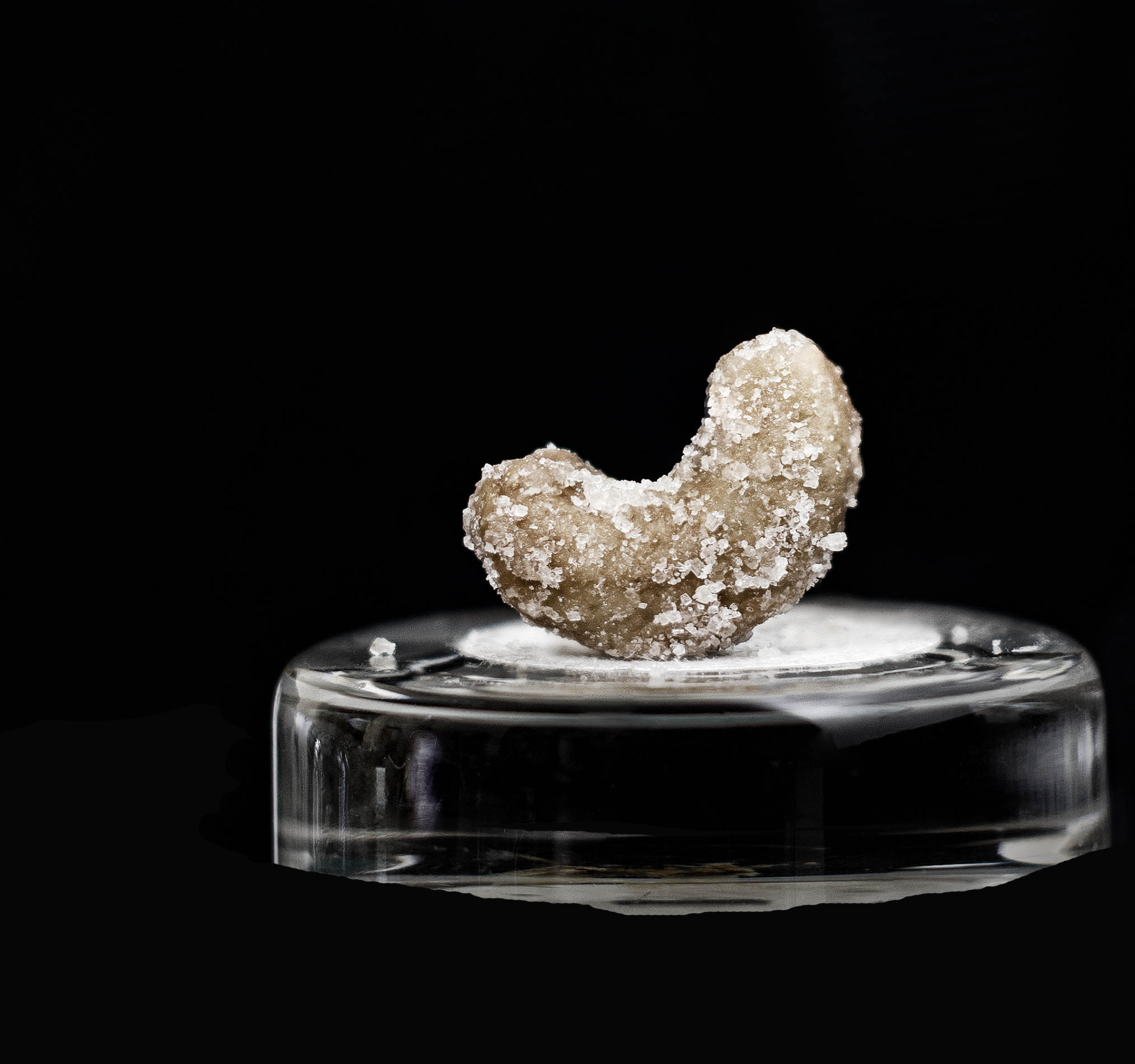
Hi Lynne, great idea to shoot what fascinates your eye. I think this is very successful, both the nut and satellite grain of salt. As to your question, I think adding the base was a good idea, but I don't care for the reflection. Suggest shooting this on a black velvet or other non-reflecting surface. Alternatively, you could PS-out the reflection--here is a rough try at that. |
Oct 15th |
 |
| 65 |
Oct 18 |
Comment |
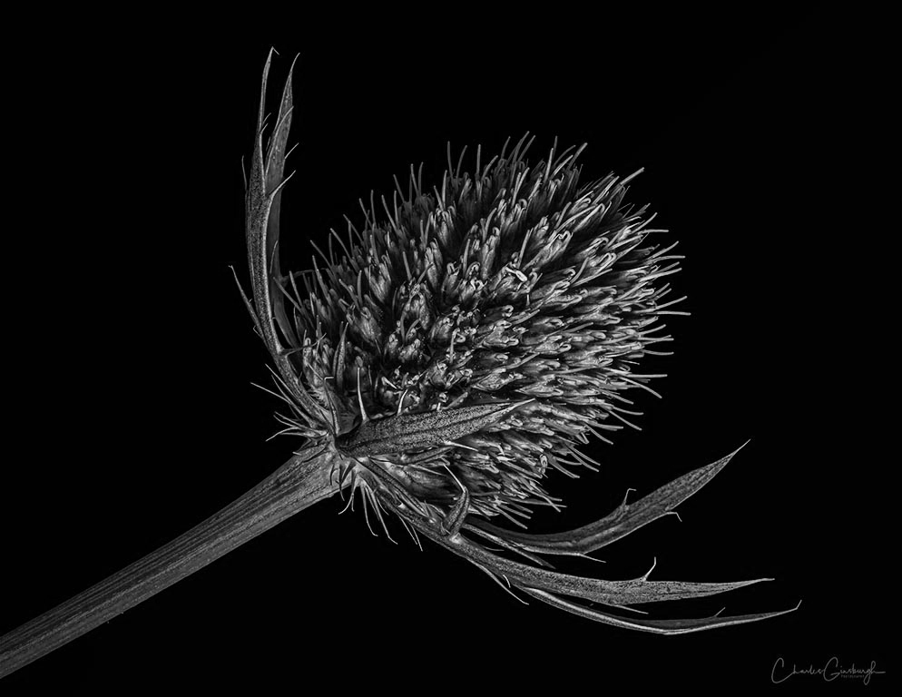
Hi, I am visiting from Monochrome Group 32. This is very striking. Since you emphasized the shadows in PS, I think it also renders very well in monochrome. |
Oct 11th |
 |
2 comments - 0 replies for Group 65
|
| 67 |
Oct 18 |
Reply |
Hoho. You should see some of my monochrome shots--I use a great deal of pure black--just the opposite of those who say I should draw out detail from the shadows.
Keep on being completely "personal" in your approach, Larry.
Great chatting with you, too. |
Oct 4th |
| 67 |
Oct 18 |
Reply |
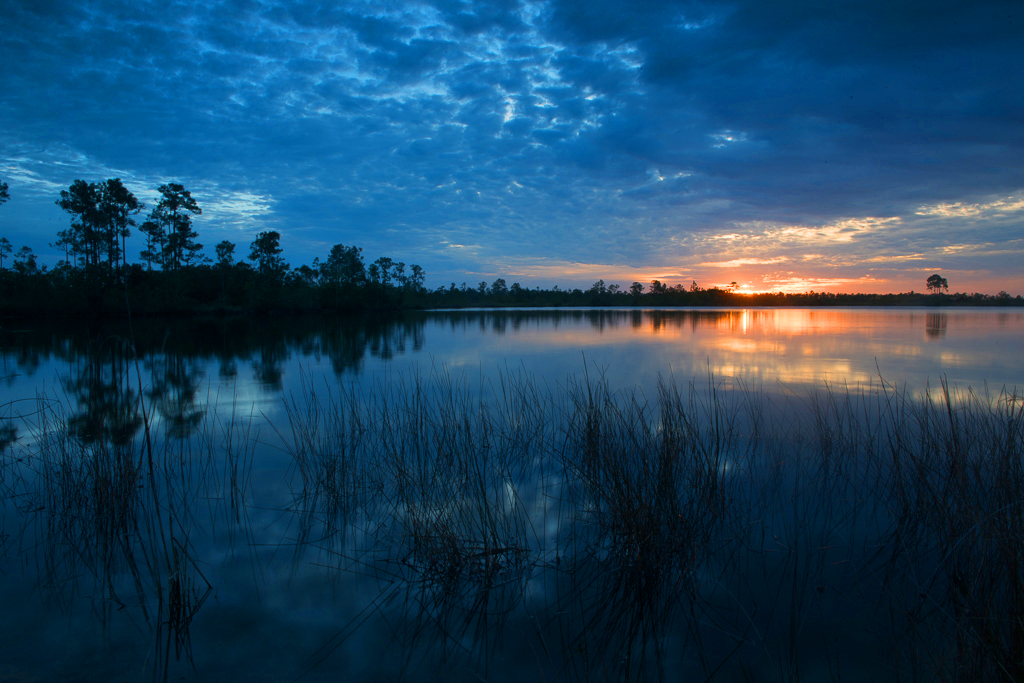
Something along these lines, but this is very personal to me, and just for discussion. Thanks. |
Oct 4th |
 |
| 67 |
Oct 18 |
Comment |
Now that you have shown us the original, I must say I prefer something closer to the original, with its deep evening mood, more than the finished image. This is personal, but I prefer that an image never announces "I am post-processed." What do you think about a midpoint of enhancement? |
Oct 4th |
| 67 |
Oct 18 |
Comment |
Looks great to me. How about showing us your original, so we can see where you started in order to get this stunning image.
I very much enjoyed your fine discussion of your intimate relationship with the 'glades. It is such discussions that add so much to the DD groups. |
Oct 1st |
| 67 |
Oct 18 |
Comment |
What a great time you must have visiting these spectacular places. This is such a striking image. Along with Barbara, I think the colors seem almost a bit too much--how about showing us your original image and we all discuss post-processing? Thanks. |
Oct 1st |
| 67 |
Oct 18 |
Comment |
Hi Michael, I am visiting from Group 32. Your story of taking the shot, naming your location, type of outing, and shooting experience, all combine to give great interest to your commentary. Your very organized step-by-step post-processing report is very clear and helpful. As to the composition of the image, I love those sharp thorns contrasting with the soft skin of the tree frog. Some more questions, since these DD groups are also a great chance to learn about the subject matter: do you know the genus and species, the range of habitat, what variety of colors or patterns are common, the life span, and if this is a male or female--in short, everything. Thanks. |
Oct 1st |
4 comments - 2 replies for Group 67
|
| 69 |
Oct 18 |
Comment |
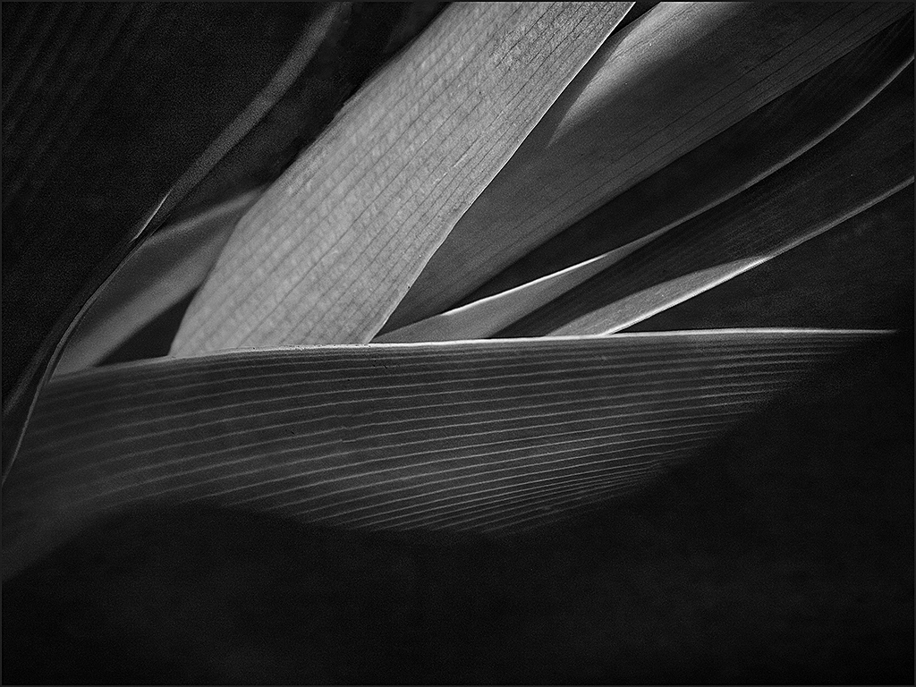
Hi, I am visiting from Monochrome Group 32. This simple and elegant shot is also suitable to render in monochrome. |
Oct 11th |
 |
1 comment - 0 replies for Group 69
|
| 71 |
Oct 18 |
Comment |
If you look through all the DD groups this month, you will see a number of Milky Way shots, and there are always a few every month. But you have done well and uniquely well to include two shooting start and a perfectly placed shot of the Andromeda Galaxy, which I am very excited to see. You evidently know the heavens very well. Nicely done. |
Oct 14th |
| 71 |
Oct 18 |
Comment |
Hello Mike. This is a lovely composition. Would you show us the original, so we can see how you changed it in post-processing? |
Oct 5th |
2 comments - 0 replies for Group 71
|
| 73 |
Oct 18 |
Comment |
Sherry, Ian, and everyone else. Congratulation on your first year together. We old-timers in Group 32 started almost ten years ago, and although some faces have changed, we have really gotten to know each others' styles, preferences, and strengths. It is wonderful to have extra supportive eyes on one's work. |
Oct 19th |
| 73 |
Oct 18 |
Comment |
I want to compliment you on this lovely shot, and particularly praise your admirable restraint to not over-process the sunset colors. |
Oct 14th |
| 73 |
Oct 18 |
Comment |
Charming photograph, and charming narrative to go with it. It really makes a difference when photographers tell heartfelt stories like this in their narratives. Thank you. |
Oct 14th |
3 comments - 0 replies for Group 73
|
| 76 |
Oct 18 |
Comment |
Great current topical subject matter to shoot. I have been seeing those Carvana ads on TV for several weeks now, and I thought the "car vending machine" thing was a clever joke. But lo, last week, I also drove by one. Did we see the same one, on I270 near Gaithersburg, MD?
P.S. I read your bio about what you shoot with. I shoot exclusively with a Canon G10, fits in my pocket, has full manual controls. |
Oct 7th |
1 comment - 0 replies for Group 76
|
| 78 |
Oct 18 |
Comment |
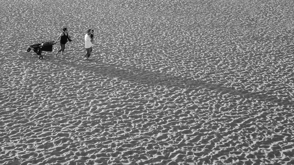
Hello Sunil, you bio says you prefer b/w. I do too, being in Monochrome Group 32. This interesting composition is all about shadows, so why not render it in b/w? Here is my very rough crack at it. |
Oct 1st |
 |
1 comment - 0 replies for Group 78
|
| 79 |
Oct 18 |
Comment |
The Smithsonian Museum Renwick Gallery here in Washington, DC has turned its entire space over this summer to a Burning Man exhibit, calling it the most important current art movement in America. A "Temple of Memory" to those gone from this life will remain as a permanent exhibit. Six large constructions are displayed on the nearby city streets. When I told my son in Seattle how impressed I was, he said Dad that's nothing to being there. So thanks for this image of being there! |
Oct 5th |
1 comment - 0 replies for Group 79
|
| 81 |
Oct 18 |
Comment |
Nicely done in b/w. There are about ten DD groups that do only b/w. Come visit some of the others. I am in 32, one of them. |
Oct 24th |
1 comment - 0 replies for Group 81
|
56 comments - 16 replies Total
|