|
| Group |
Round |
C/R |
Comment |
Date |
Image |
| 1 |
Aug 18 |
Reply |
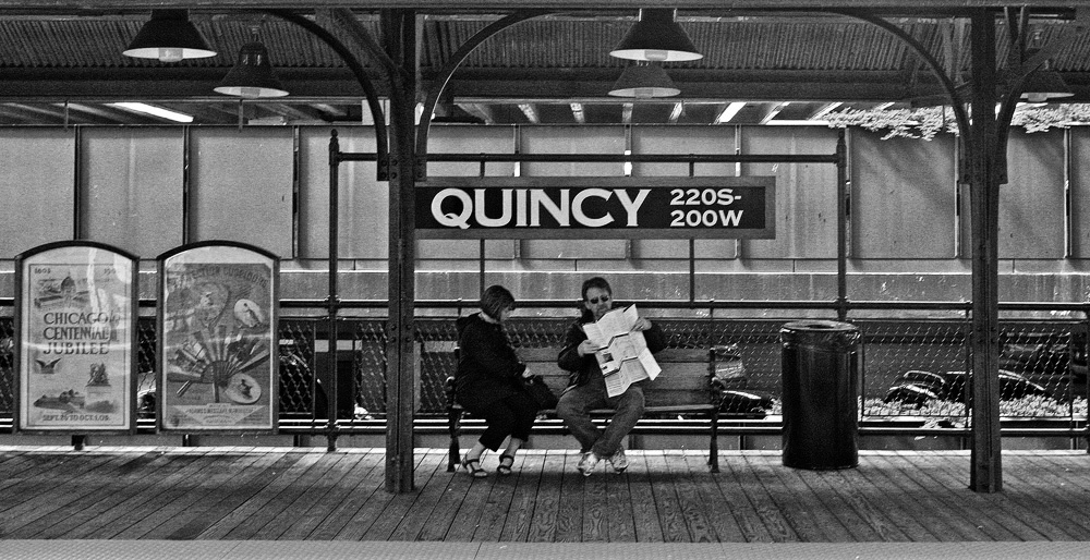
I look around at many of the groups each month. This month, I spotted four images that, to me at least, had a similarity. They all had a predominately yellow color, were all architectural, and I thought they would all look OK in monochrome. So here they are, should you want to go look at the others:
Group 1, Joey Johnson
Group 30, Leonid Shectman
Group 45, Don MacKenzie
Group 50, David Price |
Aug 10th |
| 1 |
Aug 18 |
Comment |
You might be the most vigorous point-of-view seeker in all of PSA, Kathryn. I can't understand why you were not shooting this standing in the water of the tidal basin (smile). I think this is a great success. I suggest you continue to explore this particular shot, maybe from one of the rental boats, or maybe extending the camera in one hand out over the water and a little below the level of the walkway. I am not sure it would work out, but how about filling half the frame on the right with feet--nah, bad idea, I take it back. |
Aug 3rd |
| 1 |
Aug 18 |
Comment |
Hi Joey, I am visiting from Monochrome Group 32. In our group, we frequently discuss this question of whether or not to have a focal point at the end of a leading line. I personally prefer an architecture study to be empty of people. For me, there is more focus on the composition and geometry, as well as a sense of order and peacefulness.
I think this would work equally well in monochrome. But the golden hues in this shot are quite attractive. |
Aug 3rd |
2 comments - 1 reply for Group 1
|
| 4 |
Aug 18 |
Comment |
That little bit of sky is very instructive for me. It tells me where the beautiful Irish landscape ends, but keeps the landscape the entire subject. I also like that this tranquil image is empty of people. |
Aug 4th |
1 comment - 0 replies for Group 4
|
| 5 |
Aug 18 |
Reply |
I love the supporting stories that folks can add to an image, in addition to discussing the image itself. If the goose is in mating colors, does that mean it follows the general rule of brighter male coloring, and this is a male? |
Aug 17th |
0 comments - 1 reply for Group 5
|
| 8 |
Aug 18 |
Comment |
Hi again, Mark.
I go around and look at all the groups each month, and I saw one other orange stucco window this month that you might be interested in viewing. It is in Group 51, by Pamela Hoaglund. |
Aug 10th |
| 8 |
Aug 18 |
Reply |
Ah, the blue line! I think you are right to prefer the color. |
Aug 10th |
| 8 |
Aug 18 |
Comment |
This is really impressive. You and your workshop instructor are doing great stuff. This sits in both the worlds of abstract geometry and recognizable everyday objects. You sought and accepted the deep shadow without bringing up the detail in it. I like the careful placement of the diagonal points into the exact corners of the frame. It is rare to see a color shot that takes advantage of deep shadow like this. This is very instructive, and I really enjoyed seeing it. |
Aug 4th |
| 8 |
Aug 18 |
Comment |
Hi Alastair, I am visiting from Monochrome Group 32. This is a fine tranquil composition. I think it would look equally good in monochrome. |
Aug 3rd |
 |
3 comments - 1 reply for Group 8
|
| 9 |
Aug 18 |
Comment |
A beautiful shot of this scene. I am so enthusiastic about your excellent use of the full window light source. |
Aug 17th |
| 9 |
Aug 18 |
Comment |
Hi Priscilla, I am visiting from Monochrome Group 32. This is a great perspective. Was this shot with one of your lenses set to 18mm? I think this also looks good in monochrome. |
Aug 17th |
 |
| 9 |
Aug 18 |
Comment |
Hi Jessse, nice sharp shot, yes. I look at a lot of the groups. This month, you may want to look at three other big cat shots. Cindy Lynch in Group 45 shot a resting lion. And Brenda Fishbaugh in Group 78 worked on a standing tiger. See the discussion that followed in Group 78, where everyone there discussed the shot at length. See also Tony Fabian in Group 72 who did a standing tiger. |
Aug 17th |
3 comments - 0 replies for Group 9
|
| 11 |
Aug 18 |
Comment |
Hi Sharron, I am visiting from Monochrome Group 32. What a great story you have told of getting this shot. It is certainly well done in monochrome. Aside from switching to monochrome, did you do any brightness/contrast adjustments? Sharpening? It looks like you cleared up the surface of the water? |
Aug 3rd |
1 comment - 0 replies for Group 11
|
| 23 |
Aug 18 |
Reply |
Shadows. Shadows. Shadows. I think they are part of photography, especially the human form. Now that the shadow of her hand on her bottom is gone, the overall impression is better, but I think the rest of the shadows need to stay to define roundness.
I like the straight b/w best.
Good model, good pose, good shot, good lighting, good post-processing. Let us know over in group 32 how it does in competition. |
Aug 14th |
| 23 |
Aug 18 |
Reply |
Oh yes, the more one looks, the more one sees. I agree the shadow on the back wall in your monochrome is distracting. Let us see a revised version when you get rid of it.
By the way, you improved Wendy's hair a lot in the monochrome. |
Aug 11th |
| 23 |
Aug 18 |
Reply |
I must confess I don't understand much about studio lighting. Why are those shadows unsuitable? Should there have been a fill light from the other side to eliminate them (I thought that was standard in a studio setup). Maybe Brian can tell us what the lighting setup was. |
Aug 11th |
0 comments - 4 replies for Group 23
|
| 25 |
Aug 18 |
Reply |
Thanks, Marla, this was as-shot, and you have finished it very, very nicely. Since I can't adjust such lighting, I can think in the future about bringing the model a little further indoors, so the contrast between light and dark sides is not quite so strong, especially in color. However in B/W, it might be OK, but I would still take your suggestion to brighten the eyes--good hint. |
Aug 14th |
| 25 |
Aug 18 |
Comment |
Hello Marla, I am visiting from Monochrome Group 32.
You captured a fine portrait with lots of sensitivity--a complete success. And if color is not the actual subject, such shots are often better in monochrome, in my opinion.
Since there are no harsh shadows, I am guessing you shot this in open shade?
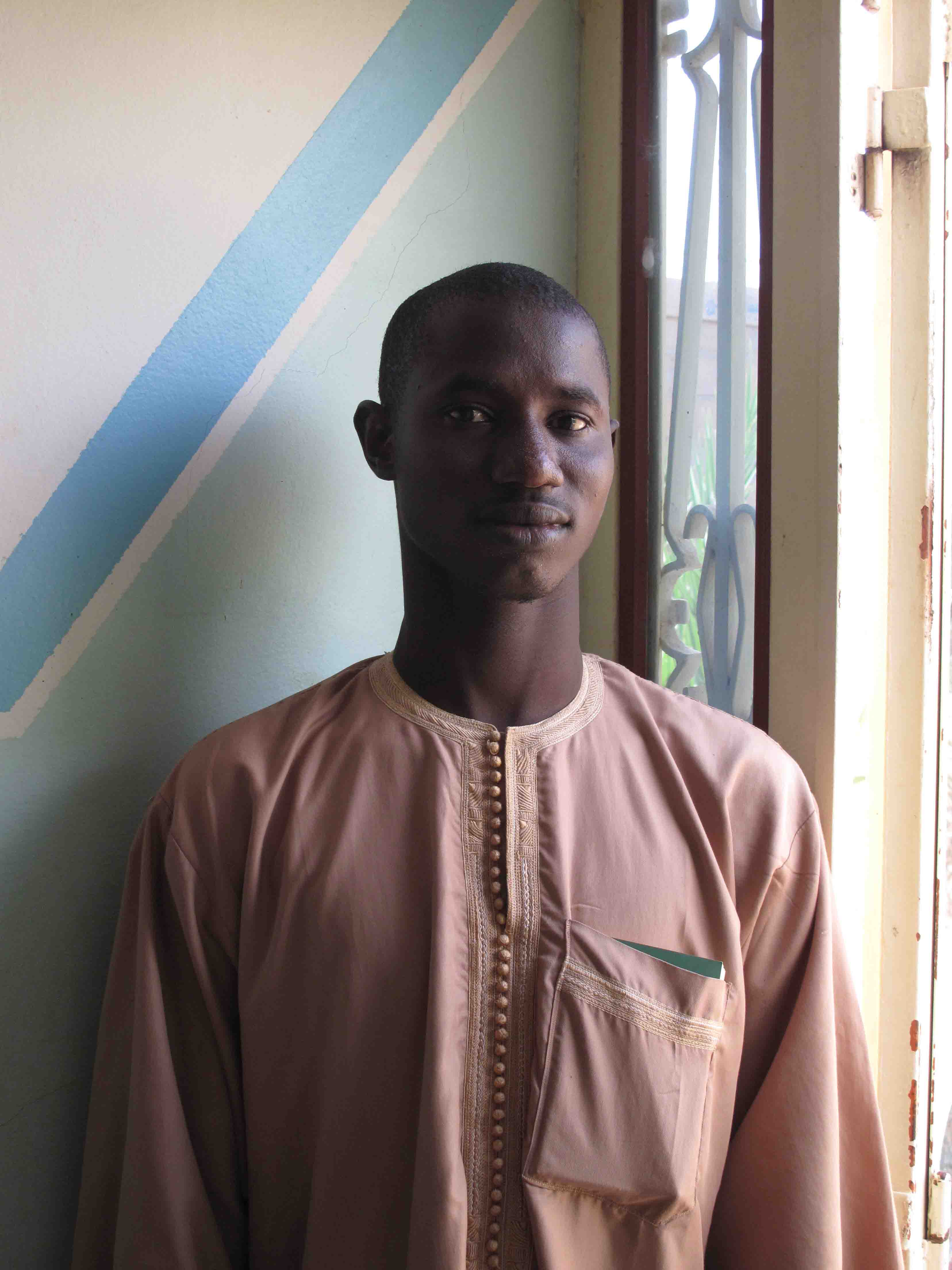
You can also try shooting natural light portraits just inside a door or window or under an arcade so a vast expanse of diffuse light comes from one side. Then you can get some very pleasant gentle shadows. Here is a shot I took a while back with that lighting. Please feel free to critique it back at me. |
Aug 11th |
 |
1 comment - 1 reply for Group 25
|
| 26 |
Aug 18 |
Comment |
This is very charming. I like that it is empty of people. I like emptiness in 'scapes.
Do you think the Botanical Gardens had in mind Monet's garden?
I have nothing to comment on except maybe to remove the jet trail showing between clouds. |
Aug 17th |
| 26 |
Aug 18 |
Comment |
Belinda, if you have a chanced to revisit this site, try shooting this scene when the sun sets out shadows of the S-Cape (I love pun) against the brick wall, if that can be done. There is a long history in photography of such urban pattern photography. |
Aug 4th |
2 comments - 0 replies for Group 26
|
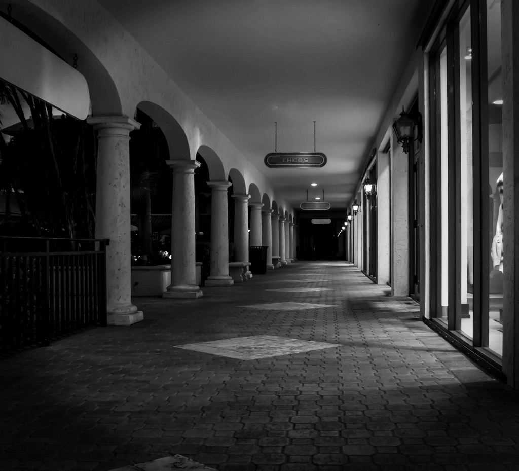
| 27 |
Aug 18 |
Comment |
Hi Danny, I am visiting from Monochrome Group 32. I very much like empty or near-empty corridor shots, and this is a nice one. The gold tones are very attractive, so color is probably the right choice, but I will point out that this works very well in monochrome as well.
|
Aug 11th |
| 27 |
Aug 18 |
Comment |
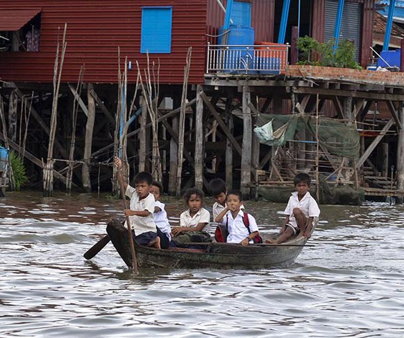
Congratulations on a fine travel shot, showing both the persons and the context. The expression of the boy in front, rowing, is a fine capture.
I think you have many cropping choices. Here is another view, showing the habitations. Just an alternative. |
Aug 6th |
 |
2 comments - 0 replies for Group 27
|
| 28 |
Aug 18 |
Comment |
Alice, I hope the photography can give you a respite from the job stress. Lots of us hit one of these periods when things are terrible. Hopefully, you can look back on it soon as a bad patch in the past.
You have a good eye for a tranquil shot. I particularly like that it is empty of people, something that I very much like in such shots. |
Aug 11th |
1 comment - 0 replies for Group 28
|
| 29 |
Aug 18 |
Reply |
Oh, that's great. I am looking forward to seeing that group make its debut. Yea, Monochrome! |
Aug 5th |
| 29 |
Aug 18 |
Comment |
Hi Bill, I am visiting from Monochrome Group 32. Your composition is very striking. I see from your bio that you don't do much post-processing, but the switch to monochrome and a little tweaking of contrast is simplicity itself. I did this in Photoshop Elements in 10 seconds. How do you like it? |
Aug 3rd |
 |
1 comment - 1 reply for Group 29
|
| 30 |
Aug 18 |
Comment |
I look around at many of the groups each month. This month, I spotted four images that, to me at least, had a similarity. They all had a predominately yellow color, were all architectural, and I thought they would all look OK in monochrome. So here they are, should you want to go look at the others:
Group 1, Joey Johnson
Group 30, Leonid Shectman
Group 45, Don MacKenzie
Group 50, David Price |
Aug 10th |
| 30 |
Aug 18 |
Comment |
I am visiting from Monochrome Group 32, and always wondering how color shots would look in monochrome. Your colored sunset is one of the best features of this shot, so monochrome can't convey that, but it can display the architectural study. Here it is, for your interest. |
Aug 4th |
 |
2 comments - 0 replies for Group 30
|
| 31 |
Aug 18 |
Comment |
I would like to add that totally empty streets is an often-visited subject matter in the history of photography, either as studies in shapes, or studies in loneliness. I think your image suggests "anticipation" since it appears to be in the early morning.
See the work of the German photographer Thomas Struth, who among other subjects, photographed streets as loneliness. Go to http://www.thomasstruth32.com/smallsize/photographs/streets_of_new_york_city/index.html on his website to see his images of New York City. |
Aug 16th |
| 31 |
Aug 18 |
Comment |
Hi John, I am visiting from your neighboring Monochrome Group 32. This is such a clever idea to show both sides of a street on just one side. I have learned and will remember the technique. |
Aug 3rd |
2 comments - 0 replies for Group 31
|
| 32 |
Aug 18 |
Comment |
Michael, you are raising a very interesting point. I don't think its a USA/UK cultural difference, just a choice that must always be made, especially if you are preparing a body of work that has a unified approach, as you point out. That would be a good reason not to crop, to keep consistent with the entire body of work.
As for story-telling in a single shot, not in a body of work, I think those of us who suggested crops did so with the idea of focusing more sharply on the most interesting story in the frame--at least I did. I think you are right not to want to reduce this shot to a portrait, and I would not suggest that. |
Aug 29th |
| 32 |
Aug 18 |
Reply |
Hi Belinda, thanks for visiting and thanks for your suggestions. Everyone has been very helpful. |
Aug 27th |
| 32 |
Aug 18 |
Reply |
Just me, but I like your first version better. I think this one is a bit too much. |
Aug 16th |
| 32 |
Aug 18 |
Reply |
Hi Marla, nice of you to visit. Thanks for chipping in to suggest improvements. I like your edits. I submitted this as an "ordinary" shot, not what I felt was my best, specifically in order to get ideas about improving, and everyone has been very helpful. |
Aug 14th |
| 32 |
Aug 18 |
Comment |
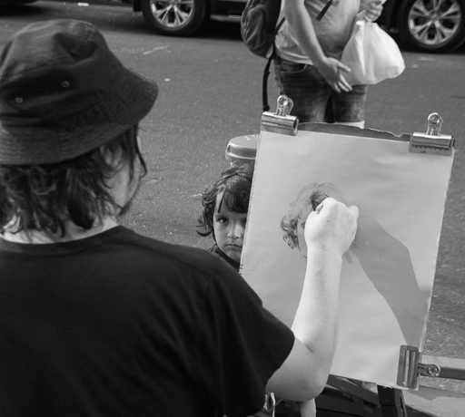
Yes, you are telling a story, and it's a fine and successful story. So my suggestion is to tell all of the story, with a crop like this, showing all of the artist's hand, all of the easel, and all of the artist. That would somewhat solve the focus problem by reducing the out-or-focus area. Of course you must remove the undesirable background elements; I think replacing them with the pavement tones would be just fine. |
Aug 12th |
 |
| 32 |
Aug 18 |
Reply |
Yes, good call, I also prefer it in color as a memory of our travels. |
Aug 7th |
| 32 |
Aug 18 |
Comment |
Jennifer, the hunt for a different view of commonly shot attractions goes on and on. You did very well with this. I think the sky is fine; darker might be OK. Remove the two cars?
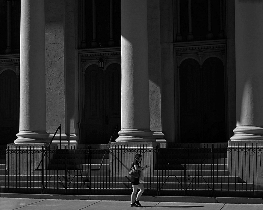
Have a look at Group 1 this month, where Kathryn Mohrman goes to great lengths to get a unique shot of the cherry blossoms at the Tidal Basin. |
Aug 6th |
| 32 |
Aug 18 |
Comment |
Now that I see from looking elsewhere in the groups that Wendy's legs are a bit heavy, I think you did very well to do the mermaid covering of them. |
Aug 6th |
| 32 |
Aug 18 |
Comment |
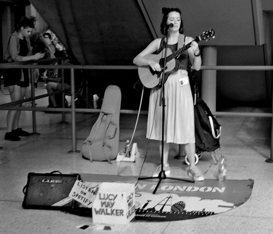
I am not sure. How about the cropping? Like below? Maybe make the second person also brighter, and compare the singer to a single passer-by, who happens to be looking at her phone rather than the singer? |
Aug 3rd |
 |
| 32 |
Aug 18 |
Comment |
Our four grand-kids range from two to six, and they also all love to play with umbrellas. We committed a major error recently when we only had three to give out.
You caught a fine, enthusiastic moment in this shot.
Good choices for cropping and darkening--you did not need that floral cushion in the shot.
Technically, I see the flash shadow is very far off-set. Was this shot with the camera rotated 90 degrees to the right? If that is the cause, then perhaps such shots should be made with the camera level, and then crop to the desired image. Do I read this right? |
Aug 3rd |
| 32 |
Aug 18 |
Comment |
I like the post-processing effect on the drapery, but not on your model's skin, which I think would look better without any effect, it being attractive, smooth, and nicely lit.
Wendy is a good model. Her facial expression is good, and her hand pose is good. But I don't care for the modesty about covering her breasts. |
Aug 3rd |
7 comments - 4 replies for Group 32
|
| 37 |
Aug 18 |
Comment |
I am so sorry that we did not see this monument when I took my wife and children to Chandigarh in 1989. We saw the city center by Le Corbusier and the Rock Garden of Nek Chand, and met Mr. Chand in his studio in the center of the garden. What a memorable visit to your city! |
Aug 11th |
| 37 |
Aug 18 |
Comment |
Both images are great, but somehow the b/w seems to show more detail, and being b/w it is a more formal portrait, very suitable to an eagle. |
Aug 11th |
| 37 |
Aug 18 |
Reply |
Lynette, my daughters used to ride hunt seat and would make a "chucking" noise to urge their mounts into the jumps. Is that "smooching?" |
Aug 11th |
| 37 |
Aug 18 |
Comment |
There are three rodeo shots this month! You all might want to look at each others'. Everyone had a different approach to working on focus:
Group 37, Gunter Haibach (and an extra image from Grace Bryant, and commentary from a former barrel racer, Lynette Colgin)
Group 59, Bruce Benson
Group 70, Kathryn Engle |
Aug 10th |
| 37 |
Aug 18 |
Comment |
This tells a wonderful story of visitors to a museum and very cleverly mixes sharp and blurred people.
The German photographer, Thomas Struth, is famous for his museum photos. Check him out on Wikipedia, and his website, www.thomasstruth32.com, and click through to his many museum collections. There was a major article in The New Yorker on him some years back, and he was the official photographer for a fairly recent formal portrait of Queen Elizabeth II and her husband. |
Aug 6th |
| 37 |
Aug 18 |
Comment |
Looks pretty great for a first try. Lots of my group colleagues used to take rodeo shots. The audience in the background is always a problem. You can de-emphasize them by pre-focusing on the barrel and using a wider aperture to blur the audience a bit. This can also be repaired in post-processing if you want to and know how. In this shot, I suggest taking out the lone viewer directly behind, wearing sunglasses and a striped shirt. Also, please tell us about this event. Is this a barrel race, and is this a 90-degree or 180-degree turn? Does anything count other than time? Is it OK to knock over a barrel? |
Aug 3rd |
5 comments - 1 reply for Group 37
|
| 38 |
Aug 18 |
Comment |
A gentle smile and a wide atmospheric background. This captivating portrait could be a Renaissance painting. Are you doing this on purpose, or is it a happy accident? |
Aug 5th |
1 comment - 0 replies for Group 38
|
| 40 |
Aug 18 |
Comment |
Interesting shot, telling the story without showing faces--well done.
Is this Ascot? |
Aug 5th |
1 comment - 0 replies for Group 40
|
| 43 |
Aug 18 |
Comment |
Hi Toni, I am visiting from Monochrome Group 32, so I am especially interested in monochrome images in the general groups.
I keep coming back to your image again and again because I find it captivating. So for staying power, it is a total winner with me. Understanding why is something else. I think it's because it is so totally a candid slice of life. The big biker is gesturing right at you, his companion is grinning, two bodyless heads are peeking over his shoulders, everything cuts off at all four edges of the frame (I like that is this case--it is like real life).
I LOVE the Real Estate office--cutting it out would be a compositional crime!
All strictly my gut reactions to your image that follows no rules.
Have a look at Robert Frank's book, The Americans, to see a famous work where all compositional rules were permanently broken, and ever after for b/w photography. |
Aug 16th |
1 comment - 0 replies for Group 43
|
| 45 |
Aug 18 |
Reply |
I look around at many of the groups each month. This month, I spotted four images that, to me at least, had a similarity. They all had a predominately yellow color, were all architectural, and I thought they would all look OK in monochrome. So here they are, should you want to go look at the others:
Group 1, Joey Johnson
Group 30, Leonid Shectman
Group 45, Don MacKenzie
Group 50, David Price |
Aug 10th |
| 45 |
Aug 18 |
Comment |
Hello Don, I am visiting from Monochrome Group 32. I very much like this sort of receding line, and a bit off-center. Although I am in a minority here, I prefer such architectural shots empty of people, showing the geometric study, and perhaps expressing emptiness or tranquility. Also, have a look at how this looks in monochrome. |
Aug 3rd |
 |
1 comment - 1 reply for Group 45
|
| 50 |
Aug 18 |
Comment |
Hi David, I am visiting from Monochrome Group 32.
I look around at many of the groups each month. This month, I spotted four images that, to me at least, had a similarity. They all had a predominately yellow color, were all architectural, and I thought they would all look OK in monochrome. So here they are, should you want to go look at the others:
Group 1, Joey Johnson
Group 30, Leonid Shectman
Group 45, Don MacKenzie
Group 50, David Price |
Aug 10th |
1 comment - 0 replies for Group 50
|
| 51 |
Aug 18 |
Comment |
Hi Pamela, I am visiting from Group 32. I am very fond of window shots like this. Very nice shot, this one, especially to have light of another color coming in from outside.
I go around and look at all the groups each month, and I saw one other orange stucco window this month that you might be interested in viewing. It is in Group 8, by Mark Southard. |
Aug 10th |
1 comment - 0 replies for Group 51
|
| 53 |
Aug 18 |
Comment |
Hi Brenda, I am visiting from Monochrome Group 32. This is so perfectly simple; what a good eye you has to see and take this shot. |
Aug 5th |
| 53 |
Aug 18 |
Comment |
This is a daring juxtaposition of the Lone Rider and Mt. Rainier. It works for me, partly because two of my kids live in Seattle (we visit often), and we don't see Rainier quite this closely from Rainier Avenue or from SeaTac. It looms large in this shot, I must say. |
Aug 5th |
2 comments - 0 replies for Group 53
|
| 59 |
Aug 18 |
Comment |
There are three rodeo shots this month! You all might want to look at each others'. Everyone had a different approach to working on focus:
Group 37, Gunter Haibach (and an extra image from Grace Bryant, and commentary from a former barrel racer, Lynette Colgin)
Group 59, Bruce Benson
Group 70, Kathryn Engle |
Aug 10th |
| 59 |
Aug 18 |
Reply |
Thanks, Bruce, for the explanation. I did not know the two riders were a team. You are right, for PJ I believe you can only make minor brightness/contrast adjustments and crop. You can't remove anything. But you have a great shot. Congratulations. |
Aug 6th |
| 59 |
Aug 18 |
Comment |
I have the same questions as for your colleague, Bruce. Did you pre-focus on a spot and wait for the action to arrive there? And how many shots did you take that day? |
Aug 5th |
| 59 |
Aug 18 |
Comment |
You certainly nailed the focus on this, and at 5.6 you have separated the inevitable spectators very nicely. Did you pre-focus on a fixed spot and wait for the action to get there? How many shots did you take that day? Consider removing the two guys standing in the ring on the right, since they are in sharper focus that the seated folks behind, and visually mix up a bit with the riderless horse. Please tell us about this event--I don't know much about rodeo. Does the contestant just have to knock the steer (?) off his feet? Is this guy going to make it, or take a spill? Is his right foot safely out of the stirrup? Is there always another rider controlling the steer in these events? Thanks--I had lots of questions. |
Aug 5th |
3 comments - 1 reply for Group 59
|
| 61 |
Aug 18 |
Comment |
I am visiting from Monochrome Group 32, so of course I am excited to see you chose to present this image in monochrome. I think it lends more formality to a portrait. Also, although the girl's blue dress is a pleasant color, this image is not about her colored dress.
These are presumably her brothers, and she shows great care towards them. One day she will hopefully be a similarly caring mother.
Well done capturing this.
P.S., you don't have a biography posted with your group. It would be nice to tell everyone a bit about yourself. If you will do so, send it to your group administrator. Thanks. |
Aug 11th |
1 comment - 0 replies for Group 61
|
| 62 |
Aug 18 |
Reply |
As I looked at this image, I thought the patches of blue sky (rendered in monochrome) were the blackest areas of the smoke from the fire I imagined. LOL, indeed, Pete. |
Aug 6th |
| 62 |
Aug 18 |
Comment |
Hello Gary, I am visiting from Monochrome Group 32. When I first looked at this, I took the clouds to be the smoke of a burning building. To me at least, in monochrome, it looked a bit ambiguous. I think that implication is just great, since it might suggest the demise of the original building long ago. |
Aug 5th |
1 comment - 1 reply for Group 62
|
| 67 |
Aug 18 |
Comment |
Tres tres charmant. Mais up peu dificile a distinguer les individus. |
Aug 7th |
1 comment - 0 replies for Group 67
|
| 70 |
Aug 18 |
Comment |
There are three rodeo shots this month! You all might want to look at each others'. Everyone had a different approach to working on focus:
Group 37, Gunter Haibach (and an extra image from Grace Bryant, and commentary from a former barrel racer, Lynette Colgin)
Group 59, Bruce Benson
Group 70, Kathryn Engle |
Aug 10th |
| 70 |
Aug 18 |
Comment |
This looks pretty good--congratulations. Nice that the sharpest point of all was the rider's face. The panning solves the problem of the inevitable spectators very well. Questions from me, a novice: what event is this, is the cowboy about to use his rope? Did you pre-focus for your range? How many shots did you take that day? Thanks. |
Aug 5th |
2 comments - 0 replies for Group 70
|
| 72 |
Aug 18 |
Comment |
Hi Tony, I look at a lot of the groups. This month, you may want to look at two other big cat shots. Cindy Lynch in Group 45 shot a resting lion. And Brenda Fishbaugh in Group 78 worked on the same problem you had, a standing tiger. See the discussion that followed in Group 78, where everyone there discussed the shot at length. |
Aug 11th |
1 comment - 0 replies for Group 72
|
| 74 |
Aug 18 |
Reply |
Oh no, I have nothing to suggest, as it looks great to me. I see that, like you said, you straightened the tilt, and lightened that back wall appropriately to the composition. I could not do as well with the post-processing. I am praising the finished product. Let's see what your group colleagues say. |
Aug 7th |
| 74 |
Aug 18 |
Comment |
Your B/W shot is not only a fine family memory, but a quality composition, worthy of display. Your son's balancing act is truly charming, juxtaposing his tricycle with your bike. |
Aug 7th |
1 comment - 1 reply for Group 74
|
| 78 |
Aug 18 |
Comment |
Hello Richard, I am visiting from Group 32. You did very well to catch this image as you did. It is captivating, and most interesting to read how you and your group colleagues are working on it together.
I am a strong advocate of a good title, but mostly for setting a context that the image itself does not convey. In this case, since you don't know the main character's story, you might imagine one based on his breathing filter and what looks like a skin condition. I tried blowing up this image, but it lacks the pixels for me to see what his skin looks like close up--maybe you can blow up your original to discern if he has a rash, or was a burn victim, or if those are just strange shadows. My title, and I am not very satisfied with it, would be "Going Home--No Treatment Available." |
Aug 9th |
| 78 |
Aug 18 |
Comment |
Hi Brenda, I am visiting from Group 32. Welcome to all of you to the DD groups. I am very impressed with all of you, and your enthusiasm for working with each other and working out your photographic problems together--in all seven of your group's images.
In the case here, I think the most recent crop, being the closest, is the best because it "makes contact" with the tiger. Only with this image do I feel like I am in danger. |
Aug 9th |
2 comments - 0 replies for Group 78
|
| 80 |
Aug 18 |
Comment |
Hello Colin, I am visiting from Monochrome Group 32. Welcome to you and your colleagues to DD. You folks are working intensively together to exchange your ideas about your images. It is most interesting to read.
I like your image because it has a foreground, middle area, and background. Each is interesting, and they relate well.
Since I am in a monochrome group, I tried converting this to monochrome, and although it looks fine that way, I prefer the colors you have captured.
I like that no faces are showing, but the people nevertheless relate to each other.
I note several things about the advertising painted on the background wall. First, the fingernails of the hand are trimmed off square--I wonder if that is a specifically Asian styling--perhaps someone can verify. Second, having managed to learn to eat sort of acceptably with chopsticks, I would point out that the hand holding the chopsticks gives an excellent instruction of the proper grip of all the fingers--bottom stick held immobile by the base of the thumb and two lower fingers, and top stick mobile and held like a pencil by the end of the thumb and index finger. |
Aug 9th |
1 comment - 0 replies for Group 80
|
54 comments - 18 replies Total
|


