|
| Group |
Round |
C/R |
Comment |
Date |
Image |
| 2 |
May 18 |
Comment |
Hi Gary, I am Steve from Monochrome Group 32.
I think you have a highly personal shot that just does not match up with convention. Even though it was an accident, I think it has merit for its impressional content. Malabika has a good suggestion, to try this deliberately as a controlled technique. Some of the most famous photographers of the 20th century used blurred images to convey mood. Reference Robert Frank's book, The Americans, or Robert Capa's famous image of the Normandy landing. |
May 14th |
1 comment - 0 replies for Group 2
|
| 3 |
May 18 |
Comment |
Hello Punkaj, I am Steve from Monochrome Group 32. I like the subject matters, since I have been there twice, and it is a devil of a shooting situation. You can't get close, and you can't get a good angle in that great outdoor museum. You did the best you could, and much better than my shots when I was there.
I like your Original 2 the best, because of the excellent lighting on the face.
It might be worth mentioning to everyone that the Terra Cotta Warriors all have individual faces, perhaps taken from life. |
May 6th |
1 comment - 0 replies for Group 3
|
| 4 |
May 18 |
Comment |
Hi, I am Steve from Group 32. I argue all the time (no pun) with my colleagues about the importance of choosing an appropriate title for an image. Just choose a title:
Birds Telling Time. Bird Clock. Clockwise Ibisi. |
May 14th |
1 comment - 0 replies for Group 4
|
| 5 |
May 18 |
Reply |
Yes, that's what we are all about in these groups, Barbara. It is very hard to see our own creations with fresh eyes. |
May 15th |
| 5 |
May 18 |
Comment |
Very dramatic, I must say! You can't tell if the center square is coming at you or receding from you. Very Escher-esque. But the edge on the upper left is very faint--can you bring it out as much as the other edges? |
May 14th |
1 comment - 1 reply for Group 5
|
| 8 |
May 18 |
Comment |
Hello Alistair, I am Steve from Monochrome Group 32. This is a very nice capture. You might also try converting it to monochrome and see how you like that. |
May 6th |
1 comment - 0 replies for Group 8
|
| 10 |
May 18 |
Reply |
Rich, I read your bio. Have you scanned any of your slides or prints from your Navy tours in Asia? You must have some great shots, now getting even historic. |
May 18th |
| 10 |
May 18 |
Comment |
Hi Donna, I am Steve from Monochrome Group 32. I know that everyone in your group is suggesting cutting out the windows, but I am not sure. Yes, the cropped composition is a better arrangement of shapes. But the uncropped version tells a story about the place, that this is a room of abandoned equipment, but there is an OUTSIDE. And LIGHT is flooding in from OUTSIDE. What lies OUTSIDE? Nature? Freedom? Danger? Dirt? Therefore, I suggest keeping the uncropped version and changing your title to "Bathtubs--Preston Prison." |
May 14th |
| 10 |
May 18 |
Comment |
Hi Rich, I am Steve from Monochrome Group 32. Doors (and windows) are wonderful architectural detail studies, and this one is very good. You could go into Photoshop and straighten out the angle so it is see as straight on. |
May 6th |
2 comments - 1 reply for Group 10
|
| 11 |
May 18 |
Reply |
Jim, you caught a rare opportunity with this pattern and shadow play. Great job. |
May 14th |
| 11 |
May 18 |
Comment |
Hi Jim, I am Steve from Monochrome Group 32. This is a great image. I am trying to read the shadows. Am I right that there is a similar railing to the left out-of-view casting the same shadows on this railing, from a large window light source? You have a wonderful eye for catching a pattern. |
May 7th |
1 comment - 1 reply for Group 11
|
| 15 |
May 18 |
Comment |
Hi Linda, I am Steve from Group 32.
This a a fine study in colors and shadows.
You have perhaps accidentally captured a good example of an Escher-esque optical illusion. One cannot tell if the white siding is receding from or approaching the viewer. It tantalizes my brain and adds an element of entertainment to this image. |
May 14th |
| 15 |
May 18 |
Comment |
I am Steve, visiting from Group 32.
Thanks for the great story of how you got this image. How well you conveyed your feelings about the journey! This is often lacking in some of the groups, so I very much appreciate the narrative--you made me feel like I was there.
Your group colleague suggested toning down the reflection, and I agree, but I also thing the prime image area is just a touch overdone and becomes a bit unrealistic. I suggest tempering it just a bit. The tones in the original are warm and glowing, but the tones in the final are a bit too fiery. |
May 14th |
2 comments - 0 replies for Group 15
|
| 16 |
May 18 |
Comment |
Kathleen, this is a lovely project.
How did you do in your competition? |
May 18th |
1 comment - 0 replies for Group 16
|
| 18 |
May 18 |
Comment |
The color palette is very similar to what silk screen artists can obtain. This is really stunning. How about showing us the original and telling us a bit more of the step-by-step process to obtain something like this? Thanks. |
May 18th |
1 comment - 0 replies for Group 18
|
| 22 |
May 18 |
Reply |
Carpe diem! |
May 18th |
| 22 |
May 18 |
Comment |
Hi Jerry, I am Steve from Group 32.
I would just like to point out that you have a brilliant visual capture of the immense blaring SOUND of a bagpipe marching band. It does to me visually what the sound does to me audibly--it blows me away. Well done! |
May 14th |
1 comment - 1 reply for Group 22
|
| 23 |
May 18 |
Reply |
Hi Dave, your panning looks great. The race car still looks like it's in motion because the background is a blur--well done.
One of my local club colleagues pans even when there is nothing moving in a frame, in order to produce deliberate color blurs, including sometimes vertical jiggles. Some of those are quite successful. |
May 18th |
0 comments - 1 reply for Group 23
|
| 25 |
May 18 |
Reply |
Yes, thanks, looks great. I have seen those "flowers" from afar. Maybe I will get a chance to try this viewpoint. |
May 18th |
| 25 |
May 18 |
Comment |
My wife and I go to Seattle several times a year to visit our children there. This is a familiar view. Where where you standing? Are you on a ferry--do I see a wake in the water? |
May 14th |
1 comment - 1 reply for Group 25
|
| 26 |
May 18 |
Reply |
Well, then, I am glad to hear some judges have responded so well to its subtlety. |
May 14th |
| 26 |
May 18 |
Comment |
Hi Albert, I am Steve from Group 32. I applaud you for your restraint in not overdoing the color in post-processing, which can be terribly unreal. I am sure this won't get anywhere in competitions, but it would be great on the wall of the meditation center my wife and I go to every week. |
May 14th |
| 26 |
May 18 |
Reply |
In many cases of architectural perspective distortion, I feel it is useful to leave the "lean-back," to give the viewer a sense of where they are standing. Many of the other groups discuss this question. I often argue for keeping the "lean-back," but in this case, a study of patterns, you are absolutely right to have corrected the perspective! |
May 14th |
| 26 |
May 18 |
Comment |
Hello Jose, I am Steve from Monochrome Group 32. Your pattern shot is very well done. I note two levels. First, of course is the pattern of the windows. But second is that every window has a shadowy story within it--every one different. I can make out a few people inside, even one looking out, different blinds and shades, a wall clock, a red light source, and reflections in other cases. This variety within similarity is a clever contrast. Well done! |
May 7th |
| 26 |
May 18 |
Comment |
Hi Guy, I am Steve from Monochrome Group 32. Please tell us some more about how you created this image. I would like to know what the shooting setup is (black felt board, box, or what?), what lights you used, and how far the camera is from the flowers. |
May 7th |
3 comments - 2 replies for Group 26
|
| 32 |
May 18 |
Reply |
Jennifer, that's an interesting thought, to keep the observer in the picture. That means there are two different stories to tell here. One is a study of the judge. Another is the situation in the room with a spectator watching the judge. |
May 17th |
| 32 |
May 18 |
Reply |
This looks pretty good. But so is the original, for the reasons I mentioned earlier. To each their own :-) |
May 16th |
| 32 |
May 18 |
Reply |
As a memory of a nice outing (in spite of rain), it is probably better in color. |
May 15th |
| 32 |
May 18 |
Reply |
Hi Barbara. Picasa is free from Google. It is fine for overall post processing. I am sure you would not find it sufficient for your use, but it works for lightweight users like me. I still cross into PS Elements or my old version of full PS for some things.
As to my employment, "Cloud" is the internet cloud. "Security" means that I work on an aspect of making it safer from misuse or failure. |
May 15th |
| 32 |
May 18 |
Comment |
This is a really interesting experiment. Yes, this image is only about light and dark. As you suggest, the original was not much about color.
A large diffuse light source (like an open window) is often a great light source for portraits, with good shadows on the face. But in this case, the light source is directional from below, making your subject look ominous--and pretty well done at that. You can get an absolutely evil look on a portrait by having the subject hold a flashlight (or torch) out of view and shining it upwards on their face. |
May 14th |
| 32 |
May 18 |
Comment |
You had a good eye, Tom, using the available light to great advantage, especially the highlights on her hair. |
May 14th |
| 32 |
May 18 |
Reply |
About the forward hunch. If she is a "young cowgirl," maybe she on horseback and resting her hands on the pommel of a western saddle? Tom? No, wait--sitting on a rail fence and holding on with both hands? Tom?? |
May 14th |
| 32 |
May 18 |
Reply |
Oh yeah, you can't resize the image in Picasa--unless that has crept in and I have not noticed. |
May 14th |
| 32 |
May 18 |
Comment |
It looks perfect to me also. You were so fortunate that the snake was there, in that great position. I also like the way the left of the lily pad fades into the black of the water. |
May 14th |
| 32 |
May 18 |
Reply |
You know me. I like dark or completely black shadows.
There have been some discussions in the other groups about when to correct tilt and when not to. In this case, I much prefer the original tilt because it sets your point of view of looking up from near the memorial, whereas correcting tilt sets your point of view of being about 50 feet off the ground and a hundred yards away. |
May 14th |
| 32 |
May 18 |
Comment |
Diana is right. A quill pen (probably a ball-point at the tip anyway) does not go with a modern clipboard. If you remove the clip on the clipboard, then you might be OK because the text that is visible looks suitable. I don't mind the brick, and the face and pose are good. |
May 14th |
| 32 |
May 18 |
Comment |
Yes, it's an OK shot, but it does not have any "wow" factor that I suppose you would need for competition--just my guess since I don't compete much. Compositionally, I prefer a side or 3/4 view to show the shape of the horses and wagons. On my monitor, it is a little too bright overall--how is it on yours? |
May 14th |
| 32 |
May 18 |
Comment |
Lots of repeating curves here, a unique angle on the memorial, and a little closer than most people shoot it--a very original composition of something shot gazillions of times before. I think the dark sky and shadows are great. You also positioned yourself for a clear view of the column shadows. I am going to look for this shot the next time I am there, and similar shots of buildings when I travel--I can apply this to the original classical architecture this summer in Turkey. |
May 10th |
| 32 |
May 18 |
Comment |
Well! Picasa!
I have been with it since it started, and it was pretty primitive at the outset, good only for quick printing with a few adjustments. Nevertheless, it suited my fairly modest requirements, and I still use it a lot--as here--when all I require is overall post-processing.
Here is what I do with it:
--Cropping.
--Brightness and contrast, something called "fill light" which does a great job of bringing up the dim areas of an image without washing out the areas already bright.
--Red eye correction, sharpening, left/right tilt correction.
--Switch to monochrome or sepia, and a lot more that I don't use very often, in the way of tones and special effects. You can apply a color filter--very good for sky darkening.
Here is what I can't do, and go to PS Elements or even my old full PS for:
--Curves, to get the black I like so much.
--Tilt-back correction for architecture, and the related pull-and-tug-at-the-corner-handles corrections.
--Cloning, and working with selected areas.
--Layers.
I find Picasa sufficient for 90% of what I do, according to my own style and interests. I think it might work for you about 30-50% of the time.
Other pluses of Picasa is that it presents a filing display interface on top of the regular PC filing system. It saves all your changes in a change file for every image without changing the original, and all the changes are reversible. It also has a face recognition aspect, so you can search for all of your pictures of "Jim," and see them displayed together. After a while, it knows Jim and files retrievable shots with Jim in them (even if in the background).
The printing interface is very easy to use and sufficient for most work. Printing from PS has a bit more control, but is trickier.
Comparison to PS--if I have somehow missed out on Picasa bringing on PS features like selection and layers, then I am a fool, and would like to be instructed. |
May 8th |
7 comments - 7 replies for Group 32
|
| 34 |
May 18 |
Comment |
Georgianne, see Group 62 this month, the image by Pandula Bandara for an idea about using a silhouette, if you are interested. |
May 15th |
| 34 |
May 18 |
Comment |
Hi Phil, I am Steve from Group 32.
Please say a little more about scanner photography--this is really interesting.
Do you just lay the flowers on the scanner glass? Do you use a black background paper on top of them?
When you added the border stroke, did you deliberately invade the stroke with the flower stems, buds, and leaves? That is a great touch. |
May 14th |
| 34 |
May 18 |
Comment |
Hello Georgianne, I am Steve from Monochrome Group 32.
This is a fascinating composition, showing a lot of prior knowledge and hard work on the image.
I think someone walking towards the tree of life should have dressed for the occasion. I can understand it might be your deliberate choice to use a model in ordinary clothes. But I would react more strongly to a figure in robes, or very little clothing, or in complete silhouette. |
May 14th |
3 comments - 0 replies for Group 34
|
| 36 |
May 18 |
Comment |
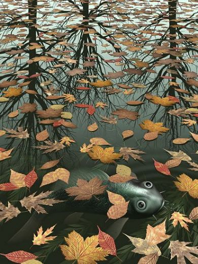
Your group discussion of the lily pads on the tower reflection is interesting. Keep them! Move them! Take them out! I suggest keeping them because they identify layers of reality: 1. the original tower; 2. the reflection of the tower; 3. the surface of the water. Missing is a hint of fish swimming beneath the surface--you could insert some ghost-like fish that appear to be beneath the surface for a fourth level of reality. Of course I am referring to an M.C. Escher painting called "Three Worlds." You can go for four.
|
May 16th |
 |
1 comment - 0 replies for Group 36
|
| 42 |
May 18 |
Comment |
Hi Diana, I am Steve from Monochrome Group 32.
You are right about the shapes and lines--they are strikingly interesting.
Can you show the original, so we can see what you started with, and can you tell us the story of your post-processing?
Also, are able to go back to the same location and shoot again? I suggest a shot without the apartment building in the right background. You might try getting a bit closer to the car, so as to fill up the right side of the frame with it, but preserve the view of the track going all the way to the top, and maybe don't include the left side showing the understructure of the bridge. That's a long way of saying to try standing six feet to the right.
The diagonal lines of the car and track are great. |
May 14th |
| 42 |
May 18 |
Comment |
Hi Pat, I am Steve from Monochrome Group 32.
Taking this shot in bad weather makes it unique compared to most shots of the shrine. But the poses of you and your companion (?) are a bit touristic. I am sure this is a personally memorable shot, but compositionally, some other pose (or just emptiness) would work better. If you use Photoshop, you could put in almost anything. |
May 14th |
2 comments - 0 replies for Group 42
|
| 43 |
May 18 |
Comment |
Hi, I am Steve from Monochrome Group 32. I will try to comment with some alternative ideas for this kind of shot. You could put in some flowers on the ground, even in post processing with this image, to suggest that this is the flower girl, or her entire basket of flowers, as if she is waiting to start her march. On another occasion, you might shoot the full-figure child from behind as they walk away from you.
I like very much the effect of the technical work! |
May 13th |
1 comment - 0 replies for Group 43
|
| 47 |
May 18 |
Comment |
Hello Darrell, I'm Steve from Monochrome Group 32. This is a tremendously dramatic shot with great lighting. It needs the explicit title you gave it to understand the image. Would you be willing to tell us the personal story of how you made this shot? |
May 7th |
1 comment - 0 replies for Group 47
|
| 48 |
May 18 |
Comment |
Hi Beverly, I am Steve from Monochrome Group 32. I love shots like this, and take a lot of them myself. I particularly like that a few of the spots in the matrix are empty of bottles! |
May 7th |
1 comment - 0 replies for Group 48
|
| 51 |
May 18 |
Comment |
Hi, I am Steve from Monochrome Group 32.
I would like to point out that the "distortion" of a wide angle lens is pretty much what your naked eye actually sees when similarly placed. When you stand in such a place and look up with concentration, you will see that the base of the tower takes up a wide portion of your view, and the top takes up a very narrow portion of your view--like this image. What happens then is that your brain takes over and "corrects" the view to make the edges of the tower more parallel in your mind. Hence we see this fairly true image as "distorted." Pamela is right--this is perspective, but not distortion. |
May 13th |
1 comment - 0 replies for Group 51
|
| 53 |
May 18 |
Comment |
Hi Natalie, I am Steve from Monochrome Group 32. I like shots of subject matter like this. How about showing the original so we can see what you started with to get this? I am thinking your color brightening is a bit too much, allowing the image to announce that it is post-processed. |
May 8th |
1 comment - 0 replies for Group 53
|
| 54 |
May 18 |
Reply |
Yes, I did think of that other pair. And why not? Except for Othello, the Shakespearean stage is getting color-blind. A few years back, Patrick Stewart appeared on stage as Othello and a black actor as Iago. It did not work well, but mostly because Stewart was so good, and the other actor was mediocre. |
May 16th |
| 54 |
May 18 |
Comment |
Hi Alan, I am Steve from Monochrome Group 32.
The composition is perfect as a double portrait and I can see that you are working with the portrait faces you had.
But it seems to me that we have a Desdemona and Othello whose personalities are inverted from the Shakespearean play. This Desdemona looks hard as nails and quite capable of "smiting him thus." Your Othello looks gentle and pensive, and perhaps susceptible to being seduced by stories of exotic adventures. My penchant for such analysis makes your image all the more interesting to me. |
May 13th |
1 comment - 1 reply for Group 54
|
| 55 |
May 18 |
Comment |
Hi Alec, I am Steve from Monochrome Group 32.
What are we to make of your subject having one eye closed? Winking? Sleepy? Injured eye? Do you know?
Was this a grab shot or did he pose for you? |
May 13th |
1 comment - 0 replies for Group 55
|
| 58 |
May 18 |
Reply |
Well, one thing is right: the right-hand square in each back row is white ;) |
May 14th |
| 58 |
May 18 |
Comment |
Hi Dan, I am Steve from Monochrome Group 32.
I like very much that this images is empty of people, something I like shooting a lot myself.
Also, a chess board is always an opportunity to arrange the pieces in a dramatic (for chess) way, like an end-game nearing checkmate. But in this case, something is funny with the pieces. I think I see rows of bishops instead of pawns, both pairs of kings and queens are reversed, and a black rook where the rook's pawn should be (and a bishop behind)??? Is this the board as you found it, am I reading it right, or is this shot a construct of yours? |
May 13th |
1 comment - 1 reply for Group 58
|
| 61 |
May 18 |
Reply |
It certainly is a complex subject, with several points of view. Sorry if I offended you. |
May 14th |
| 61 |
May 18 |
Reply |
Just a comment about piecing, not photography. Leo, I think you make the key distinction between piercing where it is traditional, and piercing as a transient fad--a psychologist or anthropologist would call the latter "cultural appropriation," and that is not a complementary term. |
May 13th |
| 61 |
May 18 |
Reply |
Thank you, Leo. This is very impressive. I don't do any of that, so it is a real WOW for me to see your work and that of your Group colleagues. |
May 13th |
| 61 |
May 18 |
Comment |
Hi Leo, I am Steve from Monochrome Group 32. Very impressive final image. How about telling us where you got the background, what you did to your model's complexion, and the colors of her garments. Please tell us the whole story. |
May 8th |
1 comment - 3 replies for Group 61
|
| 62 |
May 18 |
Comment |
Hi Pandula,
Oliver has covered everything very well.
I would add that I like the use of so much black in this image. It cuts away all distracting elements and adds to the abstract composition. |
May 16th |
| 62 |
May 18 |
Comment |
You folks have the best discussions! We are pretty active in Monochrome Group 32, but you really do the job up first class.
I have started visiting your group regularly recently. I know that Oliver travels all over the groups, and I have just started doing that also. |
May 13th |
| 62 |
May 18 |
Reply |
Capturing motion at 1/20 works here because the boy is running towards the camera, as opposed to across the field of view; the wide angle lens also reduces the apparent extent of blurring; and the boy's body speed is simply not so great. However, his flailing hands are moving quite a bit more, and are blurred. You have hit the very best capture of motion in this circumstance. |
May 13th |
| 62 |
May 18 |
Comment |
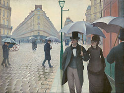
Hi Hattie, I'm Steve from Monochrome Group 32. This double composition of yours can be viewed as a whole, or as two separate compositions, both nicely done. In my opinion, the double composition technique goes all the way back to the Impressionist painter, Gustave Caillebotte, in his "Paris Street, Rainy Day" (1877).
|
May 13th |
 |
3 comments - 1 reply for Group 62
|
| 67 |
May 18 |
Comment |
Votre modele est-il professionnel, amateur, une ami, un etranger, ou un membre de votre famille? |
May 19th |
| 67 |
May 18 |
Comment |
Je prefere le numero trois, a cause de la belle couleur et la composition. Tres bien fait. |
May 14th |
2 comments - 0 replies for Group 67
|
| 70 |
May 18 |
Comment |
Frans, this image is of particular interest to me because my wife is Turkish and we visit our summer home there every year. We have never taken the balloons in Cappadocia, although we have visited there several time.
I think you did a very good job with your presented image to bring up the light, but not too much. Or else the post-processing announces itself unpleasantly.
About whether or not to cut out the cars in the foreground, that's a common problem, because they tell a story you may or many not choose to include--they are obviously emergency vehicles, waiting in case there is an accident. So you must decide if the image is just about balloons, or hint at the danger. |
May 19th |
1 comment - 0 replies for Group 70
|
| 71 |
May 18 |
Comment |
Hi Marla, I as Steve from Monochrome Group 32. Lovely image, but I just want to know where you were standing for this shot. My wife and I visit our children in Seattle several times a year, and any view of Rainier is fun. |
May 8th |
1 comment - 0 replies for Group 71
|
| 73 |
May 18 |
Comment |
Hi Peter, I am Steve from Monochrome Group 32. This is a lovely shot, but I want to discuss one subjective point. When you enhance sunset colors in PS, I think it can go too far, and look unnatural, or announce "I am post-processed." In this case, I suggest just a bit less overall lightening and sunset color enhancement. Your result is so well-lit that it could not be produced by the sunset light. |
May 10th |
1 comment - 0 replies for Group 73
|
| 74 |
May 18 |
Reply |
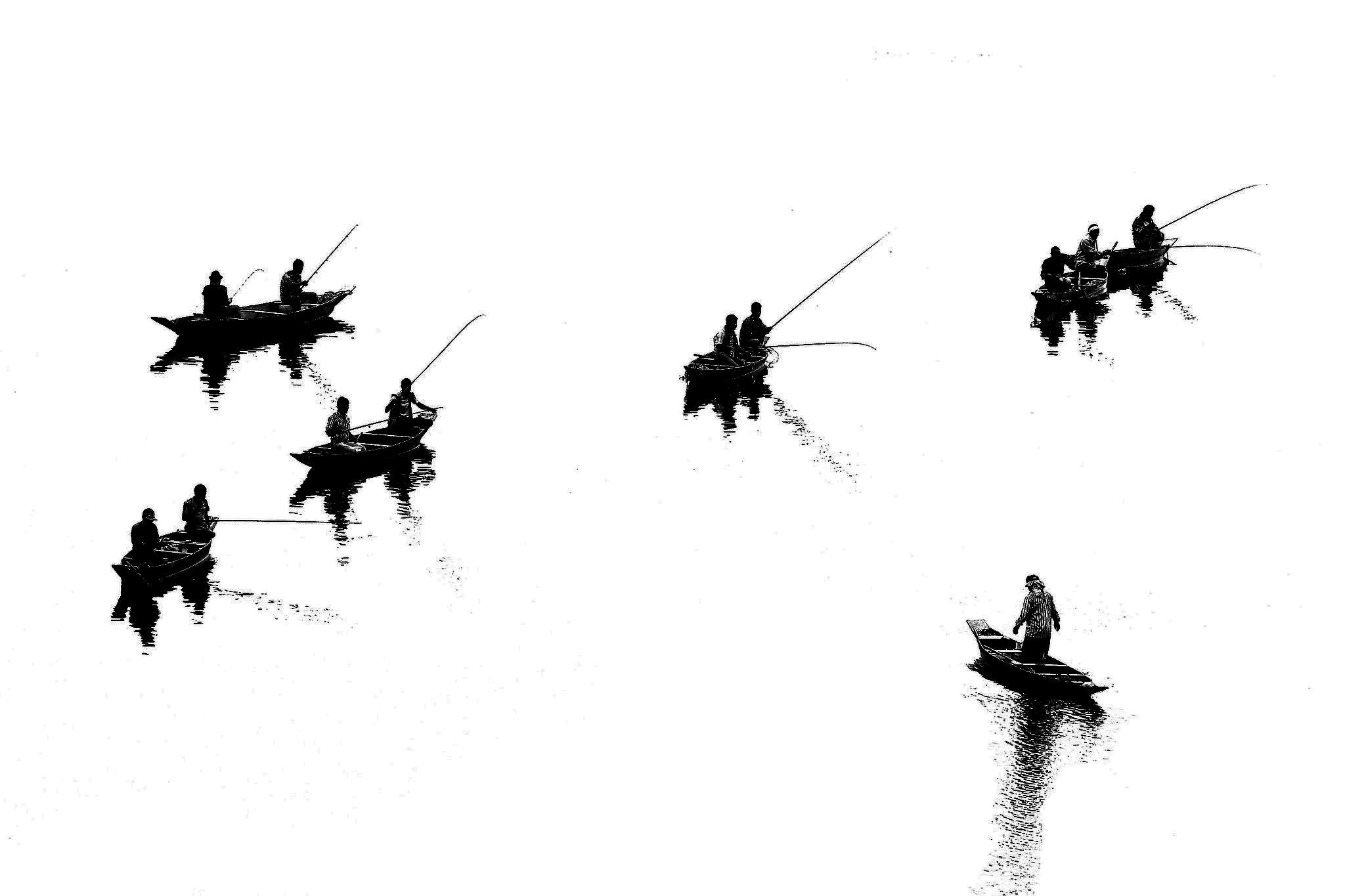
Udayan, this is only my inclination for this image, to share with you. I like a lot of black in my images, so I roughly adjusted curves in PS to make the fishermen into silhouettes. What do you think? |
May 19th |
 |
| 74 |
May 18 |
Comment |
Hello Udayan, I am Steve from Monochrome Group 32. This is an extraordinary image. I don't do salons or competitions, but I am sure it would do well in such environments. Please show us the original, so we can see how your changed it into this fine piece of work. |
May 9th |
1 comment - 1 reply for Group 74
|
48 comments - 22 replies Total
|


