|
| Group |
Round |
C/R |
Comment |
Date |
Image |
| 32 |
Jan 17 |
Reply |
Oh yes, and the white stroke suggestion is good. Thanks. |
Jan 14th |
| 32 |
Jan 17 |
Comment |
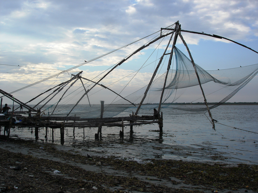
No, I did not even like the original--but maybe that was my own taste. I liked it better as a "night" scene in b/w. But here is the original. As far as putting in a moon, that might work--good idea. |
Jan 14th |
 |
| 32 |
Jan 17 |
Comment |
Increasing the contrast of dirt is an interesting idea, but it really enhances the image. You caught the perfect moment, but tell us how many shots you took to get this single one. |
Jan 13th |
| 32 |
Jan 17 |
Comment |
The three-part study is very instructive, especially with your analytic commentary. The end shot is a great capture. Since it's PJ, I guess you can't take out the third player, but compositionally, I think the image would improve without him.
Wow, ten frames/second. I have never tried the burst mode on my camera--I just tried it--about five frames/second, I think I should try that sometime with family group shots. |
Jan 13th |
| 32 |
Jan 17 |
Comment |
I like the silhouette. I like the patterns of steam. I like the sparkling water in the foreground. I like the split frame--it's daring. But, as Bill Clinton used to say, I feel your pain. You are right that something is not working. Maybe Carol will have some ideas. Here is one that I can suggest. Can you sandwich it with another shot to create a composite image? How about multiplying the silhouette in diminishing scale and arranging them on the boardwalk, or putting other silhouettes alongside this one? I think I would crop off about 2/3 of the foreground water--I like it, but not all of it. |
Jan 10th |
| 32 |
Jan 17 |
Comment |
A rare case in which I think your color original looks better that the monochrome. But the reason is the shadows. You have deeper shadows in the color version that give good drama to the faces. You have a good directional light source from the subjects' left. I suggest you try to preserve or even deepen those shadows in the monochrome.
The subject matter is excellent--the contrast between old and young, and two people who have a relationship.
This refers back to a discussion mostly between Diana and me about the importance of a title to a image. In this case, you enrich the image by stating the relationship in the title. |
Jan 9th |
| 32 |
Jan 17 |
Comment |
This is really interesting and creative, Diana. Nice going. My first reaction is to come up with other titles, since it does not really look like it's falling down. How about "I dreamed of London Bridge last night."
As to the work done, it certainly grabs one's eye. I particularly like the layer of clouds below the level of the top span, and the "melted" section of the top span. Can you add a stream of falling human beings right there, with word bubbles like "Help!" and "I'm falling!" This is great fun. |
Jan 9th |
6 comments - 1 reply for Group 32
|
6 comments - 1 reply Total
|