|
| Group |
Round |
C/R |
Comment |
Date |
Image |
| 12 |
Sep 24 |
Reply |
Thank you Nancy. I agree with you and Carole regarding Original 2... |
Sep 9th |
| 12 |
Sep 24 |
Comment |
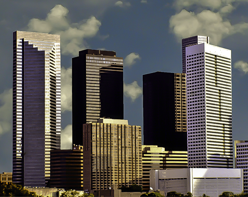
Such a fun image. Love the colors and the contrast of sharp areas to movement through the image. Well done. How do you like the Z9? |
Sep 9th |
| 12 |
Sep 24 |
Comment |
So, I agree with Carole's feedback. I love the more muted colors, including that of the sky. It really depicts how I envision an "old" small town main street. For some architecture images I think the inclusion of people can provide perspective. I don't think that is needed here. I like the signs on the right side. |
Sep 9th |
| 12 |
Sep 24 |
Reply |
So I tried to play with perspective on this but doing so loses the entire sense of the building itself. I do like what Melissa did as an edit as it really takes away any concern about perspective and emphasizes the sense of the jail itself. Scary that the noose remains! I would love to see some images of the inside. |
Sep 9th |
| 12 |
Sep 24 |
Reply |
What a cool edit! It adds atmosphere. |
Sep 9th |
| 12 |
Sep 24 |
Comment |
Scanning old film slides and negatives is tough. So I played with the image letting it look more grainy and not worrying about the sharpness. I made adjustments using exposure, highlights, shadows and dehaze sliders in LR. Then I added a noise high sharp high preset and cropped in from both sides. I could not make an adjustment for the darkest areas to see any detail, but I think that is ok. Just a fun and different look. |
Sep 9th |
 |
| 12 |
Sep 24 |
Comment |
Carole - this is an interesting interpretation of architecture. The inclusion of the servicemen at attention adds so much to the story of the image. I would agree with Srijan that this is more of a documentary image, particularly with the servicemen. Nice capture. |
Sep 9th |
| 12 |
Sep 24 |
Reply |
I also like the curb in the image. As noted in my original comment to Abby, I did apply the transform tool in LR to adjust the persepective...the resulting image is posted as part of that comment. |
Sep 9th |
| 12 |
Sep 24 |
Reply |
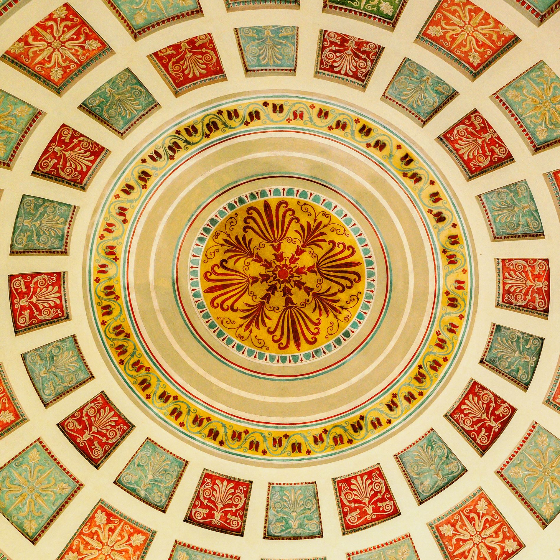
Thank you Melissa. Interesting thought about the circular image in a square frame. I like your suggestion for using the image as a centerpiece in a larger canvas. I will play with that. |
Sep 9th |
| 12 |
Sep 24 |
Reply |
Thank you Carole. I agree - I like Original 2 better from an interest viewpoint. However, it does have a sun flare spot which is why I did not submit it as the main image. I did make a slight saturation adjustment which does render the colors brighter. |
Sep 9th |
| 12 |
Sep 24 |
Reply |
Thank you Srijan. Yes, this is certainly more documentary as opposed to artistic. I probably should have pushed outside of my comfort zone and tried something a bit more creative. :) |
Sep 9th |
| 12 |
Sep 24 |
Comment |
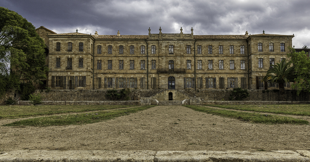
Abby what a cool building. I love the broad sweeping leading lines that draw my eye up and into the chateau. What I find challenging about photographing buildings is trying to get all or most of the horizontal and vertical lines/planes "straight." I often use the transform tool (upright-auto) in Lightroom (not just for architecture) to achieve this. I applied that to your photo, and I think that adjustment shifted the chateau just enough forward that it is a bit "straighter." I also cropped out a small amount of the sky to bring even more focus on the leading lines from the foreground to the chateau.See what you think. |
Sep 1st |
 |
5 comments - 7 replies for Group 12
|
5 comments - 7 replies Total
|