|
| Group |
Round |
C/R |
Comment |
Date |
Image |
| 41 |
Mar 26 |
Reply |
Thank you. Good to see a visitor from other groups. |
Mar 20th |
| 41 |
Mar 26 |
Reply |
Thank you. Good to see a visitor from other groups. |
Mar 20th |
| 41 |
Mar 26 |
Comment |
I really enjoy the tones and colours you employ. I particularly like the framing provided by the white picket fence either side. I really would love to see a face at the window. I think that would lift this to the next level;. |
Mar 20th |
| 41 |
Mar 26 |
Comment |
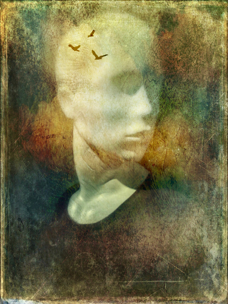
This is a very skillful use of the software. It is a very futureistic image . I agree about the eyes. |
Mar 20th |
| 41 |
Mar 26 |
Comment |
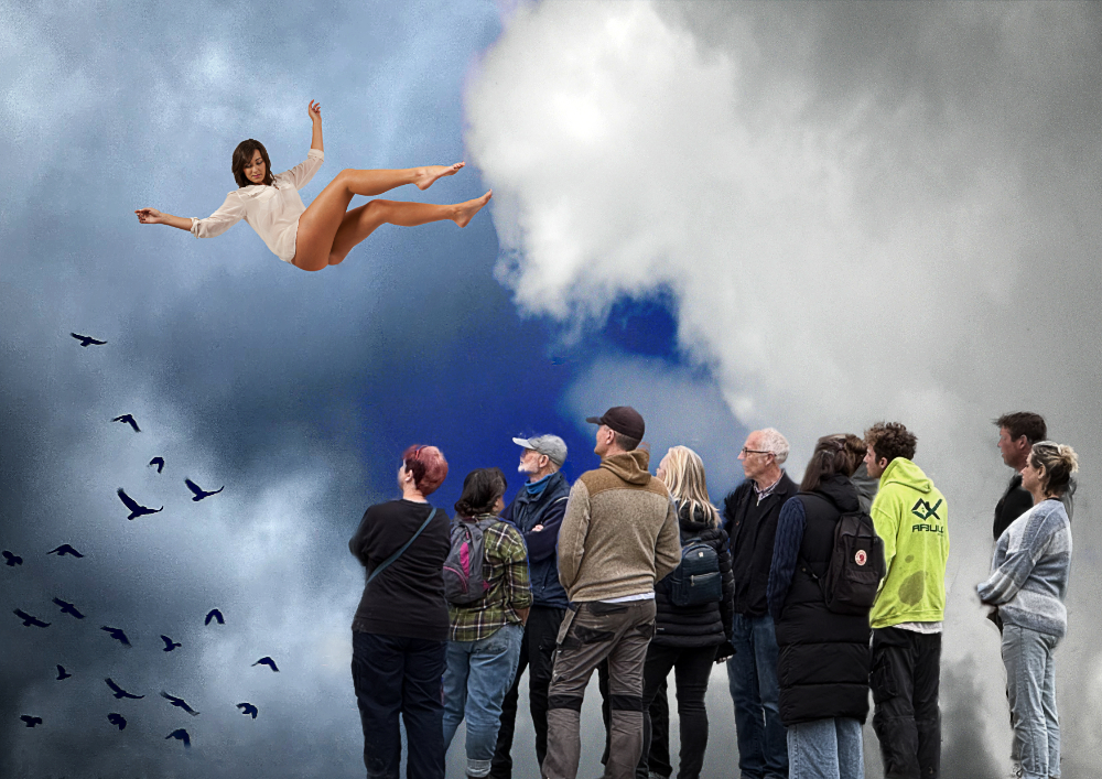
This reminds me of the images sometimes used in films to show the effect of hallucinatory drugs. I get wobbly just looking at it. Amazing, isn't it, what this software can do. |
Mar 20th |
| 41 |
Mar 26 |
Comment |
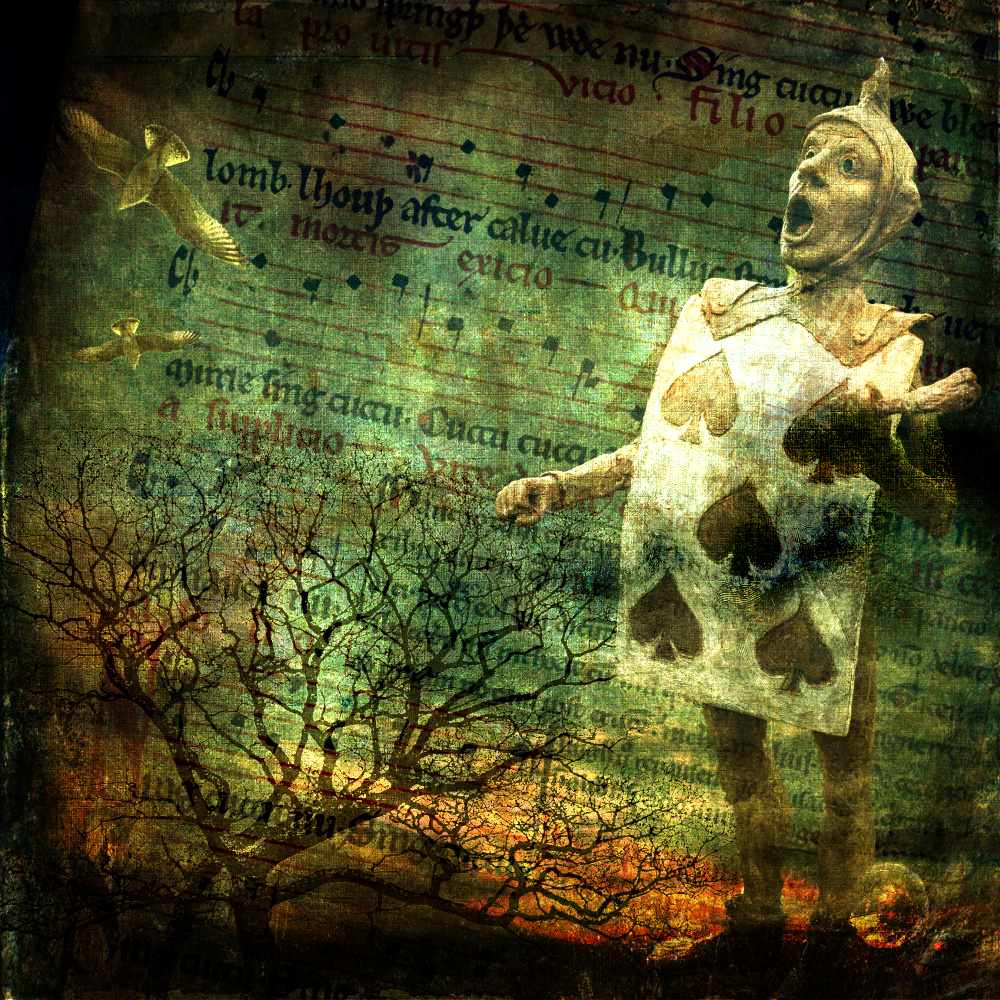
I really like your second version. That works really well and leads us straight to the man's whimsical expression. But then, no one has thrown a rotten egg . . . yet. |
Mar 20th |
| 41 |
Mar 26 |
Comment |
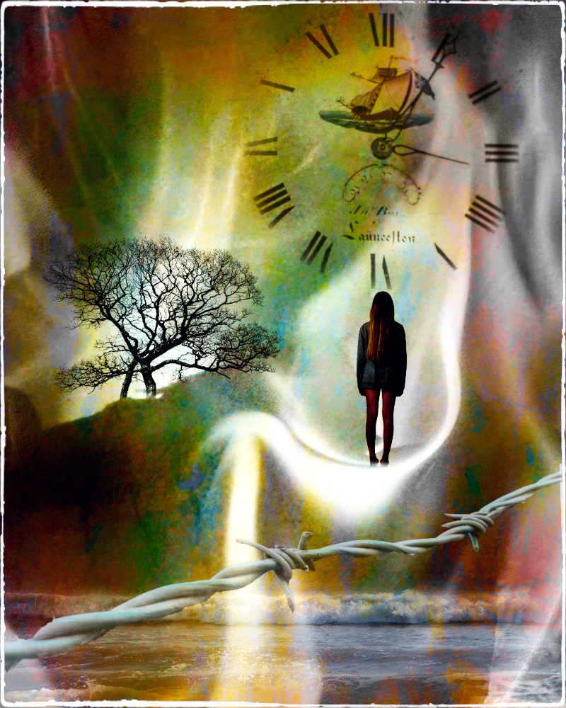
It has a fairytale feeling about it, you have merged the two scenes well. I think I might give it a slight vignette. The top LH corner is too bright and darkening that, and the edges, would help to hold everything in. |
Mar 20th |
5 comments - 2 replies for Group 41
|
| 99 |
Mar 26 |
Reply |
Peter, you are right. I gave a conventional critique, but wholeheartedly agree with you about breaking the rules. The problem is much of the amateur world hasn't caught up. I think the training judges get must be awful. They concentrate on the easy, technical aspects and conventions without looking deeper into a photograph. Sure, sometimes technical things can distract, but I had a judge disregard an image (my January picture) because he couldn't see all of the people's shoes - a fact that made not a jot of difference to what the picture was all about. It's a good job we take such things with a pinch of salt - the same picture was selected by the RPS for a portfolio publication, in the same week. I think the point you are making with your photo may work better if you were to use the image as the centre of a triptych and give it a title such as 'The Busy City' to guide the viewer. But that's just my opinion. |
Mar 21st |
| 99 |
Mar 26 |
Comment |
I like the use of a texture to lift this little tulip, but there is something about the blacks that make me uneasy. I'd like to see them blacker, it should be possible without losing too much detail. The whole is a little flat for me. Well done for trying something out of the ordinary. |
Mar 20th |
| 99 |
Mar 26 |
Comment |
All the lines lead beautifully to the figure and the watery effect of shooting throgh the glass is really good. You have to be mad (in my opinion) to go to sea in the first place . This chap is clearly madder than the rest. A great photo. |
Mar 20th |
| 99 |
Mar 26 |
Comment |
A beautiful reflection. The brickwork and the trees are rendered with superb detail and it is well processed. A fine record of this bridge. I might be tempted to take out the small sign to the right of the bridge and the distracting white bit on the RH edge. |
Mar 20th |
| 99 |
Mar 26 |
Comment |
I see what you were up to but it is a bit messy. It's unfortunate there is a black cab behind these odd figures and they tend to merge with it. Also the street sign, dividing the frame as it is, demands attention and this is what we see first, not least because of the human compulsion to read writing if it's in a photo. Then the words on the bus and, eventually, the figures. Beautifully processed. |
Mar 20th |
| 99 |
Mar 26 |
Comment |
The way you have photographed this has preserved the 'glassness' of the glass. The angle of the lighting is just right and you have brought out the slight uneveness that typifies glass cut in this way. A good job |
Mar 20th |
5 comments - 1 reply for Group 99
|
10 comments - 3 replies Total
|