|
| Group |
Round |
C/R |
Comment |
Date |
Image |
| 18 |
Nov 24 |
Reply |
No apology necessary, Bob. Good luck with your move. |
Nov 17th |
| 18 |
Nov 24 |
Reply |
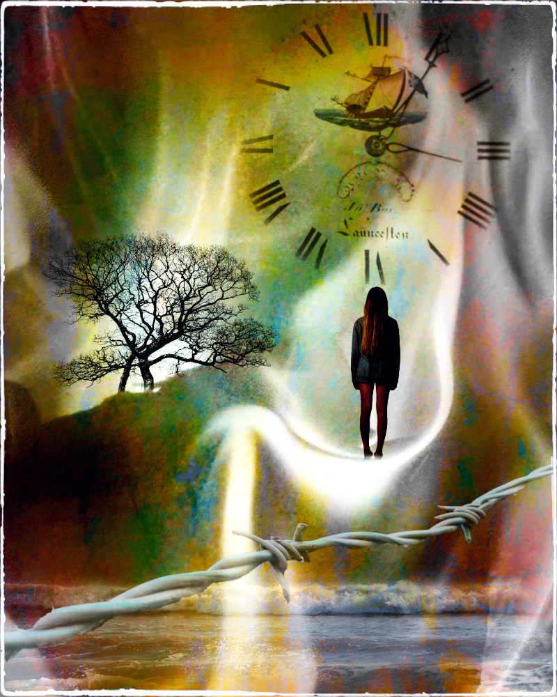
On the contrary - in Original No3 you have merged a backround and twirled the water where the ship is 'moving'. These things make it creative, for me. As has been discussed here before, the term 'creative' is open to many interpretations but I do feel you have met the criteria in Original No3 by altering the reality of the base photograph. |
Nov 17th |
| 18 |
Nov 24 |
Reply |
I take your point Gunter. Good to know you're a 'tweaker'. This issue such a great hobby. |
Nov 13th |
| 18 |
Nov 24 |
Comment |
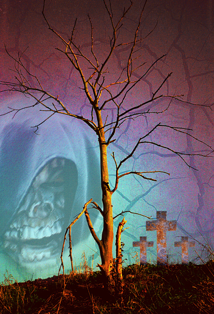
Isn't it fun just to run with an edit and see where it takes you? Often the final image is completely different to what you planned, but never mind, this is great. I can see the wolf and its baleful, red eyes. "All the better to see you with, my dear". |
Nov 13th |
| 18 |
Nov 24 |
Comment |
This is another instance where I like one of the originals (No3) much better that the finished image. I don't think the swirly bit helps and, especially since it's red, demands too much attention. But I love original No3. |
Nov 13th |
| 18 |
Nov 24 |
Comment |
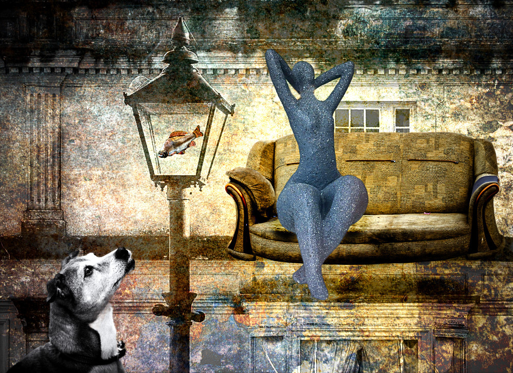
Quite an effective abstract which is enjoyable to look at. I like the colours you have chosen. The only problem I have is that with programs like Mirror Lab you end up with what the program wants. It's much more fun to play with things manually and follow your nose. A good image, though. |
Nov 13th |
| 18 |
Nov 24 |
Comment |
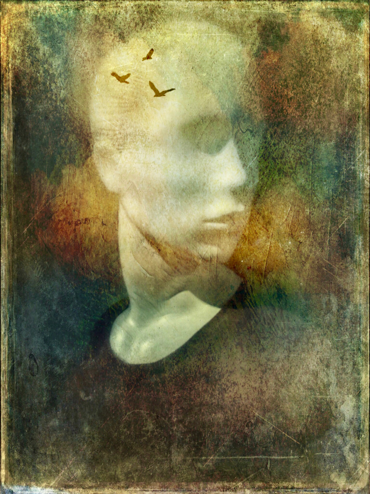
Sorry, but this time I like the original images much better, especially No.2 which tells a good story. A lot of that story detail is lost in your final image, which is quite stark. |
Nov 13th |
| 18 |
Nov 24 |
Comment |
You have certainly altered reality, with this colour! Not one of my favourite colours but that apart I quite like the painterly effect. |
Nov 13th |
5 comments - 3 replies for Group 18
|
| 99 |
Nov 24 |
Comment |
This is a lovely still picture. The boats on the right balance the building on the left and, the key to it all, the three black posts take the eye on into the mist in the distance. A very good composition. |
Nov 11th |
| 99 |
Nov 24 |
Comment |
I agree with Gerard about the contrast, your toning is a bit wishy washy, but I notice he has cropped his version. One of the first things I thought, when I saw this, was nice symmetry. Then I realised that the black line on the left made it asymmetrical. This is great because now we have a bit of tension and a reason for the eye to rove around. Asymmetry is (nearly) always more interesting than symmetry. |
Nov 11th |
| 99 |
Nov 24 |
Comment |
The quality of the shot is really good, but the figures of the (?) cheerleaders merge too much into the crowd behind. But then I'm not fond of sport and don't understand cheerleading, at all. Sorry - a bit bah humbug from me. |
Nov 11th |
| 99 |
Nov 24 |
Comment |
This one doesn't quite make it. The background is distracting and the lighting flat. Also, the subject looks very combative. Maybe if the flash had been off to one side, on a stand and a clearer background found, it may have been more engaging. |
Nov 11th |
| 99 |
Nov 24 |
Comment |
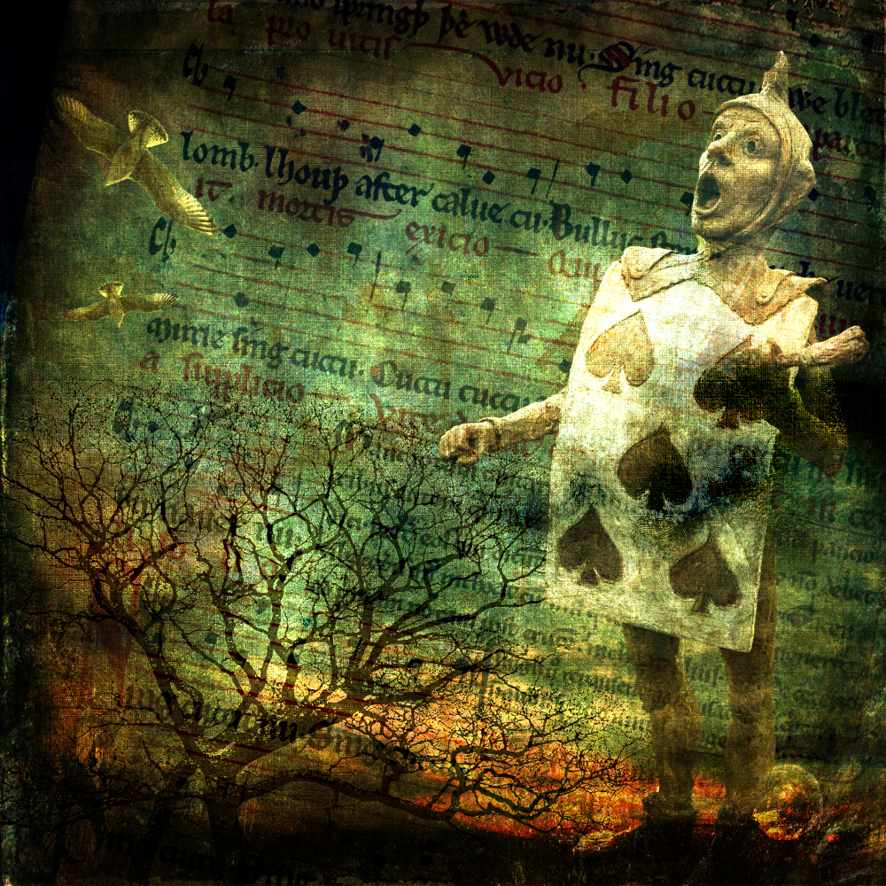
I really like this, a lot. Even where there is shadow the eyes and skin have detail. It's not quite as desperate as Munch's 'Scream' but close. The confused background creases add to it all, and the arm from the bottom left guides us to a disbelieving eye. I think we all feel a bit like this after the news. |
Nov 11th |
| 99 |
Nov 24 |
Comment |
Lovely. The composition is spot on and the clarity and sharpness of the detail is superb. Can't be faulted. |
Nov 11th |
6 comments - 0 replies for Group 99
|
11 comments - 3 replies Total
|