|
| Group |
Round |
C/R |
Comment |
Date |
Image |
| 99 |
Jul 24 |
Reply |
Thank you John. I take your point about colour but the car was a dull greenish and the foliage green - hence the black and white. Here in South West England, except in Autumn, most of the landscape is shades of green. This is what led James Ravilious (http://www.jamesravilious.com) to use black and white. It's easier than trying to separate the various tone of green, and more interesting (I think). |
Jul 22nd |
| 99 |
Jul 24 |
Comment |
I find this interesting, not the least because I live where there are no wild cactus plants! The detail is very good, even though this is a crop. I'm not so keen on the dark cactus on the right. Camera club judges are fond of saying things like 'You should have moved to the right to avoid including that', but, of course, they don't know that you might have ended up in a heap of other cacti, should you have done so. Perhaps you could tighten the crop on that side to make it just a dark edge because, in fact, it is the light edge to the right that really draws the eye. Lovely back light. |
Jul 7th |
| 99 |
Jul 24 |
Comment |
What an amazing piece of egineering. It's good there are people around who will undertake such restoration projects. The two figures in the foreground help to show the scale and I like the way they are echoed by the figures in the distance. For me, the waste bin(?) in the right foreground keeps pulling the eye away from the main subject, especially when part of it is so light. It would be quite a job to remove it - not impossible but difficult with the crash barriers behind it. Perhaps it could be darkened down in some way to make it less intrusive. I think it is quite legitimate to remove distracting elements in a photo to improve the composition, unless it is photojournalism or natural history.
|
Jul 7th |
| 99 |
Jul 24 |
Comment |
The toning and the frame are well suited to this subject. The door is interesting and I like the reflections (shades of Vivian Maier?). I agree with Barbara, the area above the wall is a distraction, and I would want to correct the perspective so that the door is properly upright. I'm not certain about the flower pot on the left, but it would mean coming in really tight to omit it.
|
Jul 7th |
| 99 |
Jul 24 |
Comment |
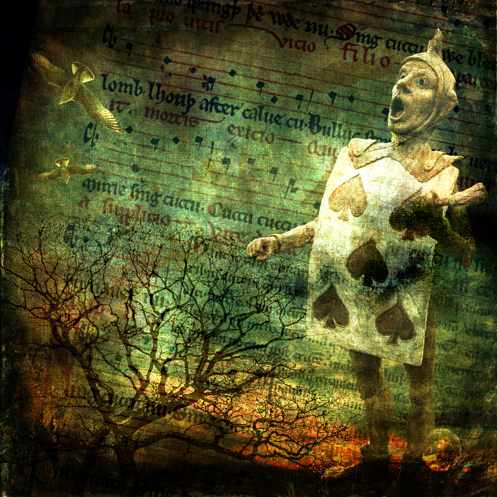
The title, in fact, makes the viewer look straight away for the feather. Then the eye moves down to the face - as you say 'demonic'. Thank goodness there are oddballs like this around to make our world richer and to give us good photographic subjects. I like the central composition and the dark background, keeping attention on the subject. A picture that raises many questions - who is he? why that expression on his face? why the religious symbols? . . . and why the feather?
|
Jul 7th |
| 99 |
Jul 24 |
Comment |
It always makes me smile to see a dog in a woolly coat. This definitely looks better in black and white and positioning in the square format is good with the angle of the dog contrasted with the angle of the flag stones. This, coupled with the obvious action pose of the body, emphasises the movement of the dog playing. Good detail in the whites and I like the darkening of the corners to help bring attention in to the subject.
|
Jul 7th |
5 comments - 1 reply for Group 99
|
5 comments - 1 reply Total
|