|
| Group |
Round |
C/R |
Comment |
Date |
Image |
| 32 |
May 25 |
Reply |
Hi Tom,
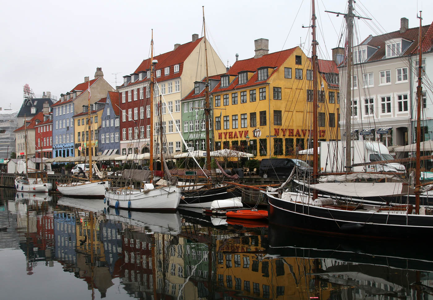
Thanks for your comments. I didn't process how much the original image did appear to slant down to the left until you mentioned it, but yes, the straightening did help. The sky is tricky since darkening it leaves some bright spots in the clouds and around the buildings. But I'll experiment some more. The color image on this overcast day was too flat, I thought, which prompted the monochrome conversion. But Nyhavn really is a colorful area, and I am fortunate to have other photos with better lighting. |
May 28th |
 |
| 32 |
May 25 |
Reply |
More contrast is needed, I agree. This may be a little more than I envisioned, but I definitely need to adjust mine more. Thanks! |
May 28th |
| 32 |
May 25 |
Reply |
Yes, you're right that the original image looks too flat. I'll try adjusting it more. |
May 28th |
| 32 |
May 25 |
Comment |
Ack, I wrote a comment, went to edit the photo, and then erased everything! So not only am I late with comments this month, but I can't even seem to post them correctly. Alas .....
I was saying that I liked the light and detail on the cheetah's fur here, but that the background to the right side isn't clear to me what is there, so I think this is an image where I'd prefer that it be completely dark there. I also suggested cropping a bit more from the top and just a little bit from the right side, but I know we in the U.S. often tend to like portraits a bit more tightly cropped than those in other places prefer them. |
May 28th |
| 32 |
May 25 |
Comment |
Hmmm, so many questions raised by this image, including the obvious one about whether it originally had a head, and if so, what happened to it. I like your image as you redid it with the stone behind the statue darkened, but I'd likely darken the bright dirt/grass area to both sides of the statue a bit more, too, as the bright spots draw my eye away from the statue itself. However, I agree that you don't need to go as dark as Diana did. |
May 28th |
| 32 |
May 25 |
Comment |
What an interesting image, and your choice to convert to monochrome was very effective here. I agree that for me, the face is a little too textured, particularly as the skin in the color image looks demonstrative as it is. But of course, you should leave your image as you prefer to present it. |
May 28th |
| 32 |
May 25 |
Comment |
I, too, like your efforts to draw our attention to where the action is, and you did a nice job capturing the flying sawdust. It seems to me that you could crop a little bit more off the right side of the image (behind the person doing the cutting) to emphasize your subject even more so. |
May 28th |
| 32 |
May 25 |
Comment |
Although I occasionally feel somewhat conflicted about photographing artwork, I too would not have passed up this fantastic lion statue with its beautiful green patina. While your color saturated image works, I think Diana's suggestion for a "color pop" effect makes the image look more time worn. The monochrome image is okay, but I think it's a shame to lose that amazing patina. |
May 28th |
| 32 |
May 25 |
Comment |
Utah has so many intriguing locations to explore and photograph. Your original image actually is not as "contrasty" as I would have anticipated given the challenging direction of the light. Others have already mentioned and provided recommendations for dealing with the bright sky. If it's there, I think it would be nice to include the entire rock that is in the front slightly to the left of center. But cutting it off doesn't detract from the image for me. I, too, like the composition. |
May 28th |
6 comments - 3 replies for Group 32
|
6 comments - 3 replies Total
|