|
| Group |
Round |
C/R |
Comment |
Date |
Image |
| 32 |
Aug 24 |
Reply |
Well, the motivation principally was that this isn't a color study group! Alas, not all subjects work in monochrome. You and others are correct that the merger is awkward, and it is made all the more prominent by the monochrome conversion. Tighter cropping and darkening didn't help, so I think I need to find another image where the butterfly is better placed. |
Aug 28th |
| 32 |
Aug 24 |
Reply |
You're correct that the monochrome conversion does create an awkward merger between the flower and the butterfly. I tried darkening the flower, but it didn't work well. I have some more images of butterflies on different wildflowers where the blossom is not in front of the butterfly. Perhaps one of those would be a better option if I am going to pursue this subject. |
Aug 28th |
| 32 |
Aug 24 |
Comment |
Your cropping helped to emphasize the peak action and to eliminate the background distractions from this image. It does seem to me that your edited image helped bring out more texture and contrast in the image, particularly in the highlights, which I prefer. The edge of the frame is a little bit tight on the left side for my tastes, and it looks like you do have some more room you could give it there. I agree that a light-colored shirt is an odd choice for an event that necessarily involves ending up on the ground, but then, it also wouldn't be my idea to jump off a running horse to try to tackle and tie a running calf! |
Aug 28th |
| 32 |
Aug 24 |
Comment |
Your composition is nice here, particularly including the bench and lamp on the left but also having some distance between them and lower part of the frame. I'm not as excited by the bench in the archway, but it isn't really a problem. I prefer the image in monochrome, as the color image is rather monochromatic anyway, and the monochrome, for me, helps bring out the textures. Your image seemed skewed a bit down toward the left side when I viewed it, but Don has resolved that already. |
Aug 28th |
| 32 |
Aug 24 |
Comment |
What an unusual castle. It doesn't look like it would be very comfortable to live there, but perhaps it is more lavish inside than it appears. Are there normally so many rugs out at one time, or was that for some particular reason? It is a bit of a shame to lose the vibrant colors of the rugs but converting to monochrome, but I do think that helps with drawing the viewer's attention more to the castle structure rather than the bright colors. |
Aug 28th |
| 32 |
Aug 24 |
Comment |
I am envious of your wildlife photography travels, as well as your beautiful image of this young polar bear. I, too, like the composition leaving some space to the right. High key was a good choice for this image, although a tricky one, no doubt, with such bright subject matter. My monitor is not calibrated, so I certainly would not go based off of it. If it is worth anything, though, I do see an edge on the right side of the bear, but there is an area to the right behind the head and about mid-way down the back that is very bright, although not blown out. |
Aug 28th |
| 32 |
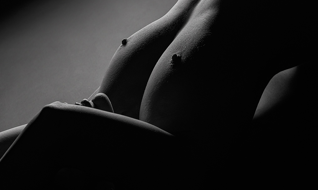
Aug 24 |
Comment |
Your lighting is beautiful. Like Diana, I find the protruding bottom of the rib cage distracting. I'm uncertain whether it is possible for the model to lie in a way that her back is not quite so arched, which then would make that area less prominent. I know it very much changes the composition, and perhaps isn't the look you are going for at all, but I believe I would prefer a tighter crop of this image, which also helps enhance the "mystery" idea for me. But this just goes to show we all have different personal preferences, so obviously, you should keep your image as you like it. |
Aug 28th |
 |
| 32 |
Aug 24 |
Comment |
Oy, this month (and this summer) about got away from me. Apologies for my delay with comments.
In reviewing your uncropped image, I debated whether I would prefer the part of the dome to have been in the image rather than cropped out. However, as it is a very bright area, I have a feeling your choice of cropping was a wise one. I agree with your assessment that this is a busy image compositionally. Would brightening the triangle area and crest (?? or whatever it is) at the top create more of a focal point there? I'm uncertain, as it possibly is not quite prominent enough in the image. Like you, I find architectural structures and patterns intriguing, but I agree finding a strong focal point can be a challenge. I'm impressed you were able to keep the camera steady with the challenging lighting and dodging other people. |
Aug 28th |
6 comments - 2 replies for Group 32
|
6 comments - 2 replies Total
|


