|
| Group |
Round |
C/R |
Comment |
Date |
Image |
| 32 |
Oct 23 |
Reply |
Now that you mention it, you're right. It seems like maybe a dodging tool went a bit berserk, or something. I'll check the original and see if I can figure out and correct whatever occurred if I do decide to keep this image. |
Oct 24th |
| 32 |
Oct 23 |
Reply |
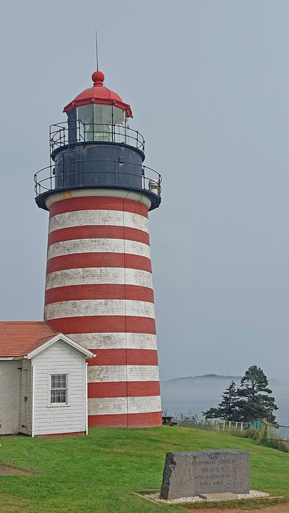
The sign is still there. Not sure who decided to put the name "West" in naming the easternmost point in the continental U.S., but such is the absurdity. We've long given up handing our DSLR cameras to anyone to take a picture of us unless it happens to be another person with a DSLR. However, in this age of most everyone doing mobile phone photography, I had higher expectations. Alas, the person who took our photo by the sign has a lot of foreground and none of the upper 1/3 of the lighthouse! Perhaps I'm starting to discover the reason so many people carry around and use those obnoxious "selfie stick" poles. |
Oct 24th |
 |
| 32 |
Oct 23 |
Comment |
For some reason, I'm having trouble making up my mind about this image. I agree that your replacement background is better than the studio backdrop. However, in spite of your good efforts to adjust it, the lighting still feels somewhat awkward to me. I am not familiar at all with lighting, but it seems that her right arm above the elbow should either be brighter to match the light hitting her bosom and the right side his face, or those areas should be darkened some more. The image does feel a bit posed and busy for my tastes, but my tastes certainly are not always aligned with those of other viewers and judges, so perhaps try it and see. |
Oct 24th |
| 32 |
Oct 23 |
Comment |
Congratulations on your prize! It's too bad you weren't able to take the trip. I, too, like your cropping. I also like the deep blacks in the Original 2 image, but I understand the more subdued tones likely was more fitting for the mood and to better bring out the details in the sculpture. |
Oct 24th |
| 32 |
Oct 23 |
Comment |
I concur with the others' comments that the deep black helps to emphasize the chrome and radiator cap, and I like your composition to include the Ford logo. There does seem to be just a bit of the (red) reflection still visible to the left above the radiator cap, but it would be easily cloned out or darkened. I considered cropping a very small amount from the left side also to avoid the radiator wires intersecting right in the corner of the image, but upon further review, it may be better to keep it as you have it since the bright metal corner also creates a visual "stop" there. |
Oct 24th |
| 32 |
Oct 23 |
Comment |
I, too, questioned why you'd cropped out part of the drum stick when I initially viewed this image, but you've addressed that in other comments, so I'll imagine it's there and also imagine the noise all those drums likely were making. Getting any useful images at events and in crowds is always a challenge for me, so you've done well to capture this nice line of drummers, as well as to crop out the distracting person on the left. I think I agree with Diana that I'd also crop on the right to eliminate the elbow and most of the partial person visible there. Also, it's extra nitpicky on my part, but I'd clone out or otherwise remove the airplane contrail, especially since it creates a distracting line right into a drummer's head. I like your contrast here. |
Oct 24th |
| 32 |
Oct 23 |
Comment |
Unfortunately, I am no help at all with flowers. I ended up getting some artificial plants for my office because the temperature extremes when the air/heat shut off at night and on weekends made it impossible for me to find any live plants that I could keep alive for long. Your choice of the conversion to black and white, as well as the single top petal, help illustrate its failure to thrive. As others already mentioned, the sharpness and contrast look good, which can be challenging with macro work. I do agree with Diana about cropping some from the top. |
Oct 24th |
5 comments - 2 replies for Group 32
|
5 comments - 2 replies Total
|