|
| Group |
Round |
C/R |
Comment |
Date |
Image |
| 32 |
Nov 22 |
Reply |
I'm sure there are lots of answers to that question, but I tried a couple of things. First, I selected only the cliff faces (so not the rock/sand floor and not the person), and then just adjusted the brightness and contrast a bit and used the sharpen filter "unsharp mask". I couldn't tell that much difference, so I then used an old Nik Collection filter, HDR Effect Pro 2, which has a detail adjustment on it. It did make the cliff on the viewer's right much brighter, so it might have helped to come back and darken it some. |
Nov 29th |
 |
| 32 |
Nov 22 |
Reply |
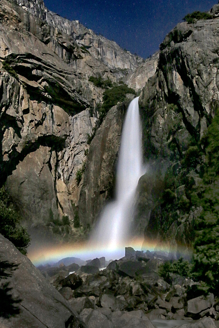
Somehow, I think this subject would be more effective in monochrome if I took a moonlight photograph the waterfall and rocks without the moonbow being a part of the image. Moonbows are interesting, but like you, I'm not convinced they are good monochrome subjects.
|
Nov 19th |
| 32 |
Nov 22 |
Comment |
Thank you for joining us here in Group 32, and welcome to the group. Although I do agree with others' suggestions to crop out some of the bright sky, I guess I am the odd one out this time because I like the feeling of this small, old shop tucked in next to larger buildings that your composition as you've presented this image provides. I'm not bothered by the sign, which is a part of the location, too. I do think I might like the brick building to be a little brighter so that I could see the brickwork more clearly. I agree this image is well-suited for monochrome. |
Nov 19th |
| 32 |
Nov 22 |
Comment |
This is an unusual structure. The shape almost looks like an evergreen tree to me, apart from the top part that is a bit askew. I like your tighter cropping and removal of the trees. To me, the replacement sky is so dramatic that it competes with the subject sculpture here. I'd probably try either reducing the contrast in the sky or using one that isn't quite so dramatic to better draw attention to the shapes and textures of the sculpture. I, too, struggle with where the line is when it comes to photos of art. However, as this subject is quite ambiguous and the image seems to me to be more about the shapes, I don't see that as too much of a concern with this image. |
Nov 19th |
| 32 |
Nov 22 |
Comment |
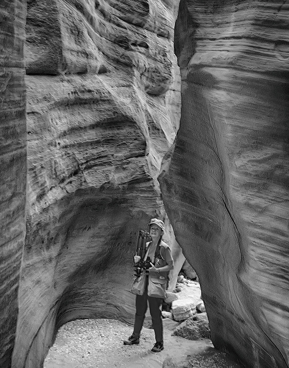
I see you went to Buckskin Gulch without me! I was hoping to get to northern AZ and southern UT last April before the heat and monsoon season, but I unfortunately was having some health issues and ended up postponing that trip. Now I see what I've missed. Although the canyon country is amazing in color, I often am surprised at how effective it can be in monochrome. Having a person in the image as you've done here certainly helps with the scale. It may be a challenge to isolate the cliff walls to do so, but I think increasing their texture a little bit might be effective with the monochrome image. |
Nov 19th |
| 32 |
Nov 22 |
Comment |
I, too, prefer the brighter flower, although I see your point that that is the inverse of what the flower actually looks like. Do you use a heavy fabric or something else to create your black backgrounds? Yours looks very nice and uniform in this image. |
Nov 19th |
| 32 |
Nov 22 |
Comment |
This subject as you've approached it that lends itself well to the abstract. I actually prefer the color image since the bold colors and red/green contrast are a part of what draws my eye into the image. For me, the monochrome image just doesn't draw me in as much as the color image does. That said, I think Diana's contrast adjustment on the monochrome image did help give the tones more separation. |
Nov 19th |
| 32 |
Nov 22 |
Comment |
Your perspective with the shadow and the converging bridge and supports is nice. The long exposure on the water keeps it from competing with the bridge. I am wondering if the bridge supports need to be brighter, but I'm uncertain how that would work with the bright sky. |
Nov 19th |
| 32 |
Nov 22 |
Comment |
Here is the color version. |
Nov 10th |
 |
7 comments - 2 replies for Group 32
|
7 comments - 2 replies Total
|


