|
| Group |
Round |
C/R |
Comment |
Date |
Image |
| 32 |
Sep 21 |
Reply |
Neat train. If I'm back that direction post COVID, hopefully I can investigate further. I hear the tour of the train yard in Ely is a good one. |
Sep 27th |
| 32 |
Sep 21 |
Reply |
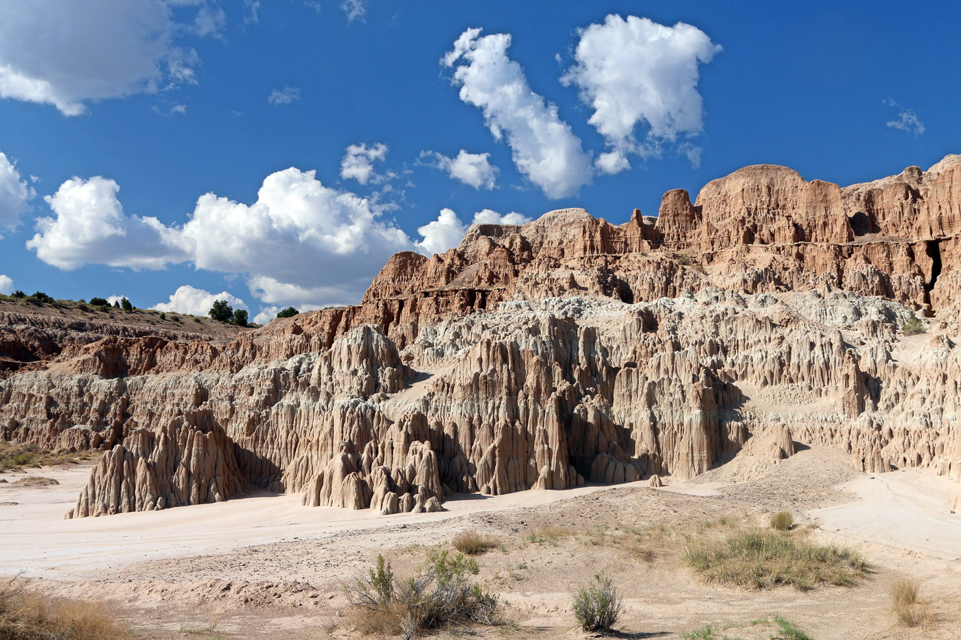
I initially thought cropping into the clouds was a bad idea, but I think you're right that I've tried to include too much sky. I may have other images of this area with better contrast for monochrome conversion, too. The cliffs are a clay/mud with different colors in them. Here's the color photo. |
Sep 27th |
 |
| 32 |
Sep 21 |
Reply |
This location is well off the beaten path, over two and a half hours north of Las Vegas and about an hour and a half east from Cedar City, Utah. I really liked it, although it's not a place I'd want to be in the rain. In all our national park travels, Robert and I kept missing Great Basin National Park in eastern Nevada, so we decided that one way to avoid crowds in a pandemic is to go to one of the least visited national parks. We are among the few people left who still plan trips and navigate with actual paper maps. It does take us longer than average to get most places that way, as we often find things on the map (such as this intriguing state park) to stop and investigate. We have made some fun and memorable discoveries, though. |
Sep 27th |
| 32 |
Sep 21 |
Comment |
Your tight composition on the Air Force Academy roofline works well in monochrome. Of course, you know already that I feel the sky is naturally completely black only at night, and thus tend not to be a fan of that look in most images. However, I do think it is effective here. Kym is right that this image almost has a graphic pen and ink feeling about it, which I also think works well here. |
Sep 27th |
| 32 |
Sep 21 |
Comment |
Goodness, you have more patience and skill than I do to successfully combine multiple images together. Like others have mentioned, I like the translucent effect on the leaves, but agree the flowers are a bit difficult to distinguish. I, too, like the stem fading off at the bottom. |
Sep 27th |
| 32 |
Sep 21 |
Comment |
Roses are nice in monochrome, and I like the way you've handled the lighting on this image, particularly on the lower and middle roses. To me, the merger of the middle and upper roses is somewhat awkward. I feel the middle rose either needs to be lower or the bottom one to be higher in the arrangement. The lack of a visible stem at the bottom of the image doesn't bother me, as it falls off to black there anyway. However, I do suggest removing the bright spot of light on the stem near the bottom of the image. |
Sep 27th |
| 32 |
Sep 21 |
Comment |
Stephen, this is yet another example of your skill in finding patterns and details that generally tend to pass me by. The repeating pattern here, broken up by the pot, is intriguing to me. I agree with Tom that eliminating the harsh light creating the the hot spot would be beneficial. What about having the pot a little more off-center in the image, too? Perhaps try moving it more to the right and leaving a little more of the patterned floor around it (unless there are other objects that prevent doing that, of course). |
Sep 22nd |
| 32 |
Sep 21 |
Comment |
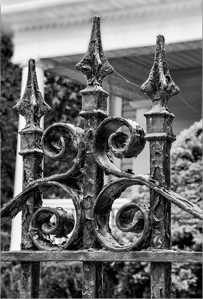
It appears from the portion of it included in your image that this is a very intricate gate. The spider web seems fortunate, as it adds interest for me. I do think I would crop the top of the image to eliminate the left corner, as it is a distraction to me. I also cloned darker bushes over the bright spots on the left side, as I found those somewhat distracting. Here is what I did, so you can see whether you think that helps or not. |
Sep 22nd |
 |
| 32 |
Sep 21 |
Comment |
Although it probably would not have occurred to me to try it this way, I agree that I think your tight framing of this locomotive is effective. Did you try any of the Nik Silver Effects settings to increase contrast/detail? I took the liberty of playing with your image a bit and decided I liked the High Structure (both smooth and harsh worked okay) and Fine Art settings best. I recommend brightening the upper right corner to help mask the noise there, but perhaps you want to keep it to help create the "old photo" feeling. |
Sep 22nd |
| 32 |
Sep 21 |
Reply |
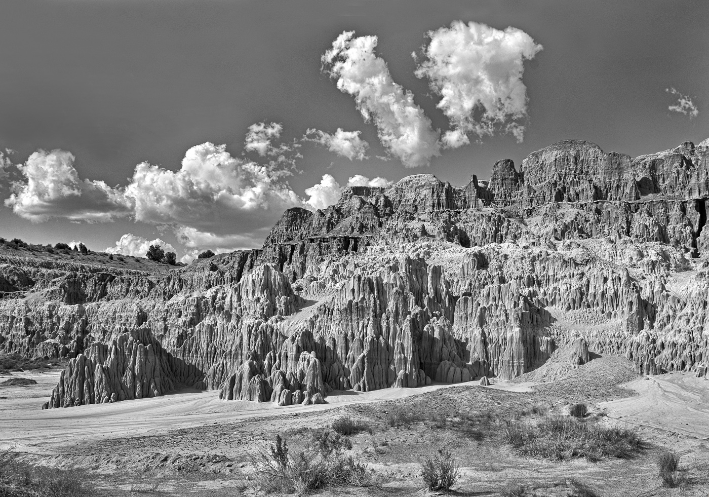
This is the other one, which seems too dark to me. |
Sep 7th |
 |
| 32 |
Sep 21 |
Comment |
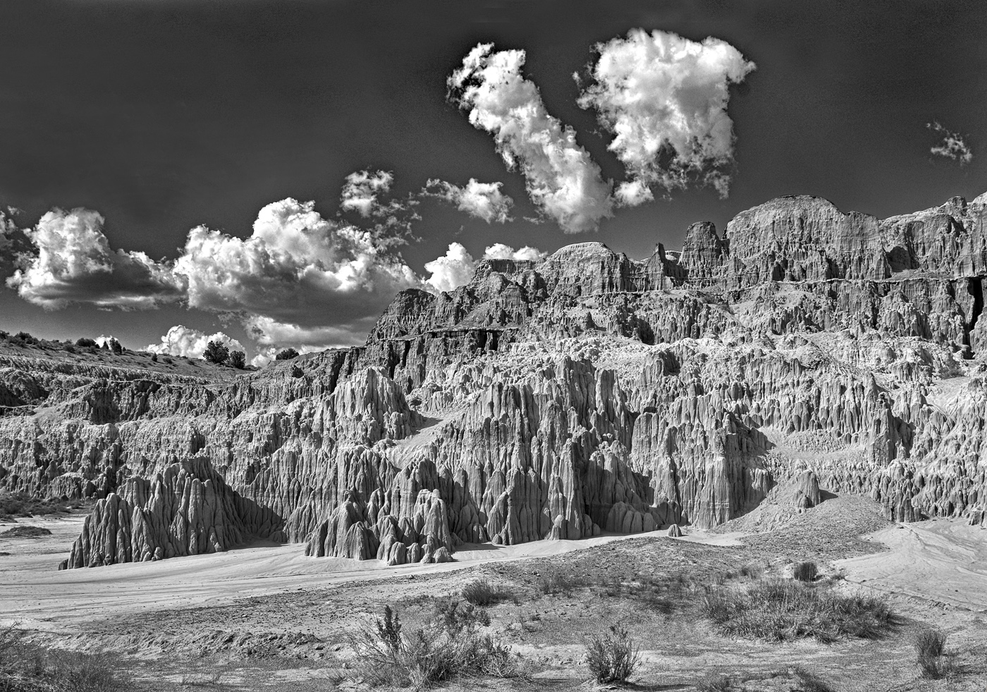
Here are a couple images where the sky is darker for sake of comparison. I've picked up a lot of noise somewhere, so I'd need to eliminate that, of course. |
Sep 7th |
 |
7 comments - 4 replies for Group 32
|
7 comments - 4 replies Total
|


