|
| Group |
Round |
C/R |
Comment |
Date |
Image |
| 32 |
Jan 21 |
Comment |
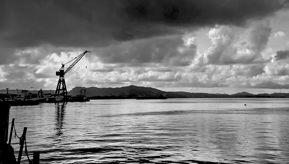
Although I know you were trying to portray the crane against the ominous sky, I really enjoy the different tones, ripples and reflections in the water in this image. The bird (gull?) is a nice addition, too. Thus, my inclination would be to remove some of the sky and brighten the water just a little bit. I also like Tom's reversal of the image, but realize that may seem awkward to those who are familiar with this landscape. |
Jan 13th |
 |
| 32 |
Jan 21 |
Comment |
In looking at this photo, I think, "Brrr, I'm glad I'm not there!" Thus, if conveying a sense of cold was your intention, you've certainly done that. I agree with you that leveling the snow might create an awkward angle with the tree, so I think the snow works as you have it. My preference is for a tighter crop to draw more attention to the intriguing shapes of the branches, but since you mention you like the whole tree, then you should keep what you prefer. Good idea getting rid of the fence. |
Jan 13th |
| 32 |
Jan 21 |
Comment |
I agree with the other comments that photographing action like dancing is very challenging, particularly in low light. Does your camera allow for adjusting ISO and/or shutter speed at all? I'm wondering whether it would work in situations such as this one to do a longer exposure that would result in motion blur throughout the dancer rather than just in the hands? Another idea might be to try making the image more abstract through editing with changes in the light. I don't think this example is quite what I'm envisioning, but I'll attach it anyway. |
Jan 12th |
 |
| 32 |
Jan 21 |
Comment |
You've done a nice job of holding some detail in the rose petals, which I find challenging when I try to do high key images with blossoms. The softening toward the background creates an ethereal feeling for me. I agree with Tom that the way you cropped the image originally provides a nice flow with the lines of the other petals. |
Jan 12th |
| 32 |
Jan 21 |
Comment |
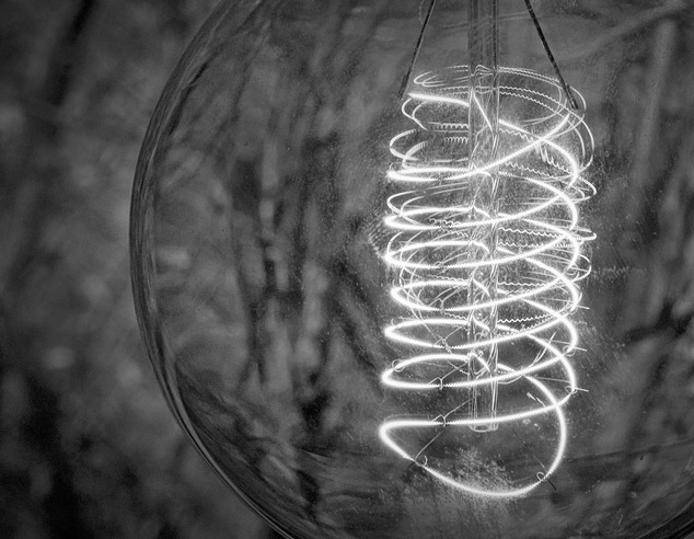
This is a neat light bulb. I can see why it drew your interest. Thanks for showing the alternate versions of the image, too. When I first viewed this image, I wondered if it was too centered. However, after playing with it a bit myself and seeing your other versions, I've now decided I prefer the way you have presented it originally. Brightening the plants/vines behind the light when you converted to monochrome helped too, I think, as they add some interest in the background without being distracting. Again, I think your original is the better version, but tried a crop that was somewhat more abstract just to see how that would work. |
Jan 12th |
 |
| 32 |
Jan 21 |
Reply |
Here it is. I do most of my monochrome conversion now with the Nik Silver Effects Pro plug in for Photoshop. I've had it for years, so probably have an older version. |
Jan 12th |
 |
| 32 |
Jan 21 |
Reply |
Apparently, I need to adjust calibration, as it seemed like the contrast was almost too high when I adjusted it, but still looks rather flat when viewing it on my office computer. My calibration Spyder broke, though, so I need to replace it. Is there something that is reasonably priced but better now? What are others using? Thanks. |
Jan 12th |
| 32 |
Jan 21 |
Comment |
You have an interesting idea to combine the meerkats and the steelworks. I believe I would prefer to see the coiled cables darkened in both the color and monochrome images. They are so bright that I find I am constantly looking more at them than the meerkats. Like you, I believe I prefer the richness of the tones and the subtleties in lighting in the color image over the monochrome version. You also discovered the U.S. affinity for liability waivers, I see. Yes, much of the rest of the world thinks things like that are very silly, but then they think some of the things people file lawsuits for here are very silly, too. |
Jan 11th |
| 32 |
Jan 21 |
Comment |
I adjusted some contrast and a few other things in the sky. I may need to start over or give up on this image, as it seems I'm creating more problems than I'm resolving. |
Jan 11th |
 |
| 32 |
Jan 21 |
Comment |
Thanks Russ. This image looks really gray/flat on my office computer monitor. I think I'll try to adjust the contrast some more and see if that will help, although you are correct that I may need different clouds for this subject. |
Jan 11th |
8 comments - 2 replies for Group 32
|
8 comments - 2 replies Total
|


