|
| Group |
Round |
C/R |
Comment |
Date |
Image |
| 32 |
Aug 20 |
Reply |
I like it vertically, but "better" is subjective yet again. Some people possibly may be bothered by the reflection being to the side rather than beneath the forks.
|
Aug 28th |
| 32 |
Aug 20 |
Comment |
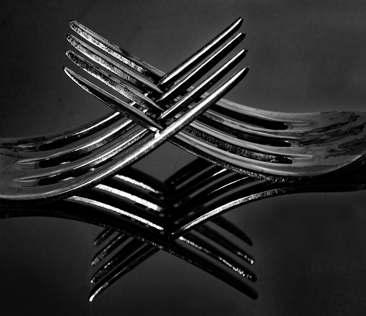
I agree with Asbj�rn that this image seems more unusual than the balanced eggs. As others already have mentioned, I also prefer the color version. I wondered whether it would be better to crop some more from the left side, so I tried it. I think I like that, but you can see what you think. It also seems this might be interesting flipped vertically. |
Aug 27th |
 |
| 32 |
Aug 20 |
Reply |
I agree that I like this image with more contrast. It works well to enhance the mood of the scene. |
Aug 27th |
| 32 |
Aug 20 |
Comment |
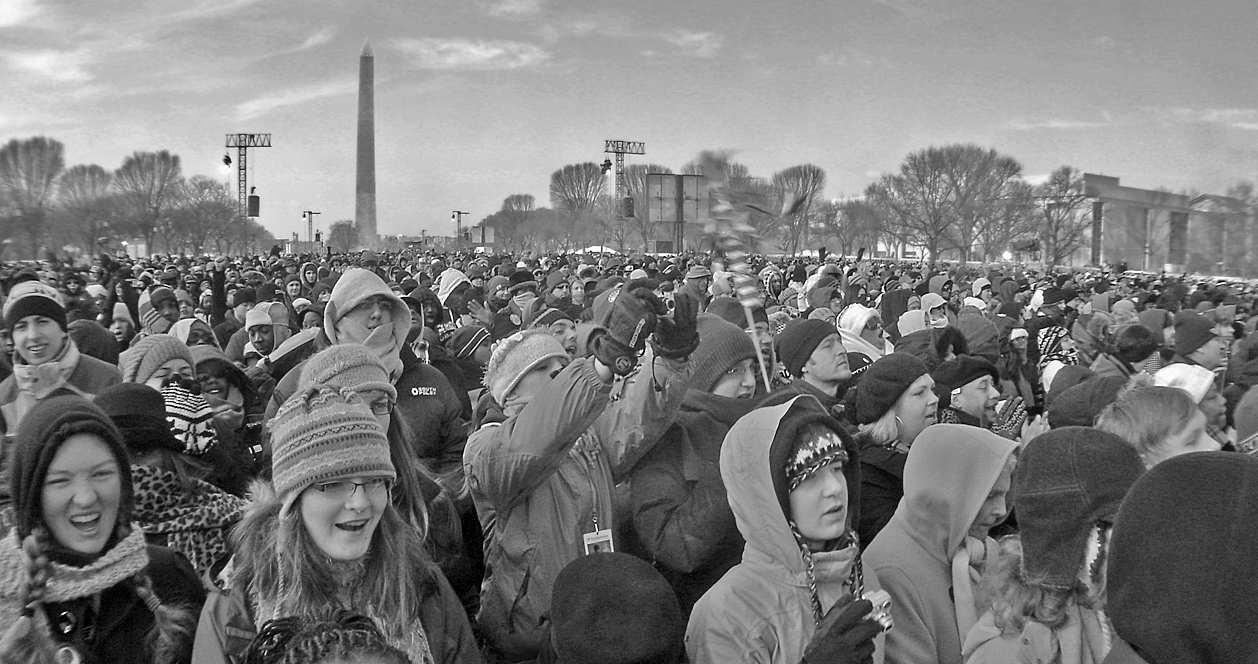
What an amazing opportunity to be at this historic inauguration. I know it was cold, but find the child in the front center part of the image, whose face cannot be seen at all since it is completely covered, to be a bit awkward. Thus, I tried cropping the image into a panorama. I also brightened the shadows because I wanted to see more details in all those intriguing and hopeful faces. Does that work? |
Aug 27th |
 |
| 32 |
Aug 20 |
Comment |
Thanks for the comments. I agree this image seems too bright the way I edited it. I'll try adjusting it some more. |
Aug 27th |
| 32 |
Aug 20 |
Reply |
I agree that I find the color version or the monochrome version Tom suggested, but leaving the door red, to be the more compelling. I tried darkening the sky and door and keeping the building brighter, but those were not better than Tom's suggestion here. Thus, I think that would work only if you needed to keep the image all monochrome. |
Aug 27th |
| 32 |
Aug 20 |
Comment |
While I agree with Stephen and others that the woman is very compelling, I think a part of the story this image conveys is that of her in her environment. Thus, I like your original crop. I also like your brighter background, with the exception of the plastic container. So, I believe my vote is to keep the light background but darken the container. I believe I also would like to see her face or at least the eyes just a little brighter. |
Aug 12th |
| 32 |
Aug 20 |
Reply |
Tom, please correct me if I'm wrong, but I believe the reason for reversing images like this one for those of us who are accustomed to reading from left to right is that large framing objects, such as the tree here, that tend to stop or interrupt eye movement feel more natural on the right. That way, they effectively push the viewer's eye back into the image. Those same framing elements on the left risk interrupting and distracting the viewer just as he/she starts to examine the image, making it take more time and effort to get to the subject. |
Aug 12th |
| 32 |
Aug 20 |
Comment |
I am impressed that you seem to have a very sharp image for having taken it from a fast-moving vehicle. The few times I've tried photographing out the window as a passenger in a moving car have been less than successful. I agree with Diana that either cropping or cloning out the "Lamar" would improve this image for me. I'm also wondering whether a full white background rather than the gray color that resulted from the blue in the color version would more effectively set off the contrasting sign. |
Aug 12th |
5 comments - 4 replies for Group 32
|
5 comments - 4 replies Total
|


