|
| Group |
Round |
C/R |
Comment |
Date |
Image |
| 32 |
Nov 19 |
Comment |
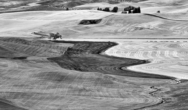
The Palouse is a photogenic area, although certainly more so during the spring than the late summer and early autumn, I would imagine. Although your image does a good job of conveying the vastness of the landscape, I am bothered by the location of the road bisecting the image so near the center. It almost seems to me that I am looking at two separate panoramic images, which might be an interesting thing to try with this image. I also tried cropping from the top and left sides and increasing the shadow and highlight contrast to add more emphasis to the lines and contrast of the dark and light areas. Of course, since you received an award with it as is, you may prefer not to change it. |
Nov 15th |
 |
| 32 |
Nov 19 |
Reply |
Looks like I should have darkened the top rail more, but hopefully it still conveys the idea. |
Nov 15th |
| 32 |
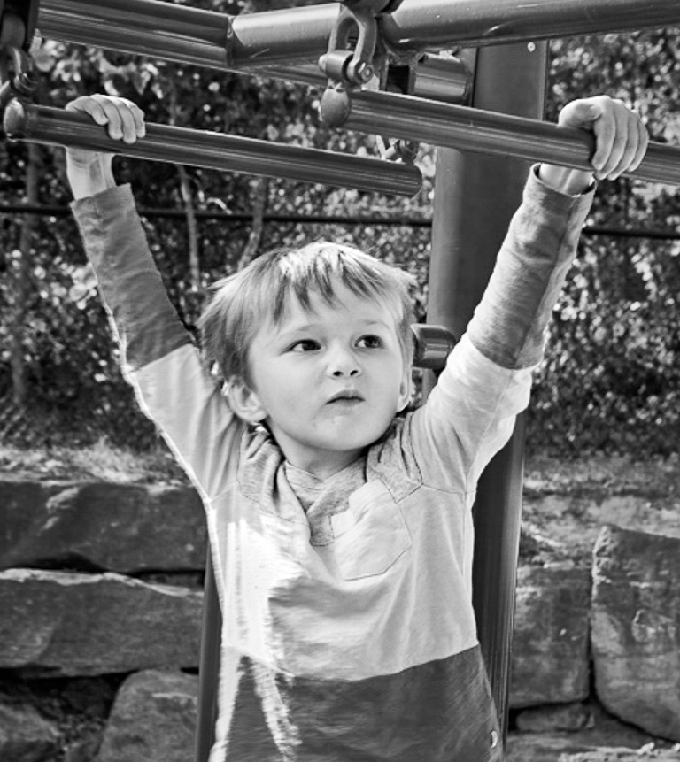
Nov 19 |
Comment |
Lucas does look very intent on what he is doing, so your efforts to draw attention to his expression worked effectively. You also captured good sharpness, particularly for his being in motion and the low ISO and shutter speed. I agree with Tom's suggestion to crop some of the top of the image, as that draws even more attention to Lucas. I've also tried selecting him and adjusting contrast slightly, then doing an inverse selection to darken the background, so as to bring even more attention to his eyes and face. Of course, some people don't like square format images, but I'll attach the one I did so you can see what you think. |
Nov 15th |
 |
| 32 |
Nov 19 |
Comment |
Now I'm wondering what really goes on at Kool Kuts, although I suspect I may not want to know. I've passed by various old buildings around here without giving them much thought, and then go back later only discover they have fallen over or been torn down and replaced with something else, so you were wise not to pass this one by. For my own personal taste, there is a little too much space on the left side of the image. However, you may have been trying to keep the corner of the sidewalk. I don't know much about film noir, so will leave that discussion for those more well-versed. |
Nov 15th |
| 32 |
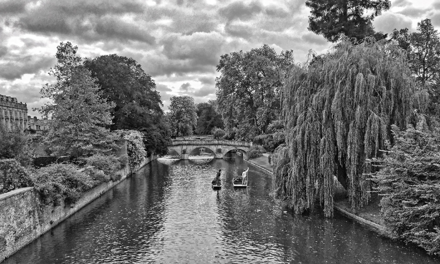
Nov 19 |
Comment |
Wonderful clouds and textures in this image. I played a bit with a vertical composition, which also works, but I think your horizontal one is better. On my monitor, the building seems slightly tilted down toward the right. You may want to remove the dust spot in the clouds on the left side roughly half-way between the building and the tree, too. Apart from the Alamo, I never did explore the missions when I was in Austin and San Antonio. You're convincing me that I need to do so next time I am in the area. There are several here in central California I should explore more, too. |
Nov 15th |
| 32 |
Nov 19 |
Comment |
I like the composition as you have it here. As an alternative to a dehaze filter, some of the art filters might increase the contrast. I don't have too many on my computer, so this is not the best example. This is a Topaz Adjust "vibrant" filter. It's effect is stronger than I had in mind, but conveys the idea, anyway. |
Nov 14th |
 |
| 32 |
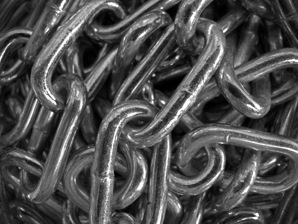
Nov 19 |
Comment |
Your interpretation of this "jumble" is effective, although a bolt, lock, or something to break up the pattern also would be interesting. What about darkening the corners/edges of this image and removing a few of the highlights there to further draw the viewer's attention to the close links that Tom pointed out? |
Nov 14th |
 |
| 32 |
Nov 19 |
Reply |
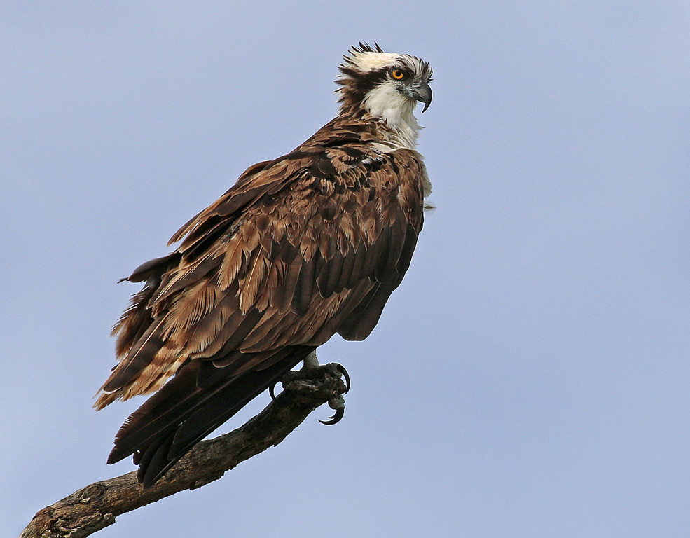
Glad you like it. I just went back through a few other images of this same bird and recollected how much luck is involved since several were not becoming poses, some I failed to realize that I had not moved to avoid a merger with other branches in the tree, etc. There used to be an "almost perfect shot" forum on one of the bird ID websites that was full of halves of birds, birds with their heads under water, and other "misses". It's unfortunate they redid the site and took that part away, as it usually made me feel better about the hundreds of bird photos I delete just to get a few keepers. |
Nov 14th |
| 32 |
Nov 19 |
Reply |
Yes, certainly an intense gaze ..... |
Nov 14th |
| 32 |
Nov 19 |
Reply |
Thank you for your comments. In the interest of avoiding too much empty space, I've created an awkward not quite square or rectangular image here. Getting to a square format would mean either having the branch run directly into the left corner, or eliminating more space in front of the osprey (or adding additional space on the sides through cloning, but that would run afoul of the nature rules). Neither of those seem wise to me. I am wondering if I should re-crop back to the rectangular format in spite of leaving more empty space in front, or if that would be more awkward than the non-traditional image dimensions? |
Nov 14th |
| 32 |
Nov 19 |
Reply |
Thanks! I find that even though I purchased it used, my Canon 100-400L seems to be a sharper lens than those I used previously. Even so, I still throw out far more bird photos than I keep. It seemed to me that this image was more compelling in monochrome than color, but you can see what you think. |
Nov 14th |
 |
6 comments - 5 replies for Group 32
|
6 comments - 5 replies Total
|


