|
| Group |
Round |
C/R |
Comment |
Date |
Image |
| 32 |
Oct 19 |
Comment |
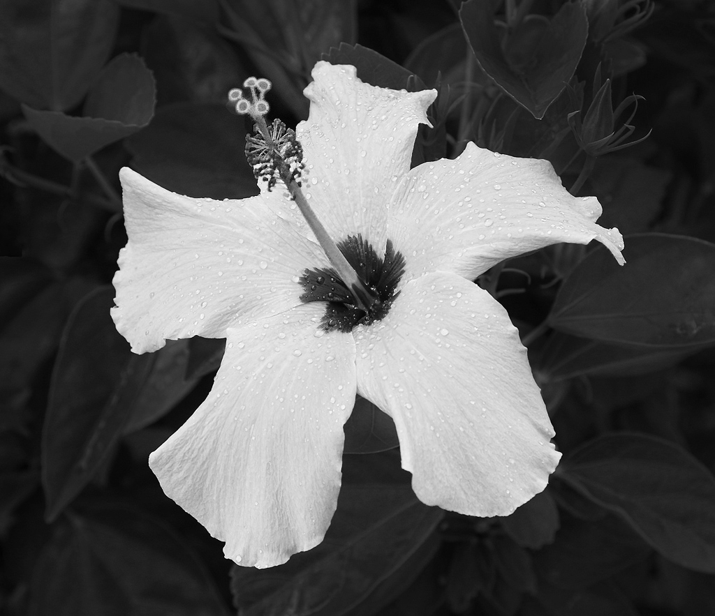
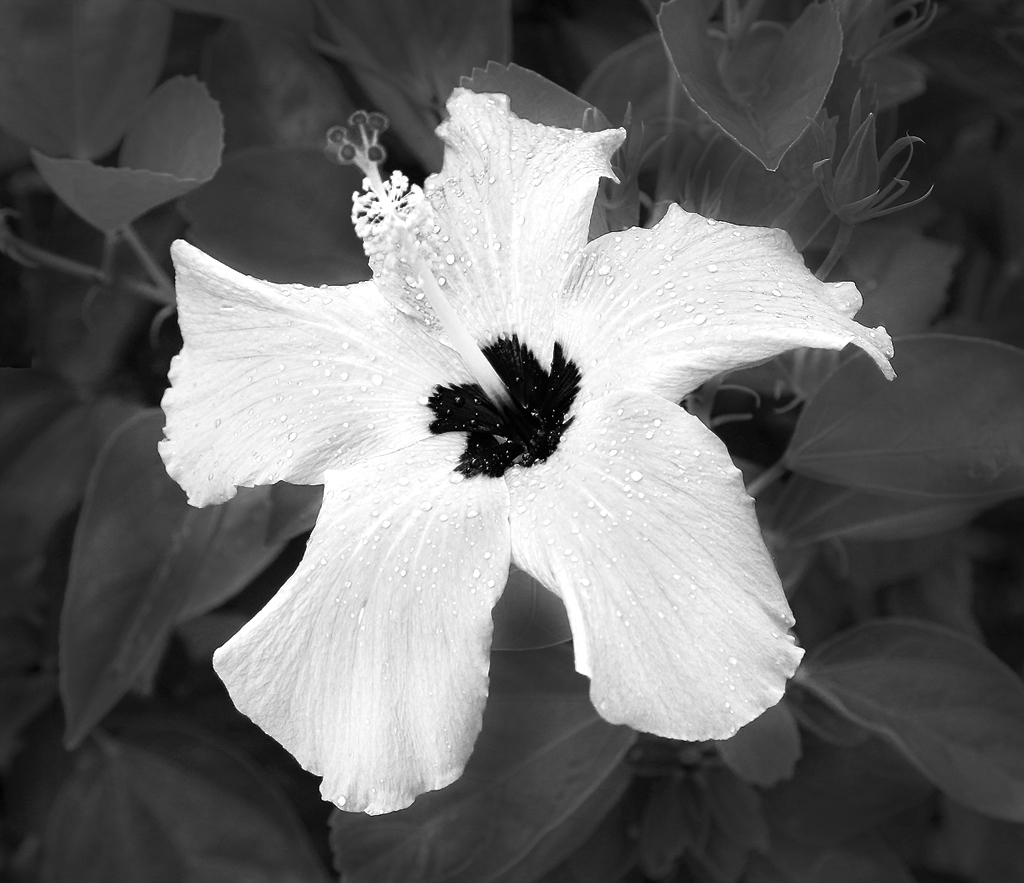
Here is one where I considerably darkened part of the flower before I converted to monochrome. That seems to have created more separation, so if I spent more time doing it carefully, that might work. Did it help? |
Oct 14th |
 |
| 32 |
Oct 19 |
Reply |
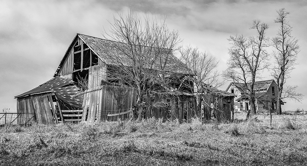
On a non-photography related note, are you familiar with the song, "This Ole House"? I think it may be by Stuart Hamblen originally. I learned it in elementary school music class, and the decaying and vanishing homesteads of my childhood in the Texas and Oklahoma Panhandles, as well as this image, always remind me of that song. |
Oct 13th |
| 32 |
Oct 19 |
Reply |
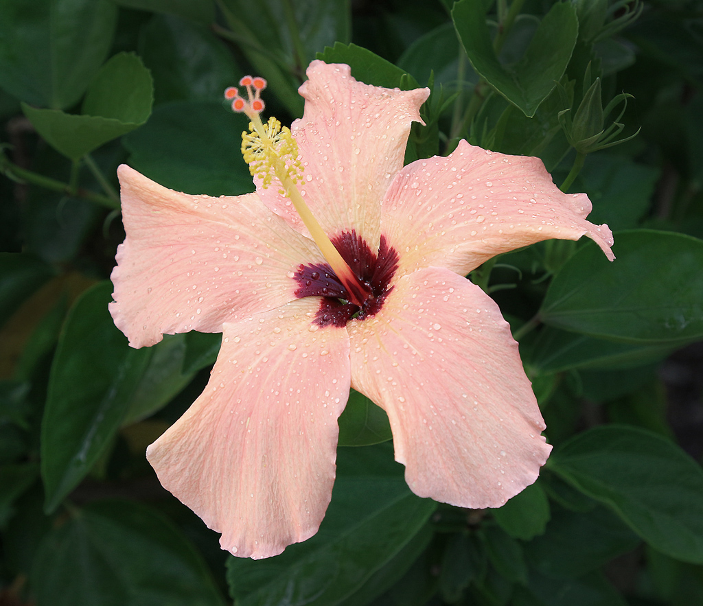
Thanks for the feedback, Tom. Unfortunately, there is not a lot of color value separation in the color version of this image. I might be able selectively increase/decrease the saturation in certain areas before making the monochrome conversion. I'm uncertain whether that would help or not. |
Oct 13th |
 |
| 32 |
Oct 19 |
Reply |
Thanks, Gloria. |
Oct 13th |
| 32 |
Oct 19 |
Reply |
Hi Lance,
Thank you for stopping by our group and for your feedback on this image. With the luminosity of the flower, were you thinking it would benefit from brighter petals? I just attempted to do that, but am concerned it may blow out with projection, as our club projector tends to be very bright.
I agree with you that auto ISO is not always ideal. Here, I was going back and forth from bright outdoor sunlight to very dark building interiors, and thus took the easier/lazier approach rather than having to change my ISO constantly. Although I enjoy digital photography, I find I have become lazier about several things now that costs of film and processing time are no longer a factor. Thanks for the reminder to work on breaking those lazy habits! |
Oct 13th |
 |
| 32 |
Oct 19 |
Comment |
I tried several things with this to see what I thought worked best for me. While the stormy sky is dramatic, there are a couple clouds that seem a bit awkward, and there is a bit of digital noise. Perhaps the judge felt those things competed or detracted from your homestead scene? I tried turning this into more of a panorama with less sky and a little less foreground grass. I don't know that it improves any upon what you've done already, though.
|
Oct 13th |
 |
| 32 |
Oct 19 |
Comment |
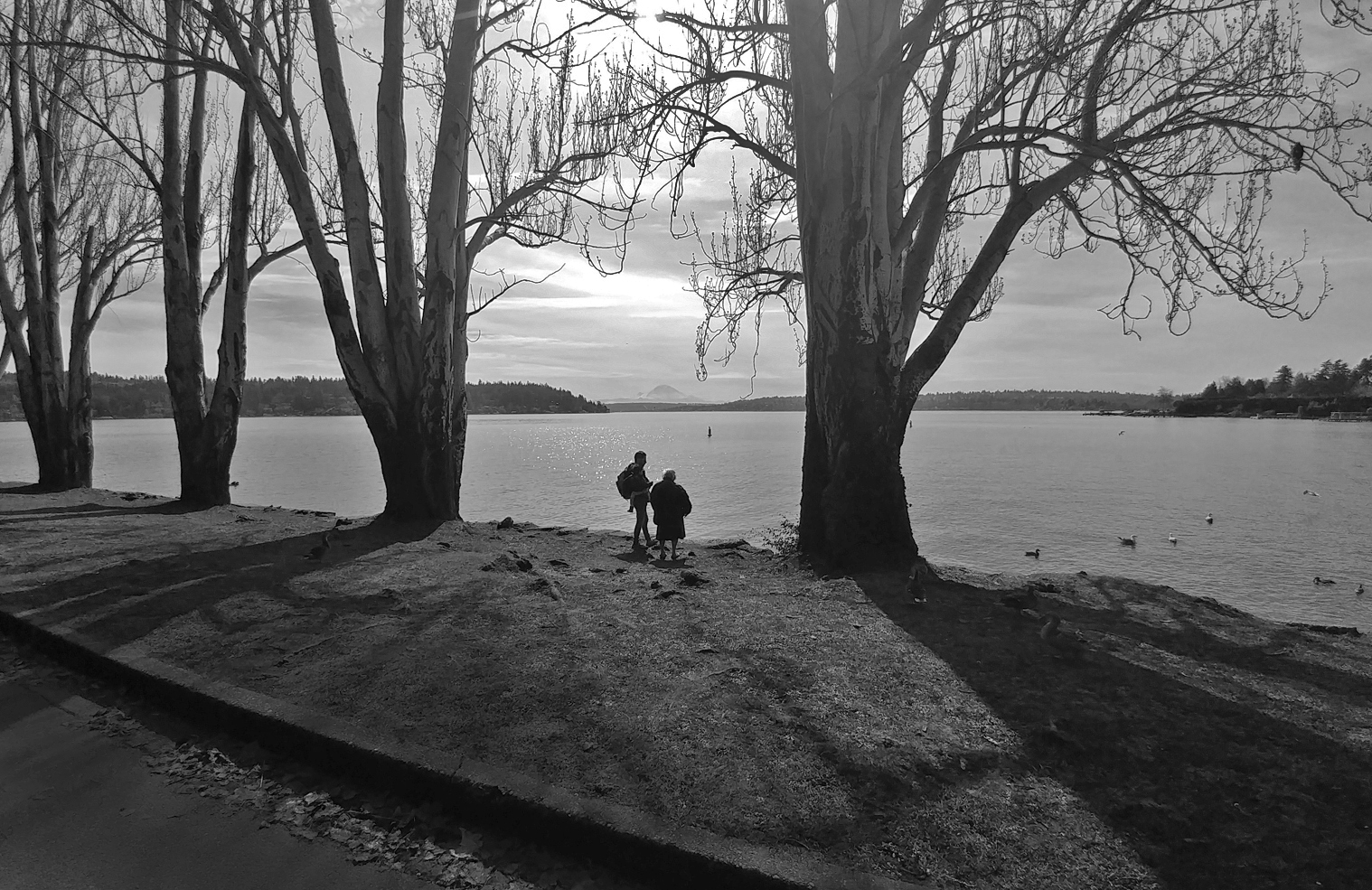
This is nice with the lake, trees and shadows. The one thing I think I would do, apart from what already has been suggested, is to darken the road and leaves in the gutter slightly more (assuming you don't follow the suggestions to crop them out). |
Oct 13th |
 |
| 32 |
Oct 19 |
Comment |
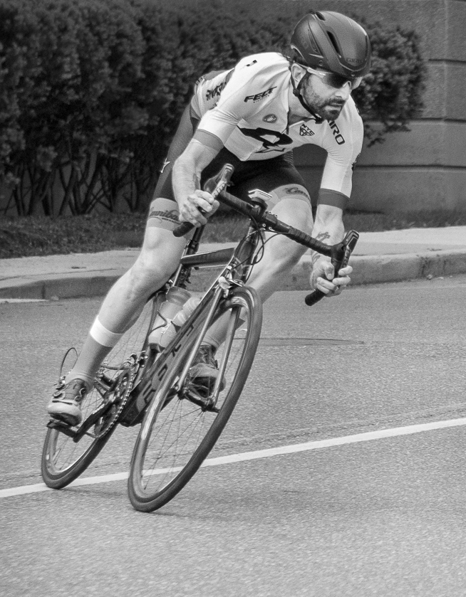
I agree that you did a nice job of timing this image to capture the rider in a flattering body position as he is making the turn. As others already commented, I, too, felt the monochrome image would benefit from being brighter. I tried adjusting it quickly with shadows/highlights, then selecting out and darkening the wall and bushes in the background. What do you think? Did that help, or is it too bright now? |
Oct 13th |
 |
| 32 |
Oct 19 |
Comment |
This is an interesting building, and I especially like that you had a stormy sky to reflect the clouds in the long row of windows. Stephen's leveling improved the slight tilt, I think. I believe my personal preference is for the building the way you have it in the "original 1" image. Since I read and view images from left to right, the full wall on the left side acts to stop my eyes from moving into and through the rest of the photograph as readily as they do with the original image. However, if you were going to enter this in an international in countries where they read and write from right to left, they might prefer your version. Have you tried brightening the banners and people near the doorway at all? I think that might help draw the viewer in more, too. |
Oct 13th |
5 comments - 4 replies for Group 32
|
5 comments - 4 replies Total
|


