|
| Group |
Round |
C/R |
Comment |
Date |
Image |
| 32 |
Sep 19 |
Comment |
This is an interesting old barn. I wonder why the care takers felt the multi-color bison needed to be a part of it? In any event, I agree that the monochrome conversion helps with that. I find that the auto tracks in the right corner of the image tend to lead my eye out of the frame. I'm not sure your intended use for this, but I'd recommend either cloning them out or possibly darkening the grass and tracks through dodging.
Regarding your image last month, am I recollecting incorrectly that dodging and burning are allowed in PJ? I'm wondering if some dodging on the wires behind the rider would help make them less of a distraction. |
Sep 3rd |
| 32 |
Sep 19 |
Comment |
Interesting use of the mirror as a framing tool in this image, although as others already mentioned, I, too, would like to see the full top part of the circle. My monitor makes this image appear very gray and rather flat. Was that intentional? I feel the image would be more impactful and help to pick up more on the faces if there was an increase in the contrast.
Street photography is very difficult in my experience, and I think you've made good efforts last month and this to capture several stories in the images. |
Sep 3rd |
| 32 |
Sep 19 |
Comment |
Hoping you and others are safe from the hurricane and spared from its destruction.
I like your composition in this image with the bridge above the boat. However, I'd recommend cropping just slightly from the right side of the image to eliminate the partial bridge support. Also, is there a way you could darken the bright white areas on the boat just in front of the driver? The monochrome image, to me, is more dramatic and compelling than the color version, so I think your decision to convert this image was a good one.
Sorry to have missed last month's comments. I liked your composition in your pier image and thought the longer exposure worked well with the water. I agree with the other comments that the color version of that image was the more much more dramatic of the two. |
Sep 3rd |
| 32 |
Sep 19 |
Comment |
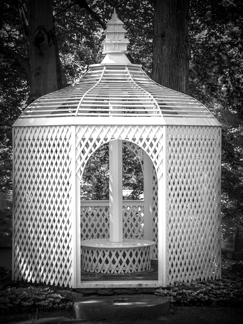
Perhaps I am the odd one in that I actually prefer the brightness and greenery in the color image. However, as others prefer the black and white, my suggestion would be to increase the contrast somewhat. I've done so in the attached image by adjusting the levels and then dodging and burning some of the foreground and trees/leaves. Did that help?
Apologies that I missed getting my comments in last month. I liked the way you handled the contrast on last month's image and thought it was an effective treatment for your subject. |
Sep 3rd |
 |
4 comments - 0 replies for Group 32
|
4 comments - 0 replies Total
|