|
| Group |
Round |
C/R |
Comment |
Date |
Image |
| 32 |
Jun 19 |
Reply |
Thanks for sharing these, Diana. I think both of these worked well with the high key effect. You're right that it seems difficult to do well. |
Jun 29th |
| 32 |
Jun 19 |
Comment |
Nice portrait. I, too, think the yellowed/sepia toned image is my favorite. My only suggestions would be to keep the left thumb as you have it in the monochrome image and to darken the bright spot above her head a little more, if possible. |
Jun 29th |
| 32 |
Jun 19 |
Comment |
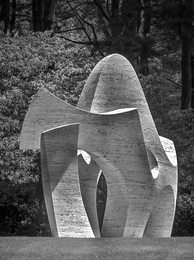
Welcome to the group, Gloria. This is an interesting sculpture that I agree works well in monochrome. I agree that getting rid of the dark shadows at the bottom of the image helps. Although I am not a frequent entrant in exhibitions, I've seen all kinds of cropping and image dimensions, so that doesn't seem to be an issue at all, particularly in digital, unless you intend to mat and frame an image, in which case, custom costs can be a deterrent. Although I think this works with the subject bright like you have it, I liked the shadows and highlights on the subject, so I tried playing with those a little bit, although not quite as dramatically as Diana did. I didn't do a very good job of it, but like the contrast between those areas. |
Jun 29th |
 |
| 32 |
Jun 19 |
Comment |
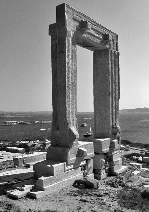
The stonework on the tower is interesting, and I think your choice to convert it to monochrome helps emphasize that. I find myself drawn to the doors, and thus am tempted to crop some more from the top of the image to draw more attention to them. We just got back from Florida a few days ago, and weren't too far away (Kissimmee for a conference), but missed this area. We'll have to add it to our list for next time. |
Jun 29th |
| 32 |
Jun 19 |
Comment |
Although there is something to be said for placing an image in the context of its surroundings, to me, this image seemed to lend itself well to a vertical composition. Thus, I've tried. one. I like your placement of the boats in the arch also, and your description of the fries is enough to convince me I need to visit Naxos if I ever have the opportunity. |
Jun 29th |
 |
| 32 |
Jun 19 |
Comment |
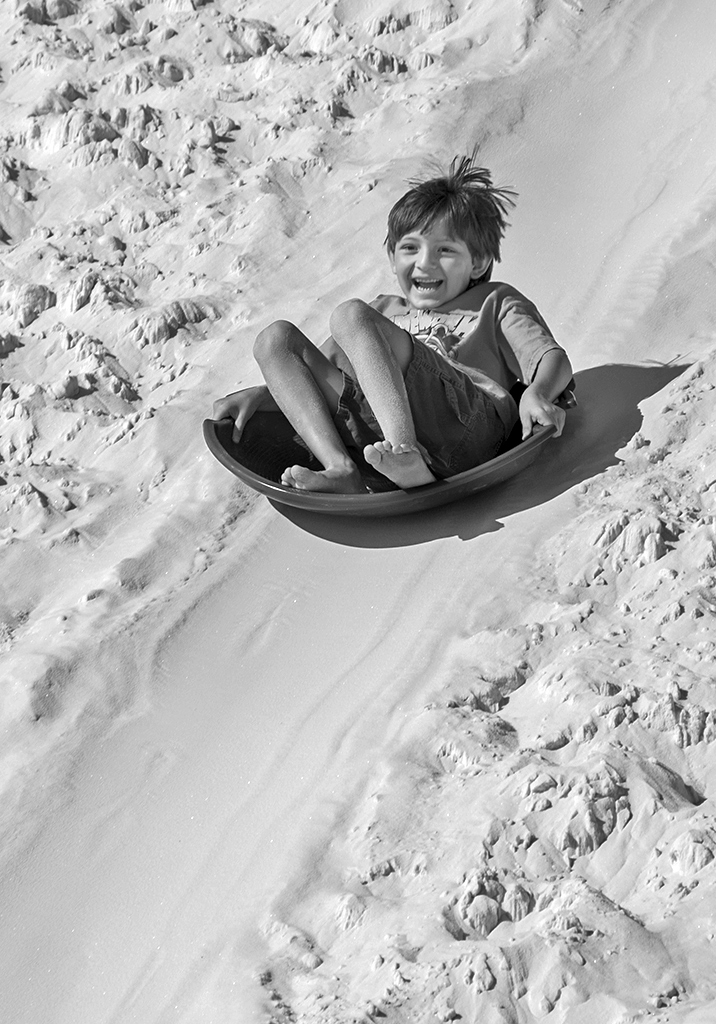
He looks like he is having lots of fun. I, too, like you composition and choice of a photo with your subject in the sun to avoid his face being lost in the shadows. I tried adjusting the shadows/highlights contrast a little bit. It seems to me that it helped to make the image brighter, but you can see what you think.
|
Jun 29th |
 |
| 32 |
Jun 19 |
Comment |
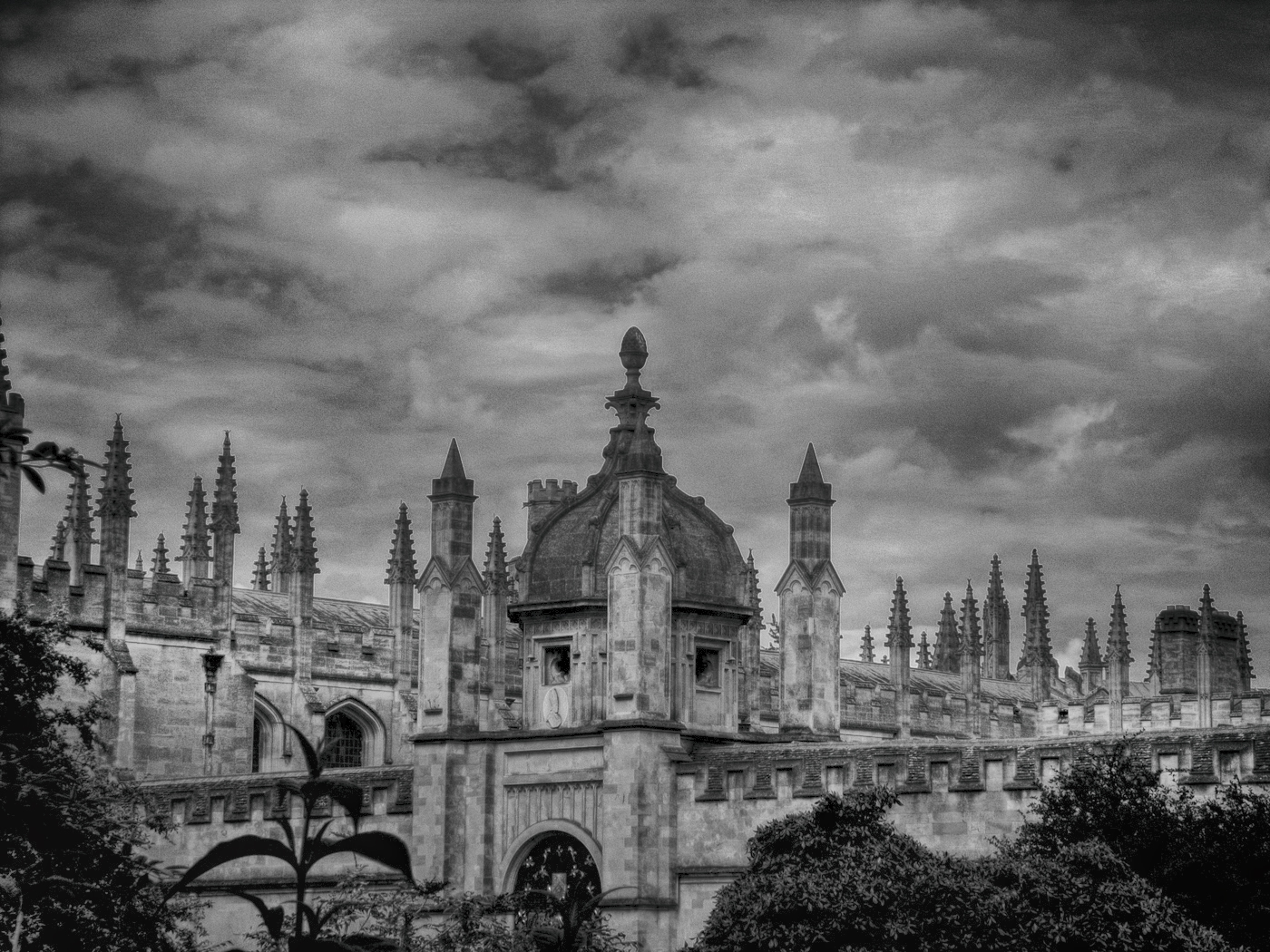
As others have already discussed, I agree that I like the brighter building, and the sky can be emphasized more with increased contrast. Have you tried any of the programs like Topaz, Nik or similar for editing? Some of the results can be too over-dramatic for my tastes, but with some experimentation, I find they sometimes interesting make adjustments quickly that would take me considerable time to do. |
Jun 29th |
 |
6 comments - 1 reply for Group 32
|
6 comments - 1 reply Total
|


