|
| Group |
Round |
C/R |
Comment |
Date |
Image |
| 32 |
Jan 19 |
Reply |
Now that I'm looking at my version, it is very tight on the left side of the frame. If you try this, you might want to clone some more space there. |
Jan 23rd |
| 32 |
Jan 19 |
Reply |
That's interesting. Do judges there still prefer birds to be smaller in the frame if it is only open space surrounding them? Does that apply to other animals too? I've heard some nature judges here mention a preference for viewing a subject in its environment, but question whether that would apply if rather than a field, pond or similar, the surroundings are just blank sky. You're correct that the nature division still struggles with some dispute among judges about man-made subjects being selected by birds and other animals as a perch, thereby making the man-made object a part of the environment, versus "too much" man-made object causing a disqualification. There are images where I struggle with that, too, when I judge. I try to enter my images such as this one in pictorial rather than nature for that very reason. |
Jan 23rd |
| 32 |
Jan 19 |
Comment |
I think you've done a good job with the background here, as my experience is that these detailed backgrounds can be distracting, but I do not find this one distracting in the way you've presented it. The lighting on the model is a little bright for my tastes, but you didn't have control over that. This pose is okay, but I think I agree with Tom that the facial expression doesn't seem to quite fit with her body language here. I think the blur effect is a little bit stronger on the left knee than I would prefer, but do think that was a good idea to help draw attention to her face. |
Jan 23rd |
| 32 |
Jan 19 |
Comment |
I know some of the Scandinavians insist that cold water swimming/bathing is very restorative, but it makes me shiver to even think about that! I should explore your link in more detail, as I am curious what the artist hoped or intended to convey with this performance. Regarding your question about context, I admit that when I first looked at the photo without reading your description or any of the comments, I was confused about the walls and ceiling and felt they didn't really seem to fit in with the rest of the image. I'm thinking this might work better for me if you eliminated the light fixtures. Both as a photographer and judge, I have lots of mixed emotions about photographs of "other people's art". I think I usually make a distinction between documenting a performance and taking a photo of a more static piece of art, but I'm not sure I can really articulate why I do that. Is a performance really that much more temporary or fluid than a short-term exhibit of sculpture(s), for example? As well, I agree that it is important to respect the artist's wishes regarding photos and to extend credit for the art. Here, I like the silhouette and your composition, but even knowing the context, still struggle to get past my feeling that somehow the walls/lights don't seem to fit with the rest of what is happening here. Of course, it's likely that was a part of the point of both the performance and your photo. |
Jan 23rd |
| 32 |
Jan 19 |
Comment |
You did a good job with the photo stacking, as the image looks very sharp throughout on my monitor. I'd be curious to see a couple of the images you used. Also, were you using a macro lens or tripod/head of some sort? I really struggle with macro depth of field, especially as it changes dramatically with the slightest of movements, so maybe I should explore focus stacking some time. Like Diana, I find I am a bit distracted by the two pieces on the left, but do really like the image. |
Jan 23rd |
| 32 |
Jan 19 |
Comment |
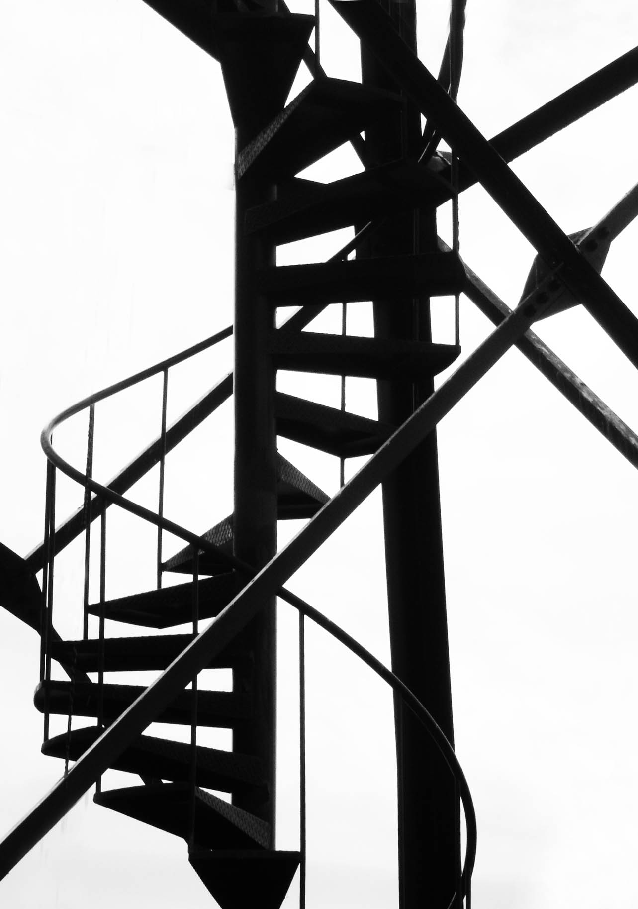
Since it seems to me that this photo is more about shape and design of the stairs and surrounding structure than a physical location per se, I think I prefer the edit Tom did eliminating the clouds. I experimented with some cropping and cloning out of some of the extra supports (assuming you are not entering it in a competition where cloning or removing elements is prohibited, of course). I think it may still be a little too busy for my own personal tastes, but you can see what you think. |
Jan 23rd |
 |
| 32 |
Jan 19 |
Comment |
Colorado is so pretty. You've done a good job of bringing out the details in the wagon, and the tonal range in the monochrome conversion looks really good to me. As Diana already has pointed out, the position of the tree is not ideal. Of course, you're right that it's hard to think of all those things when you're taking a quick roadside photo ..... or in my case, even a carefully planned and composed photo. (I once tagged along with a portrait photographer who let me frame the initial composition. I thought I'd done so well, until she pointed out the plant coming out of someone's head that I'd completely missed!) I'm also wondering if it would help to darken the hitch, as I find that the bright diagonal line tends to pull my attention away from the wagon. If you're not using this in travel or some other division where it is prohibited, I think it might help to eliminate the rocks to the left of the wagon, also. |
Jan 23rd |
5 comments - 2 replies for Group 32
|
5 comments - 2 replies Total
|


