|
| Group |
Round |
C/R |
Comment |
Date |
Image |
| 32 |
May 18 |
Comment |
You got more detail out of the monochrome image than I would have anticipated from the color exposure, and it seems the camera handled the extreme contrast range reasonably well. I unexpectedly had a similar experiment last summer when a cousin asked me to take some photos at her wedding from the back of the church, and we completely lost power as soon as the wedding started. Consequently, people were using the flashlights on their cell phones to shine light on the bride, groom and wedding party. I knew my on-camera flash would be useless covering that distance, but without it, the images did have more digital noise than I found ideal. I ended up using a de-noise filter, but since the place I'm noticing it most in your image is just above the light box, you could probably just darken that. Is there some reason you decided to remove the person watching? I kind of like him/her there. |
May 16th |
| 32 |
May 18 |
Comment |
Although this image of the young cowgirl is very nice in color, this image lends itself very well to monochrome. As others already have suggested, brightening her face/eyes helps draw more attention there, and I also like Oliver's tighter crop. Your handling of the background and hat work well and help her stand out. |
May 16th |
| 32 |
May 18 |
Comment |
I, too, very much like the concentration and old-fashioned craftsmanship you've captured in this image of Jim. I experimented with cropping tighter from the left and top of the image to eliminate some of the distraction of the bright building, but decided I didn't care for the tight crop. Thus, I agree with the suggestion already made by others to darken the building. The exposure and contrast on the rest of the image look fine to me. |
May 16th |
| 32 |
May 18 |
Comment |
Eeek! I certainly would want my long lens for a subject like that. A botanical garden also seems a rather unexpected place to find a snake of that size, although perhaps the area is not as urban as I'm envisioning. Your exposure on the flower is beautiful, and the leaf is fine as you have it. To me, the dark shadow on the back part of the snake and lily pad is a bit too dark. I like the suggestion to rotate the image a bit to put the snake's tail near the lower left corner, too. |
May 16th |
| 32 |
May 18 |
Comment |
Your composition is well-handled in this portrait, and I'm not bothered by the clipboard or pen. To me, though, the background is competing with him somewhat. I tried brightening the gnome, but think it might work better to darken the background a little more, or perhaps try like I did with Diana's image this month and use a soft blur effect to make it less prominent. I'm thinking the image is probably intended for competition, or for a memory of your trip. It seems suitable to either of those purposes to me. |
May 16th |
| 32 |
May 18 |
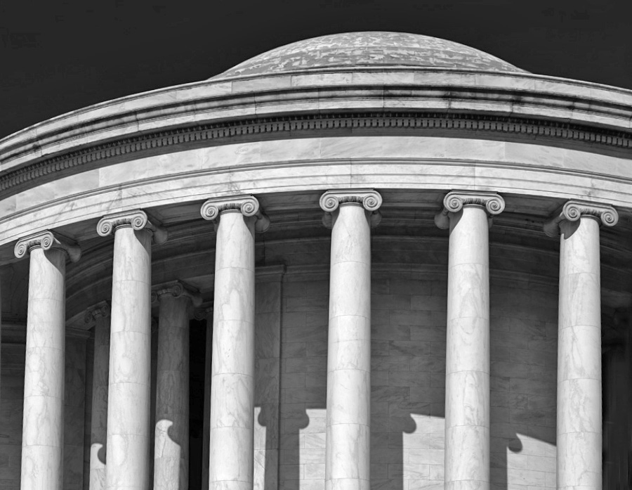
Comment |
Diana is right that the image is tilted. I tried using the distort tool to straighten the building some more, cropped out the left column (that was still not straight), and brightened the shadows. Is that any better? |
May 16th |
 |
| 32 |
May 18 |
Comment |
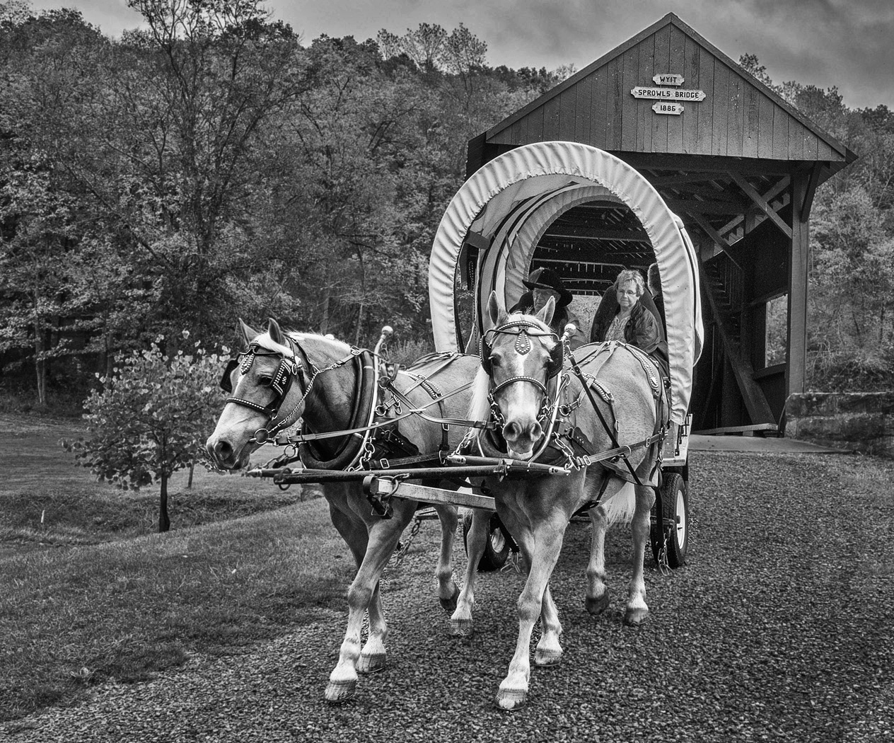
For me, the sharpness of the background draws my attention away from your intended subjects. I did a (rather poor) selection and tried blurring the background a bit. I also cropped some from the right since I liked the wall, but preferred the right horse to be a bit less centered in the frame. Of course, neither of those changes likely create the level of excitement you're seeking, but you can see what you think. |
May 16th |
 |
7 comments - 0 replies for Group 32
|
7 comments - 0 replies Total
|


