|
| Group |
Round |
C/R |
Comment |
Date |
Image |
| 32 |
Apr 18 |
Comment |
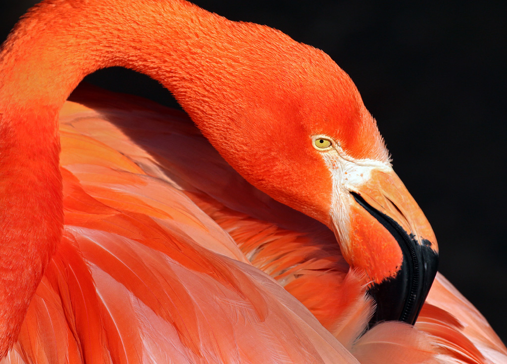
Oh my goodness, just look at that hair! I like the way you've included the two women in the background as a juxtaposition to your trio. Although it seems I should try to make a case for the monochrome image, I, too, like the detail and colors in the original. You are much better with a cell phone camera than I am. When people see me with my DSLR and hand me their cell phones to take photos, I always feel like an imposter, as I am a very incapable cell phone photographer. I tend to blame the phone camera, but somehow suspect that is only a fraction of my problem. |
Apr 26th |
| 32 |
Apr 18 |
Comment |
Love the combination of the two images and the use of the silhouettes. I, too, will miss Carol's contributions, particularly her willingness to share her knowledge and teach us how she achieved the results we sought, and of course, her beautiful photos. Looking forward to seeing some of your photography, Tom. Welcome to the group. |
Apr 26th |
| 32 |
Apr 18 |
Comment |
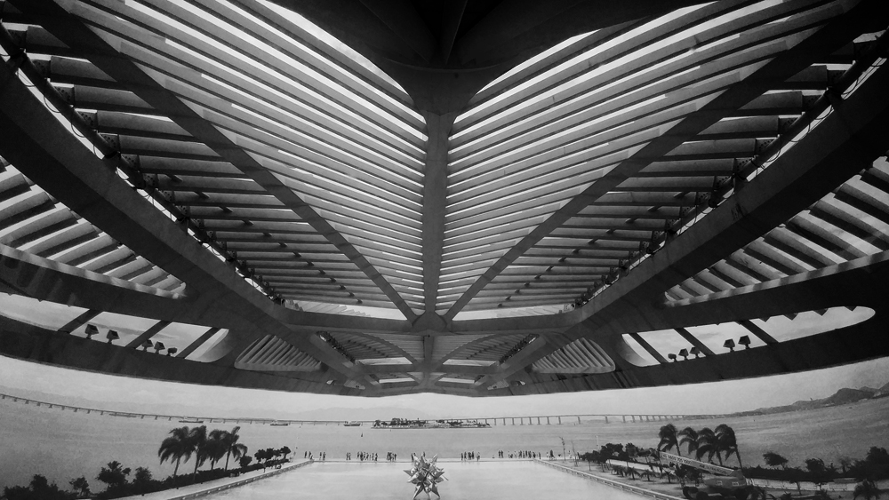
This image initially made me look twice to ensure it was not a mirror image. Of course, in looking at the lower part, that became obvious. I tried the suggestions already made about adding contrast, although I first selected out the lower part of the image so that I would not overdo that in adding contrast to the upper part. I took it a bit darker than others may have envisioned since I know you like black! Is this too much? |
Apr 26th |
 |
| 32 |
Apr 18 |
Comment |
I like the toning you used for this image, although for me, the vignette is a bit bright on the stomach and back of the horse. The sky doesn't bother me, but I do find the tree a bit distracting. Think I would be tempted to remove it. The second image you showed is very dynamic, and worth some work I think. I find sports photography extra tricky, and think you've handled the challenges very well with these images. |
Apr 26th |
| 32 |
Apr 18 |
Comment |
When I first saw this image, I wondered what happened since several of the roofs are oddly askew. Then I read it was Harry Potter World, and it made much more sense. I initially thought I'd prefer the image as a vertical (and cropped considerably to make that work), but in looking at it some more, I've decided I like the horizontal format you chose. Although I am not a fan of either butter or beer, I agree with Lynne that I would like to see the full butterbeer sign, if possible. As others already mentioned, the sky is great. |
Apr 25th |
| 32 |
Apr 18 |
Comment |
I like the idea, and also Tom's suggestion to reverse the image. One of the challenges I find with the creative division, and a reason I so seldom venture there in PSA exhibitions myself, is that it seems salon judges often reward things that involve multiple steps/layering, and are more reluctant to reward images where, in their view, only a filter or single technique was applied. Of course, we all know that simple images can be compelling, too, but I think that sometimes goes by the wayside in the creative salons. Then, am I any less guilty of considering the amount of time/work involved when I judge creative divisions in salons? Probably not, truth be told ......
|
Apr 25th |
| 32 |
Apr 18 |
Comment |
Here's the color version. Sorry I didn't get it posted sooner. |
Apr 25th |
 |
| 32 |
Apr 18 |
Reply |
Hi Hattie,
Thanks for visiting our group, and for the suggestions. I do have Nik with the control points, so I'll have to try that and see if I can add some contrast that way. |
Apr 25th |
| 32 |
Apr 18 |
Comment |
Thanks for the feedback. I'll post the original when I am back on the home computer. I don't have the photos loaded on my laptop. |
Apr 17th |
8 comments - 1 reply for Group 32
|
8 comments - 1 reply Total
|