|
| Group |
Round |
C/R |
Comment |
Date |
Image |
| 32 |
Dec 17 |
Comment |
Thanks for the feedback. I agree a darker background likely would help for PID, but does anyone know the rules regarding making considerable edits to the same image when entering it in different divisions? I am aware that the same image needs to keep the same title across divisions (I've previously made that mistake already), and I should not enter the same image in different divisions of the same exhibition in the same year. However, I don't know what, if anything, happens if I use a much more heavily edited version of the same image I've already used in nature for PID, or if I need to keep the image substantially similar (apart from perhaps a color/monochrome alteration) no matter the category. |
Dec 20th |
| 32 |
Dec 17 |
Comment |
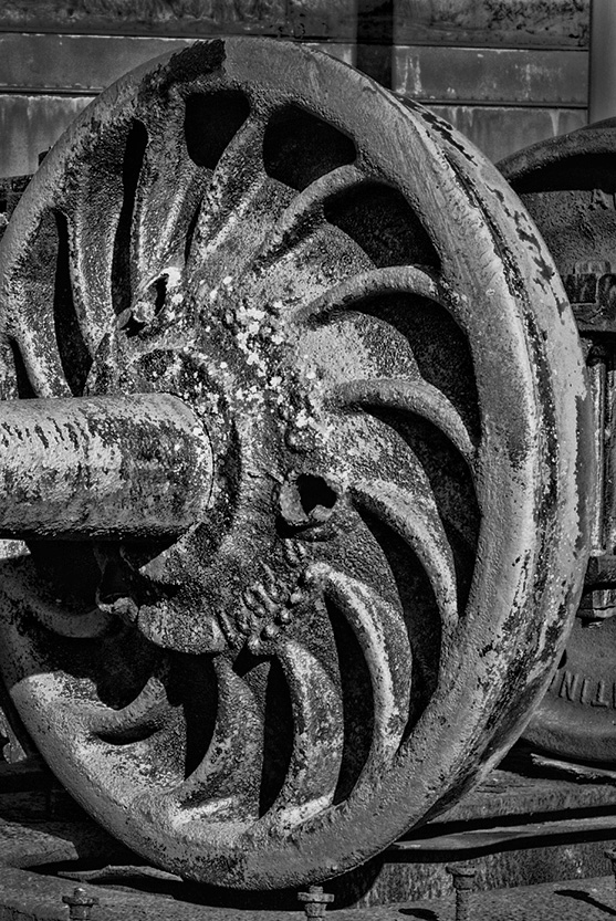
This is an interesting subject, and one I probably would have walked right by. I like your monochrome conversion, and agree with Carol's suggestion to use Topaz or some other filter to enhance the gritty feel. The image works fine the way you have it, but for some reason, I'm also seeing a vertical image here. That's twice in a row, I believe. Maybe I need new glasses! |
Dec 20th |
 |
| 32 |
Dec 17 |
Comment |
What a beautiful building. I don't know what it looks like in color, but I think it looks great in monochrome. Your efforts to straighten/transform paid off, also, as I, too, like the second version better. It is unfortunate in some ways that it created a tighter crop of the image, losing the full oval in the upper right, but I don't find that problematic in the new version. I'm not certain what else I would change -- other than to send all my leaning building images to you and Diana to help me fix! |
Dec 20th |
| 32 |
Dec 17 |
Comment |
Interesting juxtaposition of the dying flower with the fresh blossom. I like the way you have cropped this image to make that your subject. Although, as most of you already know, I do not tend to be a fan of completely dark/black backgrounds much of the time, I do think Carol's revision lends itself well to this image and helps draw my attention to your subject. |
Dec 19th |
| 32 |
Dec 17 |
Comment |
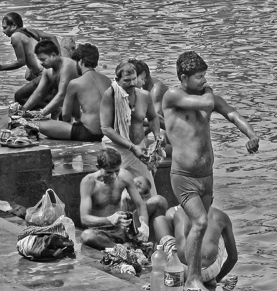
This is an interesting image of the lifestyle of that part of the world, and I like how you have cropped to focus our attention on the main action in the image. I agree there isn't too much you can do to resolve the issue of the man on the left having his hand on the edge/out of the image. However, I think I'd like to see the foot of the man in the front and perhaps the bottom of the bottles since it looks like they are in the original image. I'm wondering if this might benefit from some increase in the contrast, too. See what you think. I did most of this with the shadows/highlights sliders, then added a bit of texture with Topaz. |
Dec 19th |
 |
| 32 |
Dec 17 |
Comment |
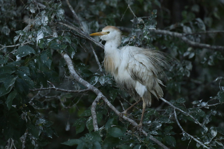
This is a neat effect, and an interesting idea to change the season in photos. Although I like the clouds, I think they still may be a bit too prominent in this image. I expect hail or lightening from these clouds rather than snow. Also, I think I'd be inclined to remove the dark spots of dirt along the bottom edge of the image in the monochrome version. The rest of it works well, though, and I don't believe I would have realized that you took this in spring rather than winter if I had not seen the original. |
Dec 19th |
| 32 |
Dec 17 |
Comment |
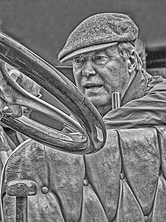
Hello, and welcome, Michael,
I am pleasantly surprised by the color and detail captured with your i-phone. My cell phone camera is a poor replacement on the best of occasions, and I often get images with it that have to go directly to the trash bin.
I agree with the suggestions made to lighten/brighten the eyes in this image, if possible. I believe I'd also try to clone out or otherwise remove the spots to the left and right of the head, as I find them distracting. Carol's alternative to darken that entire area is one way to resolve that issue.
I don't know whether you do any creative work on your images or not? I'm not very well-versed in digital editing or creative work myself, but this image seems to me to lend itself well to some kind of sketch filter. Those I have in my Topaz program weren't quite what I envisioned, but perhaps they will give some idea ... |
Dec 19th |
 |
| 32 |
Dec 17 |
Comment |
Here is the original. |
Dec 12th |
 |
8 comments - 0 replies for Group 32
|
8 comments - 0 replies Total
|


