|
| Group |
Round |
C/R |
Comment |
Date |
Image |
| 32 |
Nov 17 |
Reply |
So sorry to hear of your frustrating experiences. I'm not certain it makes any difference, but just so you're aware, my understanding is that the Image of the Year competition is run the same way through all the PSA divisions. Anyone who wins a medal (not just honorable mention) in a PSA exhibition during the past year is invited to submit their winning image(s) to the Image of the Year competition for that division. I found out about that a few years back when I won a medal (in the annual PSA conference exhibition, no less) and was invited to submit my winning image. Certainly, I do believe certain people tend to win a greater percentage of the time than others, but I can't speak too much to that since I tend to dabble in the exhibitions as my time and desire to do so (and finances, to some extent, as some exhibitions are pricey) dictate instead of entering regularly.
Individual/family membership in our local camera clubs and council in this area do not require and are separate from PSA membership, but I'm uncertain of the rules elsewhere. Perhaps that is a "compromise" option to stay involved with photography in a way that you've found more rewarding ... although as previously mentioned, we'll miss you here. |
Nov 29th |
| 32 |
Nov 17 |
Comment |
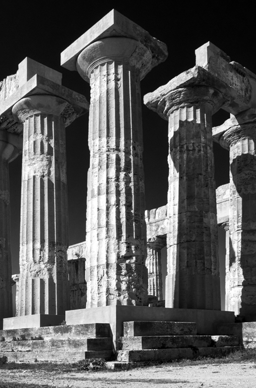
This does look like a wonderful site, and I like how you eliminated the side of the photo with the stronger shadows. I did try darkening the stairs a little more than you have and think I like that. Although the large number of columns leading off to the left is interesting, there is also a vertical image here. |
Nov 24th |
 |
| 32 |
Nov 17 |
Comment |
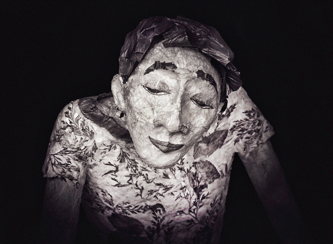
You've done a very nice job with the composition and the contrast adjustments you've made to this photo. My own personal preference, I think, would be to darken the table leg and edge just a little more, but I like the face as you have it here. I, too, prefer the monochrome version of this image, as it draws me into the subject more, while still giving a sense of the surroundings. |
Nov 24th |
| 32 |
Nov 17 |
Reply |
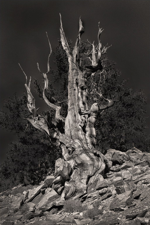
I played some with bark textures and a few roots. Since it was already late afternoon, I didn't get to stay for hours this time. I'll definitely have to go back and spend more time. These trees are really something to see and photograph. |
Nov 24th |
| 32 |
Nov 17 |
Comment |
Interesting subject. I do think it would benefit from being a bit brighter, as well as using Topaz or similar to further enhance the amazing textures. I experimented and added a little bit, but am confident Diana will do better than I have here. |
Nov 24th |
 |
| 32 |
Nov 17 |
Comment |
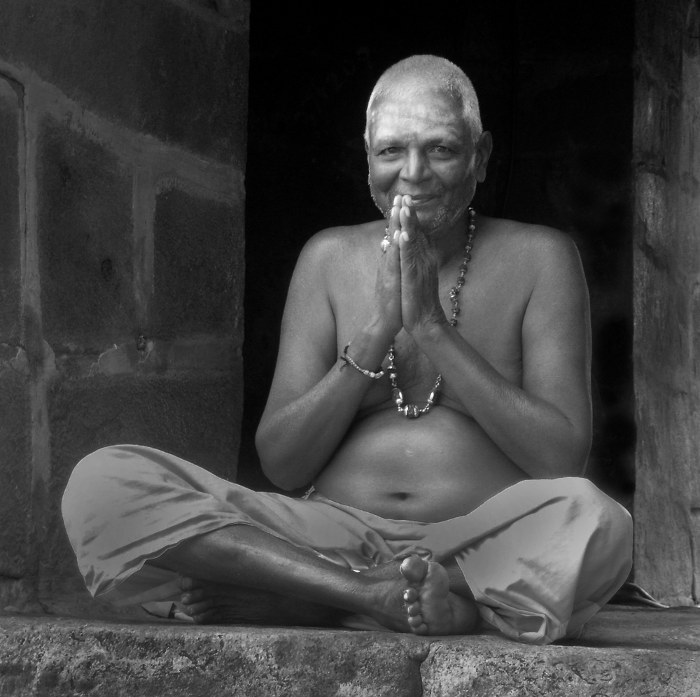
Your cropping and conversion to monochrome both have enhanced this image. Since the rest of the back wall is dark, I recommend darkening the couple brighter spots on the back wall behind his shoulder on the right side of the image. I tried darkening the other surroundings as well to see if that would bring more attention to his very interesting and expressive face and eyes. I didn't do the best job, and the pants still seem to need some work, but see what you think. |
Nov 23rd |
 |
| 32 |
Nov 17 |
Comment |
Another lovely infrared conversion. Your choice to flip the image and put the tree on the left works well, and even though I'm usually not a fan of the nostalgic borders, I do like this one with this image. As others already have mentioned the branches above the building seem a little stark, but I don't find them especially distracting. |
Nov 23rd |
| 32 |
Nov 17 |
Comment |
You've done a nice job of composing this image to emphasize the shapes and lines. I, too, like the texture Silver Effects Pro added to the darker adobe. However, I agree that it added extra noise in the sky that would be preferable to eliminate, if possible.
As mentioned privately, I've very much enjoyed your contributions to this group over the years and will miss your participation. |
Nov 23rd |
| 32 |
Nov 17 |
Comment |
Hmmm..... I wasn't as crazy about the darker living branches, but what do I know? Of course, I'd need to do a better job of darkening if I'm going to use this image in competition, but here's a quick fix. Is this any better? |
Nov 6th |
 |
7 comments - 2 replies for Group 32
|
7 comments - 2 replies Total
|


