|
| Group |
Round |
C/R |
Comment |
Date |
Image |
| 32 |
Jul 17 |
Comment |
Actually, I like where you've cropped from the top of this image, as the cloth hanging out the window and the tile rooftop help set the scene. The amount of space to the left, and particularly the bright spots of lichens, do seem distracting to me, however. Thus, I would suggest darkening them further, or I think my preference would be making this image into a vertical with only a small part of the hill remaining on the left, and either cropping a bit or darkening the railing and plant in the bottom corner on the right. |
Jul 28th |
| 32 |
Jul 17 |
Comment |
You've done a really nice job with the contrast in this image, which seems a particularly difficult task with the dark arena and very bright horse. Sharpness also looks good, especially when considering the amount of motion involved and the use of the aperture rather than shutter priority. I agree with others' suggestions about darkening the post and eliminating a couple of the "smudge" spots, particularly the one above the post near the top of the frame. |
Jul 28th |
| 32 |
Jul 17 |
Comment |
I, too, like the sepia tone you used, as it helps to give this image a feel of being from an earlier time. The pen doesn't seem distracting to me, but I do like the suggestion of perhaps underlining some of the text, adding a notation in the margin, or similar to help tie those elements together. As much as I manage to get ink on myself with pens these days, I suspect if I used one like this, I'd also have ink blots on the pages. However, making a mess probably is not the story you intended to convey here!
|
Jul 28th |
| 32 |
Jul 17 |
Comment |
You are much braver than I would be to take a photo like this with a wide angle rather than a telephoto lens! I do like how the angle helps emphasize the trumpet player, and agree with the others about trying to darken the bright upper corners so they do not draw attention away from your subject. Also, I agree with Diana that it might be worth experimenting with darkening the drums and brightening the trumpet a bit more to add additional emphasis. |
Jul 27th |
| 32 |
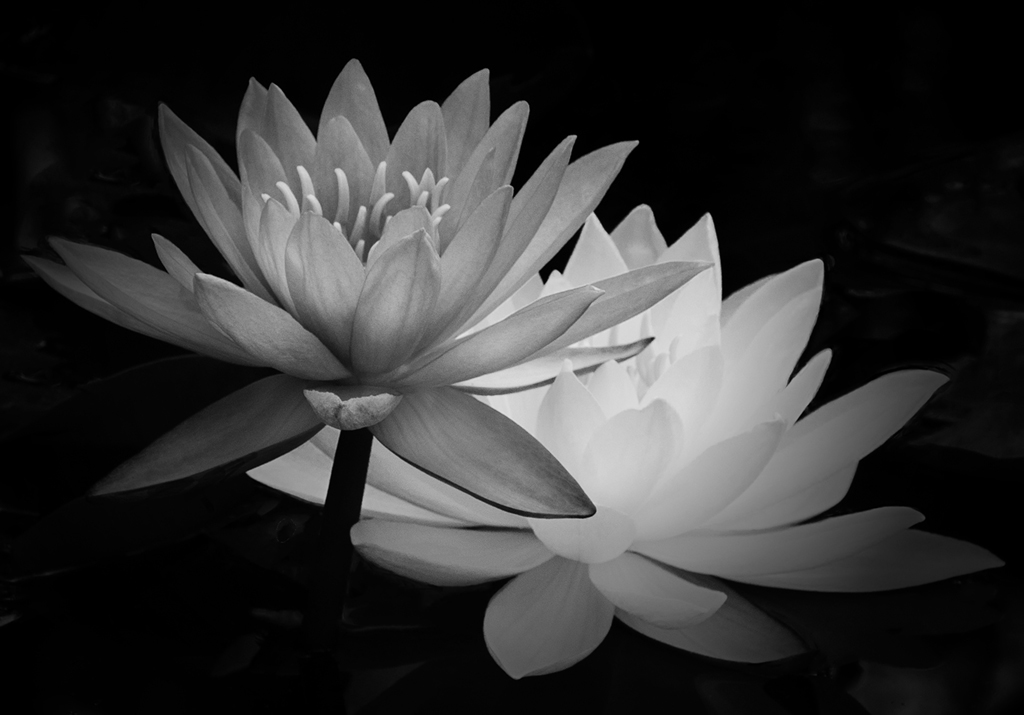
Jul 17 |
Comment |
This is an unusual lighting effect you've captured in your monochrome conversion of this image. I like how you managed to keep detail in the very bright parts of the lighter flower. The darker flower looks a bit flat on my monitor. I tried darkening it more and increasing the contrast. I'm not certain that helped, but you can see what you think. |
Jul 27th |
 |
| 32 |
Jul 17 |
Comment |
This is an unusual building. Your adjustments to the contrast helped to emphasize the building, but they seem to have added some extra noise/grain in the sky. They also seem darker on the right than the left. Was that intentional? Although the building is intriguing, the image leaves me feeling a bit unsettled. I'm wondering if a plain background might better emphasize the lines and curves of the building. |
Jul 27th |
6 comments - 0 replies for Group 32
|
6 comments - 0 replies Total
|


