|
| Group |
Round |
C/R |
Comment |
Date |
Image |
| 31 |
Jun 24 |
Reply |
Thanks Peter! |
Jun 16th |
| 31 |
Jun 24 |
Reply |
Thanks Ian, that's the look I was going for. I updated the photo with a little more contrast as Peter suggested but I'm still not sure which way I like it best. |
Jun 15th |
| 31 |
Jun 24 |
Reply |
Thanks John, I tried adding some more contrast in response to Peter's suggestions. |
Jun 15th |
| 31 |
Jun 24 |
Reply |
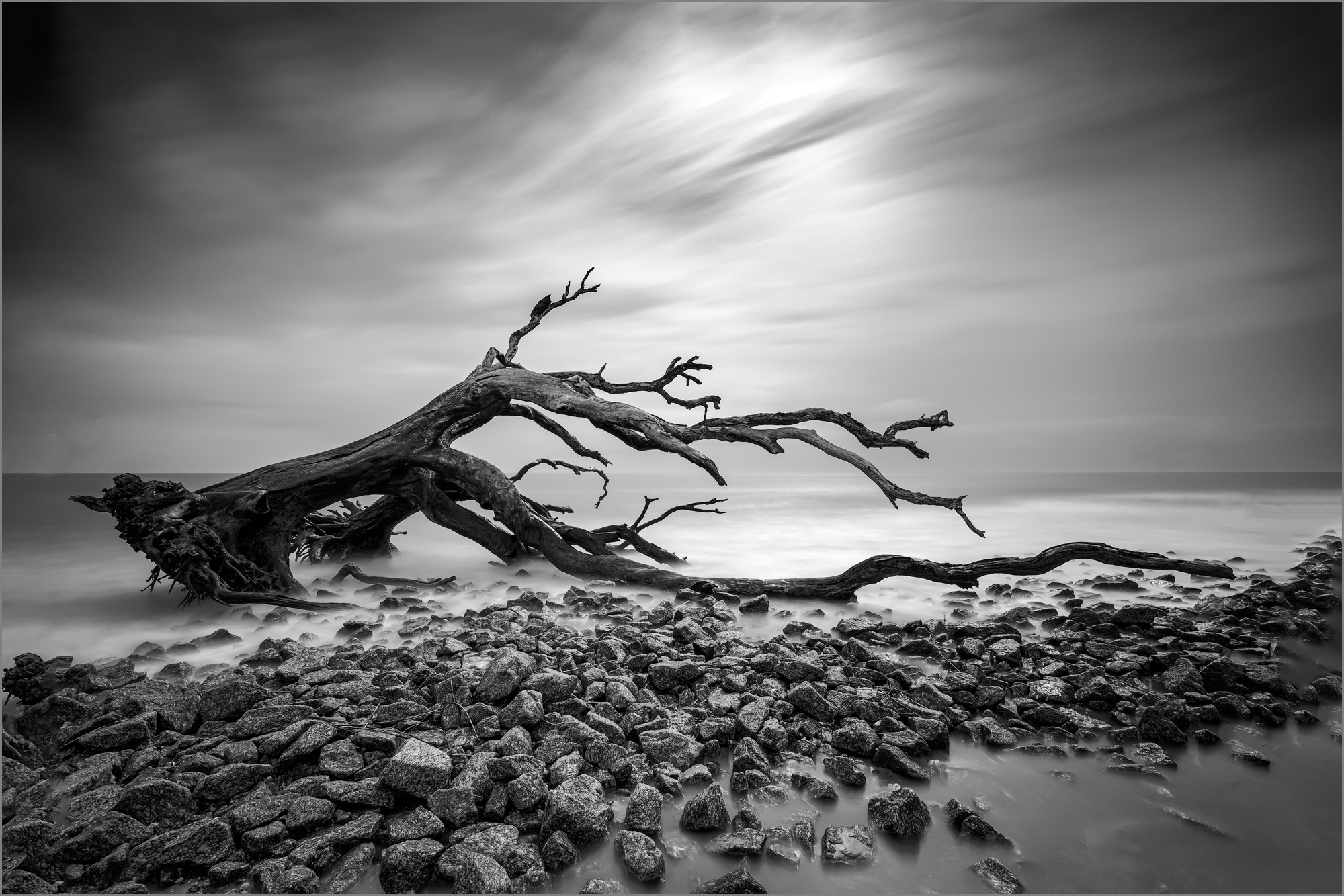
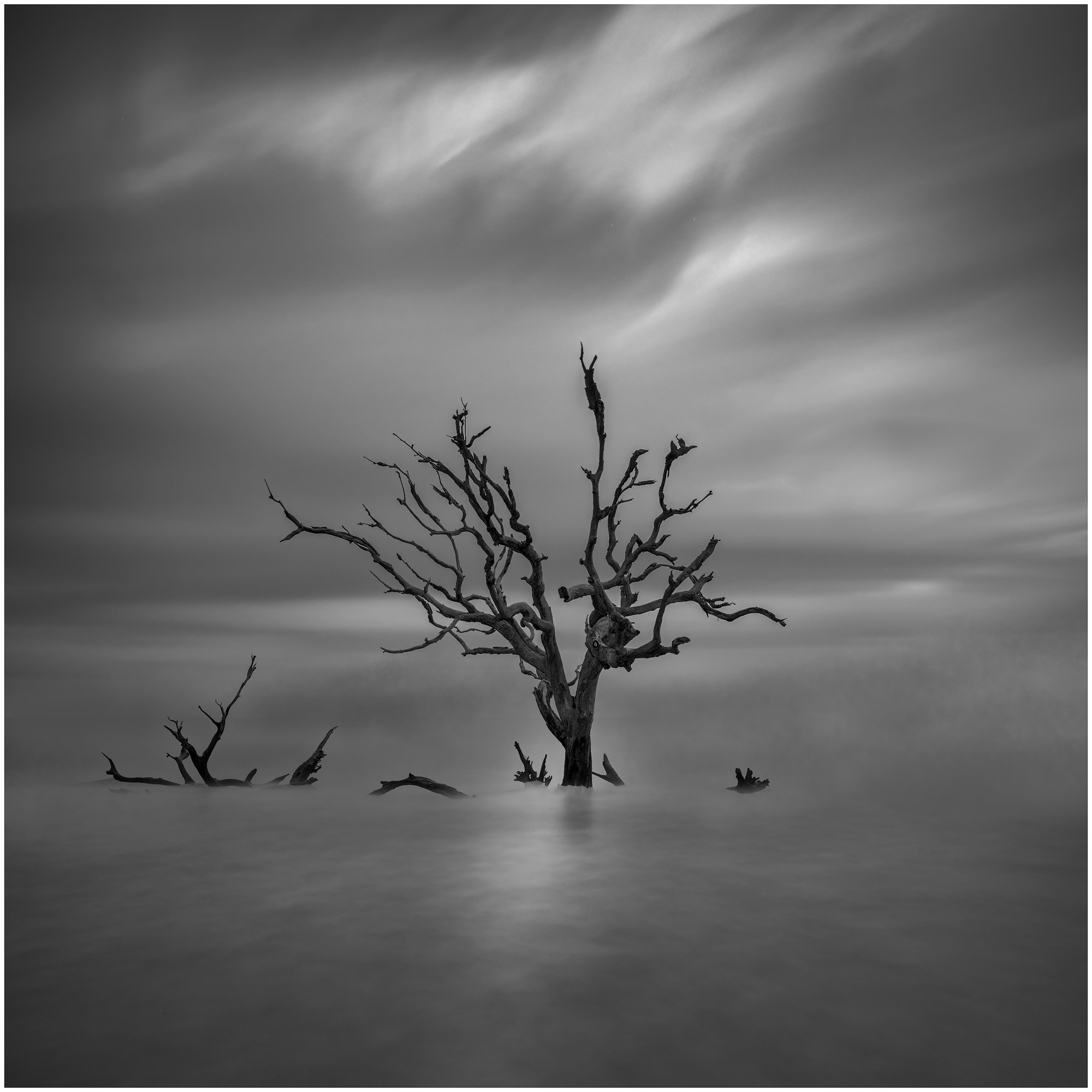
Thanks Susan, nothing like a good dead tree to photograph! I appreciate Peter's suggestions and gave them a shot. Take a look at the photo I loaded with my response to him and let me know what you think. |
Jun 15th |
| 31 |
Jun 24 |
Reply |
Thank you Ella! These are some of my favorite subjects to photograph. |
Jun 15th |
| 31 |
Jun 24 |
Reply |
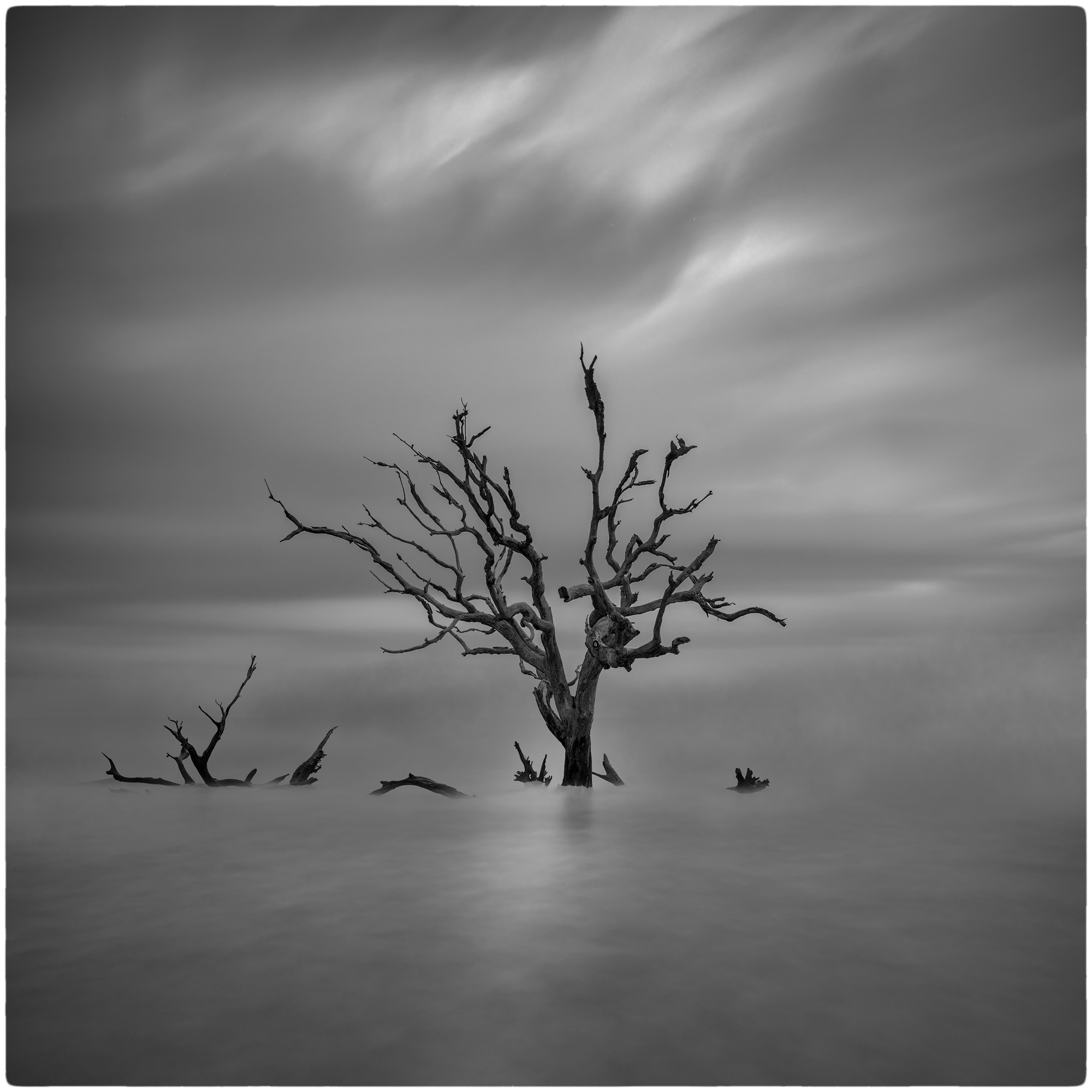
Thanks for the comments and suggestions Peter. My original vision was to give this an ethereal feel and I kept it soft intentionally, but I may have overdone it. I went back and added a curves adjustment with the medium contrast preset to bump it up a bit. Also used a mid-tone 3 mask to protect the black and white points and not lose detail in the tree. Let me know what you think. I could see a difference on my computer but some of the detail seems to get lost in the upload. |
Jun 15th |
 |
| 31 |
Jun 24 |
Comment |
Very clever still life Ella, I can imagine keeping the dust out of the photo was quite a challenge! This is one genre I can't seem to wrap my head around and you've done a wonderful job. |
Jun 15th |
| 31 |
Jun 24 |
Comment |
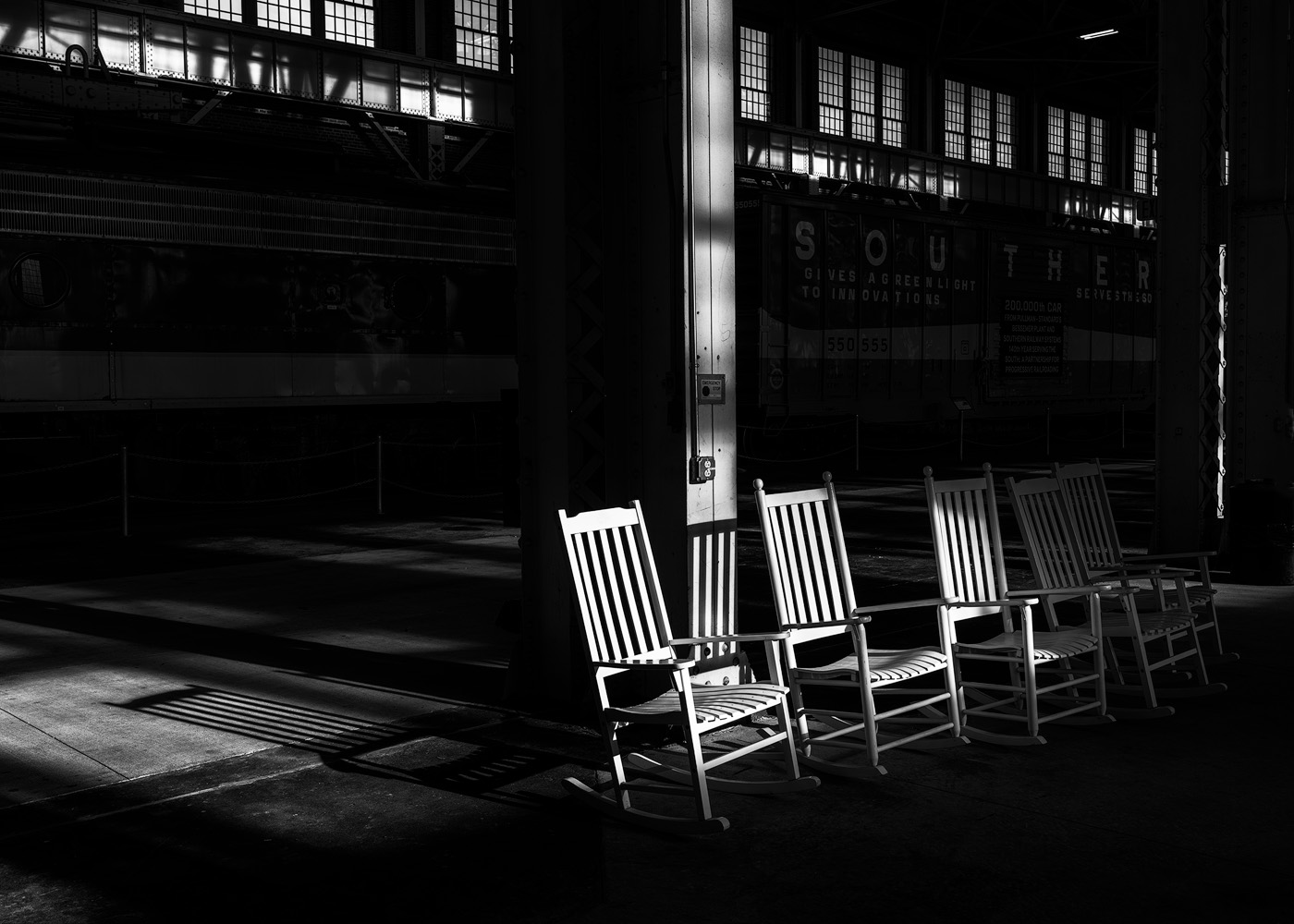
Hi Susan, lovely waterfall and I like the conversion to B&W that you did. I usually shoot my waterfalls with a 1/4 or 1/5 shutter speed to leave a little texture in the water and I'm not sure why a 10 stop ND filter was used? Would a CPL filter have served you better? That would have taken some of the glare off the water and decreased the chance of the whites blowing out. Peter's suggestions were spot on. |
Jun 15th |
| 31 |
Jun 24 |
Comment |
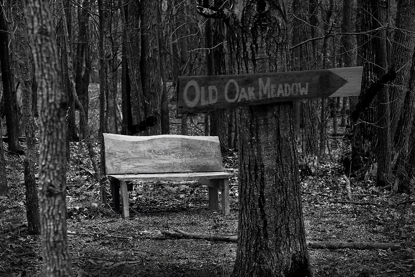
I certainly feel the sense of loneliness in viewing this photo and as a terrible hiker, that's the place where I'd be sitting! I like the placement between the trees and have to agree with everyone else that the white sign needs to be toned down.
Everyone has a different opinion about removing items in a photo but if I was processing this, I'd have removed the dead twigs and branch that overlap the bench. Maybe darkened the foreground a little to make the bench stand out more. |
Jun 15th |
 |
| 31 |
Jun 24 |
Comment |
Very nice shot and well thought out. Sometimes the simplest composition can have the strongest impact. In a perfect world, I think it would help if the fourth person was out of the shot and the three in the center were farther to the left, leaving a little more travel room before they got to that last vertical post. Can't wait to see the next one in November. |
Jun 15th |
| 31 |
Jun 24 |
Comment |
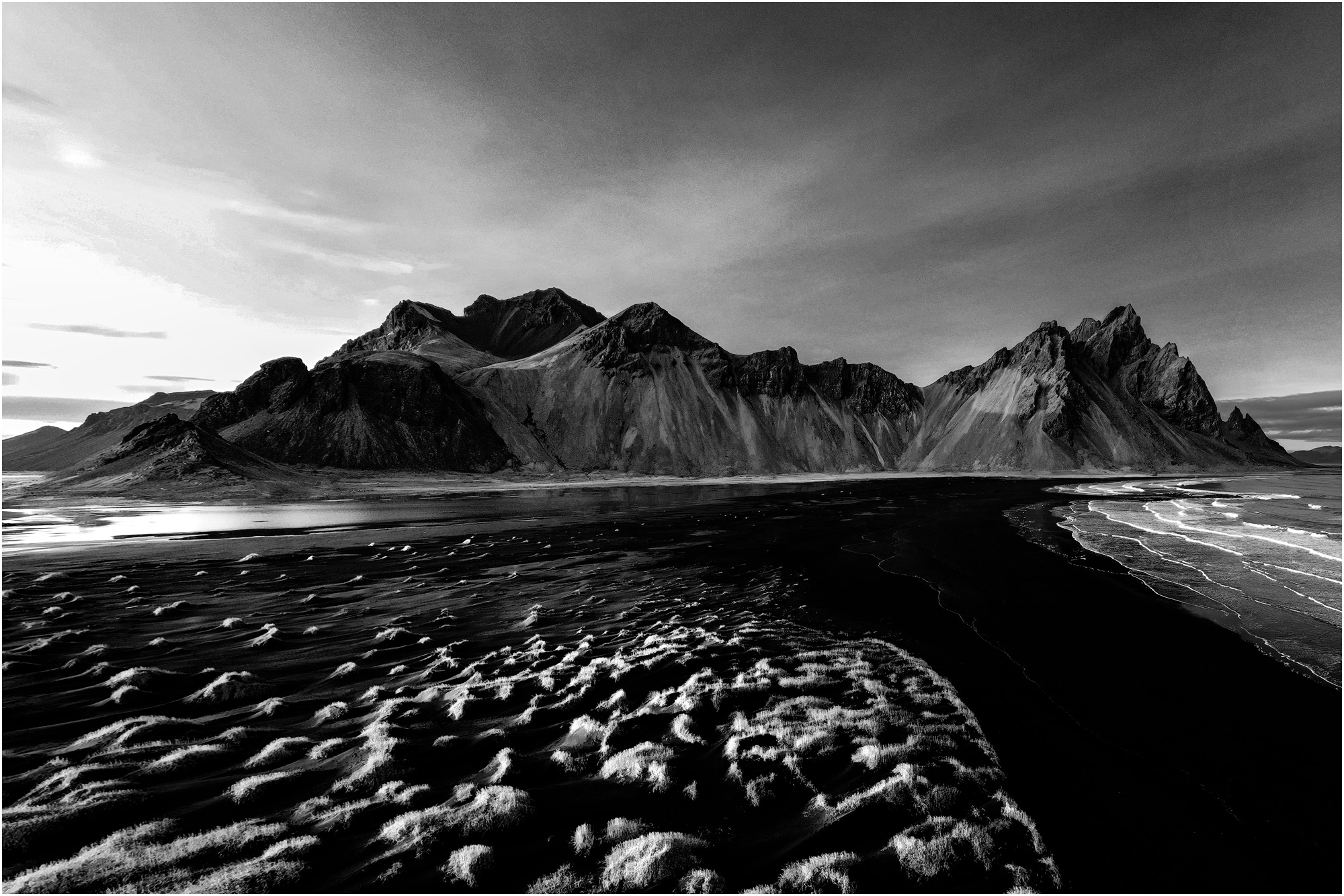
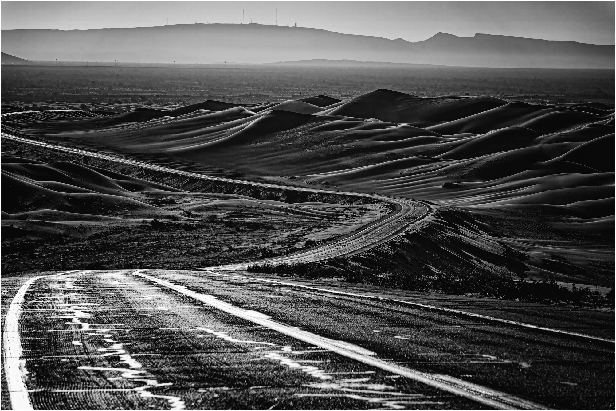
Beautiful photo, I really like the contrast between the sunlit trees and the dark mountains and sky. Sometimes it pays to be patient. |
Jun 15th |
| 31 |
Jun 24 |
Comment |
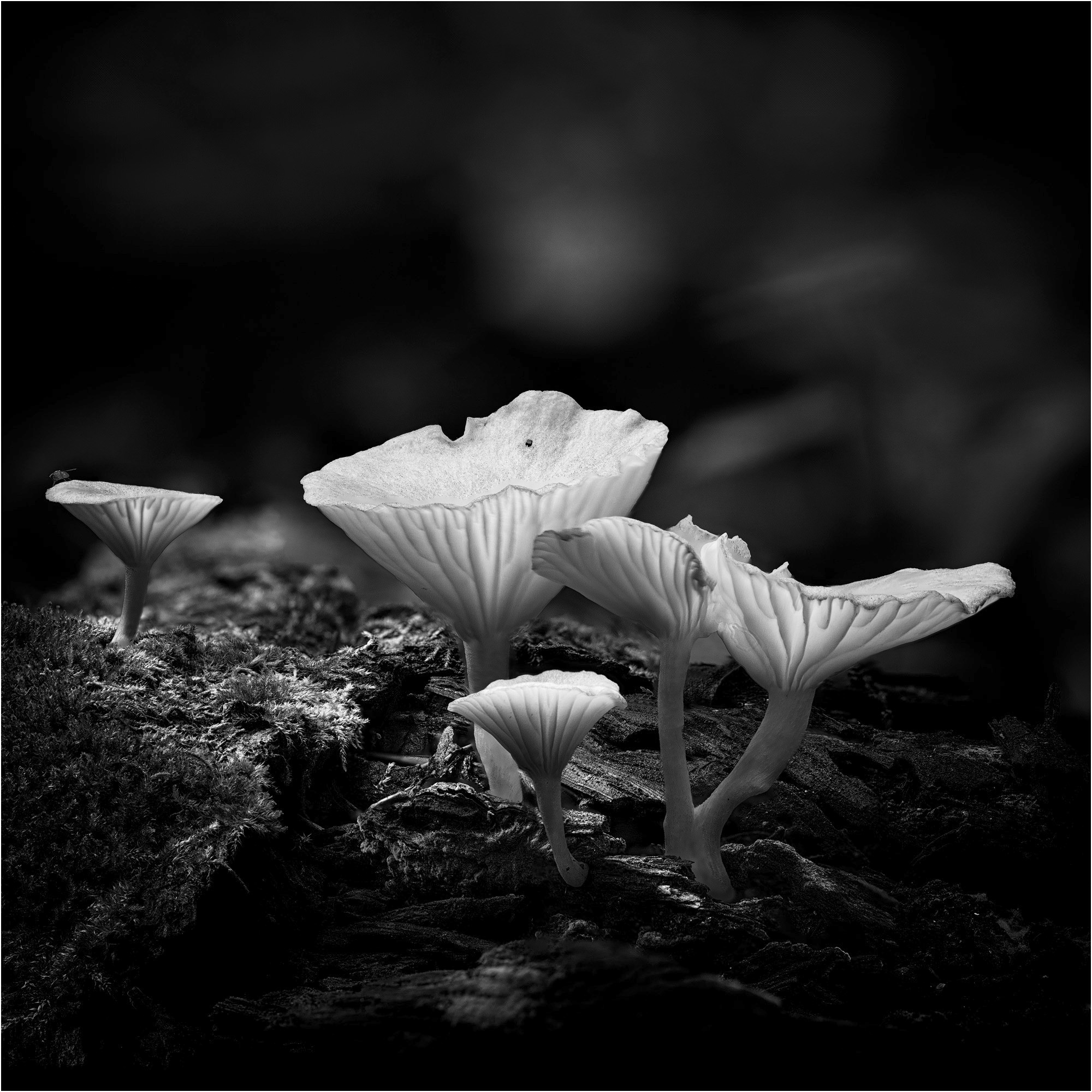
Great shot! I'm always envious of the folks who can make these abstract photos work. If you squint your eyes, it almost looks like an aerial shot with the twig as a bridge. |
Jun 15th |
6 comments - 6 replies for Group 31
|
6 comments - 6 replies Total
|