|
| Group |
Round |
C/R |
Comment |
Date |
Image |
| 54 |
Feb 25 |
Reply |
Hi Bob, I didn't know that other groups could see this group's work ?
Have you cleared this request with Peggy ? (Group co-ordinator) As it outside the rules we normally work too. ie. image sizing.
Also this group doesn't "tinker" with images we ... construct and create !
As a group we share ideas and techniques, its a two way street where the group learn from each other.
Myself I am wary of sharing my retouching and specialist techniques outwith this group, as this what gives me the edge in competitions.
Please refer to Peggy Nugent.
|
Feb 20th |
| 54 |
Feb 25 |
Comment |
Love it ! ( without the black border)
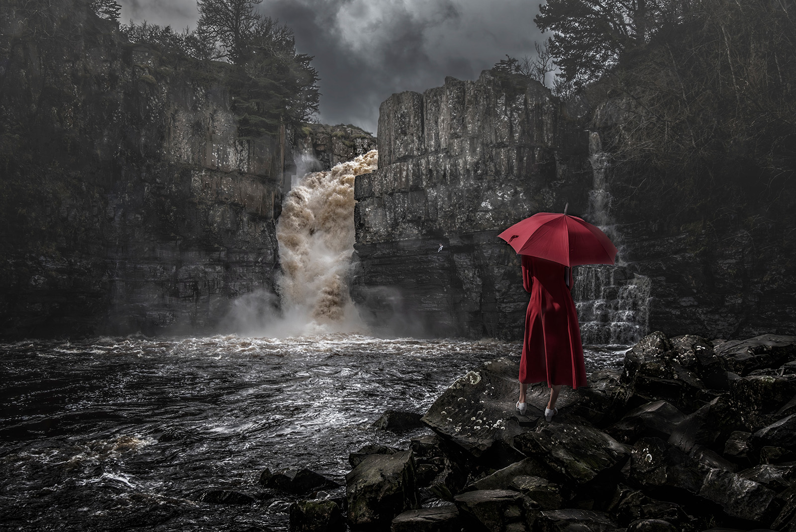
This is great great blending job into one fine landscape image.
My only tuppence worth that I can add, is I found it a bit dark, especially the shadow areas.
I took a copy and applied LEVELS and it needed correcting, the white side of the histogram. VBrought that in and bingo - big diiference. Then applied CURVES and bingo again.
See what you think.Cheers.
|
Feb 11th |
 |
| 54 |
Feb 25 |
Comment |
Hi Alan,
Not sure about this, not my comfort area.
Trying to work out where you would use this image, poster, advert for a movie, ? I cant see the story ?
Your work has been well done, especially the dice. The devil I feel didnt need a base, has he has wings and doesnt need to be grounded, and there is no ground to the image its all floating in a black void ?
Its very confusing to me, sorry, I may be odd or thick but it doesnt work for me.
Some people might find this upsetting religiously, emotionally, ....
Again you composite work is excellent but, the image content is wasted on me. Apologies I dont mean to offend or upset I am saying as I see it. Cheers. |
Feb 11th |
| 54 |
Feb 25 |
Comment |
Hi Maria,
Great story with well put together composition.
I think it runs into difficulty with its colours, especially the child subjects, and the background is too commanding.
I tried a few things especially converting to BW, to avoid the colours mix.
1. Blurred the background to null its effects on th subjects.This would happen in real world situ with a camera with the lens wide open on the subjects only.
2. Converted to BW and uptd the contrast to give it uumf.
3. Removed the shadows on the kids to make them brighter and cloned out the edges to blend into the image.
4. Created a vignette to darken all the unecessary bright areas and make the subjects stand out.
See what you think. Cheers, Bruce. |
Feb 11th |
 |
| 54 |
Feb 25 |
Comment |
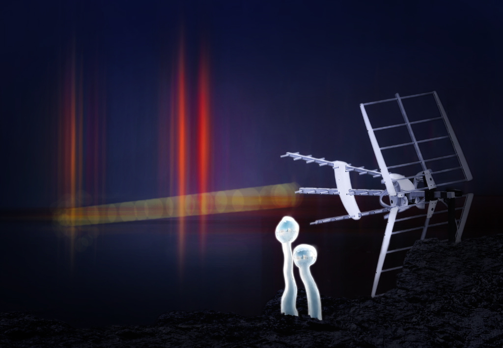
Hi Kirsti, See my edit below. Tried a few ideas to see if I could help.
1. To connect the explosions with the aerial I have added a ray. Method - new blank layer>blend color dodge> select color of choice> set to 4% opacity with hard brush paint between the subjects in straight lines until happy. Then paint single blob at 9% opc down the line to give interuptions in the ray.
2. Using NIKS EFFECTS ADD glamour glow and selective vignette on subjects and close rest of the image into darkness. This softens and brightens and also hides some of the bits that were frustrating you.
Thats it. Please ignore if you think I have lost the plot. Me thinks this a good sfi image. Cheers Bruce |
Feb 11th |
 |
| 54 |
Feb 25 |
Comment |
Love - it! Agree with Kirsti and Alan the menu board is not needed, doesnt add anything and is distracting due the colour.
You handled the the composition and the placement of the subject perfectly along with accomodating the light patterns of the background right down to the foreground which is dark and hides the join of the feet to the ground.
As the subject is brighter than the bright bits in the background this all makes for a great image. The title is also perfect and invites the reader to look into the image.
Only thing that would have been better would have been catching him face on, but as you say everything in street photography is a grab shot and you have to go with what you get. Wonderful work. |
Feb 11th |
| 54 |
Feb 25 |
Comment |
ICM is very popular in the UK the now, as is composites made to look like ICM. The technique gives a painterly type of image which is most appealing.Yours falls into this category.
With ICM there is a degree of latitude with the lack of focus, contrast, and saturation, which is all contained in your montage.
There a couple of things that my eye keeps going back to, 1. The verticals are in the background buildings are not upright, 2.the lack of texture in the path the subject is standing on, 3. the flower border on the right has an undefined end point, and the light is coming from the front/right on the subject so there shouldnt be any shadows at the foot of the wall on the LHS of the subject.cheers |
Feb 11th |
| 54 |
Feb 25 |
Comment |
Thank you Matt, and Kirsti.
The sheer vastness of the desert and the time to cross is expressed by the two modes of travel, one quicker than the other. Think I'll leave the camel train sizing as it is secondary to the balloon which is the primary subject and also included in the title. cheers.
|
Feb 11th |
7 comments - 1 reply for Group 54
|
7 comments - 1 reply Total
|

