|
| Group |
Round |
C/R |
Comment |
Date |
Image |
| 54 |
Jan 25 |
Comment |
Works for me Brad ! 10/10 composite.cheers. |
Jan 13th |
| 54 |
Jan 25 |
Comment |
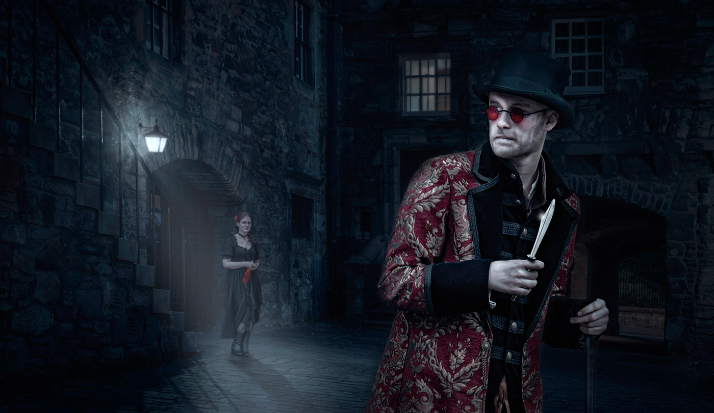
Hi Alan, Liked at soon as I seen it. Looked like one image until I looked closer.
Have to agree with Matt and Peggy. I prefer the natural colours of the background arches. A cool blue effect has crept into the composite.
The front subject his whites are bluey, so to the guy at the rear.
With the arches returning to the natural colour and the two subjects loosing the blue tinge, you are onto a winner !
The tension is the story and I love it, and looks so real. cheers. |
Jan 13th |
| 54 |
Jan 25 |
Comment |
The subject and the symmetry are the first thing that strikes you and draws you into the story.
Composition wise is very good, nice placements and details.
The cracked stairs are a good addition.
However the railings are a distraction and clutter, also their shadows are at conflicting with the angel's.
I am also confused with the side bits of sky above the walls.
The verticals are all bang on, the mirrored sky is a nice touch. In summary great composite, story, colour, lighting, interest. Maybe loose the railings and shadows ? |
Jan 13th |
| 54 |
Jan 25 |
Comment |
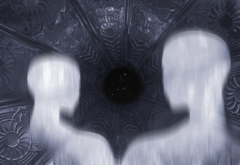
What you did with the Gramphone trumpet is right in vogue the now for Compositors. They use items like this to creat vast futuristic places with minute figures placed inside them like vast tunnels. The capture of the trumpet details and the POV help the basis for this composite, and also the stars at the centre. All providing the tunnel effect.
The ghosts for me let the side down, there is no form to them, they just look like cutouts. Ghosts are fuzzy creatures so I have done a mock up of what you could do. 1. Apply vertical motion blur to ghosts only (layer) Copy the base layer and motion blut that too only under the ghosts. The effect is more real I feel and has some form and shape albeit fuzzy, Cheers. |
Jan 13th |
 |
| 54 |
Jan 25 |
Comment |
First thing that hit me was the blue and orange colours - opposites in the colour wheel that are bound to appeal to the viewer.
Its a lovely merge of the subjects onto the main panel with multple stories for the viewer to imagine. It also has depth which is hard to do on a splash screen like this. The colour scheme has maintained the shadow detail. There are multiple interest in the image.
I see its use as promoting an area or event, such as a poster, or by a business. Great job. |
Jan 13th |
| 54 |
Jan 25 |
Comment |
My first impression was one of a GREETING CARD or Notelet. One that you would see in a card shop or Hobbycraft place. This image would sell well if used for that.
It tells a story and has artistic appeal.
The jury is out on whether the flower should occupy more space, but then again the story is about the snow falling, the subject therefore is both of them.
I like it, its airy, and colourful.Cheers. |
Jan 13th |
| 54 |
Jan 25 |
Reply |
Hi Peggy, Never came across this colour change treatment before. BW layer >luminosity > red/yellow > . Will give it a try. Cheers. |
Jan 13th |
| 54 |
Jan 25 |
Reply |
Hi Matt, Thanks for the feedback, Will take a look. Cheers. |
Jan 13th |
| 54 |
Jan 25 |
Reply |
Thanks Kirsti. |
Jan 13th |
6 comments - 3 replies for Group 54
|
6 comments - 3 replies Total
|