|
| Group |
Round |
C/R |
Comment |
Date |
Image |
| 54 |
Oct 24 |
Comment |
Thank you all for your kind and helpful comments.
This particular image has done well in international competitions.
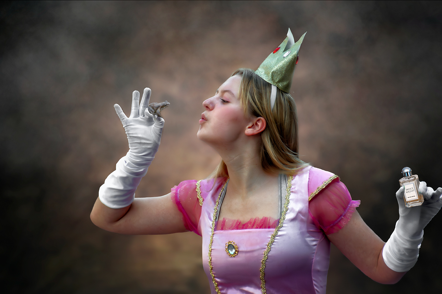
Regarding Alan's question about the girl's neck length. As this is a type of fantasy composite I intentionally lengthen the girl's neck to create attention.interest,from the viewer.
Its harking back to the "match stick men" created by LOWRY the famous artist, where he had a signature style of the unusual.
"Lowry painted scenes of life in the industrial districts of North West England in the mid-20th century. He developed a distinctive style of painting and is best known for his urban landscapes peopled with human figures, often referred to as "matchstick men".
Composites allow us the create the unusual, not seen in any other groups within the PSA. Its a unique form of photography that we in this group are gifted with, and we are able to step outside the norms of photography and create somethingf special. |
Oct 26th |
| 54 |
Oct 24 |
Reply |
Ah ! "Next" I get it, very good, very fitting. Thanks for that. |
Oct 15th |
| 54 |
Oct 24 |
Comment |
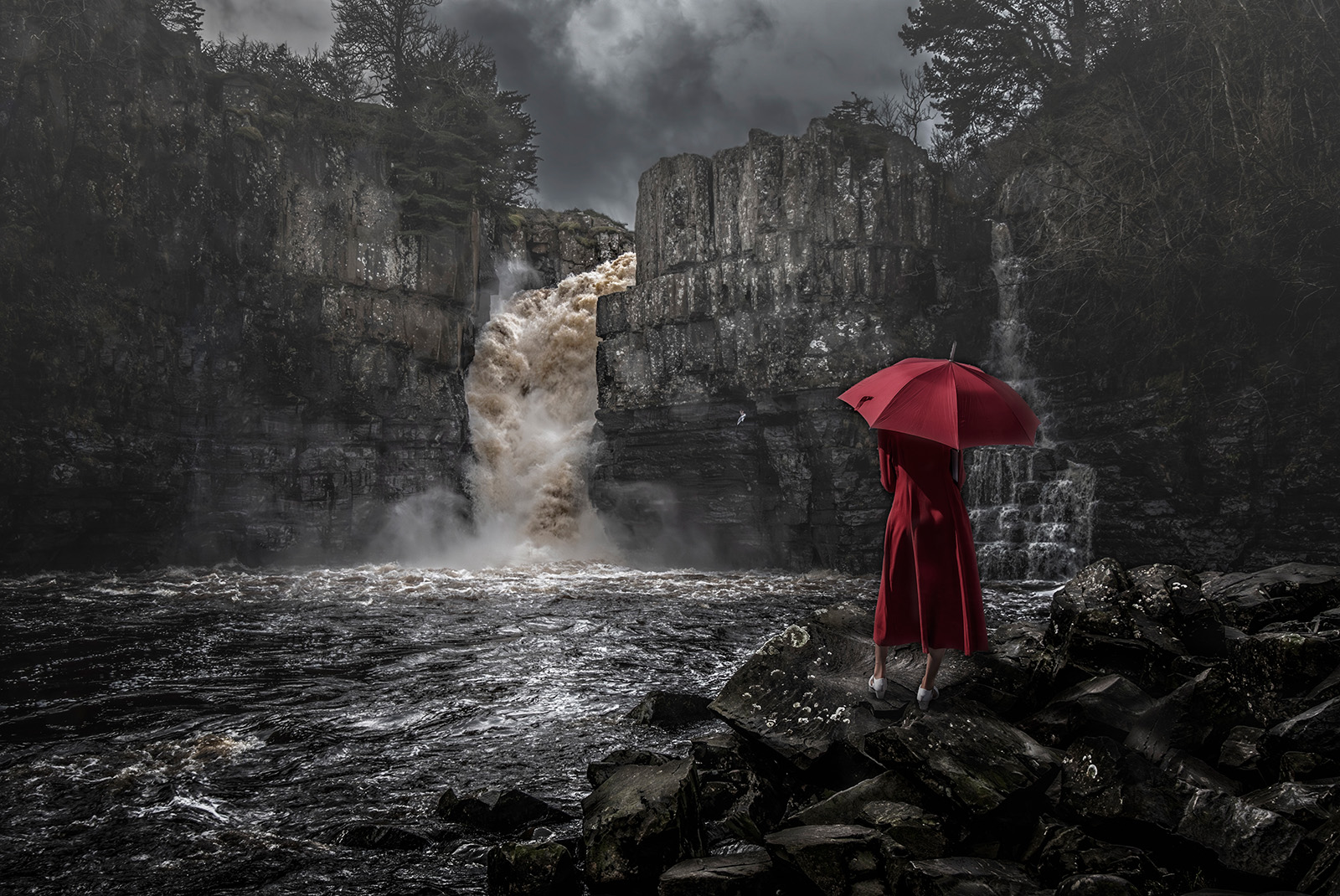
Hi Alan,
I am fan of dark and scary images so this one is right up my street. I also like minimalist images.
Composition is on the grid and good placement of the hooded figure. The Title throws me a bit, and not sure... perhaps thats what you were aiming at ?
You mention PS Levels to set the darkness, I normally use PS exposure layer and drop the Gamma level to achieve the level required that way it doesnt affect the bell curve too much to give a good image exposure. In turning an image from day into night I follow the Kelby method (see YoyTube). I have made a mock up these suggestions to let you see what I mean. Its just another way to treat your image, and hope you dont mind. |
Oct 8th |
 |
| 54 |
Oct 24 |
Comment |
Hi Maria,
First impressions were I like the scene and story (HEART WARMING). The composition and placement of the subjects are just right.
It has a fantastic forest background thats difficult to see because of the lighting.(cant see the detail in the shadows)
Overall the image could be lightened and the saturation cut back to help with this. (See my edit attached)
The flower is also brighter than the girl and the hen, at it should be the other way around to fit with the title.
Your selection and cut outs of the figures are very good so you dont need darkness to hide the joins. The whole image can stand up to being lightened. (I had to dampen down the highlights in her hair to cope with the general increase in light)
Again its all matter of taste.
I would also up the contrast, detail, and sharpness of the little girl to lift her prominance in the image.
Overall it would make a great cover image for a childrens book. Well done. |
Oct 8th |
 |
| 54 |
Oct 24 |
Comment |
Hi Kirsti, My first impression was Scandi Noir! A lot of Scandi Films have a title page like this where the prime characters and story are encapsulated into an image. You have achieved that look.
I like the Sepia toning and the feel of the image. The placement OF THE subjects is on point. The car background is delicious and needs nothing.
There are a couple of things you may wish to try.
1. See attached edited image. I added a curves layer, in drop down list top right, select Auto options > select enhance monochromatic contrast> flatten > another curves layer and add a shallow contrast layer to increase contrast on subjects at bottom and increase the light in the background > flatten.
2. Some of the image is too see through in bits. Girls hair bottom LH. The guys hat RHS can see the car too easily through it.
3. I would darken to fade out the guys jacket that is between the girl and the guy. Its not needed to the story or image.
I hope these edits are ok with you, please ignore if you dont agree. I still think its very FILM LIKE image and love it.
|
Oct 8th |
 |
4 comments - 1 reply for Group 54
|
4 comments - 1 reply Total
|