|
| Group |
Round |
C/R |
Comment |
Date |
Image |
| 68 |
Dec 24 |
Comment |
Very vibrant colors. Perhaps cropping out the upright part of the trailer on the right might be worthwhile.
The clouds look very good. It may have been better to angle the view upward just bit to get less of the trailers and more of the sky. Something I will have to remember when composing my shots in the field in the future. At least I should take a few photos so I could choose the best "after the fact".
Getting a picture of the boats out of the water was a great find and I am glad you were able to capture it in 3d. These working boats look so clean and very picturesque. |
Dec 14th |
| 68 |
Dec 24 |
Comment |
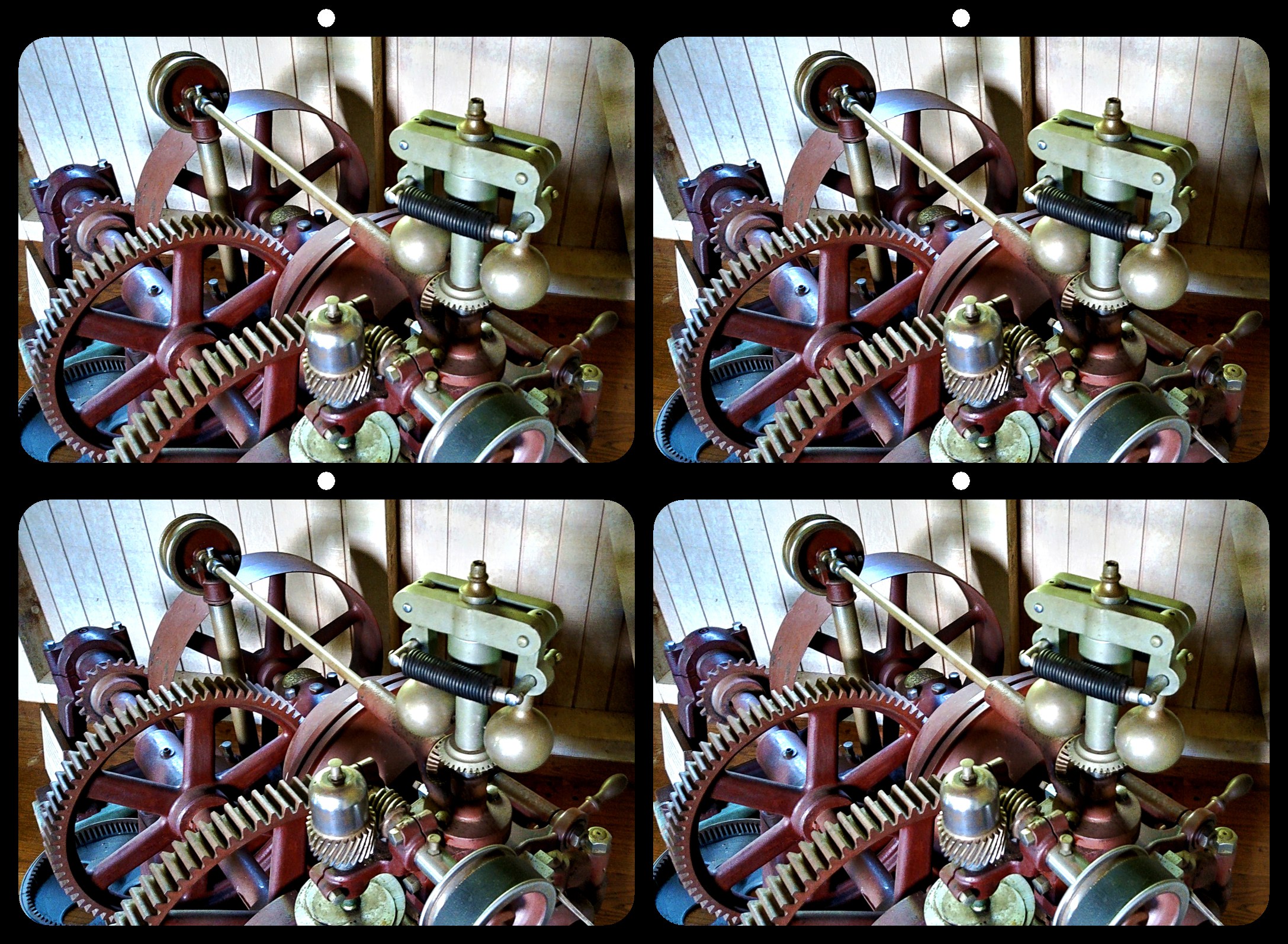
I thought this was a "colorized" image when I first saw it and guessed the tractor was from and old B&W photo. How wrong I was.
The pink color cast of the dirt on the left side of the image doesn't match the color of the dirt in the front of the tractor. But I guess it is that way on the original. You may want to "match" the colors even though it would not be faithful to the original.
The tree trunk behind the driver really jumps between L and R images. I know it is inherent to the 3d but when I focus on the driver the L-R difference is very noticeable and a bit unfortunate. It is only my opinion but I wonder if the tractor would be better shifted "down the road" if possible. Or perhaps adjusting the deviation of the background image somewhat.
|
Dec 14th |
| 68 |
Dec 24 |
Comment |
The sharp lines of the petals accentuate the "wiggly" look of the seed pod. |
Dec 14th |
| 68 |
Dec 24 |
Comment |
This almost looks like a water color painting. Especially where it seems the colors are running down the side of the millhouse. I don't remember seeing this in other 3D images. Very good image. |
Dec 14th |
| 68 |
Dec 24 |
Comment |
Interesting that it looked "peach like" to me with the colors chosen. There is a strong contrast of warm and cold colors in the LRRL that is a bit too much for me. I actually liked how the colors looked in the anaglyph more, and I don't say that very often. |
Dec 14th |
| 68 |
Dec 24 |
Comment |
I did notice something amiss in their hands prior to reading your description and finding out it was a cha-cha. I did not really notice the smoke as I think it blended in more with the background. |
Dec 14th |
6 comments - 0 replies for Group 68
|
6 comments - 0 replies Total
|