|
| Group |
Round |
C/R |
Comment |
Date |
Image |
| 32 |
May 18 |
Comment |
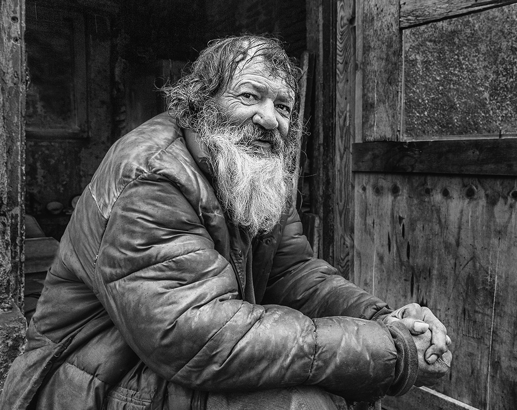
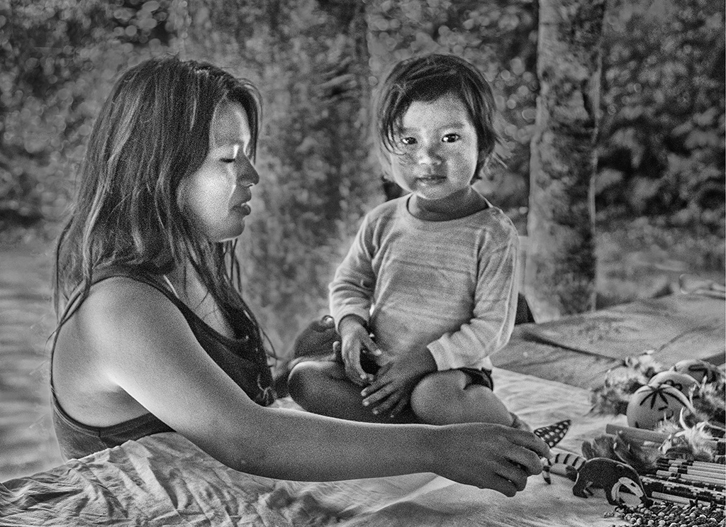
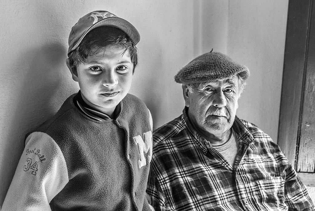
As an experimental photo, I find it interesting, not as a photo for contest.
I agree that the softness of the light on the face is more pleasing in the color version.
|
May 17th |
| 32 |
May 18 |
Comment |
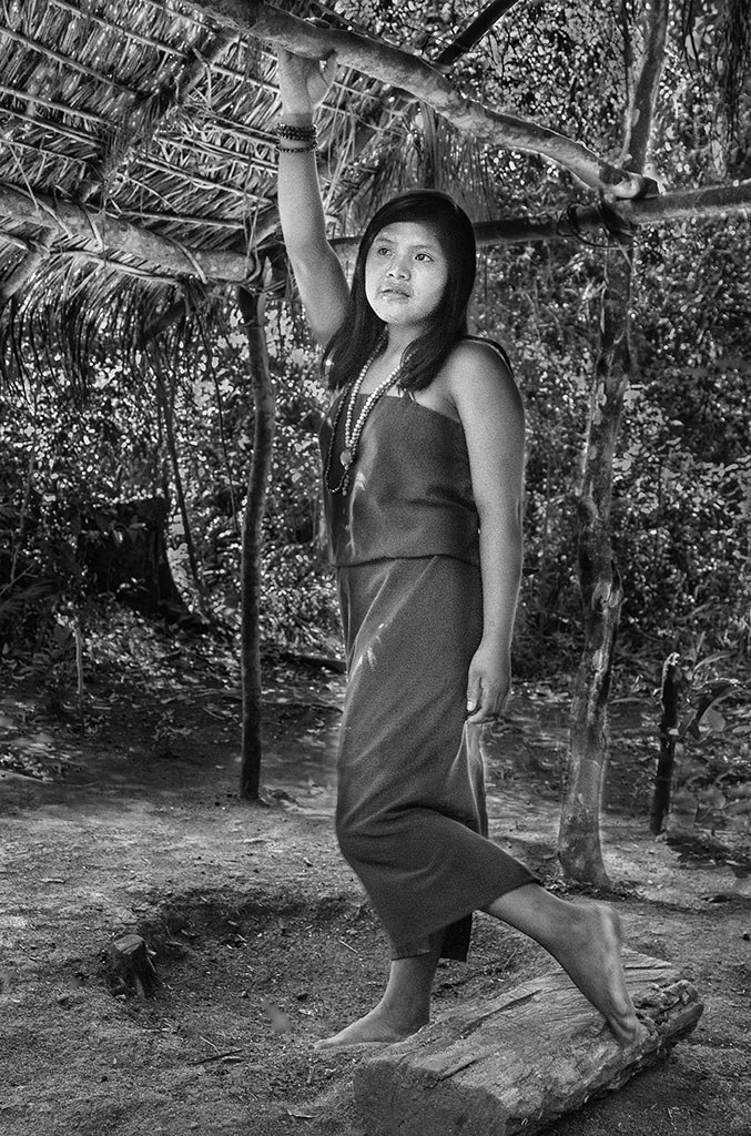
I agree that lightening his face and eyes would improve the image, as well as a tighter cut at the top. |
May 17th |
| 32 |
May 18 |
Comment |
I agree with the opinions that highlight the scene of Jim working and that the building should be darkened, which is too bright. |
May 17th |
| 32 |
May 18 |
Comment |
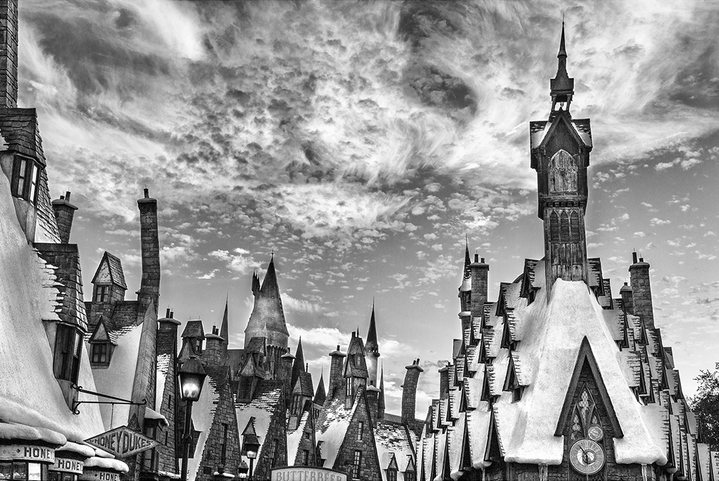
Fascinating image The suggested rotation further improves the composition of the photo.
Perhaps it would give more contrast to the leaf where the snake is so that it stands out more.
Very good work!
|
May 17th |
| 32 |
May 18 |
Comment |
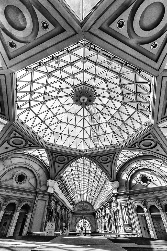
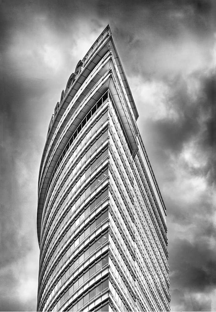
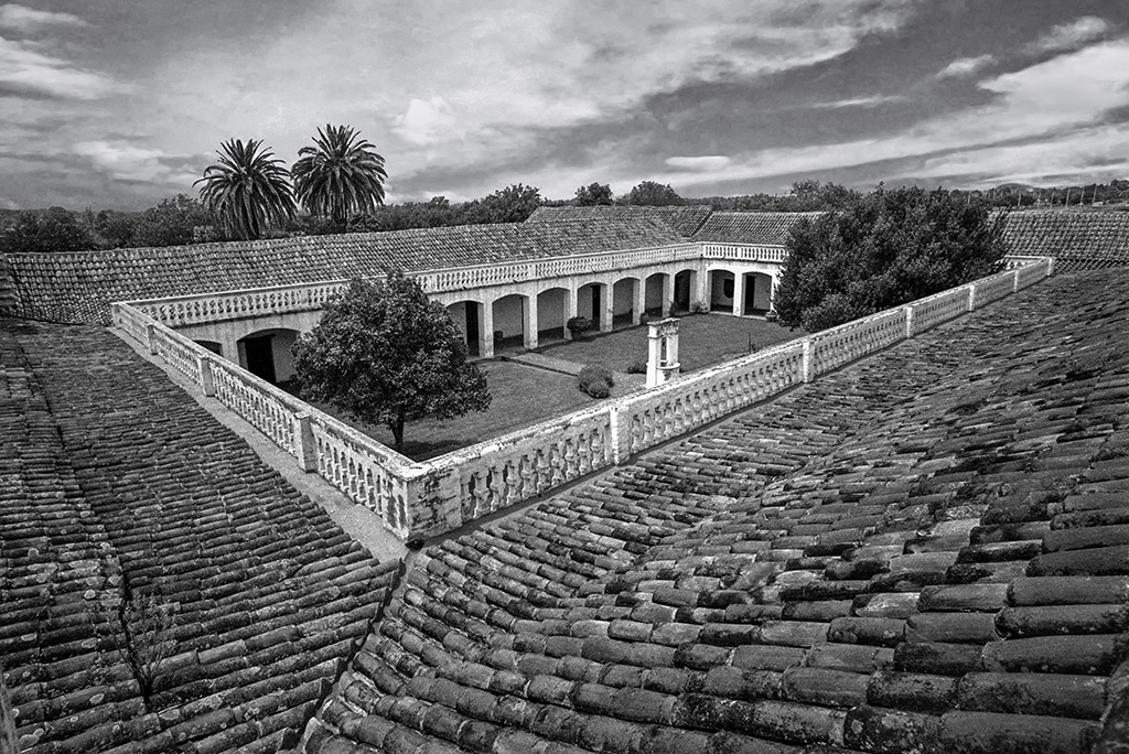
It looks better this last version.
Good tones and good contrast.
A good architecture image.
|
May 17th |
| 32 |
May 18 |
Reply |
I appreciate your honesty in the opinion but I think you have been unnecessarily cruel.
You have the right to say that you do not like it, giving the arguments, but saying that maybe my daughter might like it seems unnecessarily offensive.
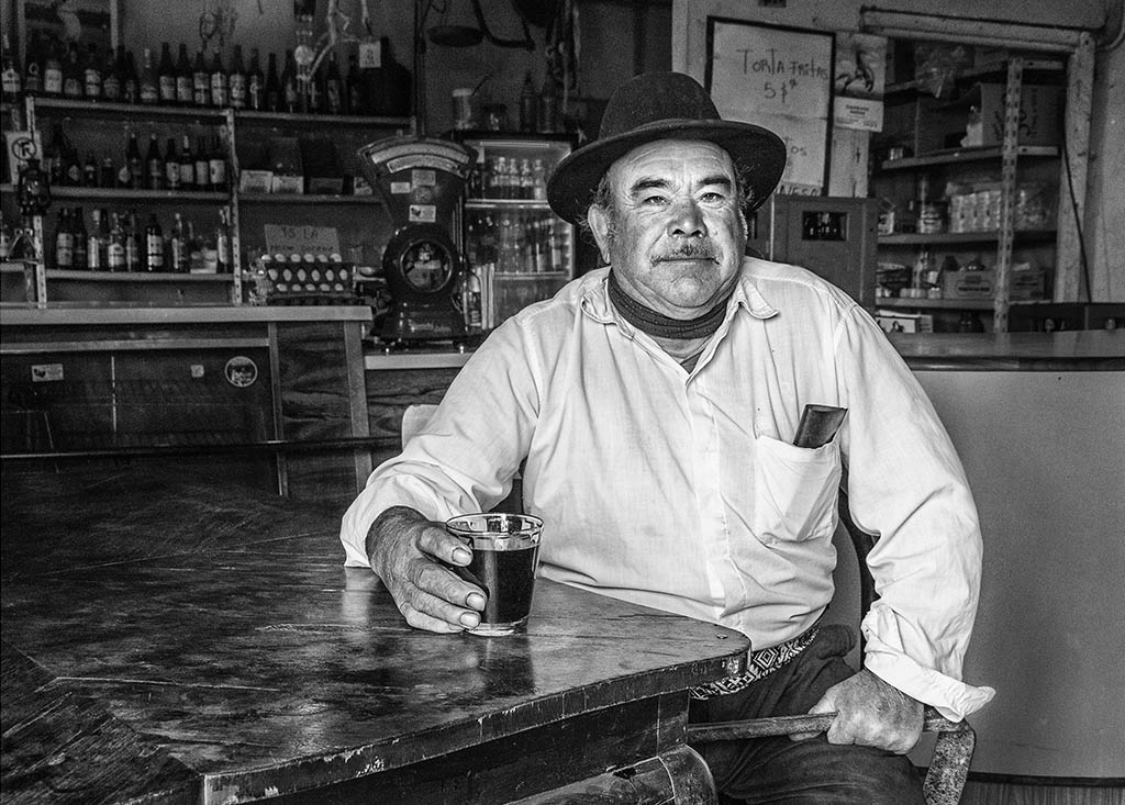
I am not very in agreement with the direction that the group is taking in the last time. I see that many do not have opinion of my photos. Maybe they have no interest in my participation so I will consider continuing to do so.
|
May 17th |
| 32 |
May 18 |
Comment |
I agree that darkening the background highlights the scene better.
I would also have liked a side shot to give the image a better look.
|
May 17th |
6 comments - 1 reply for Group 32
|
6 comments - 1 reply Total
|