|
| Group |
Round |
C/R |
Comment |
Date |
Image |
| 32 |
Apr 18 |
Comment |
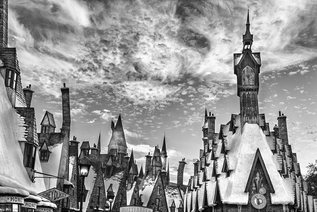
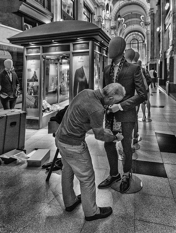
Interesting image for "street life".
Anyway, in mono is a little confusing, because the main theme is lost a little with the background.
In color the theme takes off better.
Also a vignette would help to concentrate it better.
|
Apr 17th |
| 32 |
Apr 18 |
Comment |
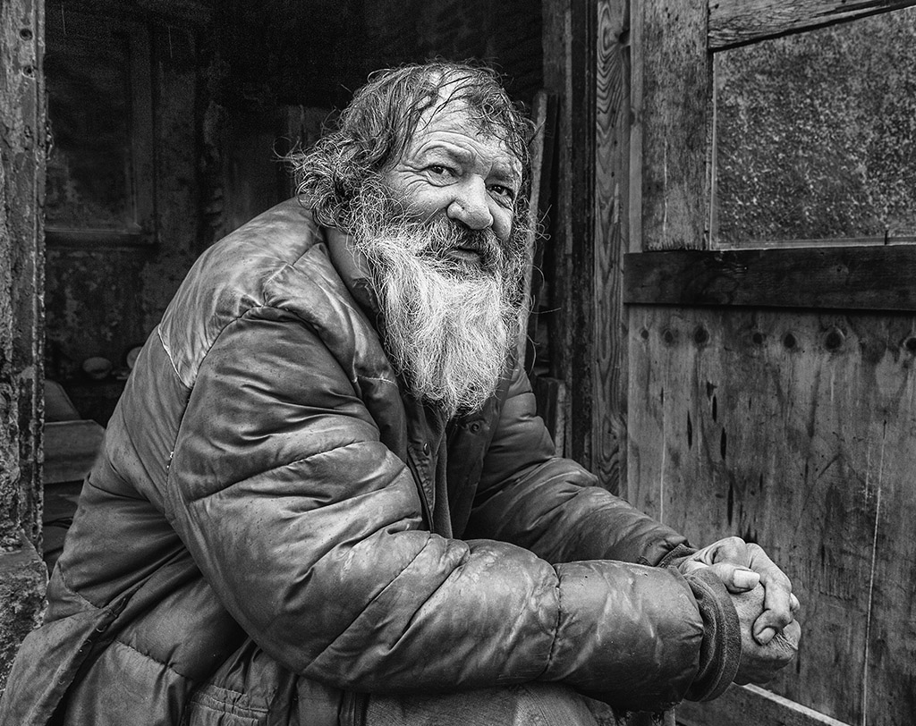
Image worthy of the look and the sagacious work of Carol, with how difficult it is to achieve a good picture with a backlight and a silhouette!
Thank you very much for all your contributions and knowledge provided Carol!
We're really going to miss you!
|
Apr 17th |
| 32 |
Apr 18 |
Comment |
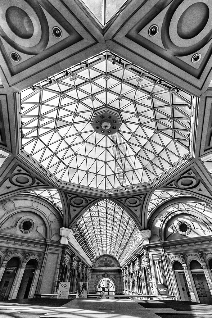
The symmetry is powerful and very attractive.
Only lacks a greater contrast to achieve a better result.
Very good shot, Stephen. Congratulations!
|
Apr 17th |
| 32 |
Apr 18 |
Comment |
Both the rider and the horse have good detail and are correctly illuminated, but I am also annoyed by the clarity of the sky, although if you try to darken it, be very careful not to overfill it. |
Apr 17th |
| 32 |
Apr 18 |
Comment |
I agree that the curve of the neck is nice and that it is fine the dark area in the upper left.
I also agree that the bird's tone is too gray, that's why it's boring.
I think that by giving it more contrast some whites will appear that will make it more interesting.
|
Apr 17th |
| 32 |
Apr 18 |
Comment |
The conversion to mono and the tones are good, but here the dilemma is the subject of the image itself.
I find the image interesting. It is imaginative and respects a pattern, although it lost a little when the "base" that sustains it disappears, when the earth and the grass appear.
|
Apr 17th |
| 32 |
Apr 18 |
Reply |
Me neither! |
Apr 14th |
6 comments - 1 reply for Group 32
|
6 comments - 1 reply Total
|