|
| Group |
Round |
C/R |
Comment |
Date |
Image |
| 32 |
Dec 17 |
Comment |
I agree with what was said by Carol and Diana. A greater contrast and the almost black background makes the flowers stand out. The " audacious" frame is interesting.
I also think that the sense of place in a pictorial image is not so important.
|
Dec 18th |
| 32 |
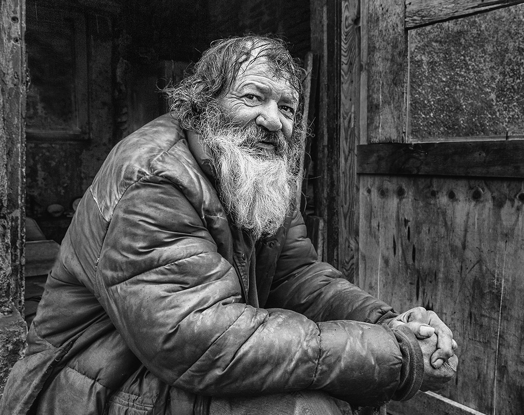
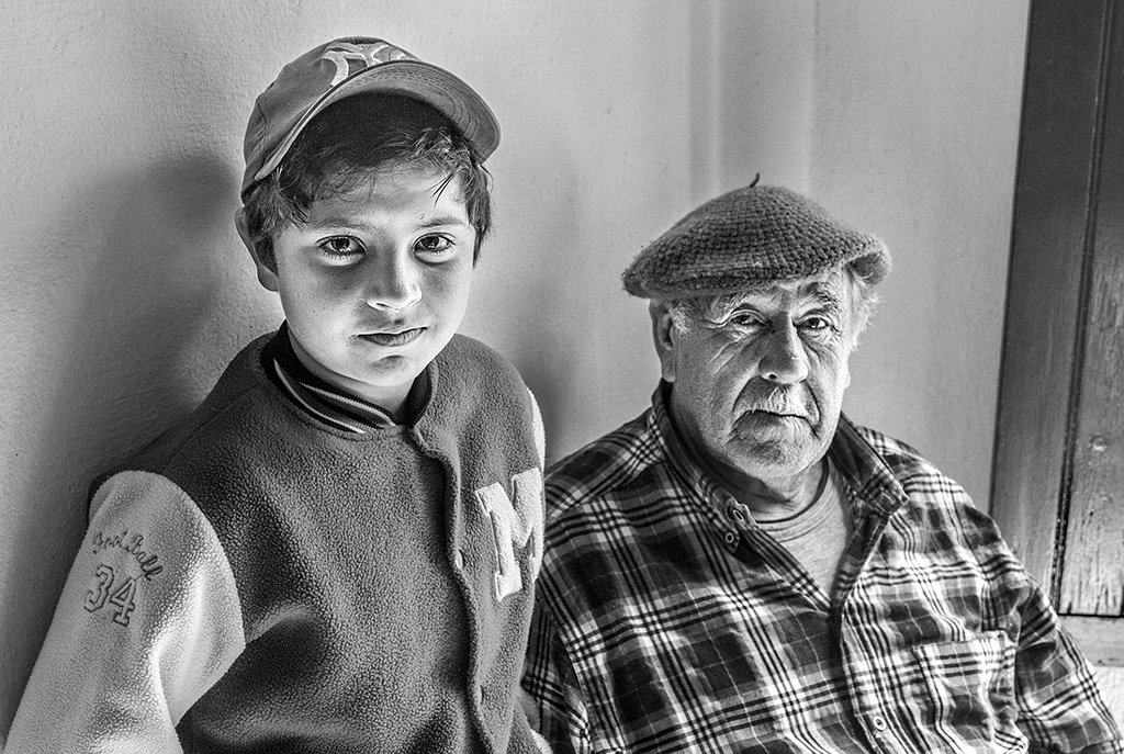
Dec 17 |
Comment |
Welcome to our group Michael.
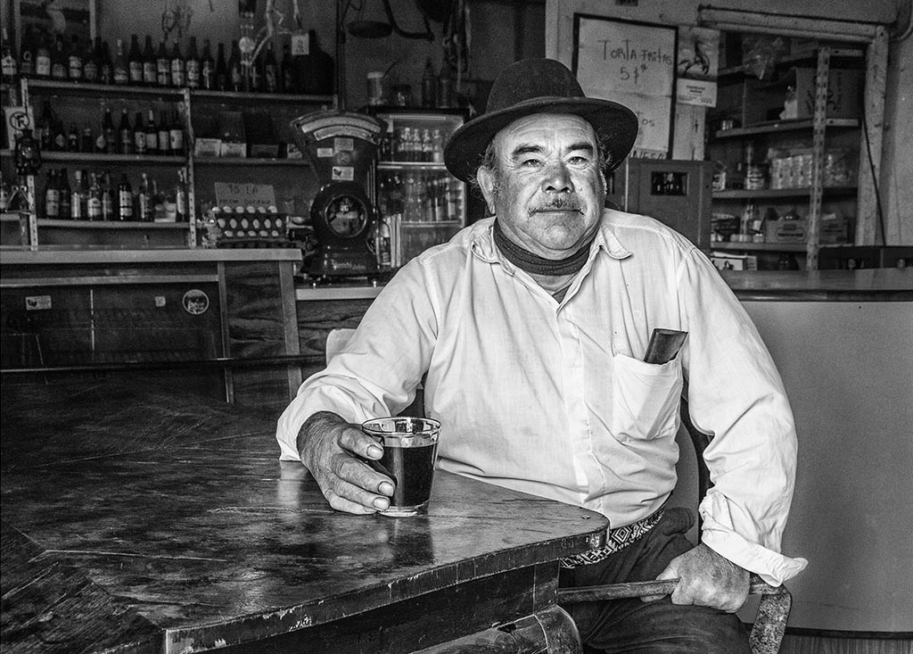
The pensive face of the driver is interesting and I agree with Diana's comment, regarding the look.
I would have liked that the shot had been a little wider so that part of the body of the driver is shown, because as it is I find something mutilated, however the picture is very suggestive.
|
Dec 18th |
| 32 |
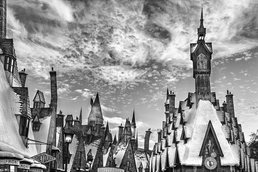
Dec 17 |
Comment |
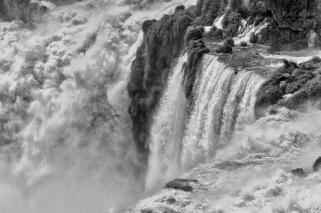
Very good result both in color and in mono.
Personally, I am more seduced by the deep tones you achieved in mono.
I think that if the snowfall were "less obvious" it would look "more real", but as a creative image it is quite well achieved.
|
Dec 18th |
| 32 |
Dec 17 |
Comment |
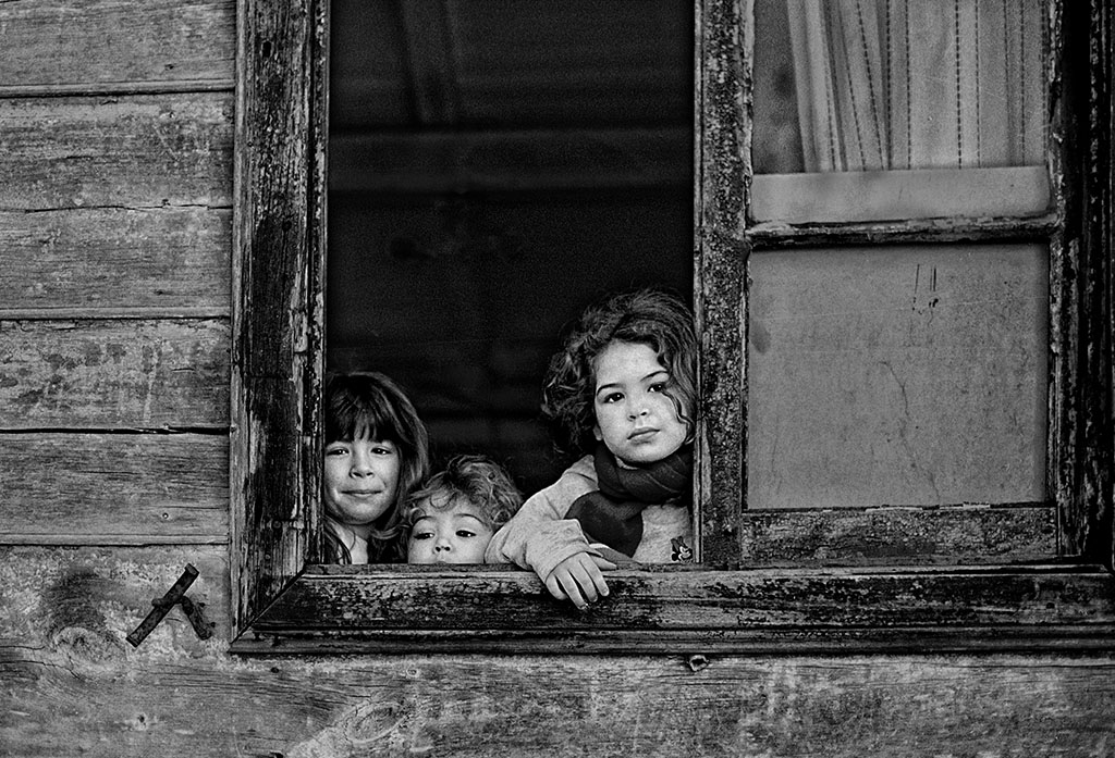
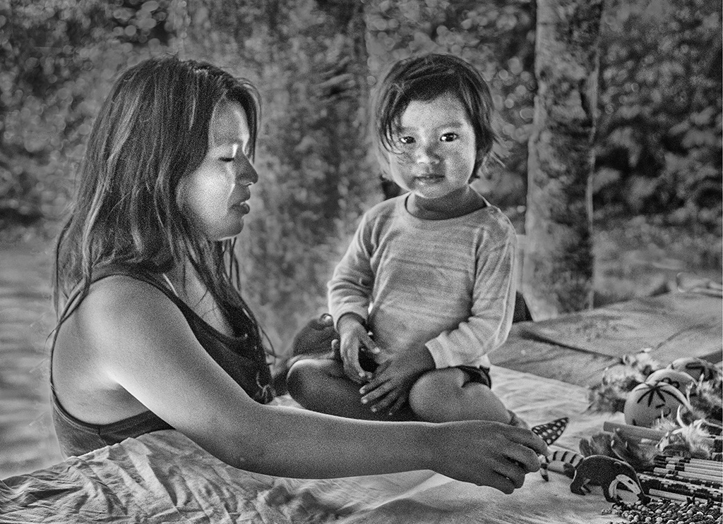
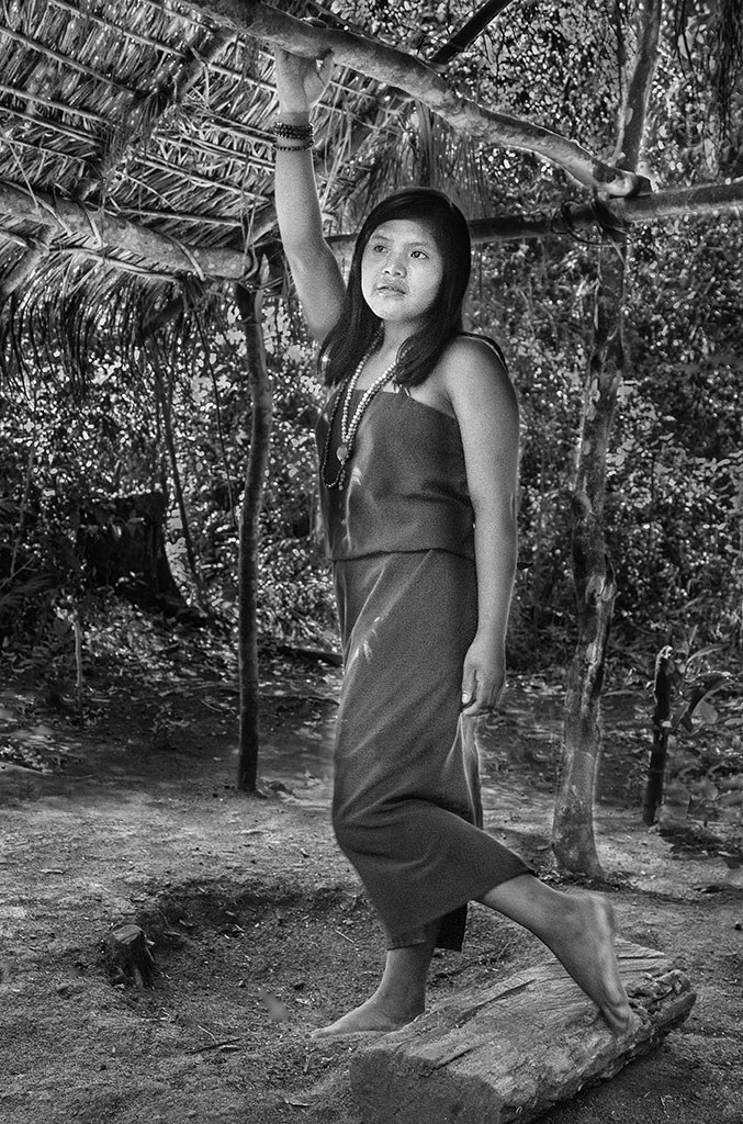
The image represents very well the customs of that place.
The tones are good and the cut appropriate.
I also agree that it is a good image for PJ exhibitions.
|
Dec 18th |
| 32 |
Dec 17 |
Comment |
For the Nature section, the color image is the most appropriate and, as already mentioned, the bird and its surroundings stand out.
To take it mono, I also agree that the background is a bit annoying and Carol's suggestion of taking it to black (or almost) is appropriate.
The rest seems to me to be correct.
|
Dec 18th |
| 32 |
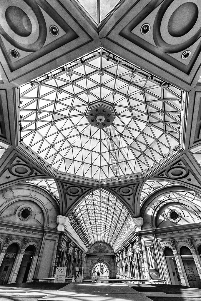
Dec 17 |
Comment |
No doubt the image in mono is superior to the color.
Usually when an image seeks to highlight shapes, patterns and contrasts, as in this case, the mono works better.
In turn, the version of Carol, the contrast and the decrease of the dark areas, the improvement even more.
You also have good tones and a good story.
I think it can work well in some competitions.
|
Dec 18th |
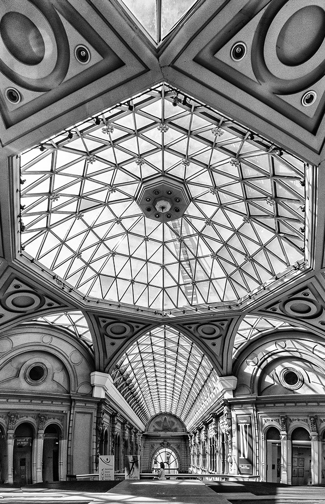
| 32 |
Dec 17 |
Reply |
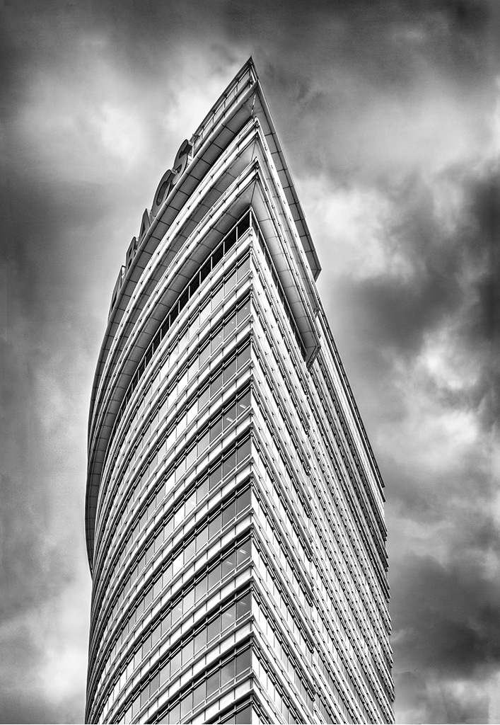
I did it by coupling all the layers and using the "edit" tab, "transform", "deform", with a lot of patience. I did not mind the deformation but I like the new version more. The architectural images always caught my attention and when I had to judge exhibitions I appreciated them although I agree that it depends on what each jury thinks and that it will always work better in a specific section |
Dec 17th |
| 32 |
Dec 17 |
Reply |
I did it by coupling all the layers and using the "edit" tab, "transform", "deform", with a lot of patience. Many thanks for the observation. I did not mind the deformation but I like the new version more. |
Dec 17th |
| 32 |
Dec 17 |
Comment |
That's better? |
Dec 8th |
 |
7 comments - 2 replies for Group 32
|
7 comments - 2 replies Total
|