|
| Group |
Round |
C/R |
Comment |
Date |
Image |
| 32 |
Jul 17 |
Comment |
The scene is nice and the tones are very good.
The tonal contrast between the horse and the rider is very interesting.
Only try to darken the light part of the pole a bit, because stands out over the horse.
|
Jul 14th |
| 32 |
Jul 17 |
Comment |
The creative work is very good and it looks very natural juxtaposition of elements that you have done.
I only have one question: how can the presence of the pen be justified if there is no underlining, as Stephan says, or some blank note or sheet?
|
Jul 14th |
| 32 |
Jul 17 |
Comment |
The scene is interesting and looks spontaneous.
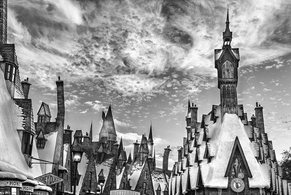
Technically I'm surprised that, having been taken out with a wide angle, the rest of the members of the band without having a better effect.
I would also try to darken the two upper angles a bit, which are too light and too noticeable.
|
Jul 14th |
| 32 |
Jul 17 |
Comment |
Welcome to the group Lynne!
We hope you feel comfortable and that our comments are useful, as I know that happens to us all.
Regarding the photo, lighting and composition is nice.
For me it has the peculiarity that, being illuminated the flower of the bottom and not especially the one of the foreground, it gives a particular and delicate composition, favored by the vignette.
I only find the support of the foreground flower very dark.
|
Jul 14th |
| 32 |
Jul 17 |
Comment |
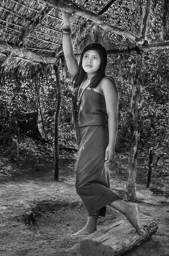
The scene is good and the general lighting is also good.
I also agree with the framing.
Just trying to lighten the bird's face a little more and darken the two clearings at the top, to focus even more interest on the bird.
|
Jul 14th |
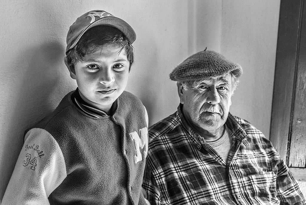
| 32 |
Jul 17 |
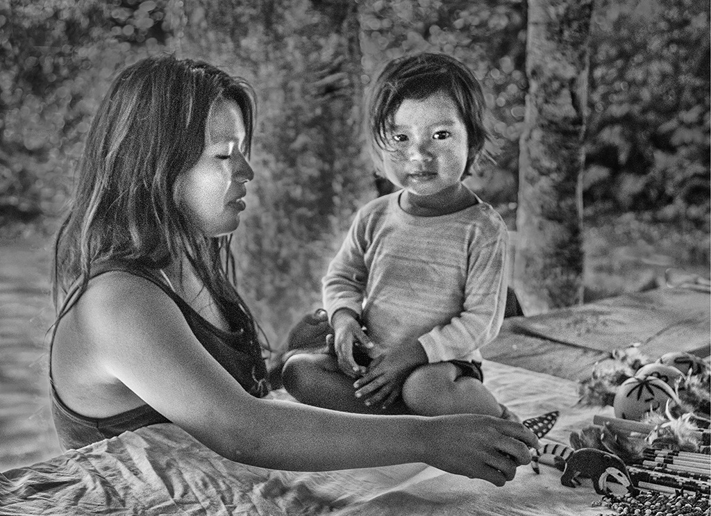
Comment |
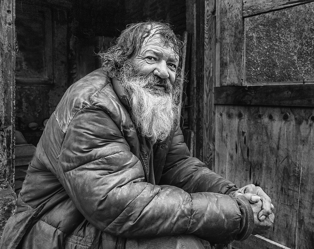
The conversion to mono favors it, the characters manage to stand out from the environment.
I still find the brightly parts of the characters' clothing bright, especially at the top of the nun.
I think you can try to compete in "Human Interest" in PJ.
|
Jul 14th |
6 comments - 0 replies for Group 32
|
6 comments - 0 replies Total
|