|
| Group |
Round |
C/R |
Comment |
Date |
Image |
| 60 |
Apr 24 |
Reply |
Cheers Rita. I think he likes getting his photo taken - maybe because he knows he gets paid well with treats! |
Apr 23rd |
| 60 |
Apr 24 |
Reply |
Thank you Michelle. I agree - he is beautiful. It's almost like cheating because it's hard to take a bad photo of him :-) |
Apr 16th |
| 60 |
Apr 24 |
Reply |
Hi Michelle,
Take any of my suggestions with a grain of salt, they're merely thoughts on what I might do based on my aesthetics, and won't necessarily make a better image!
The reason I would consider changing the green is to simplify the colour palette so as to not compete as much with the main subject - it's more just a personal preference really :-) |
Apr 16th |
| 60 |
Apr 24 |
Reply |
Cheers Robert |
Apr 6th |
| 60 |
Apr 24 |
Comment |
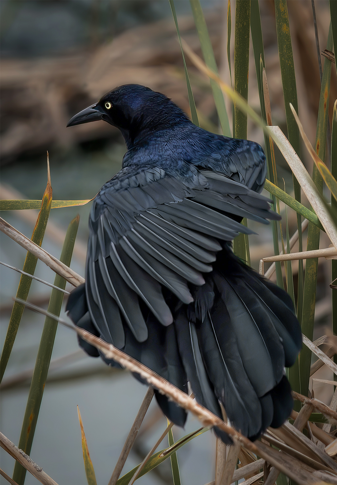
Hi Dean,
Looks like a great place to go for bird photos! The bird you captured is a very worthy subject with his intricate feathering and interesting colours.
Observations/suggestions (as always, subjective!):
The reeds behind the bird are sharper than the wing feathers. Possible solutions would be to use a smaller aperture (adjusting ISO &/or shutter speed), &/or moving the focus point from the bird's eye, to perhaps the joint on the left wing (where the horizontal reed comes across), which may keep most of the bird in focus (re for any focus point, the DOF will be roughly 1/3 in front, & 2/3 behind).
Removing the intersecting reed was a good call, however some remnants have been left behind on the lower jaw & the reed below. If you use PS, the 'Remove' tool works quite well for these type of edits (eg rather than the healing brush or content aware).
I would be inclined to shift the green hues of the reeds toward orange (slightly) to reduce the competing colours in the background (& possibly lower the saturation).
Possibly crop a touch off the bottom to remove the horizontal reed bottom left, and a touch off the right frame (to give him a little extra perceived space on the left to look into). |
Apr 4th |
 |
| 60 |
Apr 24 |
Comment |
Hi Robert,
Great moody image, with the stormy clouds, ominous mountains in the distance, and the last rays of light making a last stand. Good choice of aperture with large DOF, composition's fine. I agree with Dean re the goal base.
Observations and suggestions (purely subjective!):
Removal of the pole was a good choice, but there are some artifacts from the cloning left over (eg the cactus at the base, branches on the mountain),
The tree on the right has a serious lean, I'd possibly consider removing it,
With such a dramatic sky and tonal contrasts in the image, I'd perhaps consider a B&W conversion. |
Apr 4th |
 |
| 60 |
Apr 24 |
Reply |
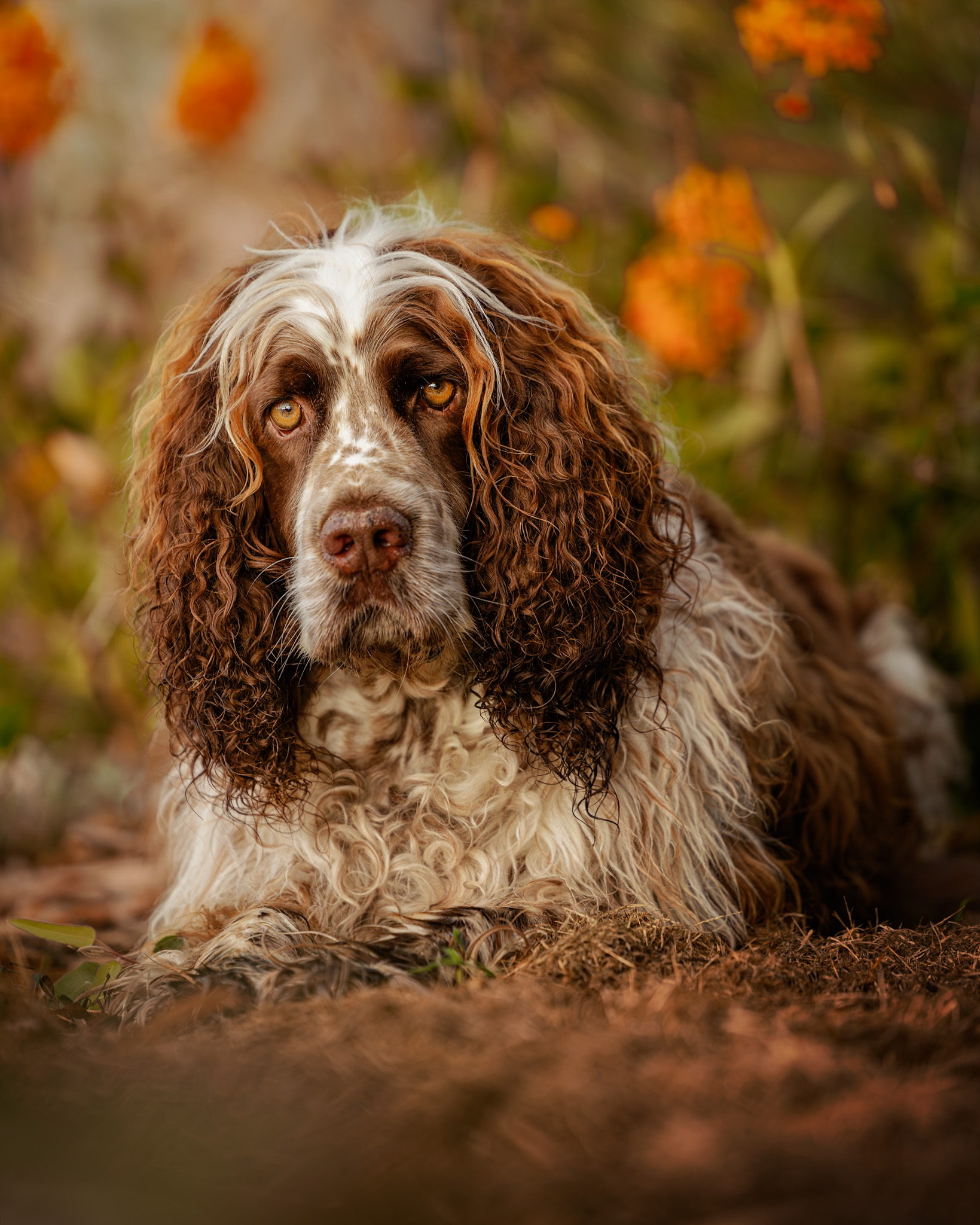
Cheers Anne,
It sounds like a lot, but doesn't really take much time in practise. I have to agree - he is a beautiful dog (& I think he knows it)! |
Apr 2nd |
| 60 |
Apr 24 |
Reply |
Cheers Dean,
lol - yes, I'm probably very biased when it comes to my dogs!
Thank you for your kind words, and, yes, probably could do with a touch more gradient on the foreground (I probably wouldn't crop in case I wanted it for print). |
Apr 2nd |
| 60 |
Apr 24 |
Comment |
Hi Rita,
I think it makes a great 'people' image - to me it tells the story of the woman embracing an important stage of her life, and looking ahead to what possibilties will come. The tiadic colour scheme works well.
Observations/suggestions (purely subjective!):
Looking through the window provides a good frame, but the angled cut-off of the top window feels (to me) a little jarring, although it could be argued that the angle adds some dynamism to the image. I'd be inclined to adjust the perspective to a straight on view (Persective Warp' in PS, or 'Geometry/Guided' in LR/ACR)
The composition would perhaps have been better taken from a lower position, changing the perspective to locate her a little lower in the frame while also lifting her head up above the treeline in the background (but then the window frame would go across her stomach, so there wasn't much leeway),
Possibly remove some of the smaller distractions (eg some of the brighter pebbles in the foreground, etc),
I agree with Dean re cropping to the scene outside the window, and I also agree that it's a dark art. I'd be inclined to crop the very top window panes off, which would place her roughly on the bottom right intersection for a 'rule of thirds' comp. The square crop to me looks unbalanced. |
Apr 2nd |
 |
| 60 |
Apr 24 |
Comment |
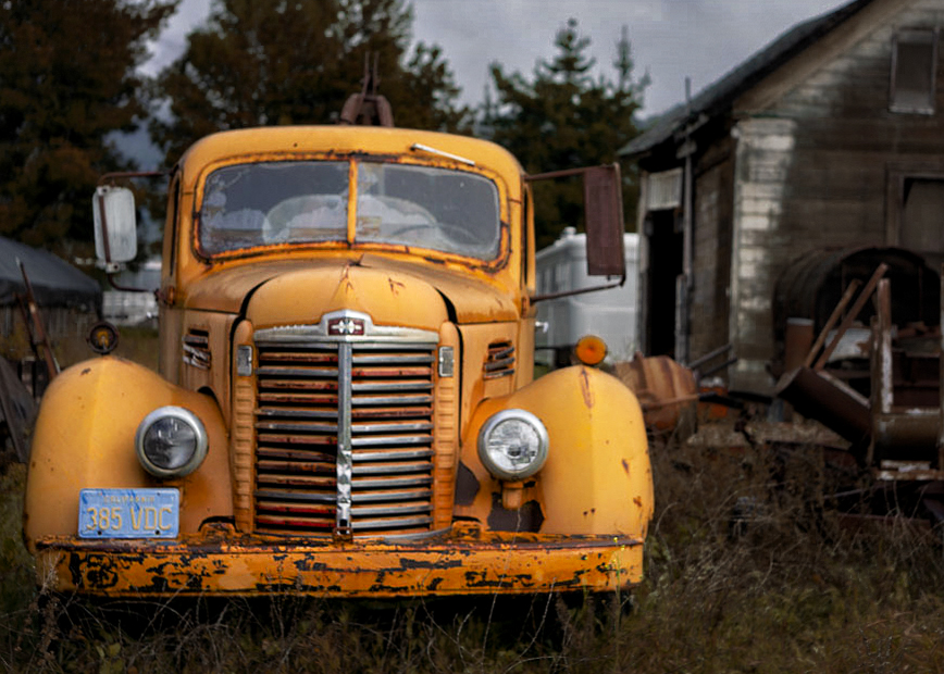
Hi Michelle,
What a great truck and setting! They combine well to tell a story of having seen better days, and the softer background helps emphasise the truck as the main subject.
Some observations & suggestions (& these are purely subjective):
Adjust the hue/saturation of the grass toward a more orange direction (subtly),
Crop a bit off the right side & top of the frame,
Reduce the saturation/luminance of the yellow barrell and cream object between the car & the building,
The focus on the front of the truck seems a little soft,
One way to possibly get a little detail back in the sky would be selecting it, adjusting the highlights & whites down a bit.
With all that said though, I think it's a great image! |
Apr 2nd |
 |
| 60 |
Apr 24 |
Comment |
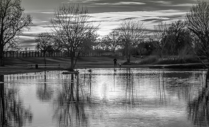
Hi Anne,
I like both images - the warm background sunset colours blend nicely into the cooler blue tones of the lake foreground. The B&W has a good range from the deeper black to the crisp highlights.
Observations/suggestions (just from how I might edit it, not from right or wrong!):
I agree with Dean re the truncated trees and possible solution at time of capture (or possibly use a 35mm focal length). In post, I would be inclined to crop the furthest left tree out (also the telegraph pole), and slightly on the right, and some off the bottom.
This (I feel) would balance the composition a little better, and provide a frame on the left and right from the half trees and their reflections.
I would remove (what appears to be) a dust spot (about a quarter in from the top right of the image), and some of the dark objects (bins?) around the picnic table(?) toward the left.
I think your foray into B&W landscape turned out fine! |
Apr 2nd |
 |
5 comments - 6 replies for Group 60
|
5 comments - 6 replies Total
|