|
| Group |
Round |
C/R |
Comment |
Date |
Image |
| 5 |
Mar 25 |
Comment |
Richard, outstanding landscape! The layering and composition create a strong visual story, and your crop is spot-on. Like David mentioned, subtly toning down the roof might help balance attention without losing the barn as a focal point-I agree the color version works beautifully here. |
Mar 30th |
| 5 |
Mar 25 |
Comment |
Wonderful candid capture, Sophia-the joy on the children's faces makes this shot truly special. I agree with Mark's suggestion to darken the background slightly, allowing the boys to naturally stand out without increasing contrast too much. Oliver's idea of reducing the green saturation could also help keep the focus firmly on their delightful expressions. |
Mar 30th |
| 5 |
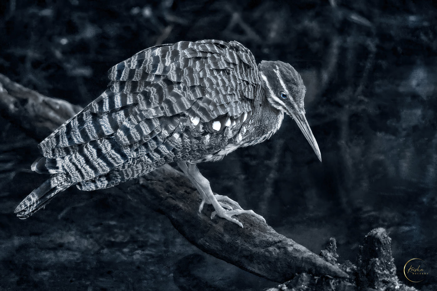
Mar 25 |
Comment |
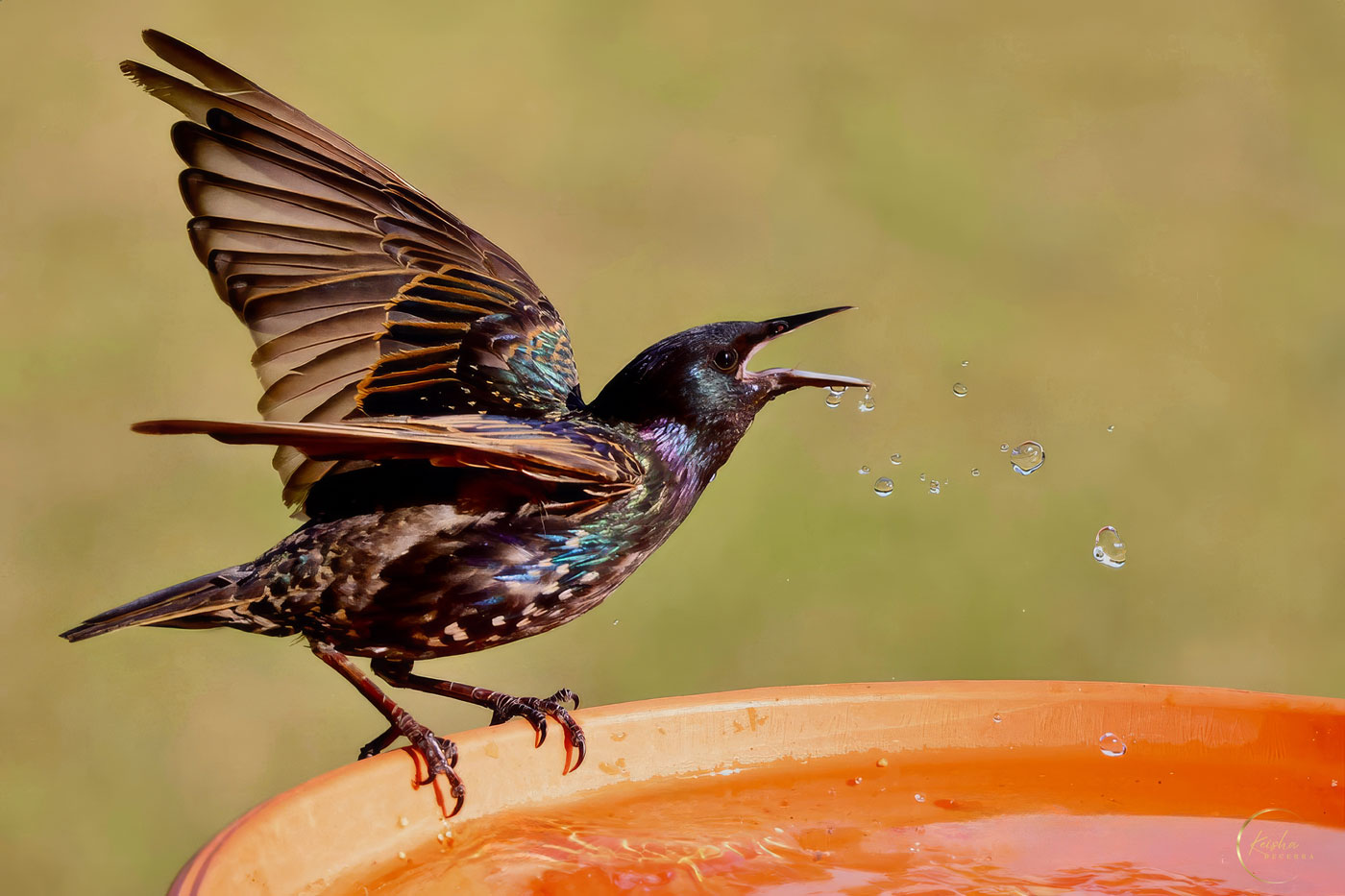
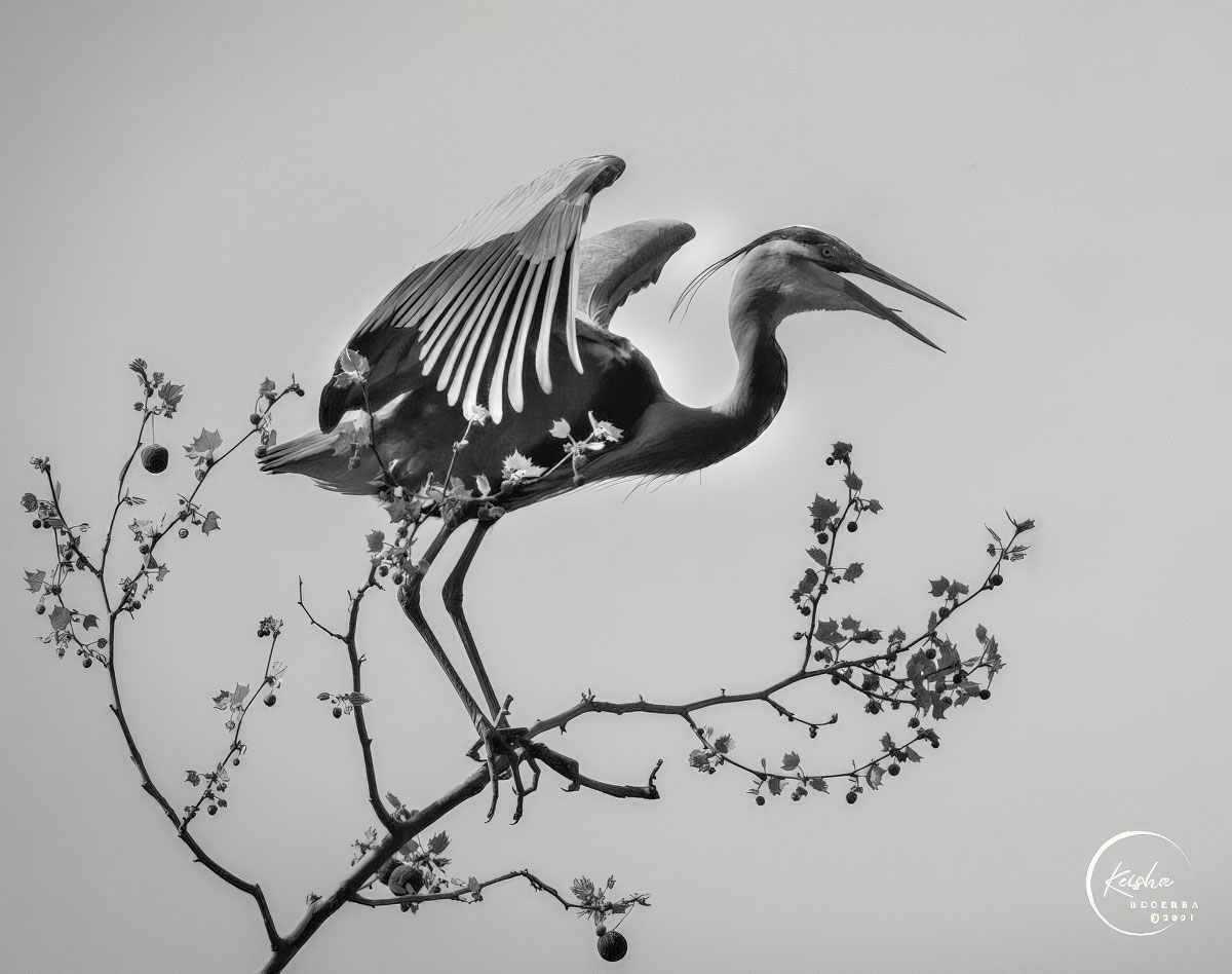
Beautiful shot, Mark! The soft lighting and gentle colors make the scene feel serene and natural-definitely worthy of hanging on a wall. Like Sophia and Richard suggested, adding a catchlight in the bird's eye would bring it to life even more. |
Mar 30th |
| 5 |
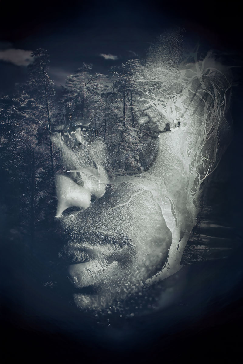
Mar 25 |
Comment |
This photo really hits home-you can practically hear what he's thinking. The black and white adds powerful emotion and great texture, making the moment even stronger. I'm with David on this one; color might have taken away from the feeling, so going monochrome was definitely the right choice. |
Mar 30th |
| 5 |
Mar 25 |
Comment |
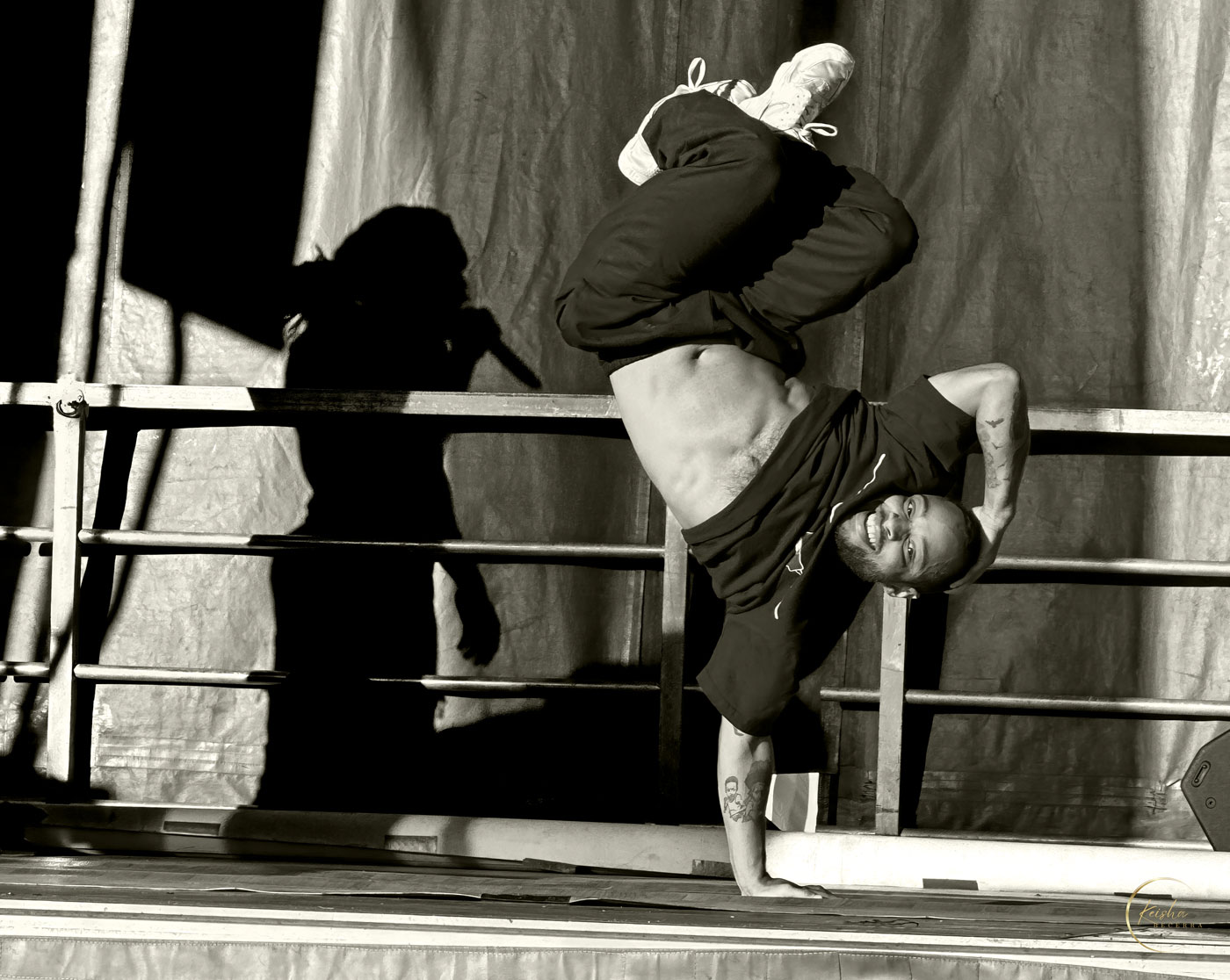
David, excellent action capture and impressive post-processing, particularly enhancing the rider's face and flame detail. I agree with Mark's suggestion to reduce the flame's intensity slightly, directing more attention to the rider's expression, and evening out the background wall for balance. Outstanding work-I look forward to seeing more! |
Mar 30th |
| 5 |
Mar 25 |
Reply |
lol….If I saw this guy in his natural habitat. No photos for me… I'd be too busy running. |
Mar 3rd |
| 5 |
Mar 25 |
Reply |
Hi Oliver, I was shooting through the glass. I think you're seeing a smudge. As you pan left the scales get clearer. |
Mar 3rd |
5 comments - 2 replies for Group 5
|
| 20 |
Mar 25 |
Comment |
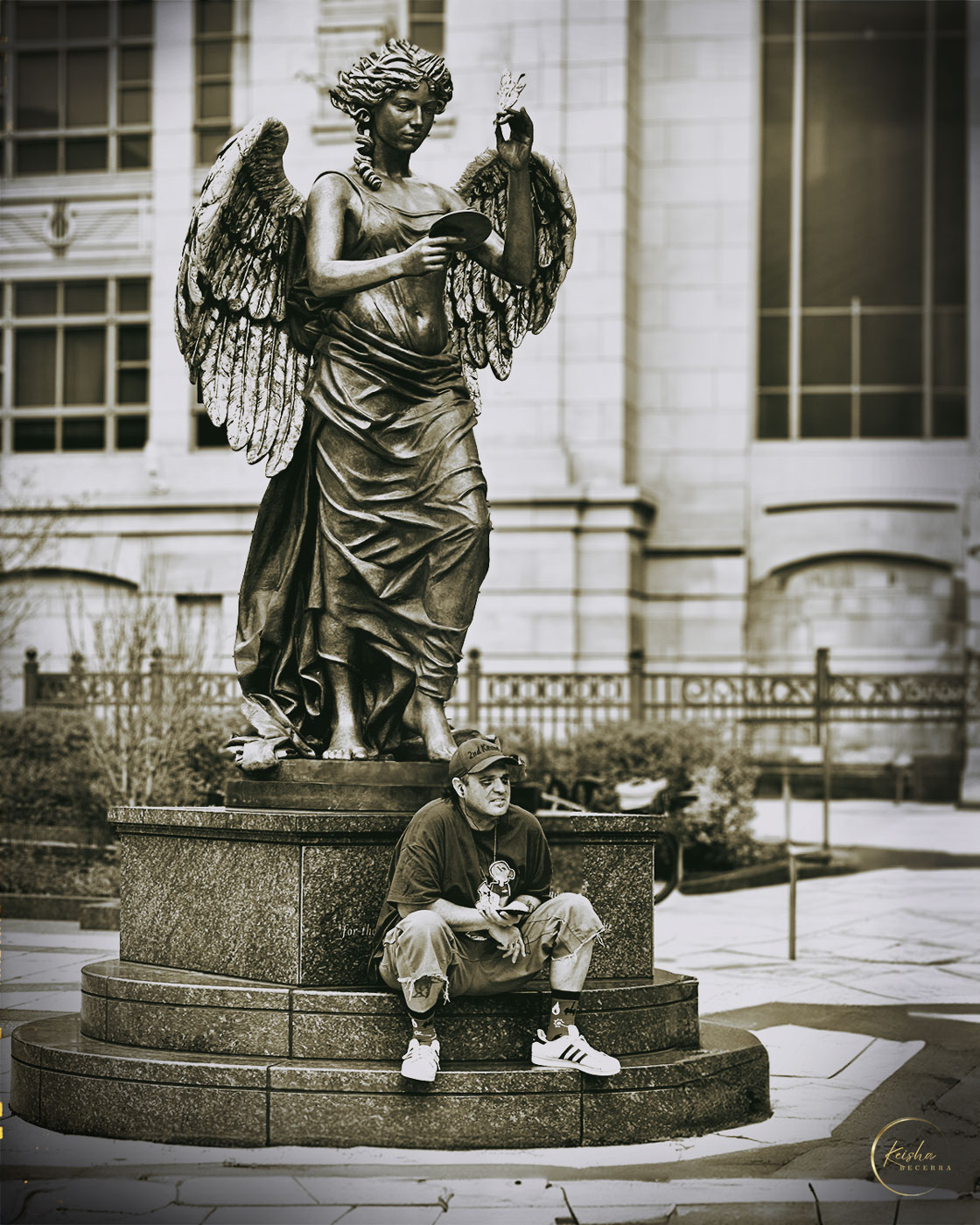
Deborah, beautiful original images and creative idea for your composite! I agree with Fran's suggestion to simplify your composition by featuring just three images, using the eagle's head as a subtle background at lower opacity to enhance the storytelling without losing detail. Your original captures are excellent, and showcasing them clearly will further elevate your final piece. |
Mar 30th |
| 20 |
Mar 25 |
Comment |
Great composite-fun and creative! Your selection and masking are very well done, keeping the image clean and convincing. I agree with Deborah; kids especially would enjoy something playful like this! |
Mar 30th |
| 20 |
Mar 25 |
Comment |
Jan, beautifully creative image! The vibrant colors and mirrored effect really enhance the visual interest. Like Angela mentioned, the curved colors at the base add a special touch-I also agree with Fran; it would be intriguing to see how different filters or effects might further transform the mirrored result. |
Mar 30th |
| 20 |
Mar 25 |
Comment |
Fran, excellent composite-I especially love the creativity and how seamlessly you've integrated the orb. Like Sylvia mentioned, adjusting the shadows to match the main light source would enhance realism. Jan's idea of straightening the deer within the orb is also worth exploring, but the whimsical tilt works if your goal is a playful feel. |
Mar 30th |
| 20 |
Mar 25 |
Comment |
Sylvia, the painted effect really transforms the mood of the image in an engaging way. Like Jan and Angela, I suggest cropping the top portion to minimize the white sky and bring stronger focus onto the bus-possibly even trying a square format. The creative approach you've taken works very well! |
Mar 30th |
5 comments - 0 replies for Group 20
|
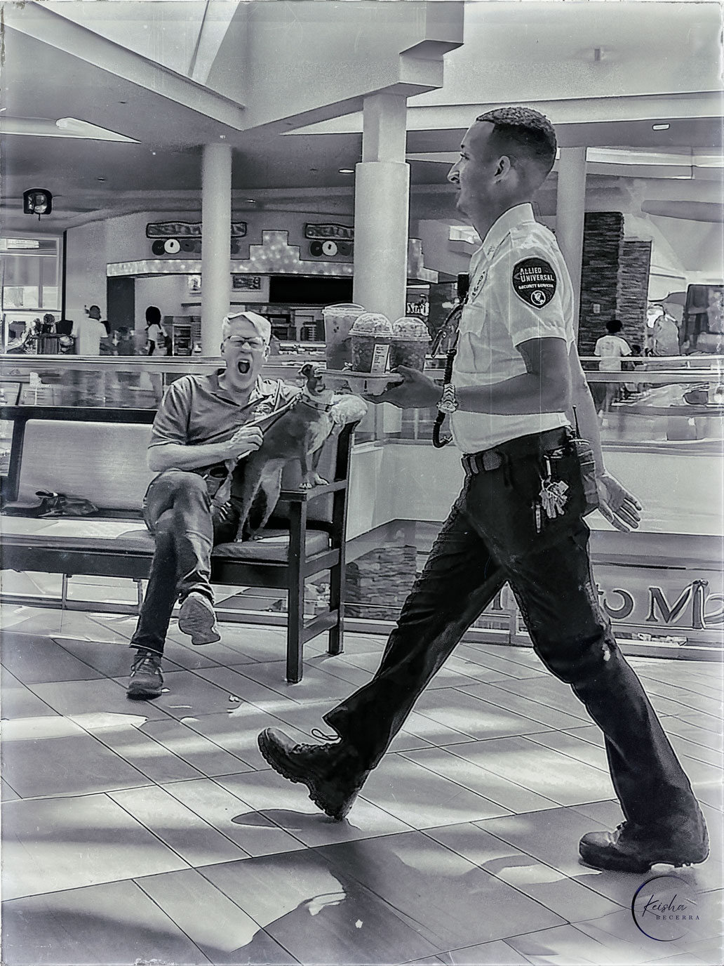
| 92 |
Mar 25 |
Comment |
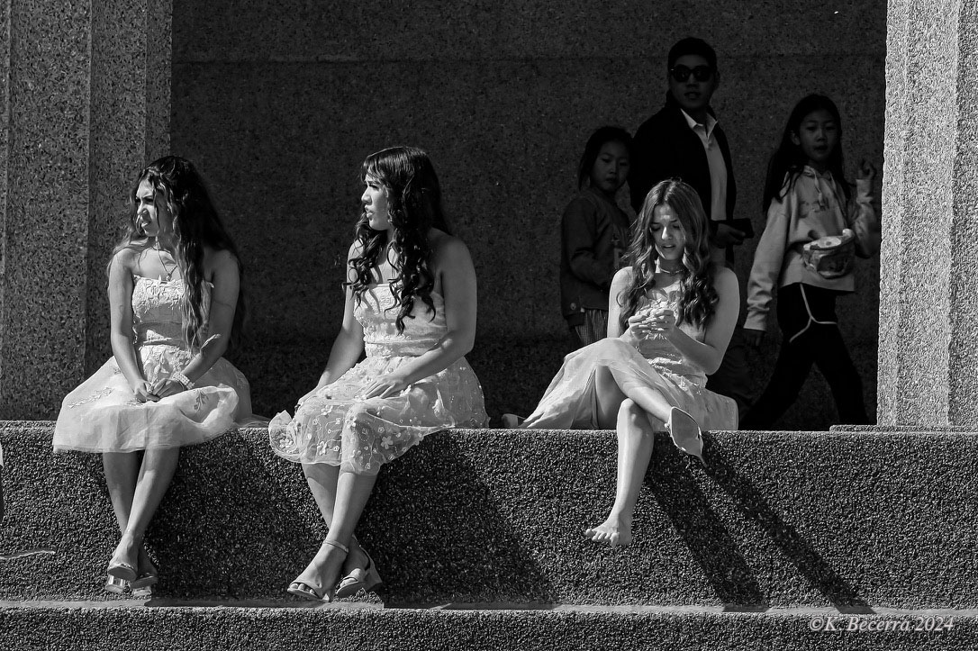
Michele, fantastic image-I appreciate both the humor and the thoughtful composition. Technically strong and visually engaging, you've captured a compelling moment. Well done! |
Mar 30th |
| 92 |
Mar 25 |
Comment |
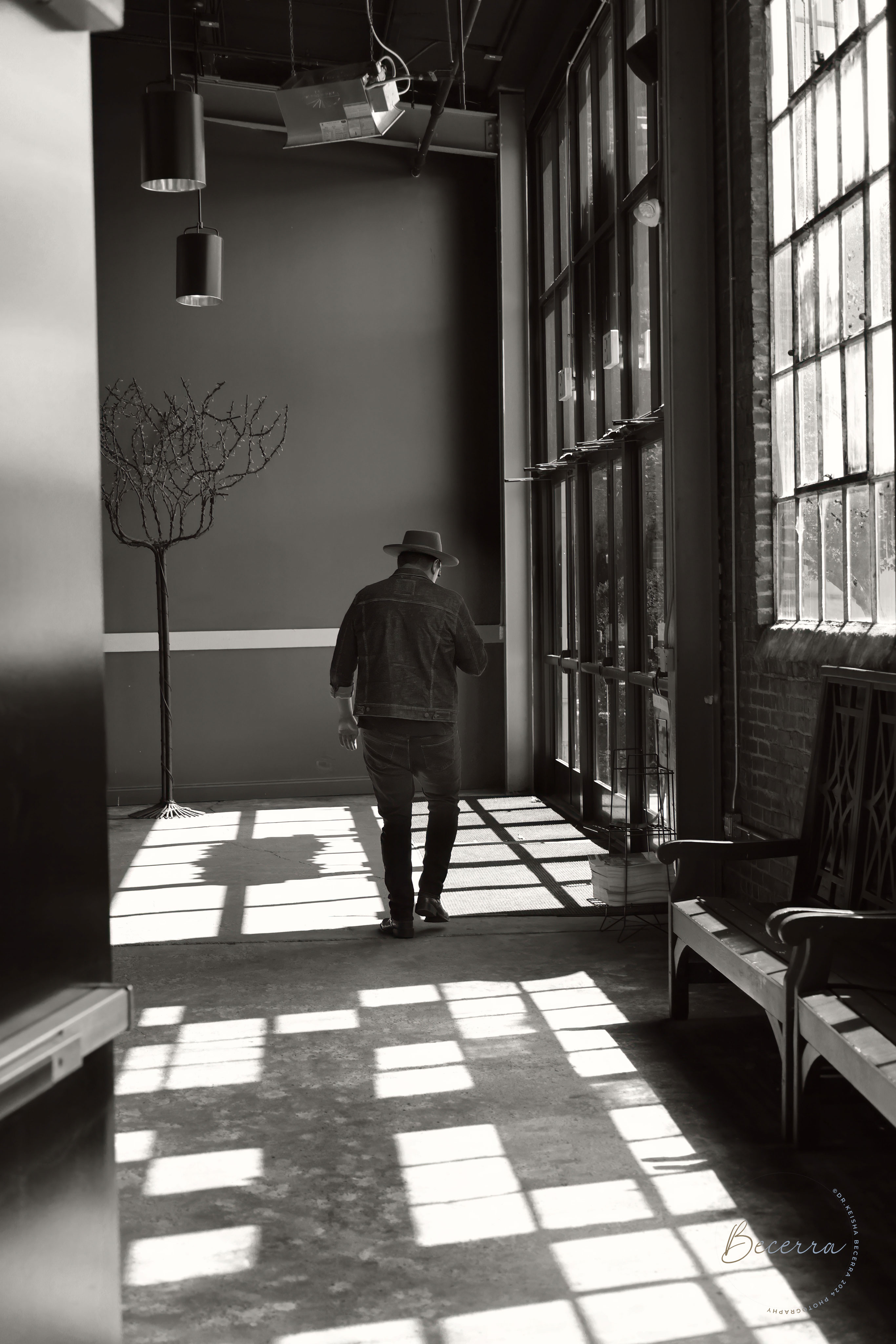
Lou, your composition is strong, effectively guiding the viewer's eye along the street toward the figure, enhancing the everyday story being told. However, I agree with Stephen and Michele-the colors currently have an artificial, HDR-like appearance. Adjusting the brightness downward slightly and increasing contrast may help achieve a more natural, realistic look. |
Mar 30th |
2 comments - 0 replies for Group 92
|
12 comments - 2 replies Total
|