|
| Group |
Round |
C/R |
Comment |
Date |
Image |
| 5 |
Oct 24 |
Reply |
Thank you so much for the feedback! I did apply some noise reduction, but not too much since the Canon handles higher ISO settings really well. As for the three ducks, I'm also on the fence-they do contribute to the story, and I can see the appeal of keeping them. I really like the edits Oliver made, and I think they work well, though I could go either way on them. I do agree that the background in his version might be a touch darker than I'd prefer. Thanks again for sharing your thoughts! |
Oct 26th |
| 5 |
Oct 24 |
Reply |
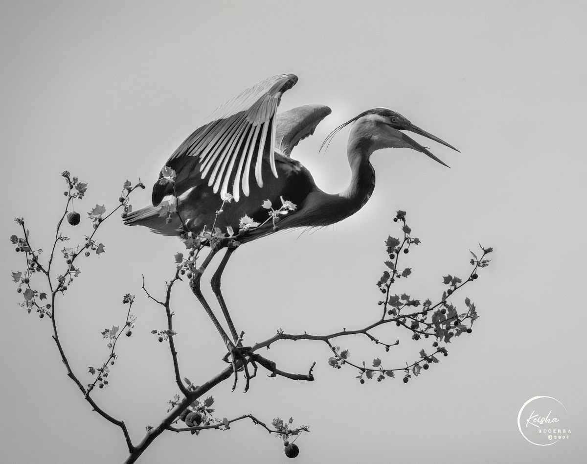
Thank you so much, I'm glad you liked the BIF shot-capturing the timing was definitely a challenge. I find your edit interesting, and I really like the adjustments you made to the pigeon. However, I feel the background is a bit too dark for my taste. Thanks again for your feedback and for taking the time to work with the image! |
Oct 26th |
| 5 |
Oct 24 |
Comment |
What a fantastic action shot! You've captured the intensity of the game perfectly with the runner just out of reach and the defenders in full pursuit. The timing is spot on, and the edits you made really help keep the focus on the players without any distractions from the background.
I love how the use of AI streamlined the process, especially when it comes to removing distractions like the person on the left and expanding the field. I agree with others about AI-when used thoughtfully like this, it enhances the image while still maintaining the integrity of the moment. The slight toning down of the background was a great touch, and Topaz Photo AI did a superb job sharpening the players. Well done! |
Oct 19th |
| 5 |
Oct 24 |
Comment |
The lights really do give that sense of movement and energy, and I love how the vertical lines bring such a dynamic feel to the scene. It almost feels like the lights are floating upward into the night sky. The reflection on the water is beautiful, adding an extra layer of depth.
I think your choice of sky works well here, adding to the overall atmosphere. Congratulations on this great image! |
Oct 19th |
| 5 |
Oct 24 |
Comment |
Hi Mark,
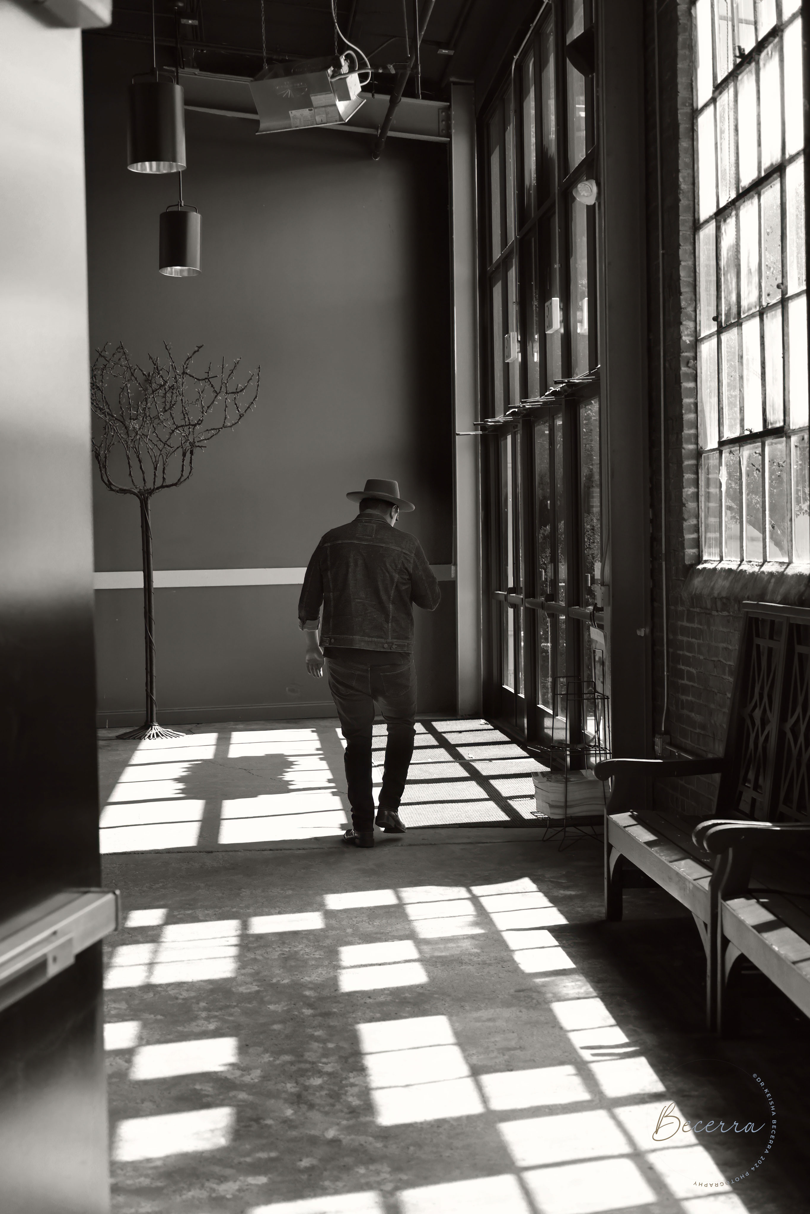
This is a beautifully evocative image that really draws the viewer in. I love how the textures and details in the door and walls create a rich story of past grandeur meeting present decline, as Victor mentioned. The muted blues and earthy tones work well to evoke a sense of history and mystery. The lighting leads the eye deeper into the scene, leaving me curious about what lies around the corner.
I also appreciate your intention to emphasize the "light at the end of the tunnel," and I think you've captured that well. Like Sophia, I would agree that toning down or cloning out the small red pieces on the right could help keep the focus on the rest of the composition. Overall, this image is a visual narrative that invites exploration. Great work!
|
Oct 19th |
| 5 |
Oct 24 |
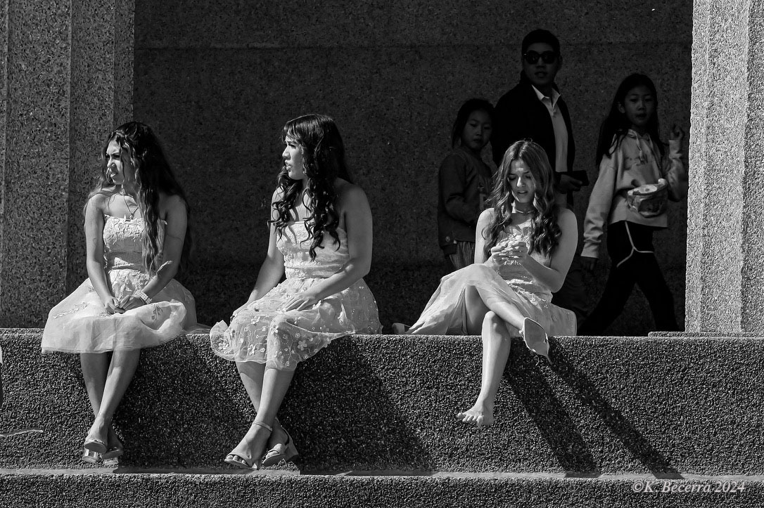
Comment |
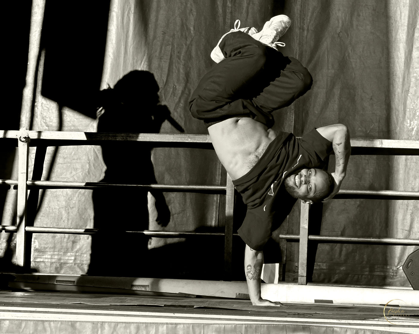
This is a fun and engaging capture of Sabrina in action! I think you did a great job handling the lighting challenges of the outdoor stage, particularly in taming the hot spots. Like others have mentioned, there's a slight greyish cast on her forward thigh. You might want to try tweaking the white balance sliders, adding a bit more yellow and magenta to bring warmth back into the skin tone.
The composition and expression really make this an enjoyable image, and your post-processing has brought out the best in a tricky situation. Nicely done!
|
Oct 19th |
| 5 |
Oct 24 |
Comment |
Hi Victor,
This is such a striking and imaginative image! I really admire how you transformed a simple ice formation into something that feels volatile and full of energy. The contrast between the icy textures and the embedded lightning creates a great dynamic that keeps the viewer's eye moving around the frame.
I agree with some of the suggestions made earlier. Like Mark mentioned, adjusting the luminance at the top might help focus even more attention on the central lightning element, and a subtle vignette could guide the eye toward the most important parts of the composition. I also think Richard's idea of experimenting with the lightning's position could be interesting-moving it slightly off-center might add a different kind of balance.
Looking forward to seeing more of your work!
|
Oct 19th |
| 5 |
Oct 24 |
Comment |
Hi David,
This is a fantastic capture of an intense moment in the race! I think your edits work really well, especially the decision to remove the half bike, which keeps the focus on the riders. Like others have mentioned, the slight separation between the riders isn't immediately noticeable, but it does add a subtle depth that enhances the image's dynamic feel.
Your desaturation of the ground helps the front rider stand out, and I agree with the suggestion that a touch more contrast on rider 86 could further bring out their presence. Desaturating rider 96 a bit more could also help maintain that focus on the front rider. Overall, you've done a great job with the post-processing, and it's a clean, action-packed shot!
|
Oct 19th |
6 comments - 2 replies for Group 5
|
| 64 |
Oct 24 |
Reply |
Thank you, John, for your thoughtful feedback. I definitely want to maintain the unique qualities of infrared that make the image stand out, but I see your point about the whites being too bright in the foreground. Slightly toning down the shirt of the girl with the cowboy hat could help create better contrast between her shirt and skin, allowing those details to come through more clearly. I appreciate your insight and will keep it in mind for future adjustments! |
Oct 26th |
| 64 |
Oct 24 |
Reply |
Thank you, Stuart! I really appreciate your open-mindedness towards this infrared image. I completely understand where you're coming from with IR's often unnatural look-it can definitely be a matter of personal taste. I'm glad that this approach resonated with you and showed how IR can reveal contrasts, shapes, and textures that are difficult to capture with traditional photography. I'm excited to explore more with this technique, and I look forward to sharing future results. |
Oct 26th |
| 64 |
Oct 24 |
Comment |
The square format is a solid choice, as it focuses attention on the harmonious architectural elements and the Philadelphia Museum of Art without distraction. I agree with Chris that the omission of the surrounding cityscape simplifies the scene and creates a cohesive, timeless feel. The kayakers in the foreground add a lively touch that contrasts nicely with the static grandeur of the buildings, and the light on the water is well handled, adding depth and interest. I do see John's point about the darker kayakers; a touch of lightening might enhance the balance without drawing attention away from the main subject. Overall, it's a beautifully layered and well-composed image. |
Oct 26th |
| 64 |
Oct 24 |
Comment |
The textures in the bark are wonderfully captured, with a strong tonal range that emphasizes the natural patterns. I agree with Jerry's suggestion about making the negative space to the right completely black to enhance focus on the bark. Don's point about removing the white spots in the top right is also spot-on, as it would help eliminate distractions. Overall, this is a solid start, and experimenting with composition or even including a small subject like a bug could elevate the image further. Great eye for detail! |
Oct 26th |
| 64 |
Oct 24 |
Comment |
What a wonderful capture of this bighorn sheep-its pose is both strong and graceful. I agree with Chris that the head is perfectly placed against the break in the foliage, making it stand out beautifully. The depth of field is spot-on, keeping the focus on the sheep while subtly isolating it from the background. I also see Jerry's point about burning down the grasses; it might enhance the contrast and draw more attention to the sheep's features. The tonal range is excellent, and the textures in the fur are captured with great clarity. Well done! |
Oct 26th |
| 64 |
Oct 24 |
Comment |
Your careful adjustments in Adobe Camera Raw and Photoshop have paid off beautifully, creating a high-contrast image that's both moody and rich in texture. Great work! |
Oct 26th |
| 64 |
Oct 24 |
Comment |
I really enjoy the smooth curves and flowing lines of the dunes in this image. The black and white conversion works well to emphasize the textures and shapes. Like others have mentioned, the inclusion of the people adds a nice sense of scale, helping to show the vastness of the landscape.
That said, it might be interesting to explore removing all but the closest couple, as this could evoke a stronger feeling of isolation and grandeur. I also agree with Chris about possibly cropping 10-15% from the bottom, which could strengthen the composition even further by focusing attention on the dunes. Overall, this is a striking and well-composed image. Nicely done! |
Oct 19th |
| 64 |
Oct 24 |
Comment |
John, impressive work with the software in removing the crowd-it's amazing how much it transforms the scene, giving the ruins a sense of solitude and timelessness. I also really appreciate your decision to leave a few people in the background for scale.
Composition-wise, I find the perspective engaging as it leads the eye naturally toward the Library of Ephesus. I might suggest adding a touch more contrast to the scene, especially with the bright light on the left, to bring out more detail in the walkway and surrounding ruins. Despite the modern building peeking in on the left, this image tells a strong story of Ephesus and highlights its grandeur. Well done!
|
Oct 19th |
6 comments - 2 replies for Group 64
|
12 comments - 4 replies Total
|