|
| Group |
Round |
C/R |
Comment |
Date |
Image |
| 64 |
Apr 24 |
Comment |
The detailed texture of their fur is particularly striking in black and white, showcasing the pattern changes that might be less pronounced in color.
The foreground and animals are crisp and sharply in focus, drawing the viewer's eye to the subjects. I think the background is well done, providing just enough detail to give context without overshadowing the primary subjects.
I do agree with the point about the corn stalks to the left; slightly blurring them could reduce their visual impact, allowing the animals to command even more attention. On the other hand, your current layout with the corn stalks in focus does help to provide a bit more context to the image. The overall composition, tonal range, and the capturing of such a candid moment is truly impressive. |
Apr 21st |
| 64 |
Apr 24 |
Comment |
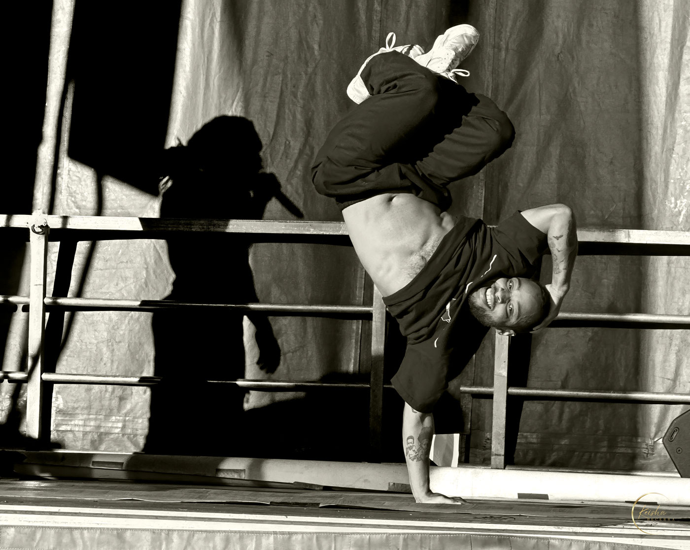
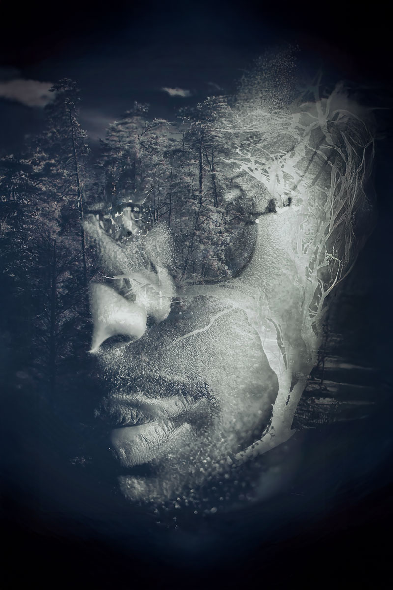
The subtle tension is palpable, communicated through body language and expression. The tattoo, while not the centerpiece, plays a crucial supporting role much like a character actor, adding context without stealing the spotlight from the central drama.
I concur with the suggestion that a slight increase in contrast could enhance the image, perhaps deepening the shadows to draw out more detail in the man's facial features, adding depth to what is already a strong and emotive composition. On the other hand, I think you have just the right amount of detail around the man's tattoo. It's not so detailed that it becomes a focal point but detailed enough that you notice it the way you would a side character in a movie. |
Apr 21st |
| 64 |
Apr 24 |
Comment |
Don, This is a very intresting photo. The image invites a discussion about the intent behind the hanging vertical elements, adding a layer of mystery. I agree with the sentiment that the monochrome enhances the geometry and patterns, turning this into an abstract study as much as a photograph.
While the suggestion to crop the bottom to focus solely on the patterns is intriguing, I think the full view with the floor intact provides a sense of place and context. It might be worthwhile to experiment with selective lighting adjustments to bring out more detail in the shadowed areas without losing the overall balance of light that gives this image its depth.
|
Apr 21st |
| 64 |
Apr 24 |
Comment |
The monochrome treatment of this daffodil photograph is certainly striking, offering a study in contrasts and textures. The sharp focus on the delicate ruffles of the petals create a strong central focal point. The varying shades from white to dark grey in the background provide a really smooth gradient that brings out the flower's form, giving the image a sculptural quality. However, I wonder if a slight reduction in the highlights or maybe an increase in mid-tone contrast would bring out even more detail in the brightest areas?Admittedly, an ajustment like this change the artistic vision you have for this image. |
Apr 21st |
4 comments - 0 replies for Group 64
|
4 comments - 0 replies Total
|