|
| Group |
Round |
C/R |
Comment |
Date |
Image |
| 86 |
Jun 22 |
Reply |
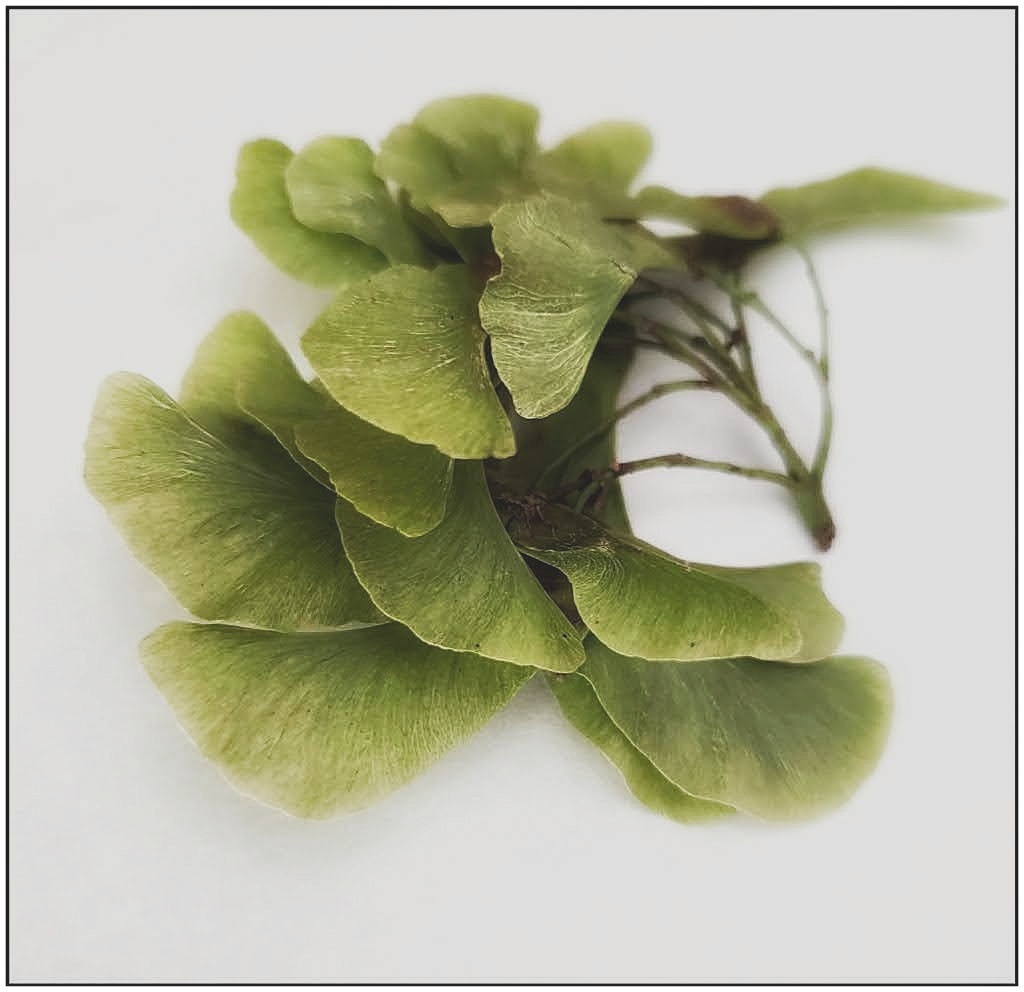
I thought it was Ginkgo too at first. Thank you, Kieu-Hanh! |
Jun 27th |
| 86 |
Jun 22 |
Reply |
Thanks, Bob! |
Jun 27th |
| 86 |
Jun 22 |
Reply |
I need to use the in-camera features more often, so I'll try to remember the focus lock. Thanks! |
Jun 27th |
| 86 |
Jun 22 |
Reply |
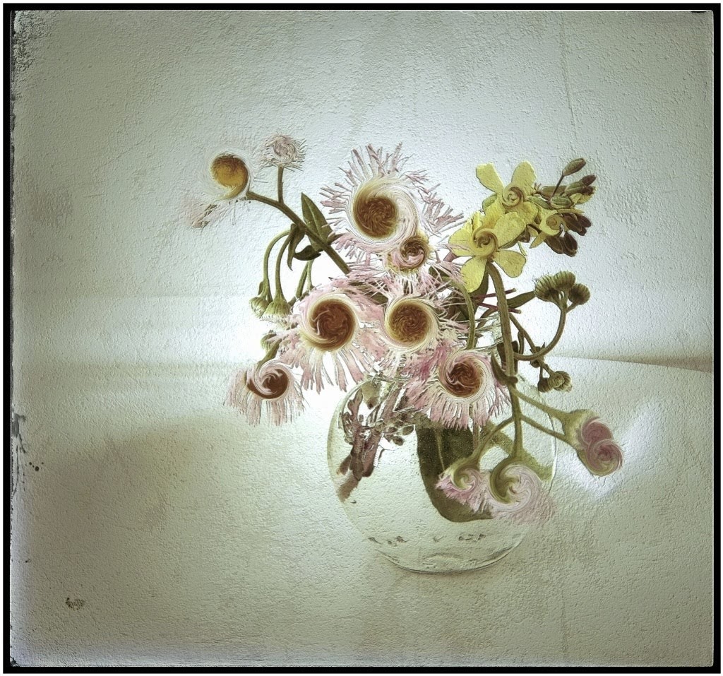
Thanks, Jack! I have others and sharp throughout so I'll try stacking |
Jun 27th |
| 86 |
Jun 22 |
Reply |
Thanks, Ruth! |
Jun 27th |
| 86 |
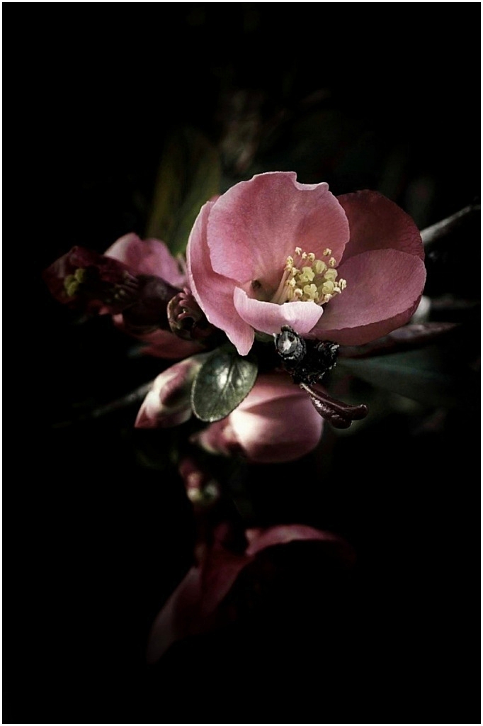
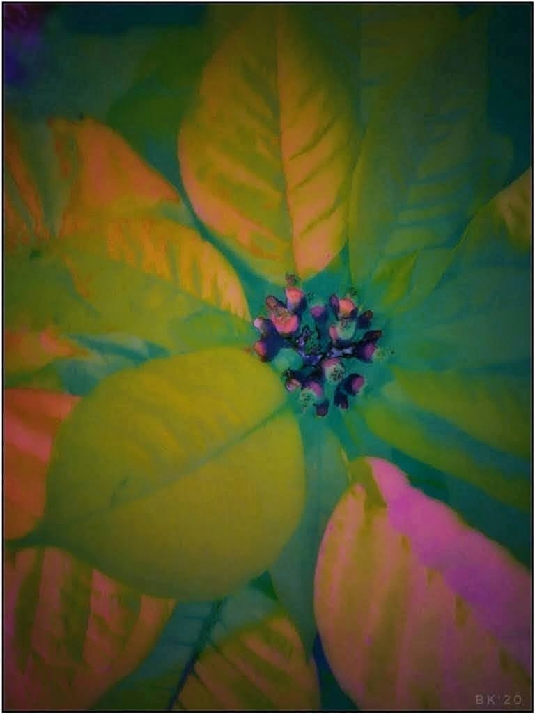
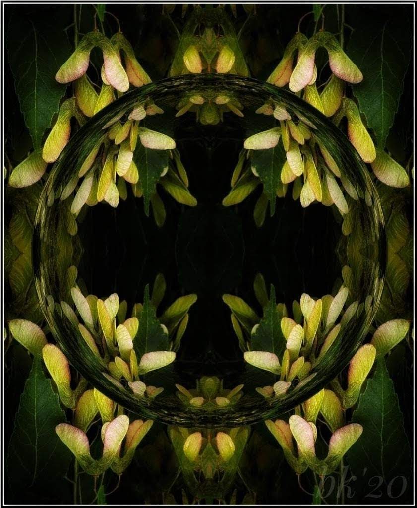
Jun 22 |
Comment |
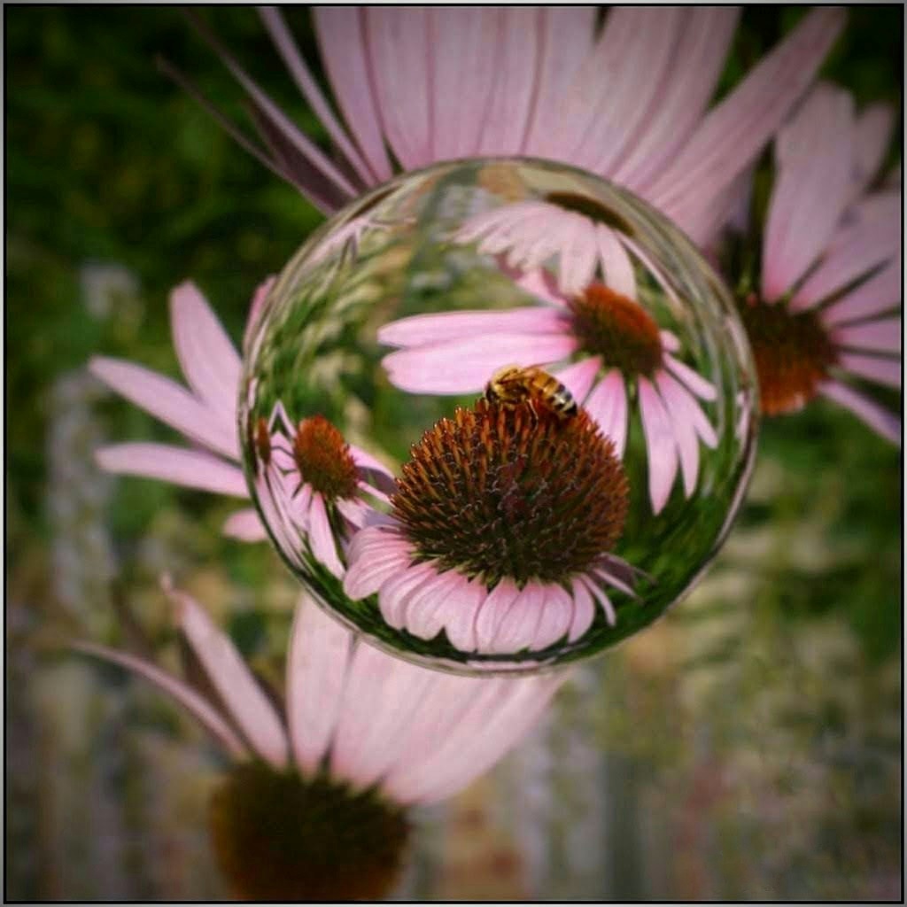
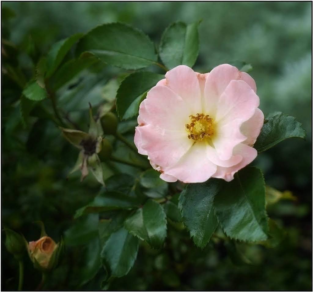
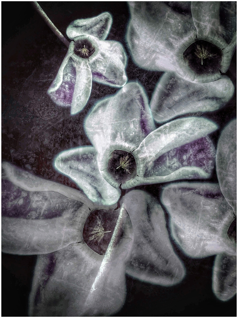
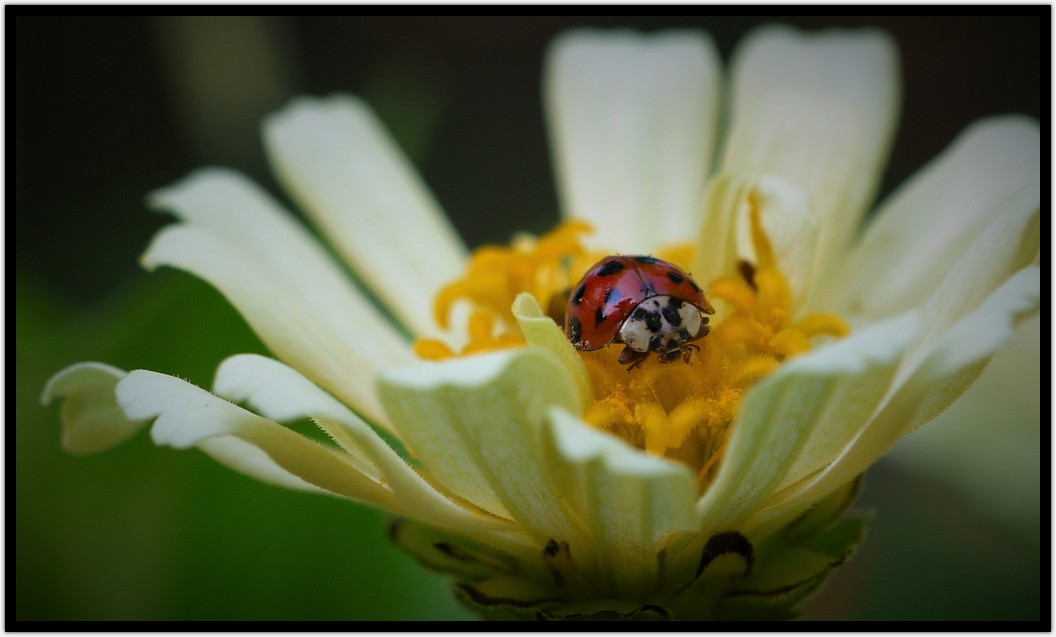
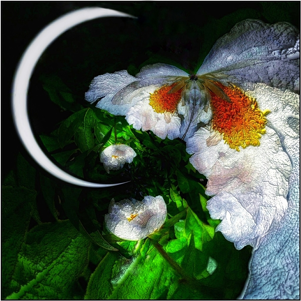
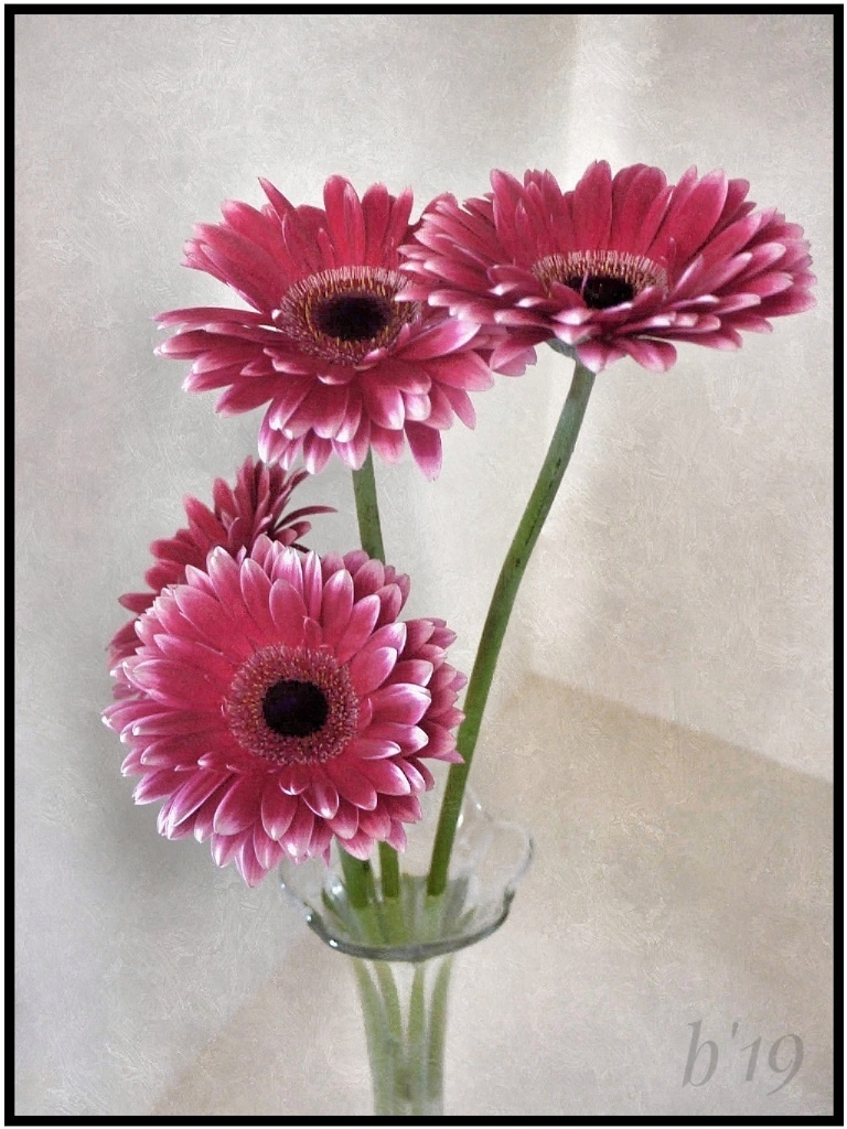
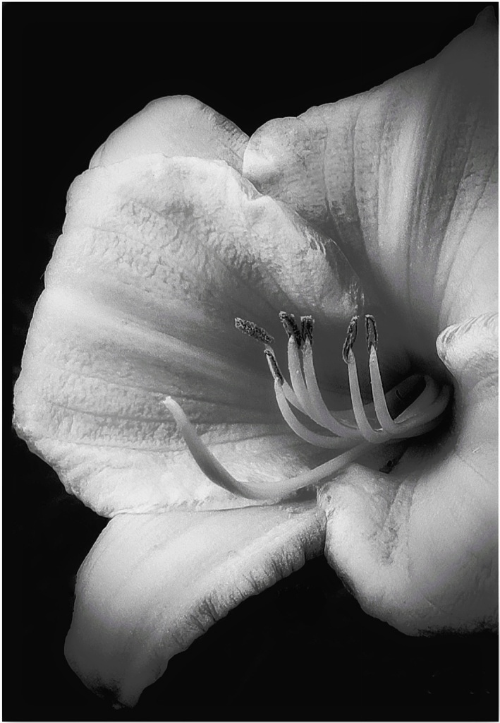
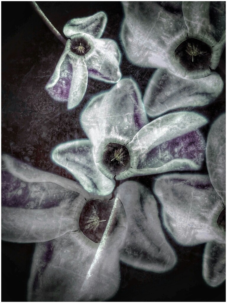
It's a perfectly sharp, pretty flower, Ruth. The ant is loving it! Your edits look great. Seeing the original would help for comparing. You could shove the background even farther away from the flower by a closer crop or by blurring or darkening. Snapseed's "lens tool" might help for that. Doing that would fill the whole frame with the flower; but as it is, it's a great flower image!
|
Jun 14th |
| 86 |
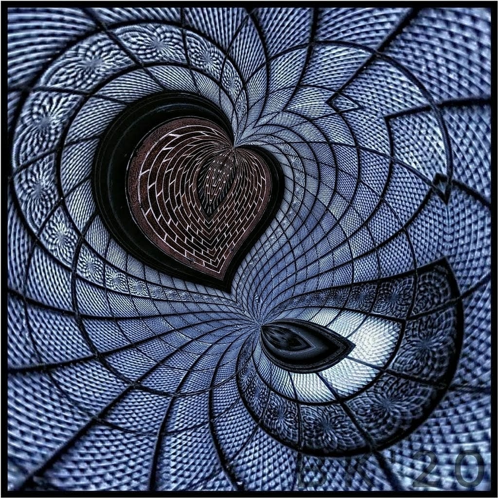
Jun 22 |
Comment |
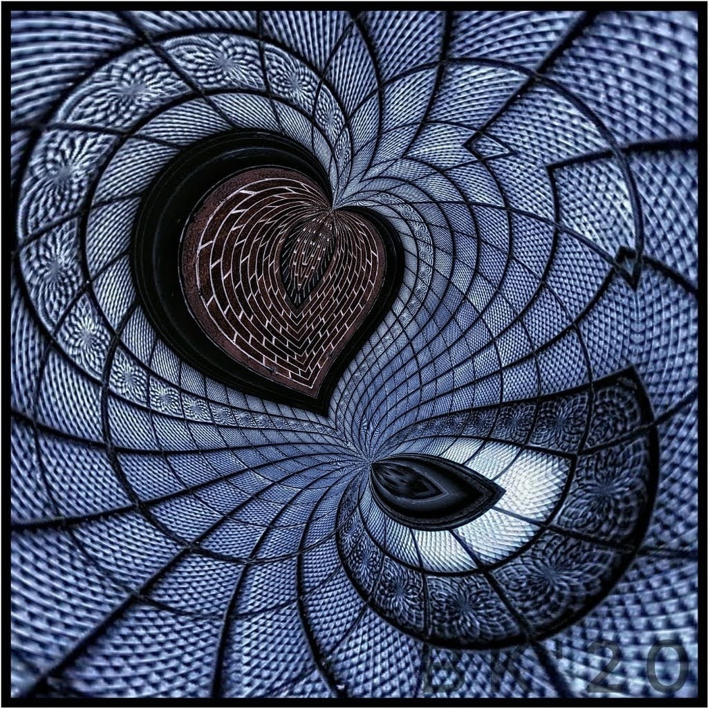
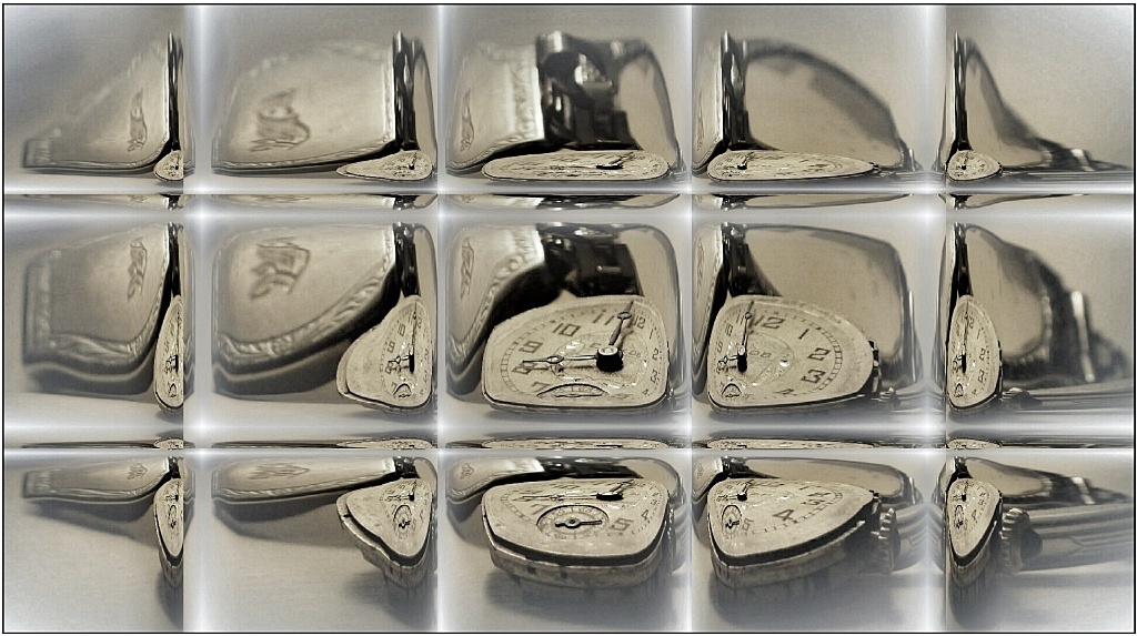
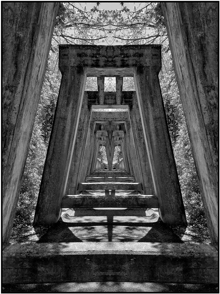
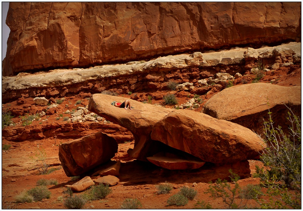
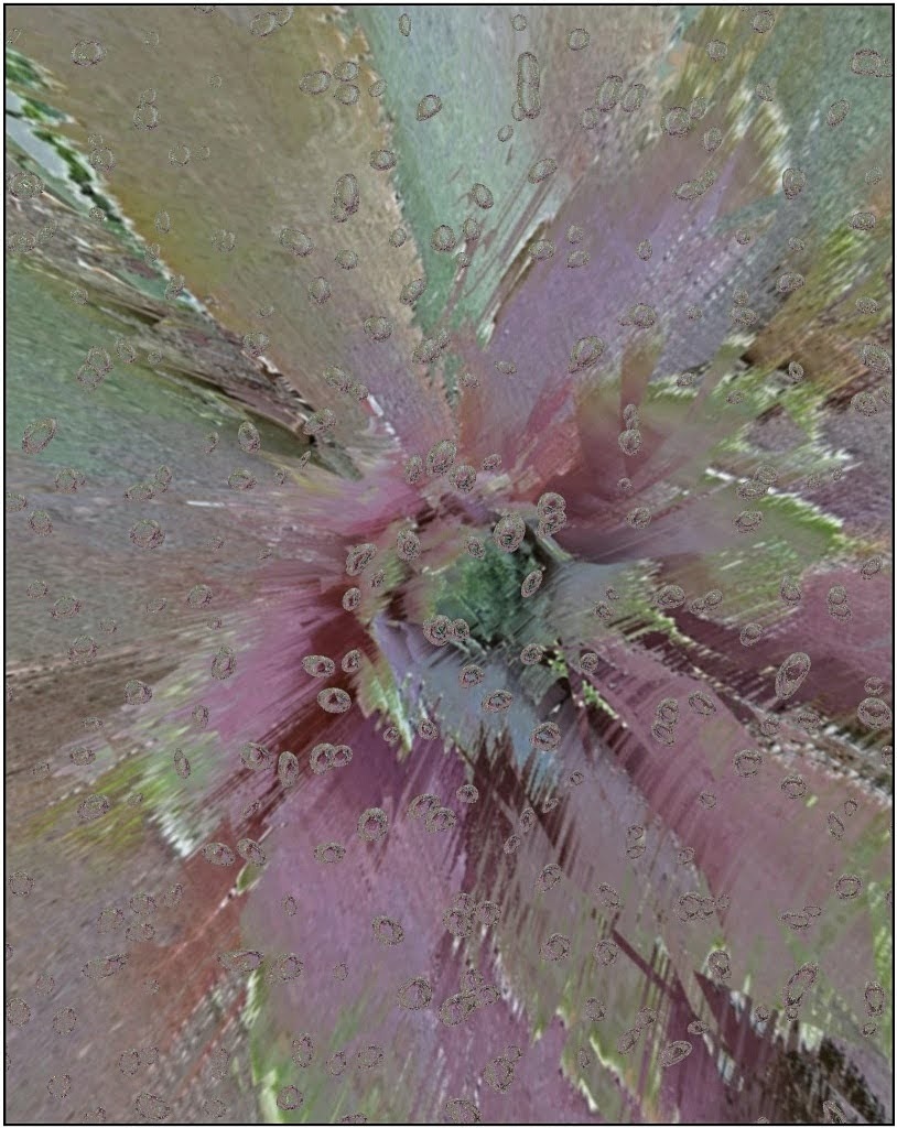
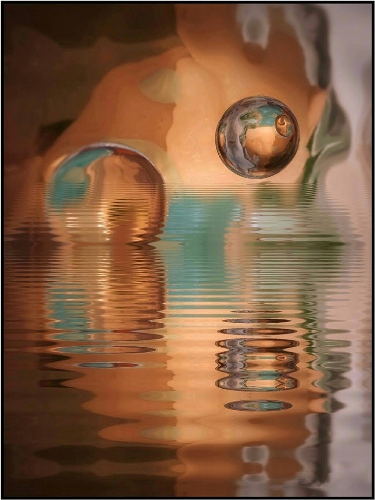
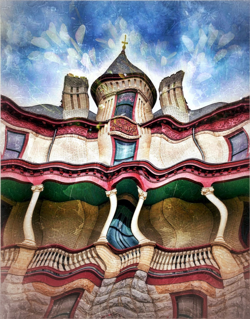
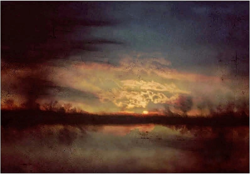
This is an interesting swirling image. The motion created a tunnel and the scene does appear somewhat painterly, fantasy-like. The original would be helpful to compare. I don't know if manipulating is possible, but if the area toward the end of the tunnel could gradually be made more static all the way to the gate (unblurred) it might offer yet another interesting look-- and a spot for the eye to land. There are many fun apps for creating art with the phone camera, it is one reason I love it.
|
Jun 14th |
| 86 |
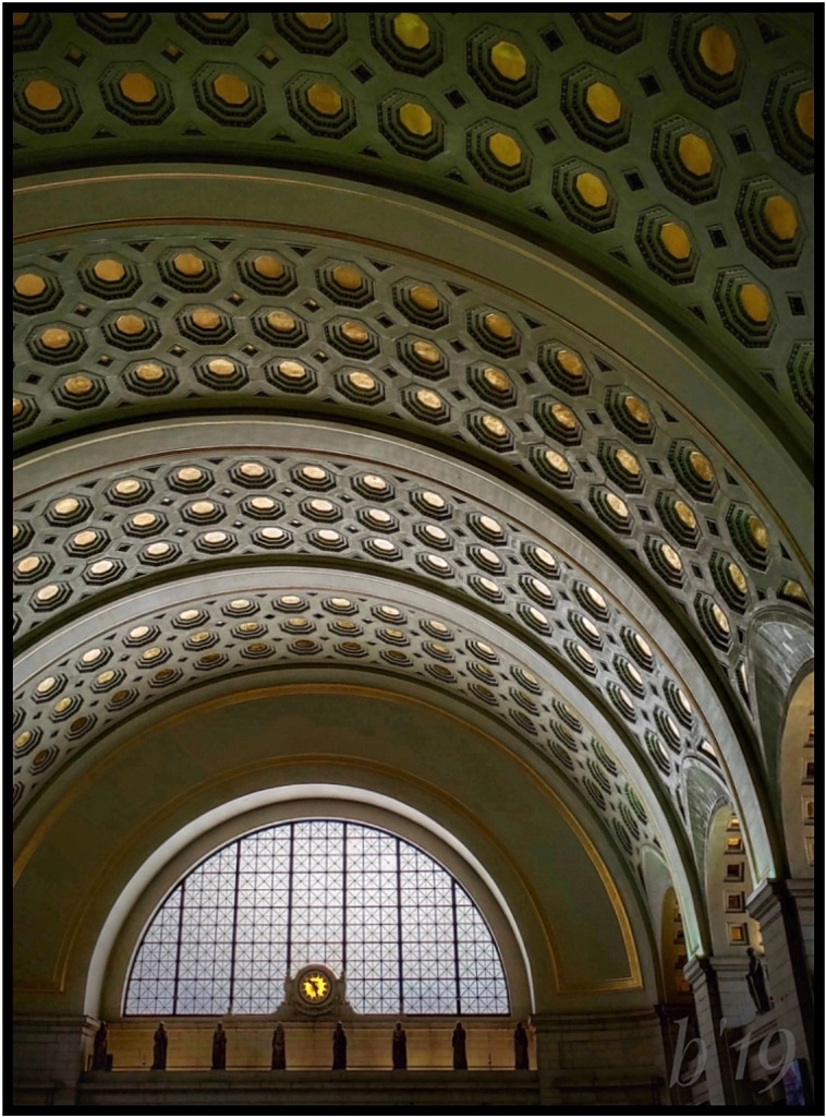
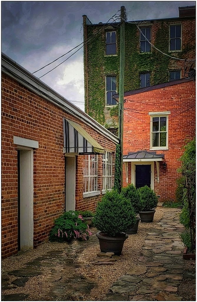
Jun 22 |
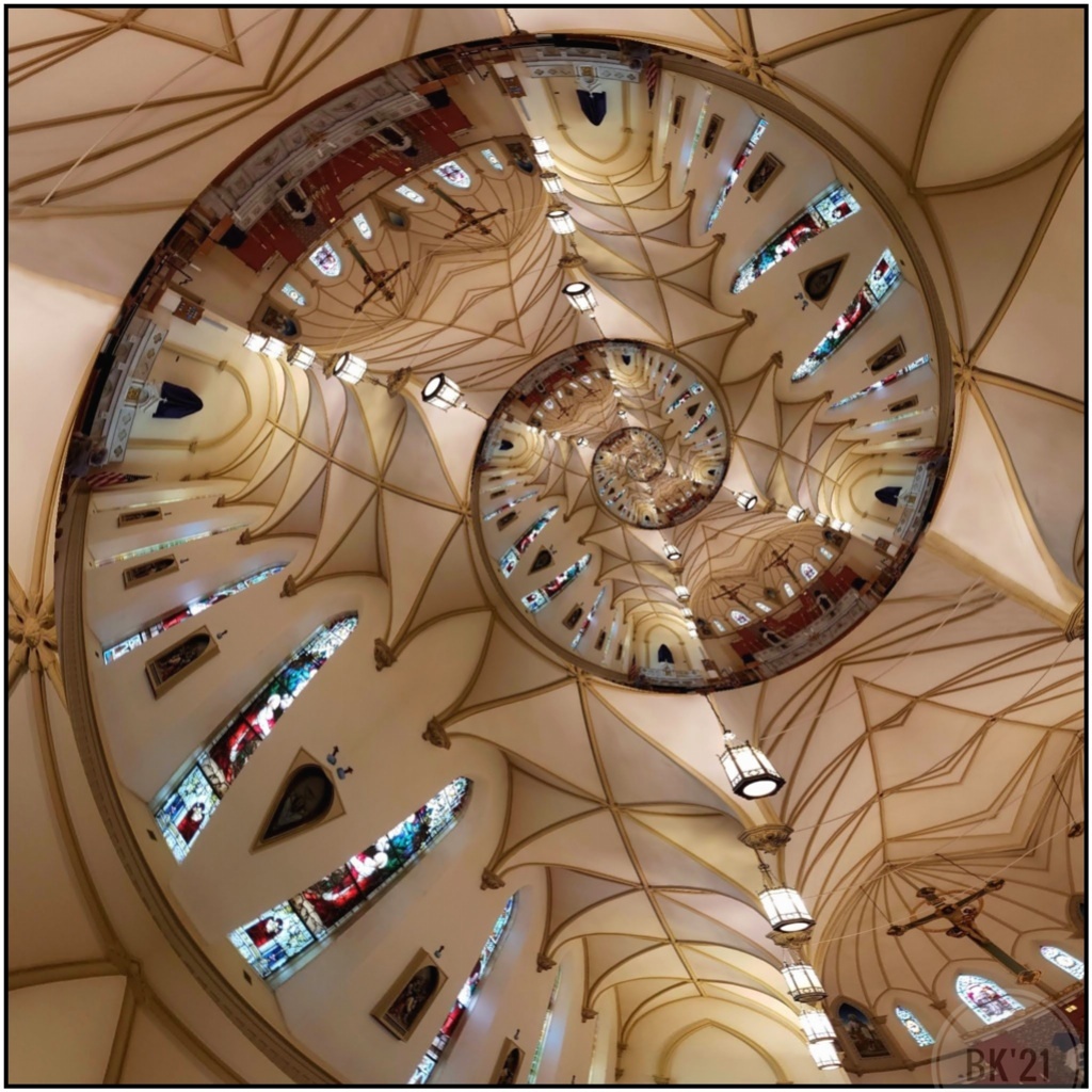
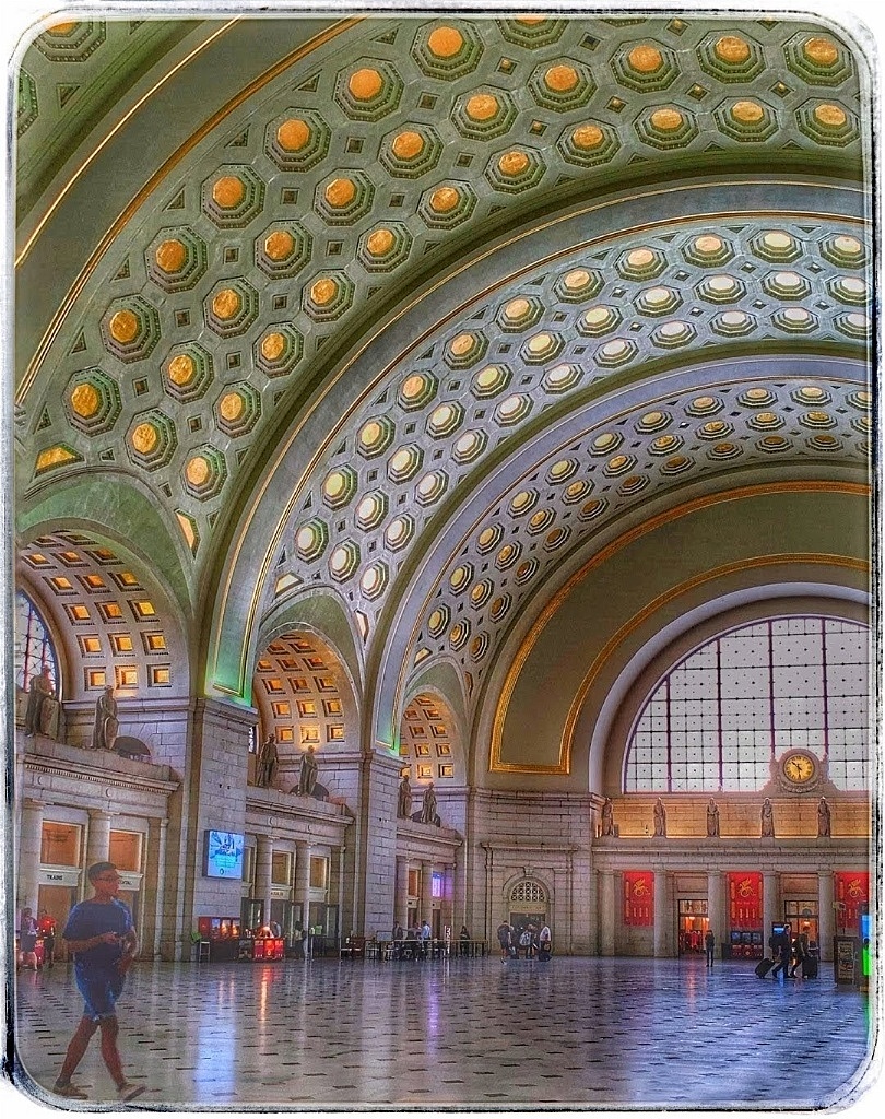
Comment |
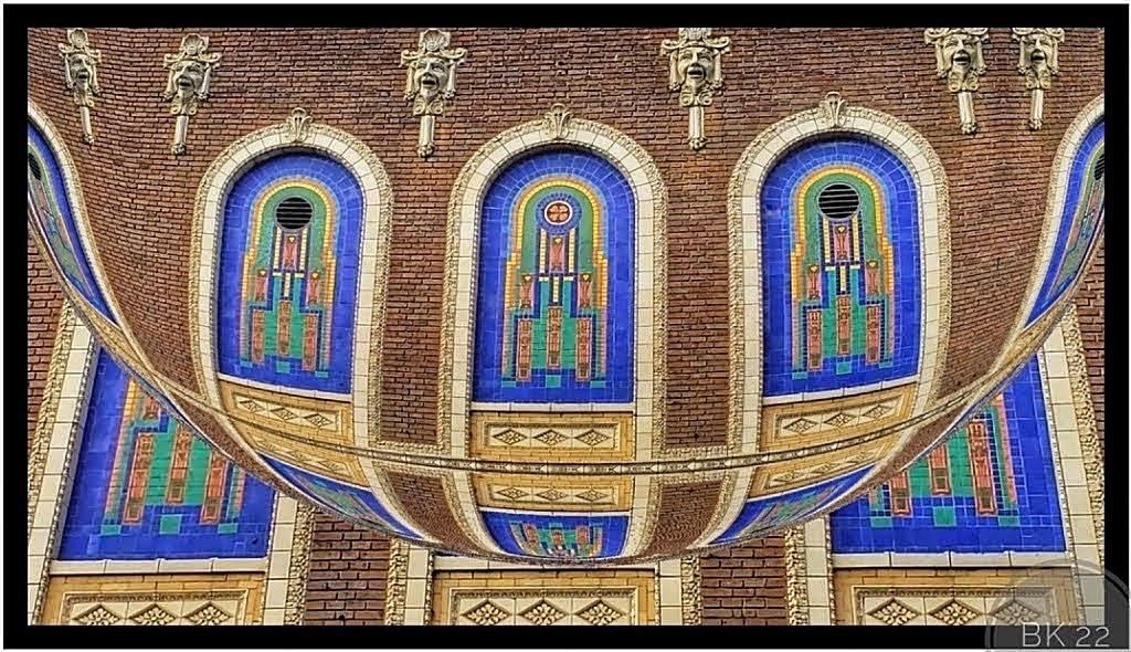
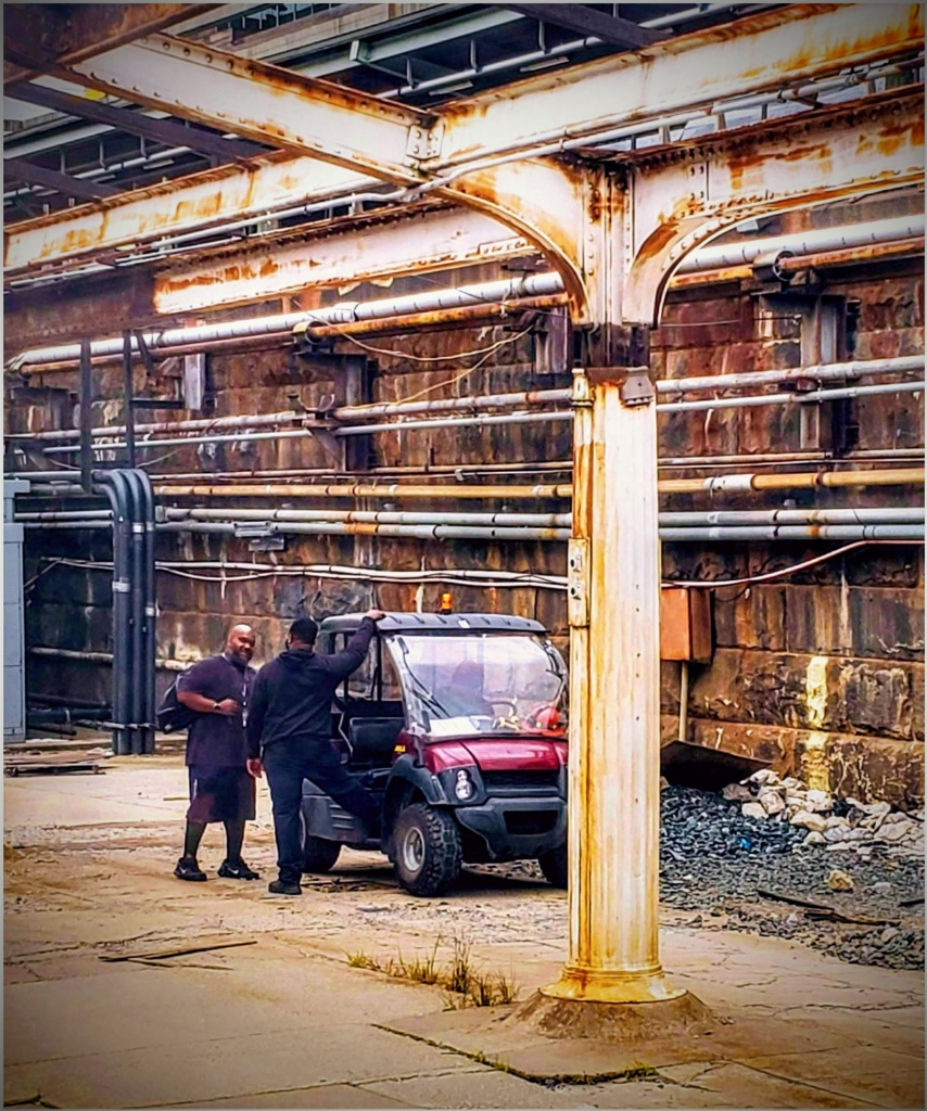
In a way it looks like a face, and at first I thought you had used MirrorLab to get the practically perfect symmetry. The ceiling structure is amazing with so many angles and lines, and the light caused curving shadows allowing for a nice lead-in which is very nice. That no people were in the way for the shot is impressive!
|
Jun 14th |
| 86 |
Jun 22 |
Comment |
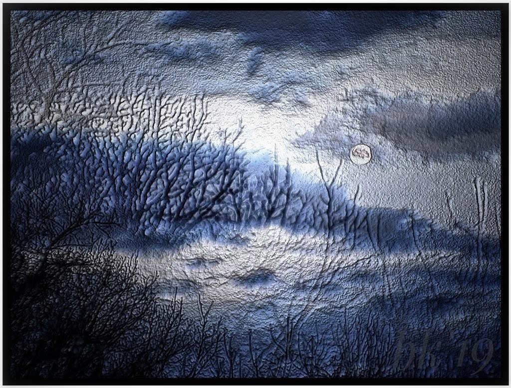
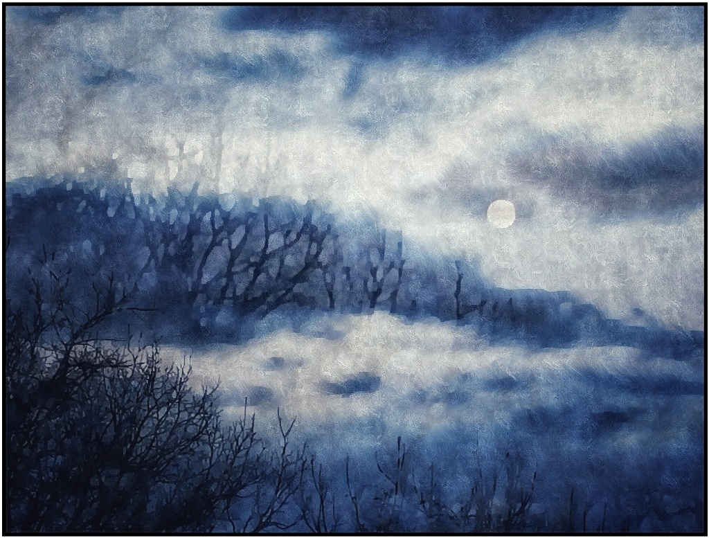
Happy Flag Day! The results are very interesting. So much of it has a blocky, almost mosaic effect that I like; yet, the flags, while stronger, do not have the same look, not so blocky. The flags are enhanced for color/saturation which, to me, is preferable. With this look, the flag shadows become more like stepping stones to me. The effect takes care of the grass nicely. I understand your attempt to show night lighting, but that doesn't come across for me. If you add a moon, I would remove the skinny tree to take advantage of the nice upper lighting and so it's not too busy. I like the overall lighting, but the lighting on dark clouds makes it look more stormy. I don't think that matters, it's an interesting creation.
|
Jun 14th |
| 86 |
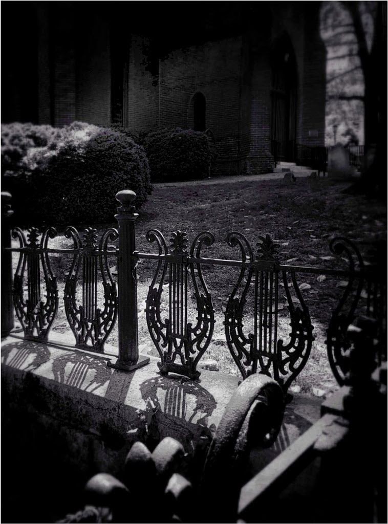
Jun 22 |
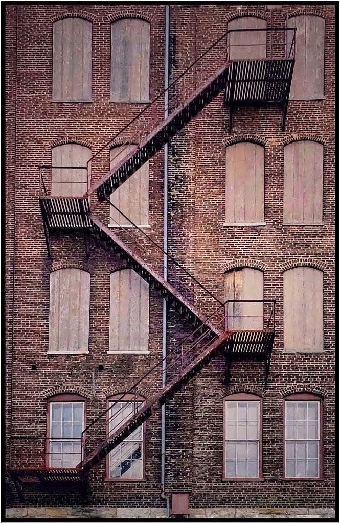
Comment |
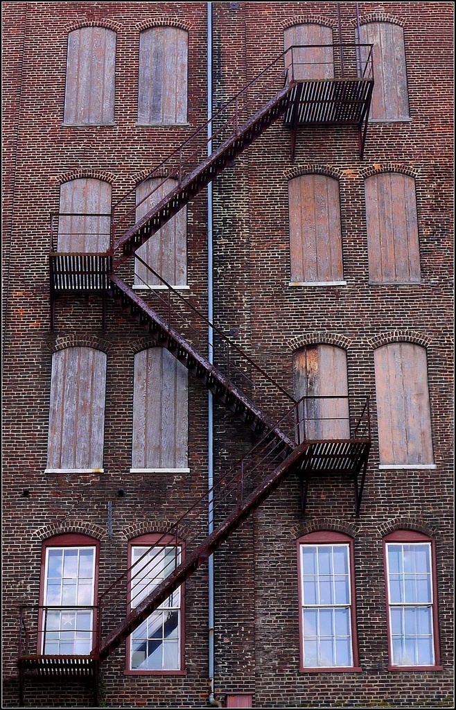
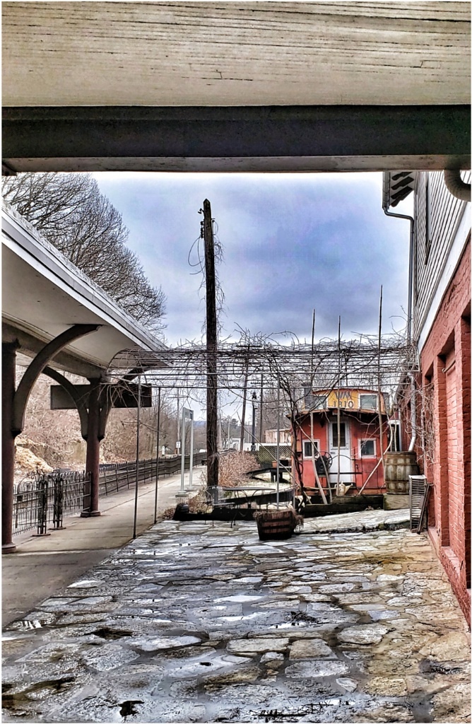
Jack, it is fine as is, I think. It's an abstract and nice in black/white. I feel that the lines actually add to the abstract nature of the image. I don't know, but our brains must tend to look for things perfectly aligned and I usually like things symmetrically lined up. I suppose you could work with a perspective tool to correct the lines, but what you see as imperfect works (perfectly) for me.
|
Jun 9th |
| 86 |
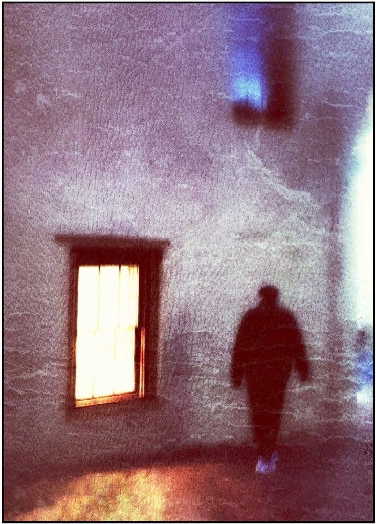
Jun 22 |
Comment |
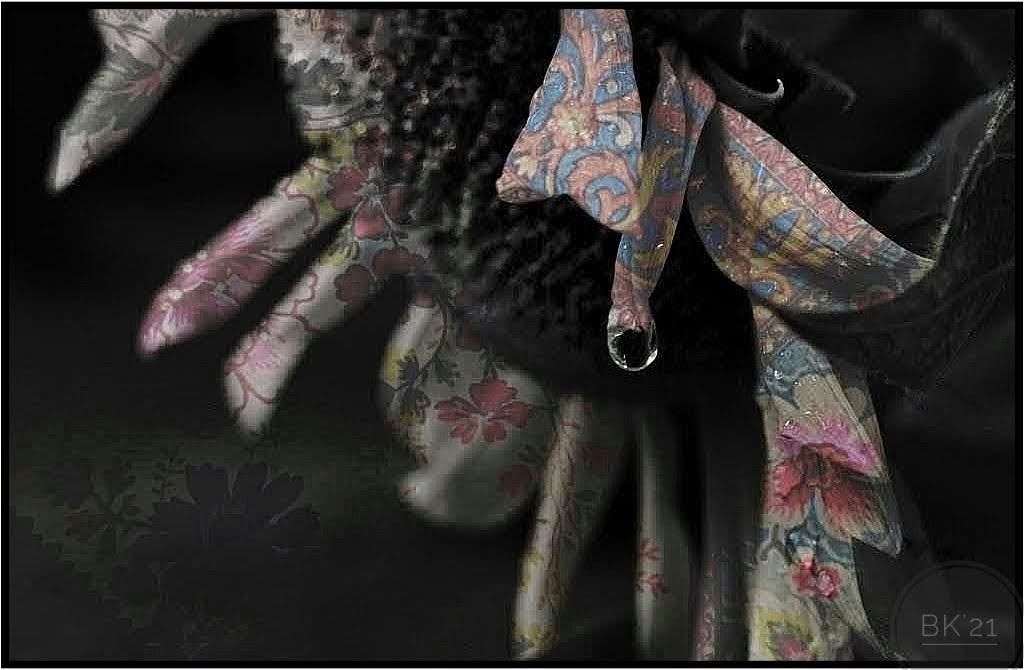
I really like this shot! You gave the artwork a special, more eerie and gauzy appearance coming across the faces. I especially like the face peeking through on the left. I would like to have seen your original for comparison, but Googling the art piece was help. ful. It's not just curtains but a very clever work of art by the creator. It's fascinating. A short review is here (if it opens) https://metropolismag.com/viewpoints/nicolas-party-hirshhorn-museum/
|
Jun 9th |
6 comments - 5 replies for Group 86
|
6 comments - 5 replies Total
|